The “Ready Player One” font isn’t one single font, but rather a distinct, retro-futuristic style reminiscent of 80s arcade games and early digital interfaces. To capture its essence for your design, focus on bold sans-serifs with geometric or slightly blocky letterforms, often incorporating neon glow effects. This guide will help you find and use fonts that evoke that iconic “Ready Player One” feel.
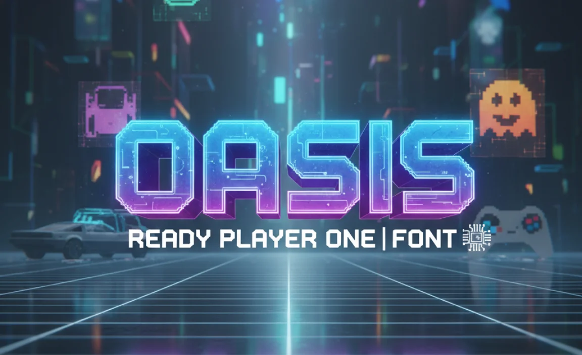
Ready Player One Font: Essential Design Choice
The world of “Ready Player One” is a vibrant, nostalgic landscape, and its visual identity plays a huge role in that feeling. When we think about the iconic “Ready Player One font,” what often comes to mind is a specific aesthetic: bold, geometric, and steeped in 80s retro-futurism. It’s the kind of lettering that screams arcade cabinets, early video games, and a digital dreamscape. If you’re looking to inject that same energy into your own projects, whether it’s a website, a logo, or a social media graphic, you’ve landed in the right place. Don’t worry if you’re new to typography; we’ll break down what makes this style tick and guide you through finding and using fonts that capture that “Ready Player One” magic. Get ready to design with a touch of digital nostalgia!
What Exactly Is the “Ready Player One” Font Aesthetic?
Before we dive into finding specific fonts, let’s understand the core elements that define the “Ready Player One” font style. It’s more of a stylistic genre than a single typeface. Think about the visual design cues from the movie and the book’s universe:
Retro-futurism: The blend of past (80s) and future (virtual reality) is key. This translates to fonts that feel both familiar from older technology and advanced in their digital presentation.
80s Arcade and Video Games: Many of the fonts evoke the chunky, blocky, and often monospaced lettering seen on arcade game marquees, early computer terminals, and pixelated game interfaces.
Digital and Glitchy: There’s an inherent digital nature. This can mean clean, geometric lines, sometimes with a slightly distressed or “glitched” look, as if the digital signal isn’t perfect.
Bold and Impactful: These fonts are designed to grab attention. They are usually strong, sans-serif designs that command presence, especially when used for titles and headlines.
Neon Vibes: While not strictly a font characteristic, the frequent use of neon lighting and vibrant colors in the “Ready Player One” aesthetic often influences how the fonts are presented, giving them a glowing appearance.
Essentially, if a font looks like it could be on a vintage arcade machine or an early sci-fi computer screen, it’s likely tapping into that “Ready Player One” vibe.
Finding Your “Ready Player One” Style Fonts
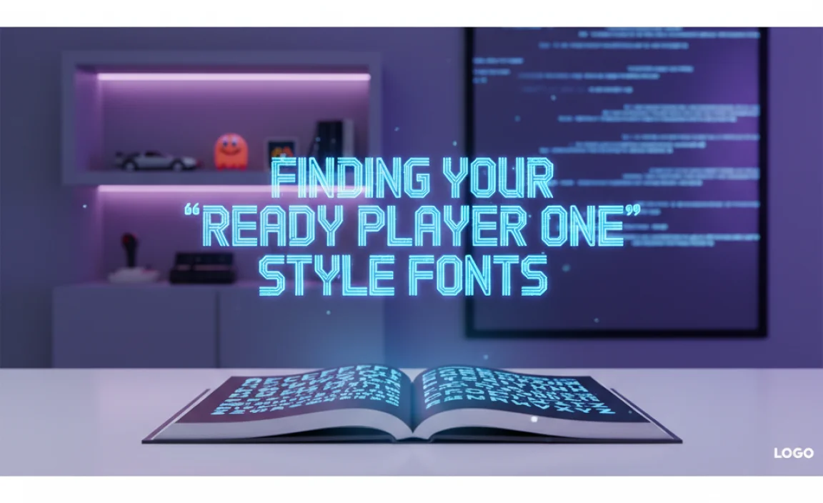
While there isn’t one official “Ready Player One” font, many typefaces capture the spirit. Here’s how you can find them, along with some characteristics to look for:
Key Font Characteristics to Search For:
Geometric Sans-Serifs: These fonts are built on simple geometric shapes like circles, squares, and triangles. They often have a clean, futuristic feel.
Monospaced Fonts: In these fonts, every character takes up the same amount of horizontal space, similar to old typewriters and early computer consoles. This gives a very distinct, often retro-tech look.
Blocky or Stencil Styles: Fonts with thick, block-like letters or those that resemble stencils can evoke a sense of utilitarian or industrial design, common in sci-fi.
Distressed or Glitchy Variants: Some fonts come with built-in texture or imperfections that simulate digital errors or analog degradation, fitting the “glitch art” aspect of the OASIS.
Display Fonts: Many of these styles fall under the “display” category, meaning they are best suited for large sizes (headlines, logos) rather than long blocks of body text.
Where to Discover These Fonts:
Many online font repositories offer a vast selection. When searching, use keywords like “retro,” “80s,” “futuristic,” “geometric,” “display,” “arcade,” “digital,” or “sci-fi.”
Google Fonts: A fantastic free resource offering a wide range of fonts. Explore categories like “Display” or search using keywords.
Font Squirrel: Another excellent source for free, commercially usable fonts. They have a great tagging system.
Adobe Fonts (Typekit): If you have an Adobe Creative Cloud subscription, you have access to a massive library of high-quality fonts.
MyFonts, Fontspring, Creative Market: These are marketplaces where you can purchase premium fonts. You’ll find more unique and specialized designs here.
Popular Font Styles that Embody the “Ready Player One” Vibe
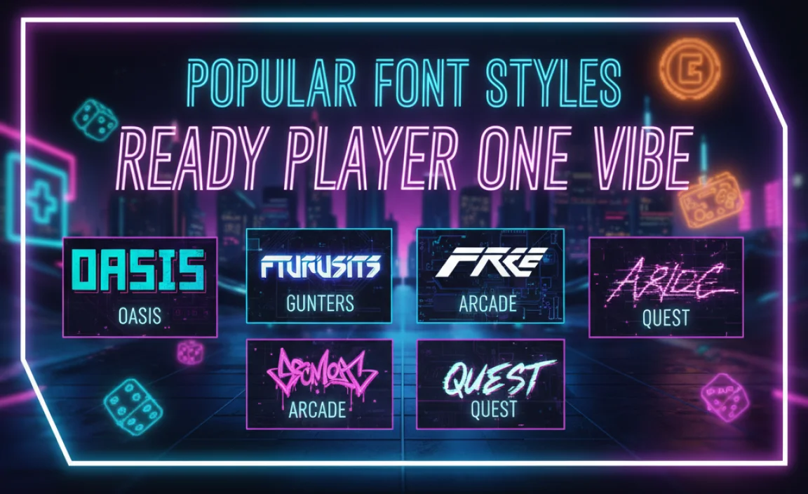
Let’s look at some specific font styles and examples that can help you achieve that “Ready Player One” aesthetic. Remember, the key is often in the combination of a font choice and its visual application (color, effects).
1. Geometric Sans-Serifs with a Chunky Feel
These fonts are clean and modern but with a solidity that feels distinctly retro-tech. They often have consistent stroke widths and well-defined shapes.
Examples:
Orbitron: As the name suggests, this geometric sans-serif has a strong futuristic and space-age feel. It’s available on Google Fonts.
Aldrich: A sans-serif designed for use in space-related applications, it has a strong, blocky presence. Also on Google Fonts.
Bebas Neue: While more condensed, its strong, uppercase-only form can be very impactful for headlines. Available on Google Fonts.
2. Monospaced Fonts for a Classic Digital Look
These fonts are straight out of the early computing era. They give a very authentic “coder” or “terminal” feel that’s crucial for that 80s digital aesthetic.
Examples:
Inconsolata: A popular, highly readable monospaced font. Available on Google Fonts.
VT323: This font emulates the look of old dot-matrix printers and terminals, giving a very authentic retro feel. Available on Google Fonts.
IBM Plex Mono: Part of a comprehensive family, this mono variant offers a clean, modern take on the style. Available on Google Fonts.
3. Bold Display Fonts with a Retro Edge
These are fonts designed for impact. They might have unique character shapes, a slightly distressed texture, or an overall vibe that screams 1980s.
Examples:
Press Start 2P: This font is directly inspired by pixelated video game fonts. It’s a perfect fit for an authentic arcade feel. Available on Google Fonts.
Cyberdyne: While not directly “Ready Player One,” fonts with names like this often lean into cinematic sci-fi aesthetics. (Requires purchase or specific find).
Many stencil or block-letter fonts found on marketplaces can also fit this bill.
4. Fonts with a Futuristic or Sci-Fi Flair
Beyond simple retro looks, some fonts are specifically designed to feel futuristic and could easily be found within the OASIS.
Examples:
Titillium Web: A versatile sans-serif with a modern, slightly technical feel. Available on Google Fonts.
Exo 2: Designed with a modernist sentiment, it offers a clean, geometric, and slightly futuristic look. Available on Google Fonts.
Applying the “Ready Player One” Font Style in Your Designs
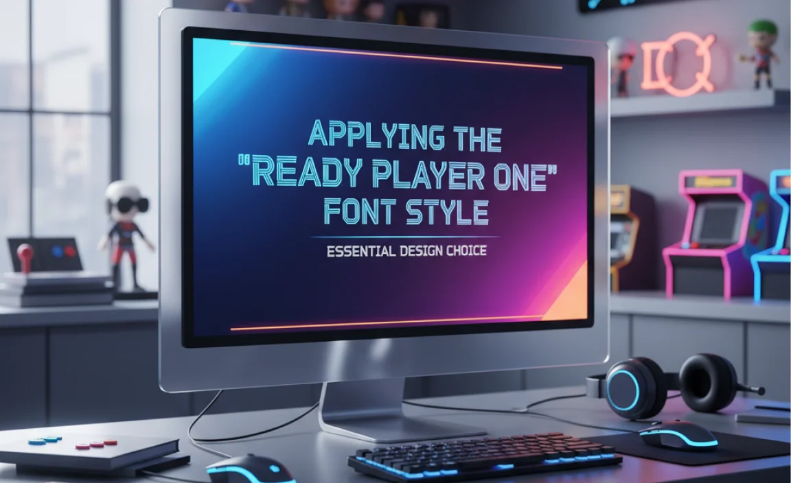
Choosing the right font is only half the battle. How you use it – the styling, color, and context – is what truly brings the “Ready Player One” aesthetic to life.
Step-by-Step Design Application:
1. Select Your Font:
Choose a bold, geometric sans-serif or a classic monospaced font that fits your project’s needs.
Consider if you need an all-caps font for maximum impact.
Google Fonts is an excellent starting point for free options.
2. Embrace the 80s Color Palette:
Think vibrant neons: hot pink, electric blue, lime green, bright orange, and cyan.
Contrast these with dark backgrounds (black, deep purple, dark grey) for a glowing effect.
Also, consider metallic gradients or pixelated color blocks.
3. Add Effects (Sparingly but Effectively):
Neon Glow: This is a signature look.
In Photoshop or similar software, use `Layer Styles` > `Outer Glow`.
Choose a vibrant color that matches your text.
Adjust the spread and size to create a soft, pulsating glow. You can often stack multiple glows for depth.
Some vector software also has similar `Outer Glow` or `Drop Shadow` effects that can simulate this.
Pixelation/Glitch:
For a more literal interpretation, you can use distorted text effects or textures that mimic pixelation.
Look for “glitch text generator” tools online or experiment with displacement maps in image editing software.
Retro Textures:
Overlaying a subtle noise or grunge texture can give the font an aged, analog feel, like it’s been printed on old equipment.
4. Context is Key:
Headlines & Titles: This is where these fonts shine. Use them for prominent titles, game names, or event headers.
Logos: A strong, custom-lettered logo using a “Ready Player One”-inspired font can be highly memorable.
Digital Interfaces: If designing for a website or app that aims for a retro-tech feel, these fonts are perfect for button labels, navigation, or status messages.
Body Text (Use with Caution): Generally, these bold display fonts are not ideal for long paragraphs. If you need to use them for smaller text, find a highly readable variant or a monospaced font designed for legibility. Ensure good contrast and sufficient line spacing.
Example Application: Designing an Event Poster
Let’s say you’re designing a flyer for an 80s retro gaming night.
Headline: Use a bold, geometric font like Aldrich or even Press Start 2P for the event title “OASIS ARCADE NIGHT.” Make it all caps.
Color: Render the text in a bright neon pink or electric blue.
Effect: Apply a soft outer glow effect to make it pop against a dark, starry background.
Sub-headline/Details: Use a more legible, but still fitting, font like Exo 2 or a clean monospaced font like Inconsolata for event details (date, time, location). These can be in a contrasting color, perhaps a sci-fi silver or white.
Background: Consider a dark background with subtle grid lines or pixelated elements.
This combination immediately evokes the “Ready Player One” aesthetic without being overly complicated.
Table: Font Categories and “Ready Player One” Examples
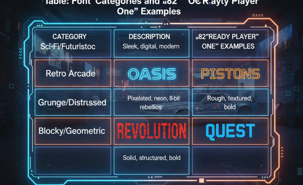
To help visualize the range, here’s a table of font categories that fit the “Ready Player One” aesthetic and some illustrative examples.
| Font Category | Key Characteristics | “Ready Player One” Vibe | Example Fonts (Google Fonts) |
|---|---|---|---|
| Geometric Sans-Serif | Based on simple shapes, clean lines, often even stroke weights. | Futuristic, clean, precise, slightly retro-tech. | Orbitron, Aldrich, Exo 2, Titillium Web |
| Monospaced | All characters occupy the same width, typewriter/terminal style. | Classic digital, coding, retro computer interface. | Inconsolata, VT323, IBM Plex Mono |
| Pixelated / Blocky Display | Chunky letters, resembling low-resolution digital displays or construction blocks. | Authentic 80s arcade, pixel art, retro gaming titles. | Press Start 2P |
| Stencil / Industrial | Letters with cutouts, utilitarian & bold. | Sci-fi tech, industrial design, functional interfaces. | (Many options on marketplaces, search “stencil font”) |
This table helps illustrate how different font styles can contribute to the overall “Ready Player One” mood. You can mix and match these, but always prioritize legibility for important information.
Resources for Further Exploration
To deepen your understanding and find more resources, here are some excellent places to look:
The Art of the Poster (Movie): Understanding the official movie posters and marketing materials can provide a wealth of inspiration regarding color palettes and typography. You can often find discussions about the specific fonts used in various promotional materials online.
Retro Computing History: Websites dedicated to the history of early computers and video games (like the Computer History Museum) offer a visual library of the fonts and interfaces that inspired the “Ready Player One” aesthetic.
Typography Blogs and Guides: Sites like Canva’s Design School or Typedia have excellent beginner guides on font types and how to use them effectively.
Font Identification Tools: If you see a font you love in an image, tools like Font Squirrel’s Font Identifier or WhatFontIs can help you identify it or find similar alternatives.
Legibility and Accessibility Considerations
While the “Ready Player One” aesthetic often leans towards visually distinctive display fonts, it’s crucial to remember readability, especially for any functional text (like on a website menu or an app interface).
Body Text: Stick to highly legible sans-serifs or monospaced fonts for paragraphs. Ensure sufficient font size, line height, and contrast.
Contrast: The high contrast often used in neon effects can sometimes be challenging for readability. Ensure your text is easily distinguishable from its background. The WebAIM Contrast Checker is a great tool for ensuring your color combinations meet accessibility standards.
* Font Weight: Use bold weights for emphasis, but avoid overly thin or stylized fonts for critical information.
By balancing the exciting retro-futuristic style with practical design principles, you can create impactful and user-friendly designs.
Frequently Asked Questions (FAQ)
Q1: Is there one official “Ready Player One” font?
No, there isn’t a single official font. The “Ready Player One” aesthetic is a style that combines elements of 80s arcade games, early digital interfaces, and retro-futuristic sci-fi. Many fonts can capture this vibe.
Q2: What kind of fonts should I look for to get the “Ready Player One” look?
Focus on geometric sans-serifs, monospaced fonts, and bold display fonts with blocky or stencil-like characteristics. Keywords like “retro,” “80s,” “futuristic,” and “arcade” can help you find them.
Q3: Where can I find free fonts with this style?
Reputable sources for free fonts include Google Fonts and Font Squirrel. Both offer large libraries that can be searched using relevant keywords.
Q4: How important are color and effects when using these fonts?
Extremely important! The “Ready Player One” look is often enhanced by vibrant neon colors, dark backgrounds, and effects like glowing outlines or subtle glitch textures. These elements help sell the retro-futuristic theme.
Q5: Can I use these fonts for body text?
Generally, bold display fonts inspired by “Ready Player One” are not ideal for long paragraphs due to readability issues at small sizes. It’s best to use them for headlines, titles, and short labels. For body text, choose a more legible sans-serif or monospaced font.
Q6: What are some common characteristics of 80s-style fonts?
They often feature bold strokes, geometric or blocky letterforms, sometimes a slightly condensed feel, and can have a futuristic or analog-tech appearance. Think of the lettering on vintage computer monitors or movie posters from that era.
Conclusion
The “Ready Player One” font aesthetic offers a fantastic gateway to vibrant, nostalgic, and futuristic design. By understanding the core elements—geometric shapes, monospaced layouts, bold forms, and a distinct retro-futuristic vibe—you can confidently choose and apply fonts that capture this unique style. Whether you’re aiming for the authentic feel of an 80s arcade screen or the cutting-edge digital world of the OASIS, the right typeface, paired with evocative colors and effects, will make your project truly stand out. So, go ahead, explore the vast world of typography, and let your designs jump into the future while celebrating the past. Happy designing!

Leave a Comment