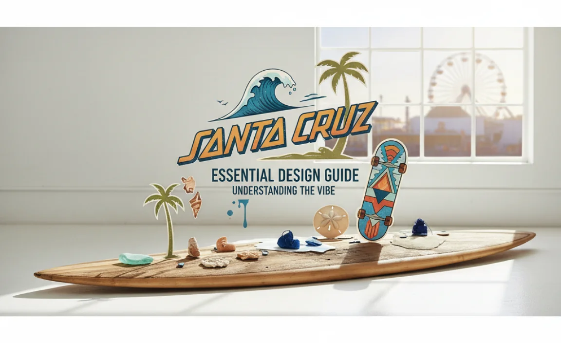
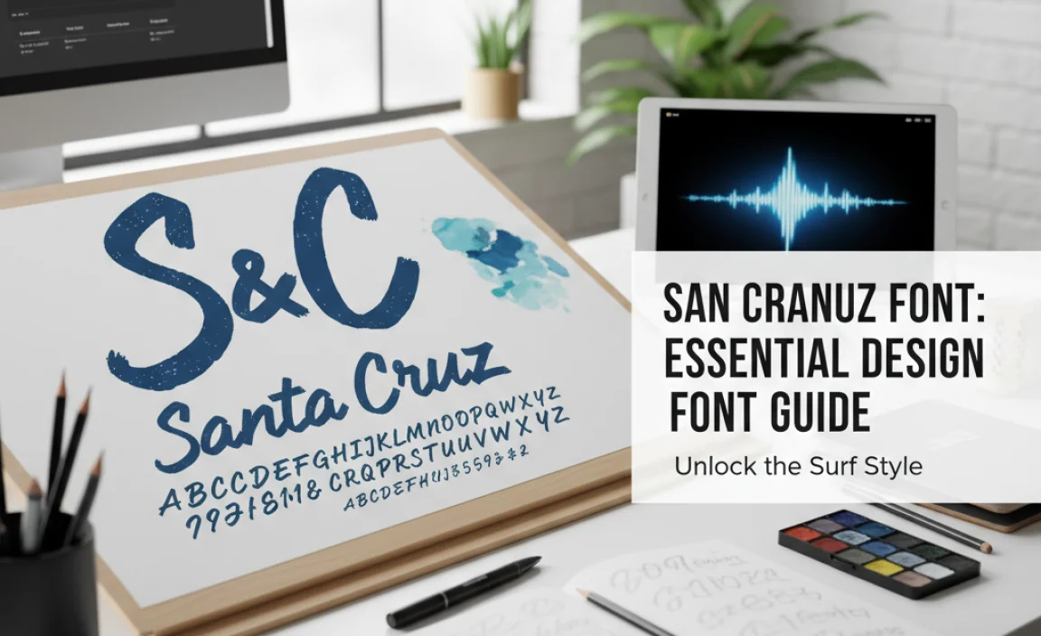
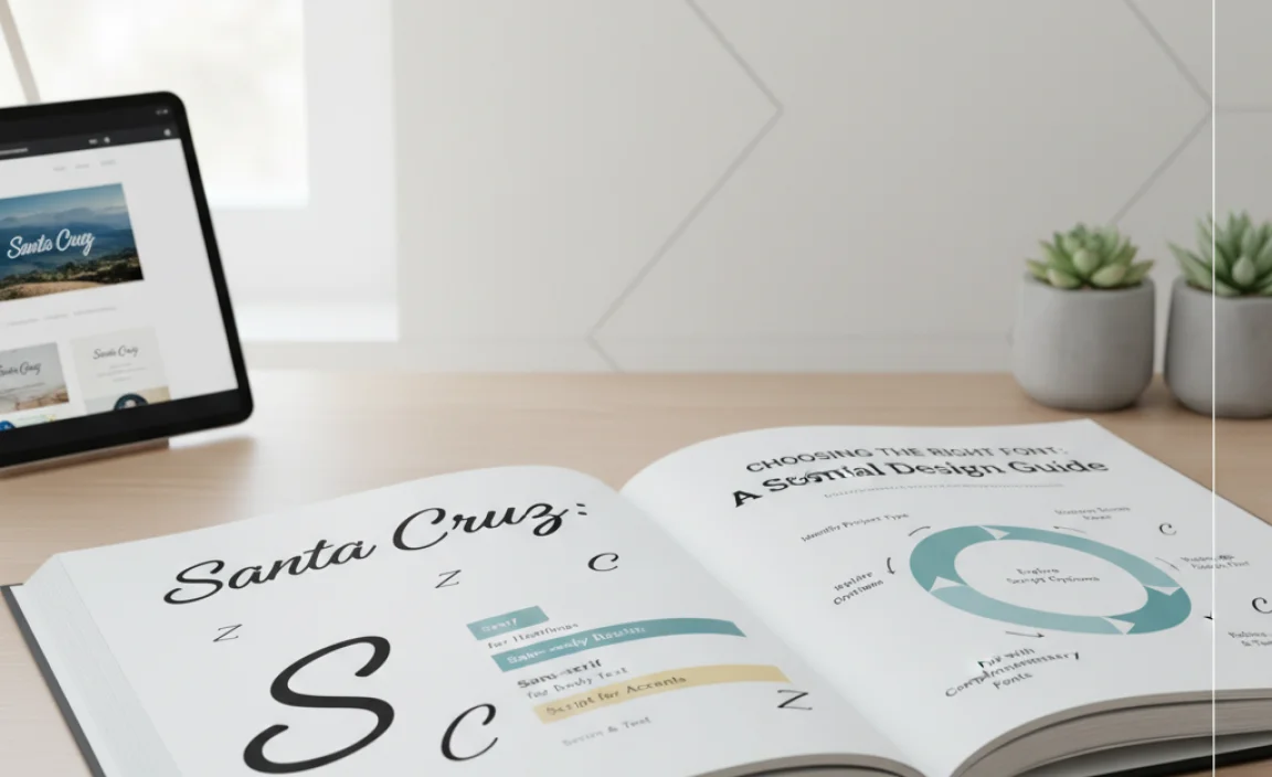
The “Santa Cruz font” isn’t a single typeface but refers to various fonts heavily inspired by the casual, adventurous, and often retro vibes associated with Santa Cruz, California. This guide helps you find and use fonts that capture this spirit effectively for your designs.
Ever seen a design that just screams “beach vibes,” “skate culture,” or “laid-back cool”? Chances are, it’s using a font that channels the spirit of places like Santa Cruz. But what exactly is the “Santa Cruz font,” and how do you pick one that feels right for your project? It’s a common question for designers, bloggers, and business owners alike. Many get stuck trying to find that perfect font that embodies freedom and fun without looking unprofessional. Don’t worry, we’re here to break it down. We’ll explore the essence of this style and guide you through choosing fonts that perfectly capture that Santa Cruz feeling. Get ready to bring that California sunshine and effortless cool to your designs.
Understanding the “Santa Cruz Font” Vibe
When people talk about the “Santa Cruz font,” they aren’t usually referring to one specific typeface. Instead, it’s a descriptive term for fonts that evoke a particular feeling or aesthetic. This aesthetic is heavily influenced by the lifestyle and culture associated with Santa Cruz, California. Think about it: sunny beaches, surf culture, skate parks, a slightly bohemian and free-spirited atmosphere, and a touch of vintage nostalgia. Fonts that fit this description often share characteristics like:
- Casual & Relaxed: They tend to be informal and approachable, avoiding stiff or overly formal structures.
- Retro & Vintage: Many draw inspiration from fonts popular in the 60s, 70s, or 80s, bringing a sense of nostalgia.
- Playful & Energetic: They can have a dynamic, sometimes slightly quirky, feel that suggests fun and activity.
- Handwritten or Brush-like: Some emulate the look of hand-lettering, adding a personal and authentic touch.
- Bold & Expressive: Often, these fonts make a statement, standing out with unique shapes or strong character.
Essentially, a “Santa Cruz font” is one that makes you feel like you’re basking in the California sun, riding a wave, or exploring a vibrant boardwalk. It’s about radiating a sense of freedom, creativity, and youthful energy.
Finding Fonts That Capture the Santa Cruz Spirit
Since there isn’t one official “Santa Cruz font,” the key is to identify font categories and specific examples that align with the desired vibe. Here’s how you can search and what to look for:
1. Explore Font Categories
Certain font styles naturally lend themselves to the Santa Cruz aesthetic more than others. Focus on these categories when you’re browsing:
- Script Fonts: Especially those with a brush-like or handwritten feel. These can capture the fluidity of waves or the spontaneity of a doodle.
- Display Fonts: These are designed for impact and often feature unique, decorative, or bold characteristics that fit a lively theme.
- Retro/Vintage Fonts: Look for fonts inspired by mid-century advertising, old surf posters, or classic skate graphics.
- Serif Fonts (with a twist): While not always the first choice, some serifs with rounded edges or a slightly quirky personality can work, especially for a more mature or established take on the vibe.
- Sans-Serif Fonts: Bold, rounded sans-serifs can also fit, particularly those with a slightly condensed or extended feel that evokes vintage signage.
2. Look for Specific Characteristics
Beyond font categories, pay attention to these design elements:
- Rounded Terminals: Where the strokes of a letter end in curves rather than sharp angles.
- Hand-drawn Quality: Imperfect lines, varied stroke widths, or slightly irregular shapes.
- Bold Weights: A strong presence can convey energy and confidence.
- Unique Ligatures or Swashes: These decorative flourishes can add personality and flair.
- Distress or Texture: Some fonts include built-in texture to mimic printing imperfections, enhancing a vintage feel.
3. Consider Popular Font Foundries and Marketplaces
Websites like Google Fonts, Adobe Fonts, Font Squirrel, MyFonts, and Creative Market are great places to search. Use keywords such as “retro,” “brush,” “display,” “bold,” “surf,” “skate,” “California,” or “vintage” in your search queries on these platforms.
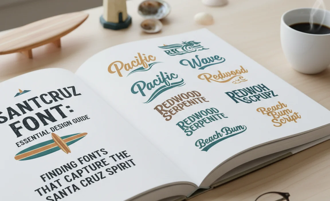
Examples of Fonts Evoking the Santa Cruz Vibe
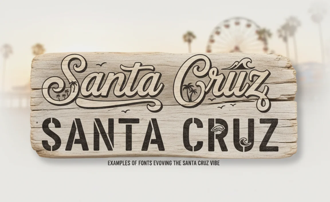
While “Santa Cruz Font” isn’t a specific named font, many typefaces capture its essence. Here are a few examples of styles and actual fonts that commonly embody this spirit. These are often found in categories like brush scripts, retro displays, and bold sans-serifs. Remember, the context and how you use them are crucial!
| Font Style/Category | Why it Works | Example Fonts (Illustrative) |
|---|---|---|
| Bold Brush Script | Captures the dynamic energy of surfing, lettering on surfboards, and a free-flowing, artistic vibe. | Pacifico, Lobster Two, Playlist Script |
| Retro Display/Groovy Fonts | Perfect for evoking the 70s surf culture, vintage concert posters, and a playful, funky mood. | Bangers, Cooper Black (classic influence), Goats |
| Chunky Sans-Serifs | Offers a bold, approachable, and slightly retro feel, similar to old signage or skate brand logos. | Anton, Bebas Neue (in bold weights), Montserrat (bold weights) |
| Handwritten/Doodle Fonts | Adds an authentic, personal, and slightly imperfect touch, like spontaneous notes or artwork. | Permanent Marker, Architects Daughter, Caveat |
| Distressed/Textured Fonts | Enhances the vintage, weathered look, reminiscent of old surf shop signs or faded apparel. | Some variations of Compressor, Route 66 |
Finding the exact font used in a specific Santa Cruz-inspired design can be challenging unless the designer reveals it. However, the fonts listed above are excellent starting points for achieving a similar aesthetic. When exploring, use font preview tools on websites like Google Fonts to see how different phrases look in various typefaces.
When and How to Use “Santa Cruz Font” Styles
The key to using fonts that evoke the “Santa Cruz” vibe is matching them with the right project and audience. These styles are fantastic for specific applications:
Ideal Use Cases:
- Branding for Surf/Skate Shops: Obvious, but essential. It instantly communicates the brand’s core identity.
- Event Posters/Flyers: For music festivals, beach parties, community events, or surf competitions.
- Apparel Design: T-shirts, hats, and hoodies benefit greatly from bold, expressive typography.
- Social Media Graphics: Especially for lifestyle brands, travel bloggers, or businesses with a relaxed, adventurous appeal.
- Website Headers/Titles: To inject personality into the landing page of a relevant business or personal site.
- Restaurant/Cafe Menus: For establishments with a laid-back, coastal, or retro theme.
- Packaging Design: For products aiming for a fun, youthful, or handcrafted feel.
How to Use Them Effectively:
- Pairing is Key: Don’t use a very decorative “Santa Cruz” style font for all your text. Pair a bold display font for headings with a clean, readable sans-serif or serif font for body text. This ensures readability. A common pairing might be a groovy display font for the title and a simple sans-serif like Open Sans or Lato for long paragraphs.
- Consider Readability: Highly stylized fonts can be difficult to read in large blocks of text. Reserve them for headlines, short phrases, or graphic elements. For website body text or detailed information, always opt for a clear, legible font. Resources like W3Schools offer guidance on web font best practices.
- Context Matters: Ensure the font style aligns with your brand’s overall message and target audience. A playful brush font might be perfect for a surf school but could be inappropriate for a corporate law firm, even one located in Santa Cruz.
- Don’t Overdo It: A little goes a long way. Using one or two carefully chosen “Santa Cruz” style fonts for impact is usually more effective than cluttering a design with too many decorative elements.
- Legality and Licensing: Always check the license for any font you use, especially for commercial projects. Free fonts from Google Fonts are generally quite permissive, but paid fonts have specific usage rights. Verify this on the font vendor’s site.
Choosing the Right Font: A Step-by-Step Approach
Ready to find your perfect “Santa Cruz” inspired font? Follow these steps:
- Define Your Project’s Goal: What emotion or message do you want to convey? Is it purely fun and energetic, or does it need a touch of professional polish?
- Identify Keywords: Based on your goal, brainstorm keywords related to the Santa Cruz vibe: “vintage,” “surf,” “skate,” “retro,” “brush,” “bold,” “playful,” “California,” “summer,” “cool.”
-
Choose Your Platform: Decide where you’ll search for fonts:
- Free Options: Google Fonts (excellent for web use), Font Squirrel (curated free fonts).
- Paid/Premium Options: MyFonts, Adobe Fonts (included with Creative Cloud), Creative Market (offers bundles and unique finds).
- Search and Filter: Input your keywords into the search bars. Use filters to narrow down results by style (script, display, sans-serif), classification, or even popularity.
-
Preview and Test: This is crucial! Type in your brand name, a tagline, or key phrases to see how the fonts look. Pay attention to:
- Overall Feel: Does it match your desired vibe?
- Legibility: Can you easily read it at different sizes?
- Character Shapes: Do the letters look harmonious? Are there any awkward quirks?
- Versatility: Does it have different weights (light, regular, bold) if you need them?
- Consider Pairing: If you’re using a decorative font for headings, select a complementary font for body text. Aim for contrast but harmony. A good rule of thumb is to pair a script or display font with a simple sans-serif.
- Check the License: Ensure the font’s license allows for your intended use (personal, commercial, web, print).
- Download and Implement: Once you’ve made your choice, download the font files and install them on your design software or website.
Readability and Accessibility Considerations
While the “Santa Cruz font” aesthetic often leans towards expressive and decorative styles, it’s vital not to sacrifice readability and accessibility. Poorly chosen fonts can alienate users and hinder communication, no matter how stylish they look.
Key principles to remember:
- Body Text is King: Never use highly decorative or condensed fonts for large blocks of text where people need to read detailed information. Stick to clear, well-spaced sans-serif or serif fonts.
- Contrast is Crucial: Ensure there’s sufficient contrast between your font color and background color. This is especially important for users with visual impairments. The Web Content Accessibility Guidelines (WCAG) provide standards for color contrast, which you can check using online tools like the WebAIM Contrast Checker.
- Appropriate Spacing: Letter spacing (tracking) and line spacing (leading) significantly impact readability. Well-spaced text is easier to read for longer periods.
- Font Size Matters: Ensure your font size is adequate for the medium. For web content, a minimum of 16px is often recommended for body text.
- Test on Different Devices: What looks great on a desktop might be illegible on a mobile phone. Always test your typography across various screen sizes.
Even when adopting a fun, expressive font for a headline, ensure it doesn’t become illegible at smaller sizes or when viewed quickly on a social media feed. Think about striking a balance where the font is unique and exciting but also serves its primary purpose: communication.
Frequently Asked Questions (FAQ)
What exactly is the “Santa Cruz font”?
The “Santa Cruz font” isn’t a single, specific typeface. It’s a term used to describe fonts that capture the casual, retro, adventurous, and free-spirited aesthetic associated with Santa Cruz, California. Think surf culture, skate vibes, and laid-back cool.
Are there specific fonts called Santa Cruz?
No, there isn’t a font officially named “Santa Cruz.” The term is descriptive of a style rather than a distinct font product. You’ll find many fonts that embody this particular aesthetic.
Where can I find “Santa Cruz” style fonts?
Great places to search include Google Fonts (free), Font Squirrel (free), Adobe Fonts (subscription), and premium marketplaces like MyFonts or Creative Market. Use keywords like “retro,” “brush script,” “display,” “bold,” “vintage,” and “surf.”
Are these fonts suitable for body text?
Generally, no. Fonts that strongly evoke the “Santa Cruz” style are often decorative display fonts, which can be hard to read in large paragraphs. They are best used for headlines, titles, logos, and short phrases.
How do I choose the best font for my brand if I want a “Santa Cruz” feel?
Start by defining your brand’s core message. Then, look for fonts with characteristics like rounded edges, hand-drawn qualities, bold weights, or retro influences. Always pair a decorative headline font with a clean, legible font for body text and test thoroughly for readability and your specific audience.
Is it okay to use a slightly “imperfect” looking font for my business?
Yes, absolutely! If your business aligns with a casual, creative, or adventurous brand identity (like a surf shop, craft brewery, or artisanal product), a font with a hand-drawn or slightly distressed look can be very effective. It conveys authenticity and personality. Just ensure it doesn’t compromise professionalism where it matters.
How can I ensure my font choice is accessible?
Prioritize readability for body text, maintain good color contrast between text and background, use adequate font sizes, and ensure proper letter and line spacing. Test your design on different devices to confirm legibility for all users.
Conclusion
The “Santa Cruz font” aesthetic is all about channeling a feeling—one of freedom, creativity, and laid-back cool. While there isn’t one definitive font, understanding the characteristics and styles that embody this vibe empowers you to make informed choices. By exploring retro displays, energetic brush scripts, and bold sans-serifs, you can find typefaces that resonate with your project’s goals. Remember to always prioritize pairing for readability, consider your audience, and check licensing. Whether you’re designing a logo, a website, or apparel, the right font can transport your audience straight to the California coast. So go ahead, experiment, and infuse your designs with that unmistakable Santa Cruz spirit!


Leave a Comment