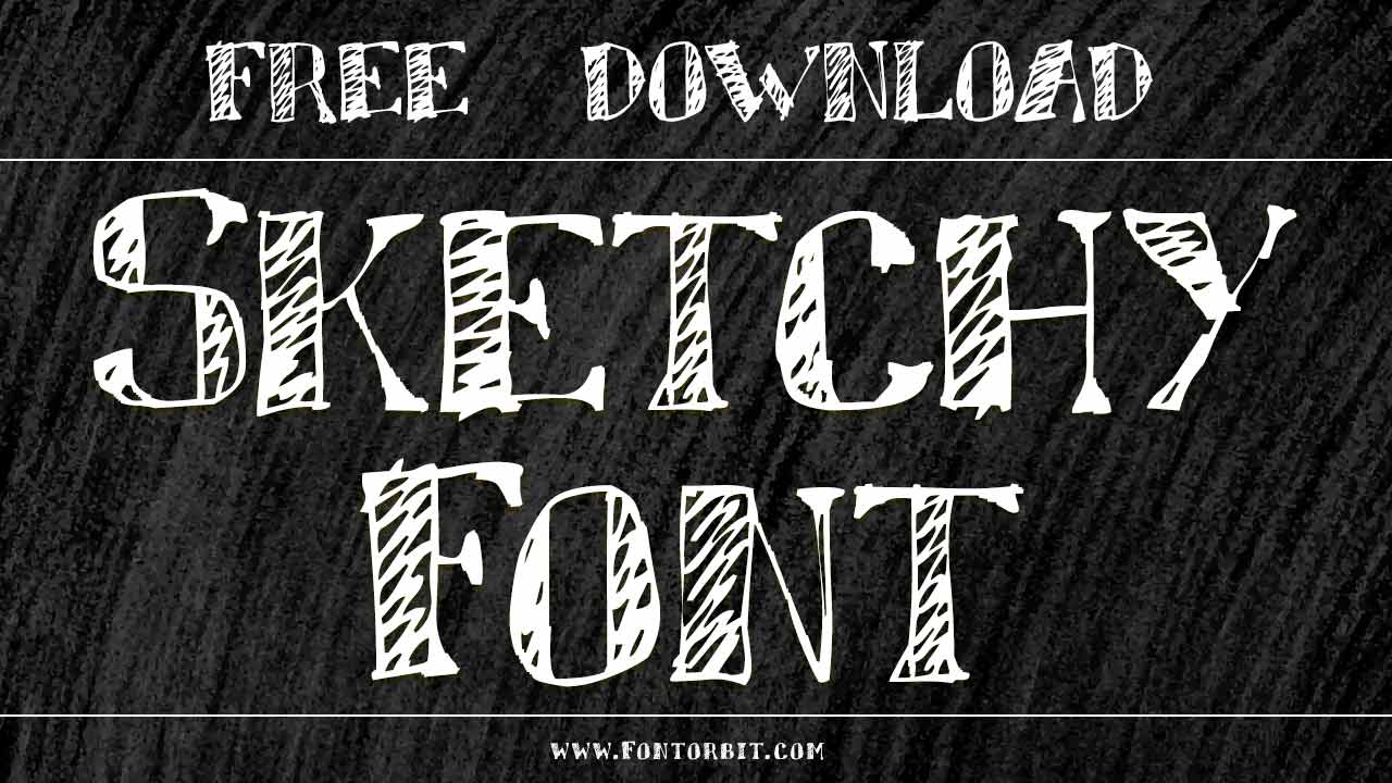
A sketchy font refers to a typeface that has an unfinished or rough appearance, often resembling something that has been hand-drawn or sketched out. These fonts typically feature irregular strokes, uneven lines, and sometimes even intentional imperfections that give the font a more organic, artistic feel. The “sketchy” quality can evoke a sense of playfulness, casualness, or creativity, making it ideal for designs that want to appear hand-crafted or less formal.
Sketchy Font Live Preview Customizer:
Hello World!
Note: Download Only for Practice or Personal Use.
Sketchy fonts are often used in
- Creative Projects that need a fun, informal tone (e.g., event posters, greeting cards, or handmade product labels).
- Artistic Designs to emphasize an “under construction” or “in-progress” vibe.
- Logos and branding for businesses or products that want to communicate a handmade or custom feel.
These fonts can range from subtle, lightly distressed versions of more traditional typefaces to exaggerated designs with clear imperfections and visible “sketch marks.”
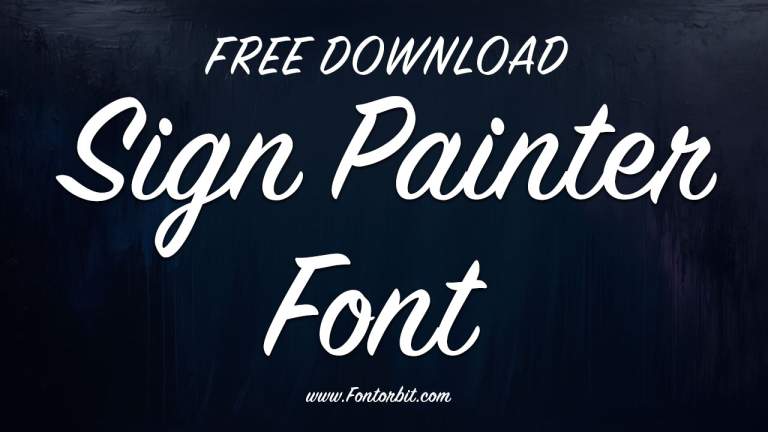
Sketchy Font is a fun and versatile typeface that brings a hand-drawn touch to digital and print design projects. Whether you’re creating posters, logos, or wedding invitations, this sketch font adds a unique, organic feel to any creative work.
Why Choose Sketchy Font?
Sketchy Font stands out with its raw, imperfect strokes that give it a handmade quality. Here’s why designers love it:
- Authentic Hand-Drawn Look – Perfect for projects that need a creative, casual feel.
- Versatile Usage – Works well in logos, packaging, and printed materials.
- Multiple Formats – Available in SVG, PNG, and vector formats for various applications.
- Compatible with Design Software – Easily used in Adobe Illustrator, Photoshop, and other programs.
Popular Sketchy Font
- Sketch Block – A structured, bold sketch font.
- Sketchy Times – A rough, newspaper-style sketch font.
- Clementine Sketch – A softer, handwritten alternative.
- Grutch Shaded – A grungy take on sketched typography.
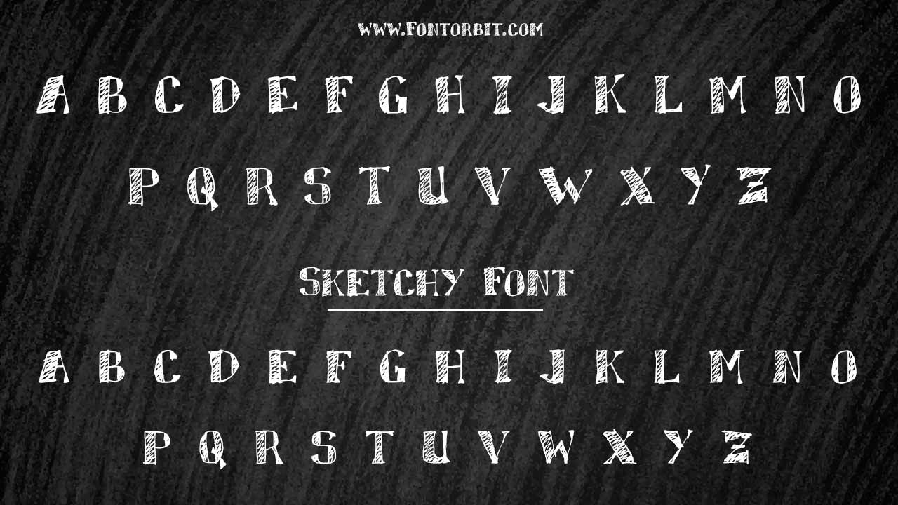
Sketchy Font Info Table:
| Name: | Sketchy Font |
| Available File | sketchy.ttf |
| Format: | ttf |
| Files Count: | 1 |
| Size: | 127 KB |
| Style: | Script |
| License: | Practice/Personal Use Only |
How To Incorporate Sketchy Fonts Into A Minimalist Design?
Incorporating sketchy fonts into a minimalist design can create a unique contrast between the organic, rough texture of the font and the clean, simple aesthetic of minimalist design. While minimalist design typically focuses on simplicity and clarity, the key to blending these elements is balance. Here are a few tips on how to do so effectively:
1.Use Sketchy Fonts Sparingly
- Minimalist design thrives on simplicity, so avoid overwhelming the design with too many sketchy elements. Use the sketchy font for emphasis, such as in headers, key phrases, or small accent text, while keeping the rest of the typography clean and neutral.
- Consider using the sketchy font for one or two important words or phrases (e.g., the brand name, slogan, or call-to-action).
2.Choose The Right Sketchy Font
- Look for subtle sketchy fonts that don’t overwhelm the clean lines typical of minimalist design. Opt for fonts that have a lighter, more restrained sketchy look (e.g., fonts with slight imperfections rather than rough, messy strokes).
- Fonts that are too exaggerated or chaotic can clash with minimalist aesthetics. Look for one that has a delicate balance between creativity and readability.
3.Pair With Simple Fonts
- Pair the sketchy font with a clean, modern sans-serif font (like Helvetica, Arial, or Futura) or a simple serif font (like Times New Roman or Georgia). This combination will ensure the sketchy font doesn’t dominate the design and maintains a sense of clarity.
- Use the minimalist font for body text or secondary information and the sketchy font for emphasis, such as headlines, quotes, or key details.
4.Embrace Negative Space
- Negative space (the empty or unoccupied areas of a design) is crucial in minimalist design. Use this to your advantage by allowing the sketchy font to breathe. Don’t overcrowd the design with text; instead, create a layout with ample space around the sketchy font to keep the design clean and balanced.
- Avoid cramming too much text into the design, and let the sketchy font shine in contrast with the surrounding empty space.
5.Limit Color Palette
- Stick to a neutral color palette for most of the design, using shades like black, white, gray, or soft pastels. This helps maintain the minimalist approach. The sketchy font can be highlighted using a subtle accent color, or you can keep it in a contrasting color (e.g., a bright accent against a muted background) to draw attention without overwhelming the design.
6.Play With Scale
- A sketchy font can stand out in minimalist design when used at a larger size. By scaling the font appropriately, you can make it the focal point of your design while keeping everything else in proportion. The larger size of the sketchy font creates visual interest, but the minimalist layout ensures the overall design isn’t cluttered.
- Use the sketchy font for short, impactful text like titles or quotes and let the size and positioning make the text prominent without cluttering the space.
7.Ensure Readability
- While sketchy fonts can add character, ensure they don’t sacrifice readability. In minimalist design, where the focus is on simplicity and clarity, make sure the sketchy font is legible, especially when used for key messages or headlines.
- Test the legibility of your design at different sizes to ensure that the sketchy details don’t blur the text.
8.Balance With Imagery
- In minimalist design, imagery is often a crucial element. If you use a sketchy font, pair it with clean, high-quality images or icons that complement the aesthetic. Avoid busy or overly detailed visuals that might compete with the text, and choose images that enhance the overall simplicity of the design.
Example Use Cases:
If you’re creating a logo for a creative business or a handmade product, a sketchy font can convey the personal and artistic aspect. Pair it with clean, geometric shapes or lines to maintain a sense of structure and minimalism. This font is ideal for a variety of creative projects, including:
- Logos & Branding – Adds a unique, artistic touch.
- Posters & Flyers – Eye-catching headlines and text.
- Web Design – Perfect for modern, sketch-style websites.
- Packaging – Enhances handmade and organic products.
- Printed Materials – Works well on greeting cards, book covers, and marketing materials.
Use a sketchy font for the event name or key phrase (e.g., “Pop-Up Art Show”) while keeping the rest of the information in a simple sans-serif font. Add plenty of white space around the text to keep it from feeling crowded.
How To Install Sketchy Font
Incorporating a sketchy font into minimalist design requires carefully balancing creativity and simplicity. When used thoughtfully, a sketchy font can add a unique, personal touch to an otherwise sleek and modern design, creating an engaging and memorable result.
Follow these steps to use Sketchy Font in your projects:
- Download the Font – Ensure you have the correct SVG or PNG format.
- Install It – Open the font file and click “Install.”
- Open Design Software – Access it in Adobe Illustrator, Photoshop, or other programs.
- Apply Creativity – Adjust color, size, and spacing to suit your design.
Faqs
1.Can I Use Sketchy Font For Commercial Projects?
Yes, but check the licensing terms before use.
2.Does Sketchy Font Support Special Characters?
Yes, it includes various stylistic alternates and symbols.
3.What File Formats Does Sketchy Font Come In?
SVG, PNG, and vector formats for flexible design use.
4.Can I Use Sketchy Font For Web Design?
Absolutely! It works well for creative website text.
5.Is Sketchy Font Suitable For Cricut And Crafting?
Yes, its hand-drawn style is great for SVG and PNG cutting projects.
6.How Can I Make Sketchy Font Look Better In Designs?
Pair it with clean, modern fonts and adjust kerning for balance.


Leave a Comment