Solvay Logo Font: Essential Design Secrets
The Solvay logo font is a modern, sans-serif typeface that exudes professionalism and sophistication. It’s characterized by its clean lines, open counters, and geometric structure, making it highly readable and versatile. While the specific font used is proprietary, it shares characteristics with popular commercial fonts like Futura, Proxima Nova, and Montserrat. Understanding these characteristics can help you choose similar fonts for your branding, ensuring a cohesive and impactful visual identity.
Welcome to FontOrbit! Today, we’re diving deep into the world of corporate logos and, specifically, the font that represents a global chemical giant: the Solvay logo font. Have you ever looked at a brand’s logo and wondered about the typeface it uses? It’s a common curiosity, especially when a font feels just right – modern, trustworthy, and memorable. The Solvay logo has a distinct typographic identity, and understanding it can be super helpful for anyone working on their own brand. We’ll break down what makes it tick, explore similar fonts, and give you practical tips. Get ready to unlock some essential design secrets!
Unpacking the Solvay Logo: A Typographic Deep Dive
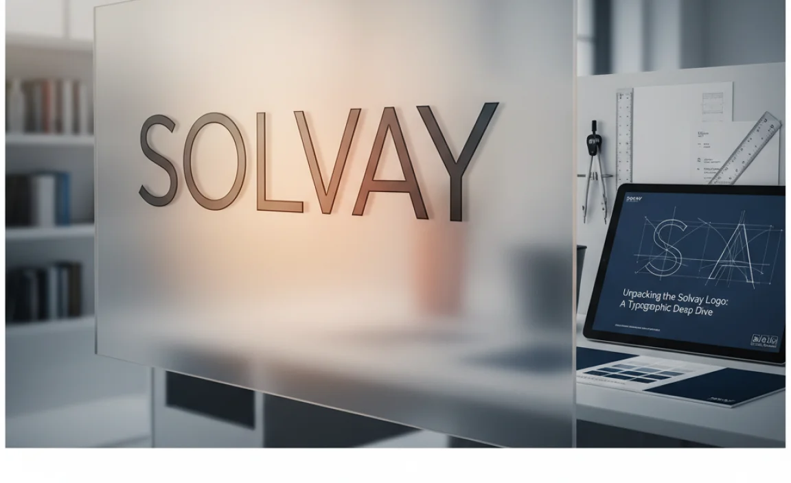
When we talk about the Solvay logo font, we’re referring to the typeface used in their prominent wordmark. Solvay is a company with a long history, and their visual identity, including their typography, plays a crucial role in communicating their values and expertise. The current iteration of the Solvay logo font is a testament to timeless design principles, balancing a sense of heritage with forward-thinking innovation.
Let’s look at the key characteristics that define the Solvay logo font. These elements are what give it its unique personality and make it stand out. By understanding these, you can better appreciate why certain fonts work so well for corporate branding.
Geometric Sans-Serif: The Foundation
The Solvay logo font predominantly falls into the geometric sans-serif category. What does this mean? It means the letterforms are largely based on simple geometric shapes, like circles and straight lines. Think of the perfect ‘O’ as a circle, or the ‘I’ as a single vertical stroke. This geometric foundation lends a sense of order, precision, and modernity to the typeface.
Geometric sans-serifs are often favored by brands that want to appear:
- Innovative
- Technological
- Clean and efficient
- Approachable yet professional
This style contrasts with older serif fonts (which have small decorative strokes at the end of letter stems) or humanist sans-serifs (which have more variation in stroke width and are inspired by handwriting).
Clean Lines and Open Counters
Another defining feature is the clean, uncluttered nature of the letterforms. The lines are sharp and crisp, with no extraneous flourishes. Pay attention to the “counters” – the enclosed or partially enclosed negative space in letters like ‘o’, ‘p’, ‘a’, and ‘e’. In the Solvay font, these counters are typically open and well-defined. This openness is crucial for readability, especially at smaller sizes or on digital screens.
Why is this important for a brand like Solvay? It suggests clarity in their operations, transparency in their communication, and accessibility to their solutions.
Balanced Proportions and Legibility
The proportions of the Solvay logo font are carefully balanced. The height of the capital letters (x-height) and the ascenders and descenders (parts of letters that go above or below the main body) are all designed to create a harmonious and easily scannable wordmark. This ensures that the name “Solvay” is instantly recognizable and readable, even from a distance or in less-than-ideal viewing conditions.
Good legibility is paramount for any brand identity. It means the audience can easily identify and remember the brand name, which is the first step in building a strong connection.
Subtle Nicknames or Distinguishing Features
While many geometric sans-serifs can look similar, often there are subtle details that set them apart. For the Solvay logo font, one might observe the specific shape of the ‘S’, the angles of the ‘V’ and ‘W’, or the construction of the ‘A’. These small design choices contribute to its unique character and prevent it from blending in too much with generic modern sans-serifs. For instance, a slightly squared-off curve on an ‘O’ or a sharp point on a ‘V’ can add personality.
Deconstructing the “Solvay Look”: Fonts That Share the DNA
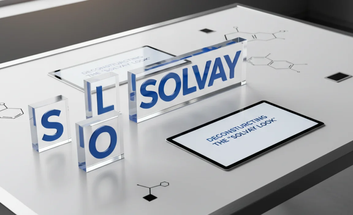
While the exact font used by Solvay might be custom or a specific licensed version, its design principles align with several well-known and widely available typefaces. For designers and businesses looking to capture a similar vibe, exploring these fonts is a great starting point. This section will guide you through fonts that echo the Solvay aesthetic.
Finding a font that perfectly matches is sometimes a quest, but understanding the style of the Solvay logo font allows us to pick excellent alternatives. We’re looking for that blend of geometric structure, clean lines, and modern appeal.
1. Futura: The Classic Geometric
Futura is arguably the progenitor of many modern geometric sans-serifs and shares a strong resemblance to the Solvay aesthetic. Designed by Paul Renner in 1927, its design is based on simple geometric shapes, with a strong emphasis on circles and straight lines. It has a clean, neutral, and sophisticated feel.
- Key similarities: Pure geometric shapes, consistent stroke width, open counters.
- When to use: For brands aiming for a timeless, minimalist, and sophisticated image. It’s excellent for fashion, technology, and architectural brands.
- Considerations: Futura can sometimes feel a bit too classic; newer geometric fonts might offer a more contemporary edge.
2. Proxima Nova: The Modern Go-To
Proxima Nova, designed by Mark Simonson, has become incredibly popular for its perfect blend of geometric, modern, and grotesque styles. It’s often seen as a bridge between the pure geometry of Futura and the more classic proportions of antique sans-serifs.
<ul
3. Montserrat: The Friendly Geometric
Montserrat is a geometric sans-serif typeface inspired by the old posters and signs of the traditional Montserrat district of Buenos Aires. It features a beautiful balance of geometric construction with a friendly, approachable feel. It’s available for free through Google Fonts, making it highly accessible.
- Key similarities: Geometric basic forms, open counters, clear and friendly appearance.
- When to use: Great for brands that want to convey modernity with a touch of warmth and friendliness. Ideal for web design, branding, and display text.
- Considerations: Some weights might appear a bit too rounded for a strictly corporate, ultra-formal look, but its versatility is a major plus. You can find it on Google Fonts.
4. Gotham: The Powerful Geometric
Designed by Tobias Frere-Jones, Gotham is known for its strong, geometric letterforms inspired by architectural signage. It has a bold, confident, and masculine feel, making it a favorite for established brands that want to project stability and authority.
- Key similarities: Very strong geometric structure, clean and precise letterforms, excellent clarity.
- When to use: For brands that want to convey strength, stability, and a commanding presence. Frequently used in corporate and political branding.
- Considerations: Its strong personality might not suit brands seeking a softer or more whimsical tone.
5. Poppins: The Versatile And Accessible Option
Poppins is another popular geometric sans-serif available on Google Fonts. It’s designed with a dual nature: its letterforms are nearly perfect geometrically, but there’s a slight touch of warmth that makes them very friendly and approachable. It boasts a wide range of weights, making it extremely flexible.
- Key similarities: Clean geometric construction, very legible, modern appeal.
- When to use: Excellent for branding, web interfaces, and packaging. It works well for a wide variety of industries seeking a clean, modern, and accessible look.
- Considerations: Similar to Montserrat, its very pleasant nature might not be the best fit for extremely formal or austere branding needs.
Designing with Solvay-Inspired Typography: Practical Tips

Now that we’ve explored the characteristics of the Solvay logo font and identified similar typefaces, let’s talk about how you can apply these insights to your own design projects. Whether you’re a seasoned designer or just starting, these tips will help you make informed and impactful typographic choices.
Using a font inspired by a successful logo like Solvay’s is a smart move, but it requires a thoughtful approach. It’s not just about picking a font; it’s about how you wield it.
1. Understand Your Brand’s Core Message
Before selecting any font, ask yourself: What is my brand all about? What message do I want to convey?
- Does your brand emphasize innovation and technology? A crisp geometric sans-serif like those inspired by Solvay would be a great fit.
- Is your brand more about tradition and heritage? You might lean towards classic serifs or more humanist sans-serifs.
- Do you want to feel approachable and friendly, or authoritative and established?
The Solvay logo effectively communicates stability, expertise, and a modern approach to chemistry and materials. Ensure your chosen font aligns with your own brand’s core values.
2. Prioritize Readability and Legibility
As we saw with the Solvay font, clean lines and open counters are crucial for legibility. This is non-negotiable for any logo or brand identity. Your audience needs to be able to easily read your brand name, especially on various platforms and sizes.
- Test in different sizes: See how your chosen font looks large on a billboard and tiny on a mobile screen.
- Consider the context: Where will your logo and brand type primarily be seen?
- Avoid overly decorative or condensed fonts for primary branding: Unless you have a very specific reason, stick to clear, straightforward designs for the core of your brand identity.
3. Explore Font Families and Weights
Most good fonts come in a “family” with various weights (light, regular, medium, bold, black) and styles (italic). This versatility is key for creating a cohesive brand system.
- For the logo: Often, a clean, medium to bold weight works best for the main wordmark for maximum impact and readability.
- For supporting text: You can then use other weights from the same family for headings, body text, and other applications. A lighter weight might be great for a tagline, while a bold weight could be used for headlines on a website.
For example, if you choose Montserrat, you have a wide spectrum of weights to play with, ensuring consistency across all your brand’s communication materials.
4. Consider the Competitor Landscape
While you want your brand to be unique, understanding what fonts your competitors are using can be insightful. You don’t want to be indistinguishable from another brand, but you also want to be perceived as being in the right league. A chemical company using a very playful, script font might seem incongruous.
If many established players in your industry use a similar style of geometric sans-serif, it signals that this is a font style that resonates with your target audience and conveys the necessary professionalism. You can then adapt this by choosing a specific geometric font that has its own unique character or by using it in a distinctive color palette or layout.
5. Test, Test, Test!
This is the golden rule of design. Don’t just pick a font and stick with it. Experiment! Mock up your logo in various scenarios. See how it feels.
- Create mockups: Place your logo on business cards, websites, social media profiles, and even hypothetical product packaging.
- Get feedback: Ask potential customers or colleagues for their honest opinions.
- Trust your gut: Ultimately, the font should feel right for your brand.
The Role of Typography in Corporate Branding: Beyond Solvay
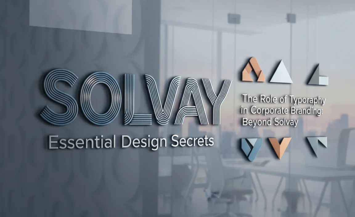
The Solvay logo font is a prime example of how typography is an indispensable element of corporate branding. It’s not merely decorative; it’s functional and deeply symbolic. Understanding this broader context can elevate your design thinking.
Typography is often the unsung hero of branding. It’s the visual voice of a company, speaking volumes before anyone reads a single word of copy. For major corporations, this is amplified because their visual identity is the primary ambassador of their brand to the world.
Building Trust and Credibility
A well-chosen font can instill trust and credibility. Geometric sans-serifs, like the Solvay logo font, are often associated with logic, efficiency, and forward-thinking. These are desirable traits for companies in technical fields, finance, or corporations dealing with complex products or services. The perception is that a company that pays attention to detail in its visual identity likely applies the same rigor to its operations.
Communicating Brand Personality
Every font has a personality. A serif font might feel traditional, elegant, or academic. A handwritten script can evoke creativity, personalization, or a casual vibe. A bold, blocky font can suggest strength and power.
The Solvay font, with its clean, geometric structure, communicates professionalism, innovation, and a modern outlook. It suggests that Solvay is a reliable, cutting-edge company. Conversely, if Solvay used a playful, decorative font, it might undermine its image as a serious leader in the chemical industry.
Ensuring Brand Consistency
Typography is a cornerstone of brand consistency. A unified set of typefaces across all brand touchpoints – from the website and marketing materials to internal documents and product labeling – reinforces brand recognition and creates a seamless experience for the audience. When multiple fonts are used within a brand system, they should complement each other and adhere to defined typographic hierarchies.
Adobe Fonts, for example, offers a vast library of professional typefaces that can help maintain consistency. Understanding font pairings is key here, ensuring that headings, subheadings, and body text work harmoniously.
Accessibility in Design
Beyond aesthetics and symbolism, the choice of font has a direct impact on accessibility. Fonts that are highly legible, with clear letterforms and sufficient spacing, are crucial for readers with visual impairments or cognitive differences. The focus on open counters and balanced proportions in fonts like the one used by Solvay contributes to this accessibility, ensuring that their brand message is open to as wide an audience as possible.
According to the U.S. General Services Administration (Section508.gov), clear and simple language, combined with accessible design, is vital for government websites, and this principle applies universally to all effective communication. Good typography is a significant part of that.
FAQ: Your Solvay Logo Font Questions Answered
What is the exact font used in the Solvay logo?
The exact font used in the Solvay logo is proprietary and not publicly disclosed by the company. However, it is widely recognized as a modern geometric sans-serif that shares many characteristics with popular typefaces like Futura, Proxima Nova, and Montserrat.
Why do companies like Solvay use geometric sans-serif fonts?
Geometric sans-serif fonts convey a sense of modernity, professionalism, efficiency, and innovation. They are often chosen by technology-driven or forward-thinking companies to reflect these attributes in their brand identity. Their clean lines and simple shapes also ensure excellent readability across various mediums.
Can I use a font similar to the Solvay logo font for my business?
Absolutely! You can use fonts that share similar characteristics, such as Montserrat, Poppins, or Futura. The key is to choose one that aligns with your business’s specific brand identity, values, and target audience.
Is Futura a good alternative to the Solvay logo font?
Yes, Futura is an excellent alternative if you’re looking for a typeface with a similar geometric foundation and classic appeal. It’s timeless, clean, and widely recognized for its sophisticated simplicity.
How can I ensure my chosen font is legible on all devices?
To ensure legibility, choose fonts with open counters and clear letterforms. Test your font at various sizes, from small mobile screens to large print. Readability also depends on the font weights you choose; avoid extremely thin or overly condensed styles for primary text.
What’s the difference between a geometric and a humanist sans-serif font?
Geometric sans-serifs are based on simple geometric shapes like circles and straight lines, giving them a clean, modern, and precise feel. Humanist sans-serifs are inspired by handwriting and have more variation in stroke width and less rigid forms, making them often feel warmer and more organic.



Leave a Comment