The typography used in Star Trek has played a key role in establishing the franchise’s iconic visual identity. Allen R. Walden and others designed the fonts used in Star Trek. From the original series to Star Trek: Discovery, these fonts define its sci-fi aesthetic. They appear in movie posters, show titles, and graphic novels. More than decoration, they tell a story and set the universe’s tone. This article explores their impact on Star Trek’s visual identity.
Star Trek Font Live Preview Customizer:
Hello World!
Note: Download Only for Practice or Personal Use.
Star Trek Fonts: A Quick Overview
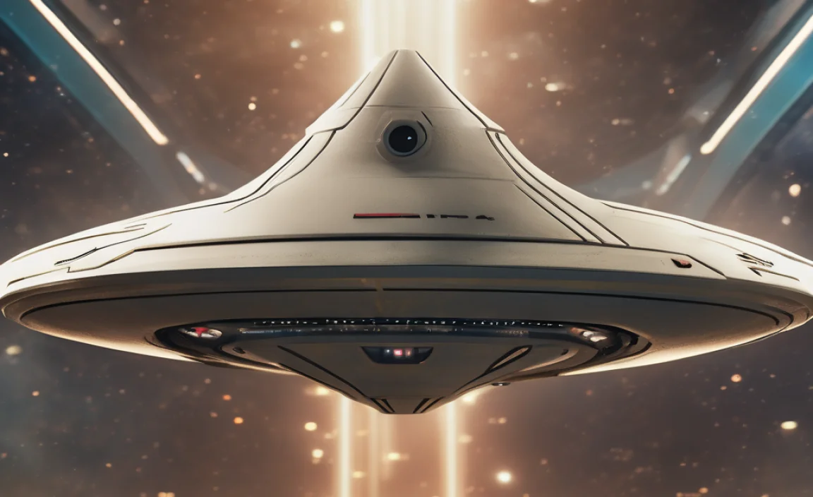
The font shapes the franchise’s tone, theme, and style in every Star Trek film and series. Each Star Trek era has unique typography, reflecting exploration, adventure, and technology.
Star Trek Font Info Table:
| Name: | Star Trek Font |
| Format: | ttf |
| Files Count: | 2 |
| Size: | 175 KB |
| Style: | Fancy |
| License: | Practice/Personal Use Only |
Font Family Breakdown
Here’s a quick chart to break down the key fonts used across Star Trek media:
| Font Family | Used In | Notable Features |
|---|---|---|
| TOS Title | Star Trek (Original Series) | Classic, bold, and futuristic, evoking a sense of adventure. |
| TNG Title | Star Trek: The Next Generation | Sleek and modern, matching the show’s tone of diplomacy and exploration. |
| Final Frontier | Star Trek: The Movie Titles | Bold, sharp edges capture the grandeur of the universe and space exploration. |
| Nova Light Ultra | Star Trek: Voyager, Discovery | Modern take on sci-fi fonts, sleek and professional. |
| Trek Movie 1 | Star Trek Films (original films) | The serif design gives a sophisticated and bold feel to the franchise. |
| Federation | Star Trek Novels and Comics | Mimics’ futuristic military-style fits Starfleet’s commanding presence. |
Why Fonts Matter in Star Trek
Typography shapes more than just words in Star Trek. It builds the immersive, futuristic atmosphere fans love. Every series, from The Original Series to Voyager and Discovery, uses fonts that evoke space exploration, advanced technology, and bold adventure.
- Iconic Series Representation: Each show’s font reflects its era and theme. The TNG Title font, for example, uses a more refined, clean typeface that fits the diplomatic tone of The Next Generation. In contrast, the bolder, sharper Final Frontier font from the original series reflects the pioneering spirit of the Star Trek universe.
- Visual Connection to Starfleet: The fonts used in Star Trek also help fans connect with the essence of Starfleet, evoking thoughts of starships like the USS Enterprise, Starfleet vessels, and the exploration of new civilizations.
- Branding: Just as with any major franchise, the right font in Star Trek creates a recognizable brand. Whether on a movie poster, in a Star Trek novel, or across Star Trek websites, the fonts have been carefully designed to create a sense of consistency and familiarity across all media.
Fonts in the Expanded Universe
The importance of typography goes beyond the television and film series. Various related media also feature Star Trek fonts. Novels, comic books, fan content, and merchandise use them. The Star Trek animated series adopts a more playful, colorful aesthetic. Yet, the fonts still reflect the franchise’s legacy.
For example, Star Trek comic books often use the same fonts seen in movies or television shows, creating a seamless visual transition between all forms of Star Trek media. Even in fan-made Star Trek posters or websites, using these fonts helps recreate the feel of the universe and keeps it consistent with official content.
Fonts And Fan Culture
Fonts also play a crucial role in Star Trek’s fan culture. Fans of the franchise often create their own Star Trek posters, fan sites, and other works of art that pay homage to the universe. The availability of free fonts online has enabled fans to use the same typography found in Star Trek movies and shows, allowing them to create their own content while staying true to the aesthetic.
These fan-made creations, whether they feature Star Trek film posters, websites about the Star Trek section 31 organization, or fan art celebrating Philippa Georgiou or William Shatner, all benefit from the fonts that have become integral to the franchise. They help carry the visual legacy forward and connect the fan community with the official Star Trek world.
Star Trek Font Character Map:
| A | B | C | D | E | F | G | H | I | J | K | L | M |
| N | O | P | Q | R | S | T | U | V | W | X | Y | Z |
| a | b | c | d | e | f | g | h | i | j | k | l | m |
| n | o | p | q | r | s | t | u | v | w | x | y | z |
| 0 | 1 | 2 | 3 | 4 | 5 | 6 | 7 | 8 | 9 | |||
| . | , | : | ; | @ | # | ! | – | / | ? | < | > | |
| & | * | ( | ) | [] | $ |
FAQs
Can I Use Star Trek Fonts In My Own Projects?
While many Star Trek fonts are available for free download, most are for personal use only. You must verify the font’s licensing terms if you plan to use them in commercial work (like on posters, websites, or merchandise). Websites like Star Trek Minutiae or font resources for Star Trek fans often provide links to free and premium versions of these fonts.
Who Designed The Fonts Used In Star Trek?
Many of the iconic Star Trek fonts were designed by Allen R. Walden, who helped craft the futuristic aesthetic for which the franchise became known. His work, particularly on title fonts like Final Frontier Old Style and others, has impacted the visual language of Star Trek films, television series, and fan creations.
How Does The Star Trek Font Differ From Star Wars Fonts?
While both Star Trek and Star Wars have distinctive fonts, the differences lie in their design philosophies. Star Trek fonts, like Crillee Italic and Final Frontier, lean more toward geometric and clean designs, emphasizing technology and space exploration. In contrast, Star Wars fonts are more dramatic and script-like, reflecting the epic, mythic tone of the franchise. However, both contribute significantly to their respective universes’ immersive experiences.
What Fonts Are Used In Star Trek: Discovery?
Star Trek: Discovery employs sleek, modern fonts that reflect the advanced technology of its era. Fonts like Nova Light Ultra and TNG Title help establish a futuristic, high-tech aesthetic, aligning with the tone of the series, which follows Philippa Georgiou and the crew aboard the USS Discovery. The modern fonts in the show contrast with the older, more traditional styles in the original series.



Leave a Comment