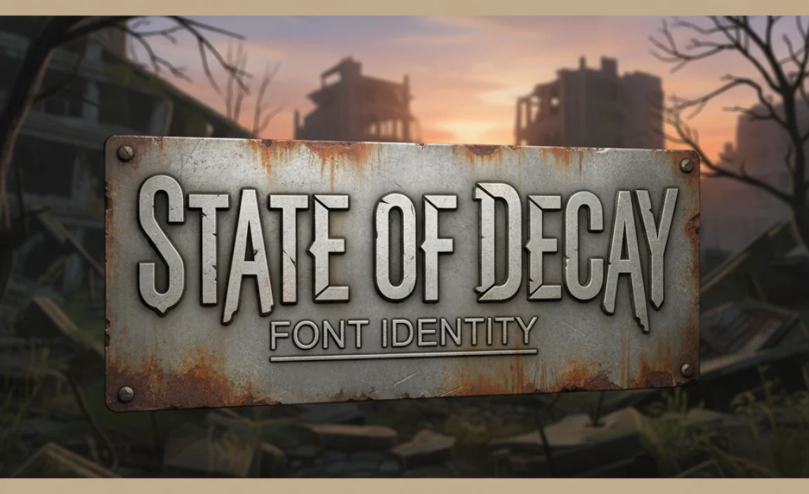
State of Decay Font: Essential Guide
The “State of Decay” font is a distinctive, weathered serif typeface that embodies the gritty, survivalist aesthetic of the game. It’s crucial for capturing that specific post-apocalyptic vibe in your designs, whether for fan art, game-inspired branding, or themed projects. This guide will help you identify and use it effectively.
Hey there, creative explorers! Jillur Rahman here from FontOrbit. Ever stared at the spine-chilling title screen of State of Decay and wondered, “What font is THAT?” You’re not alone! That distinct, worn-out lettering screams post-apocalyptic survival and adds so much to the game’s identity. Finding fonts that perfectly capture a specific mood can be a real puzzle, especially when you want to bring that gritty, determined feel into your own projects. Don’t worry, we’re going to crack this code together. This guide is designed to make identifying and using the State of Decay font style super simple, even if you’re just starting out. Get ready to inject some serious survival spirit into your designs!
Understanding the “State of Decay” Font’s Identity
The State of Decay series is renowned for its bleak, yet hopeful portrayal of surviving the zombie apocalypse. A huge part of its visual charm comes from its typography, particularly the font used in its logo and overarching branding. This isn’t just any ordinary font; it’s carefully chosen to amplify the game’s core themes of resilience, decay, and the human spirit fighting against overwhelming odds.
When we talk about the “State of Decay font,” we’re generally referring to a typeface that has a classic serif structure but is heavily distressed and weathered. Think of it as a font that has seen better days, much like the world within the game. It carries a sense of history, struggle, and a defiant spirit. This makes it perfect for anything that needs to evoke a sense of realism, grit, and a fight for survival.
Key Characteristics to Look For:
- Serif Style: It’s based on a serif typeface, meaning it has small decorative strokes (serifs) at the ends of the main strokes of letters.
- Distressed Texture: The most defining feature is its rough, worn, or “distressed” appearance. This can include subtle imperfections, scratches, or uneven edges that suggest wear and tear.
- Bold and Sturdy: Despite the wear, the font often appears bold and substantial, conveying strength and endurance.
- Gritty and Organic: It avoids a super clean, digital look, opting for something that feels more tactile and organic, as if it were printed on imperfect materials.
- Readability: While distressed, it generally maintains good readability, which is essential for titles, logos, and important signage.
Identifying the Closest Matches: Fonts Similar to “State of Decay”
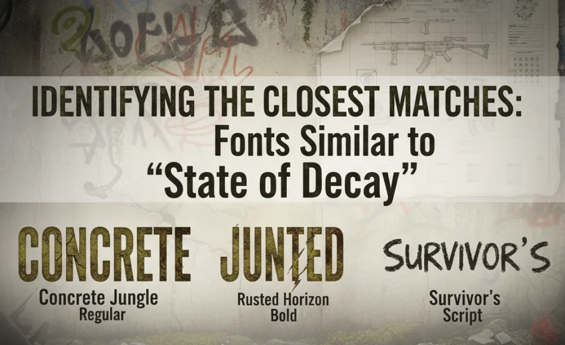
While there might not be a single, exact commercial font that perfectly replicates every nuance of the State of Decay logo font, there are many excellent options that come very close. These are fonts that share its core characteristics: serif structure and a significant amount of distressing. For designers, finding close alternatives is a common and practical approach.
The goal is to capture the essence of the State of Decay font. This means looking for typefaces that have a similar base structure and then applying or finding distressed versions. Many font designers create these variations specifically to emulate a worn, vintage, or industrial feel.
Popular and Similar Typefaces:
Here are some fonts that often come up when people are searching for that State of Decay vibe. They offer varying degrees of distressing and stylistic interpretations.
| Font Name | Characteristics | Best For | Where to Find (General) |
|---|---|---|---|
| Abel (Distressed Version) | Clean sans-serif that, when artificially distressed, can mimic a weathered stencil look. Not a serif, but captures a utilitarian grittiness. | Logos, titles, industrial themes. | Google Fonts (Base font), various font marketplaces for distressed versions. |
| Bebas Neue (Distressed Version) | Similar to Abel, a tall, condensed sans-serif. Distressed versions add significant texture. | Bold headlines, strong branding statements. | Google Fonts (Base font), font marketplaces for distressed versions. |
| Blackletter/Gothic Fonts (Distressed) | While not serif in the traditional sense, some heavily distressed blackletter fonts can evoke a very old, rugged, and intense feeling, similar to the raw survival theme. | Dark fantasy, historical themes with a gritty edge. | Font marketplaces like MyFonts, Fontspring. |
| League Gothic (Distressed Variant) | Another strong, condensed sans-serif. Its wide letterforms can feel very impactful. Distressed versions are key here. | Impactful titles, retro-futuristic designs. | League of Moveable Type (Base font), font marketplaces for distressed versions. |
| Trajan Pro (Distressed/Rusted Effects) | A classic, all-caps serif often used for movie posters and epic titles. While originally clean, applying textures can make it feel weathered and ancient, fitting a post-apocalyptic theme. | Epic titles, ancient ruins, historical survival themes. | Adobe Fonts, Linotype. |
| Metal Mania | This font has a rough, metallic, and distressed feel built-in. While it’s a display font, it can work for titles needing a very raw, hammered look. | Heavy industrial, post-apocalyptic metalwork aesthetics. | Google Fonts. |
| Specialized Distressed Fonts | Many independent font creators offer fonts specifically designed with a “post-apocalyptic,” “grunge,” or “distressed” theme. These are often the closest in spirit. | Highly specific thematic projects requiring authentic weathering. | Creative Market, MyFonts, FontBundles.net. |
It’s important to note that the official State of Decay logo likely uses a custom-modified typeface or a font that’s been heavily treated. When sourcing, look for fonts described as “grungy,” “distressed,” “weathered,” “industrial,” or “apocalyptic.”
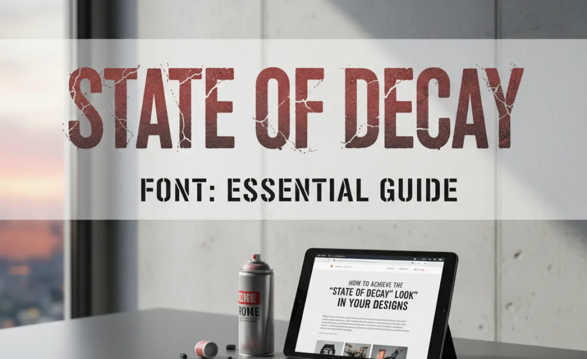
How to Achieve the “State of Decay” Look in Your Designs
Finding a font is only half the battle. To truly nail the State of Decay aesthetic, you need to consider how you use the font and what other visual elements complement it. It’s about creating a cohesive look and feel.
Step-by-Step Guide to Implementing the Style:
- Choose Your Base Font: Select a font from the list above or find another strong serif or sans-serif that has a solid structure. Consider the mood you want to evoke. A bold serif might feel more classic and resilient, while a distressed sans-serif can feel more utilitarian and urgent.
- Add or Find Distressing:
- Use Pre-distressed Fonts: The easiest way is to find a font that already has weathering built-in. Many fonts on marketplaces are specifically designed this way.
- Apply Textures: If your chosen font is clean, you can add distressing manually in design software like Adobe Photoshop or Illustrator. This involves layering grunge textures, noise, or using brushes to create rough edges and imperfections. A quick search for “grunge textures” or “distressed Photoshop brushes” can yield great results. Sites like PSDGraphics offer free texture packs, and resources like Textures.com provide a vast library.
- Consider Color Palette: The State of Decay aesthetic is often associated with muted, desaturated colors. Think earthy tones, grays, browns, deep greens, and muted reds. Avoid bright, neon colors unless specifically for contrast.
- Incorporate Supporting Graphics: Elements like cracked textures, rust effects, stains, dirt, or even subtle blood splatters can enhance the post-apocalyptic feel. Think about the environment in the game – overgrown nature, decaying structures, makeshift signs.
- Layout and Composition: Often, titles in this style use strong, centered alignment or a slightly off-kilter, hand-painted look. Avoid overly complex or minimalist layouts. The feel is usually raw and direct.
- Context is Key: Where will you use this font? For a logo, keep it bold and readable. For in-game text or a website, ensure it doesn’t hinder readability. Imagine it printed on wood, metal, or paper that’s seen hard times.
Tools and Software for Font Manipulation and Design
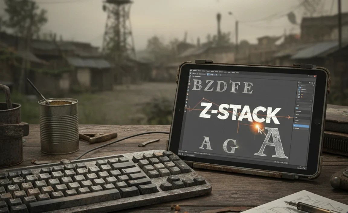
To truly customize and apply the State of Decay font style, or create your own distressed versions, you’ll want to become familiar with some design tools. These software packages are industry standards for a reason and offer the flexibility needed to achieve that unique, weathered look.
Essential Design Software:
- Adobe Photoshop: Indispensable for raster-based image editing. It excels at applying textures, grunge effects, and subtle imperfections to text. You can warp text, use layer styles with noise and grunge overlays, and even use custom brushes to paint in wear and tear.
- Adobe Illustrator: The go-to for vector graphics. This is perfect for creating distressed text that can be scaled infinitely without losing quality. You can use effects like “Roughen,” “Distort & Transform,” or import vector textures to apply to your text outlines. It’s also great for creating clean logos that incorporate distressed elements.
- Affinity Designer: A powerful and more affordable alternative to Illustrator, offering robust vector tools for text manipulation and effects.
- Affinity Photo: A strong Photoshop alternative for raster editing and texturing.
- GIMP (GNU Image Manipulation Program): A free and open-source alternative to Photoshop. While it has a steeper learning curve for some, it offers many powerful features for manipulating text and applying textures.
- Inkscape: A free and open-source vector graphics editor comparable to Illustrator.
Where to Find Textures and Brushes:
- Font Marketplaces: Websites like Creative Market, Envato Elements, and FontBundles.net often sell packs of grunge textures, distress brushes, and even complete distressed font families.
- Stock Photo/Texture Sites: Sites like Unsplash, Pexels, and Pixabay offer free textures (you can extract elements from images). More specialized sites like Textures.com, PSDGraphics, and ShareTextures.com offer a wider variety, sometimes with free tiers.
- Brush Resource Sites: Many designer blogs and forums offer free Photoshop or Illustrator brushes specifically for grunge, distress, or grunge effects.
Creative Applications of the “State of Decay” Font Style
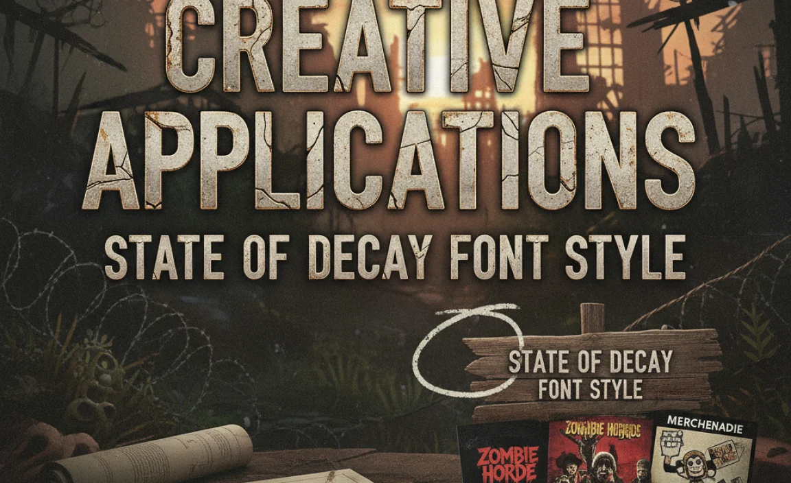
The gritty, survivalist aesthetic of the State of Decay font isn’t just for fans of the game. It has a broad appeal for any project that needs to communicate a sense of grit, resilience, or a battle against the odds. Think beyond just zombie themes!
Ideas for Your Designs:
- Gaming Fan Art and Content: The most obvious use! Create fan posters, social media graphics, or video intros with that authentic State of Decay feel.
- Post-Apocalyptic Themed Branding: For businesses or events that want to convey durability, ruggedness, or a “tough” image. This could be for a survival gear company, an adventure tourism group, or even a workout program.
- Indie Game Development: If you’re developing a survival, horror, or gritty action game, this font style can immediately help establish your game’s tone and atmosphere.
- Book Covers and Publishing: Excellent for thriller, horror, survival, or dystopian novel covers. It suggests immediate stakes and a raw narrative.
- Event Promotion: Imagine flyers for a “zombie run” 5K, a post-apocalyptic themed party, or a survival skills workshop.
- Personal Projects: Design anything from custom t-shirts and posters to personal blogs or digital art pieces that embody a theme of overcoming challenges.
- Logo Design: A distressed serif or sans-serif can give a logo a unique, memorable, and enduring personality, suggesting a brand that’s been around and weathered storms.
The key is to match the font’s inherent characteristics – its robustness and wear – with the message you want to convey. It speaks of stories, struggles, and survival, making it incredibly versatile for a range of creative expressions.
Readability and Accessibility Considerations
While the distressed look of the State of Decay font style is appealing, it’s crucial to remember that readability is paramount, especially for user interfaces, website text, or any application where people need to consume information easily. A font that is too heavily distressed or has awkward letterforms can quickly become a barrier.
Tips for Maintaining Readability:
- Use for Headlines and Titles: Heavily distressed fonts are usually best suited for short bursts of text like titles, logos, or major headings. For longer passages, opt for a cleaner, highly legible font.
- Contrast is Your Friend: Ensure there’s sufficient contrast between the text color and its background. Distressed edges can sometimes make text blend into busy backgrounds more easily.
- Test at Different Sizes: What looks good as a large title might become illegible at smaller sizes on a mobile screen. Always test your chosen font at various sizes and on different devices.
- Consider the Underlying Font Structure: A font with fundamentally clear letterforms and good spacing will be more readable even when distressed, compared to a font that was already complex or poorly spaced.
- Limit Usage: Don’t overdo it. Pair your distressed font with cleaner, simpler fonts for body text and secondary information to create a balanced design hierarchy.
Remember, the goal of typography in design is to communicate effectively. The State of Decay style is a powerful tool for setting a mood, but it should serve, not hinder, your message. For more on web accessibility standards, resources like the Web Content Accessibility Guidelines (WCAG) provide comprehensive information on ensuring content is usable by everyone.
Frequently Asked Questions (FAQ)
Q1: Is the “State of Decay” logo font available for commercial use?
The exact font used in the official State of Decay logo is likely proprietary or custom-made for the game’s developers, Undead Labs. It might not be publicly available or may have specific licensing restrictions. If you need a commercial license, it’s always best to find a very close alternative from reputable font foundries or marketplaces that offer commercial licenses.
Q2: Can I use fonts found on Google Fonts for commercial projects?
Yes, most fonts on Google Fonts are released under open-source licenses (like the SIL Open Font License) which generally allow for free use in both personal and commercial projects, including use in products, logos, and websites. Always double-check the specific license for each font, but Google Fonts is generally very creator-friendly.
Q3: How can I make a font look more “distressed” or “grungy” in Photoshop?
In Photoshop, you can achieve a distressed look by:
- Placing your text.
- Layering grunge texture images over the text, setting the blend mode of the texture layer to “Multiply” or “Overlay” and adjusting opacity.
- Using distressed brushes to paint away parts of the text or add imperfections.
- Applying Photoshop’s built-in “Roughen Edges” filter (though this can be a bit harsh) or using the “Distort” filters.
- Experimenting with layer styles like “Noise.”
Q4: What’s the difference between a serif and a sans-serif font?
The main difference is the presence of small decorative strokes called “serifs” at the ends of the main strokes of letters. Serif fonts (like Times New Roman or Trajan Pro) tend to look more traditional, formal, and are often associated with print. Sans-serif fonts (like Arial or Helvetica) lack these strokes and are often perceived as more modern, clean, and legible on screens.
Q5: Are there any free fonts that look like the “State of Decay” font?
While exact matches are rare for free, you can find excellent free alternatives on platforms like Google Fonts. Look for fonts that have a strong serif structure and then explore ways to add distressing. Fonts like Metal Mania or base fonts that are often given distressed versions (like League Gothic, though it’s sans-serif) can provide a starting point, and you can add textures yourself in design software.
Q6: How do I choose the right distressed font for my logo?
For logos, prioritize readability even


Leave a Comment