Quick Summary
Stretched-out fonts, often called wide or extended fonts, are excellent for bold statements and eye-catching headlines. They create a solid, impactful look ideal for branding, titles, and large-format designs where you need text to command attention.
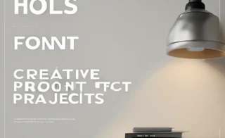
Ever notice how some fonts seem to ‘stretch’ across the page, occupying more horizontal space? These are commonly known as stretched-out, extended, or wide-set fonts. They can feel overwhelming or clunky if used incorrectly, but don’t let that fool you! When chosen and applied thoughtfully, these fonts are powerful tools in a designer’s arsenal. They can transform a simple design into something unforgettable. This guide will walk you through the best creative ways to use stretched-out fonts, turning potential design challenges into stunning visual opportunities.
What Exactly Are Stretched-Out Fonts?
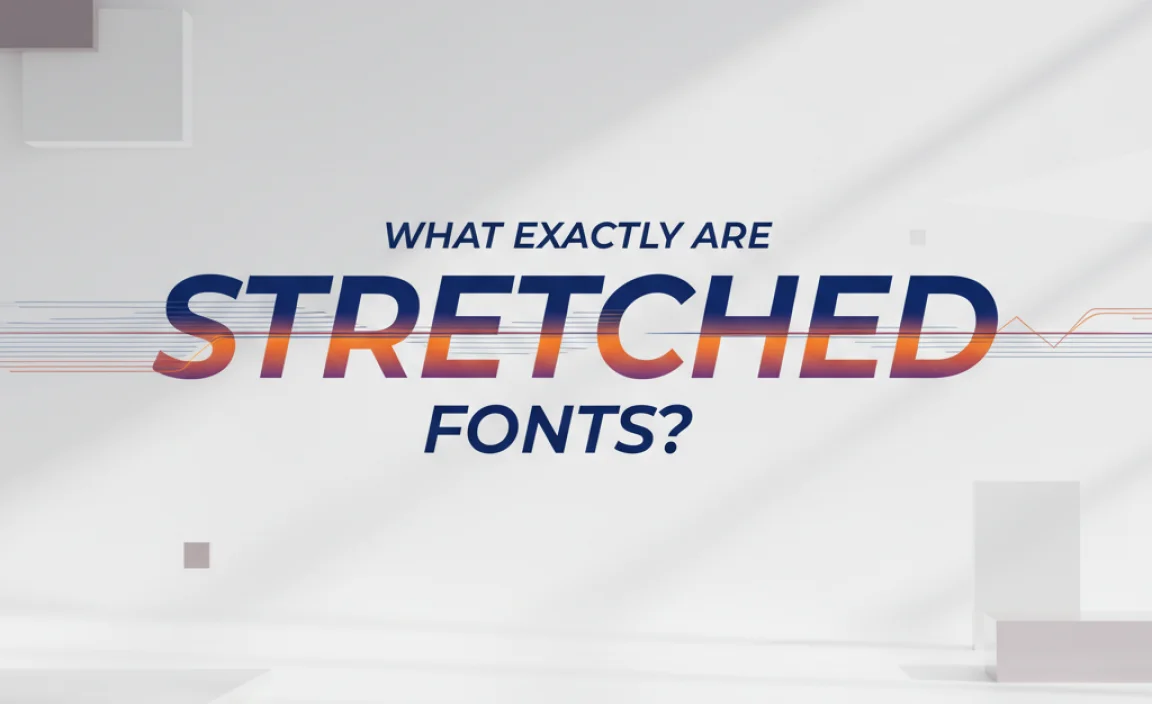
Stretched-out fonts, formally referred to as “extended” or “wide” typefaces, are designed with greater letter spacing and broader character shapes than standard fonts. Think of them as fonts that have taken a deep breath and expanded outwards. This deliberate wideness gives them a unique presence, making them stand out from the crowd. They’re not just regular fonts with extra space added; their very structure is built for width. This makes them perfect for making a bold statement without shouting.
The history of extended typefaces is tied to the need for impactful display typography. Early examples can be seen in 19th-century advertising and signage, where boldness was key to attracting attention. Today, they continue to serve that purpose, offering designers a way to create a solid, authoritative, and visually arresting typographic effect.
Why Use Stretched-Out Fonts? The Creative Advantages

Stretched-out fonts are more than just a stylistic choice; they offer tangible benefits when you want your message to have maximum impact. Let’s explore some of their key creative advantages:
1. Unmatched Visual Impact
The inherent width of these fonts naturally commands attention. They fill space elegantly and create a strong visual hierarchy. When you need a headline to stop people in their tracks, a stretched-out font is your go-to solution. They feel substantial and confident, making any text they set appear significant.
2. Enhanced Readability at Scale
While it might seem counterintuitive, wider fonts can sometimes be more readable than condensed ones, especially at larger sizes. The increased negative space between characters and within the letterforms themselves can help prevent the text from blurring together. This makes them fantastic for:
- Billboards and large signage
- Poster designs
- Website banners and hero sections
- Event invitations and flyers
3. Unique Branding Personality
In branding, typography is crucial for conveying personality. Stretched-out fonts can communicate a sense of modernity, strength, stability, or even quirkiness, depending on the specific typeface. They can help a brand stand out from competitors who might be using more conventional typography.
4. Artistic and Experimental Possibilities
Beyond their functional uses, stretched-out fonts open doors to creative experimentation. Their bold forms can be manipulated, layered, or combined with other design elements in exciting ways. They’re a playground for graphic designers looking to push creative boundaries.
Best Creative Uses for Stretched-Out Fonts
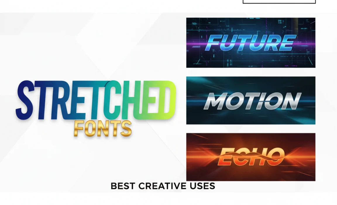
Now that we know the strengths of stretched-out fonts, let’s dive into practical, creative applications where they truly shine. Think of these as your go-to scenarios for adding that impactful typographic flair.
1. Bold Headlines and Subheadings
This is perhaps the most common and effective use. A stretched-out font can turn a simple phrase into a powerful statement. Whether it’s a magazine cover headline, a website’s main heading, or a prominent announcement, these fonts ensure your message is seen and remembered. They work wonderfully for:
- Product Launches: “NEW COLLECTION” that feels substantial and exciting.
- Event Announcements: “SUMMER FESTIVAL” that promises energy and scale.
- Promotional Offers: “SALE NOW ON” for maximum visibility.
2. Logo Design and Branding
Stretched-out fonts can form the backbone of a strong brand identity. They convey reliability and presence. A well-chosen extended typeface can make a logo instantly recognizable and memorable. Many tech companies, sports teams, and lifestyle brands opt for wide fonts to project strength and modernity. Consider brands that want to feel:
- Authoritative and trustworthy
- Modern and forward-thinking
- Playful yet impactful
For example, a fintech startup might use an extended sans-serif to communicate stability and innovation. A surf brand might use a custom stretched script for a retro, laid-back yet bold feel.
3. Posters, Flyers, and Event Graphics
When designing for print or large-scale digital displays, hit them with impact! Stretched-out fonts are ideal for grabbing attention from a distance. They are perfect for concert posters, movie titles, exhibition announcements, and promotional flyers. The sheer presence of the text ensures that key information is absorbed quickly. Think about posters for music festivals where oversized, bold typography is the norm to capture the energetic vibe.
4. Album Art and Book Covers
The music and publishing industries often leverage stretched-out fonts to convey genre, mood, and artistic intent. A bold, wide font can instantly suggest the tone of the music or the theme of the book. For an electronic music album, a sleek, extended sans-serif might be perfect. For a historical novel, a heavy, wide serif could evoke a sense of gravitas.
5. Website Hero Sections and Banners
First impressions matter online. A stretched-out font in your website’s hero section can immediately communicate the essence of your brand or message. It creates a strong focal point and draws users into the content. Remember to balance it with readable body text. For businesses, this could be a tagling like: “YOUR TRUSTED PARTNER IN INNOVATION.”
6. Titles in Videos and Presentations
In the fast-paced world of digital media, titles need to be instantly recognizable. Stretched-out fonts work exceptionally well for video intros, lower thirds, and presentation slides. They ensure that the title is clear and impactful, even when viewed on smaller screens or at a glance.
7. Artistic and Typographic Art
For designers who enjoy playing with typography as a visual art form, stretched-out fonts offer a fantastic base. They can be used to create patterns, textures, or abstract compositions. Their form lends itself well to being part of a larger visual narrative.
Choosing the Right Stretched-Out Font: A Practical Guide
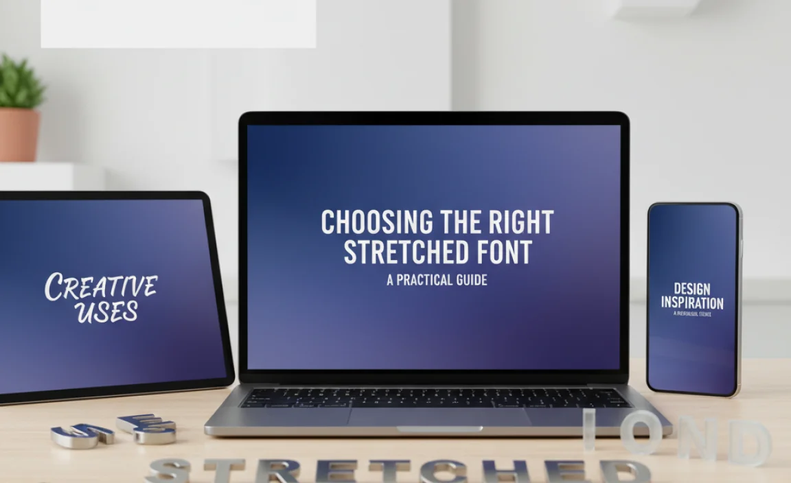
Not all stretched-out fonts are created equal! Selecting the perfect one depends on your project’s needs. Here’s how to make a smart choice:
Understand the Font’s Personality
Just like any font, extended typefaces have distinct personalities. Are they:
- Modern & Geometric: Think clean lines and perfect circles.
- Classic & Bold: Often serif-based, with thick strokes.
- Industrial & Sturdy: Evoking a sense of raw strength.
- Playful & Quirky: With unique twists or softened edges.
The personality of the font should align with your brand or message.
Consider Readability for Your Context
While great for headlines, some extremely stretched fonts can become difficult to read in longer blocks of text. Always test your chosen font in the actual size and context it will be used. For body copy, stick to standard or slightly wide fonts, never heavily extended ones.
Pairing with Other Fonts
A strong stretched-out font is often best balanced by a more neutral, readable font for supporting text. A common pairing is an extended sans-serif for headers with a classic, well-spaced sans-serif or serif for body copy. This contrast ensures both impact and clarity. For example:
| Purpose | Recommended Font Style | Example Pairing |
|---|---|---|
| Headline/Title | Extended Sans-Serif (e.g., Impact, Bebas Neue Extended) | Montserrat Normal |
| Subheading | Wide Slab Serif (e.g., Rockwell Extra Bold) | Open Sans |
| Call to Action | Heavy Extended Display Font (e.g., Anton) | Lato Regular |
Check Licensing
Always ensure you have the proper license for any font you use, especially for commercial projects. Some extended fonts might have specific usage restrictions or require premium licenses.
Where to Find Great Stretched-Out Fonts
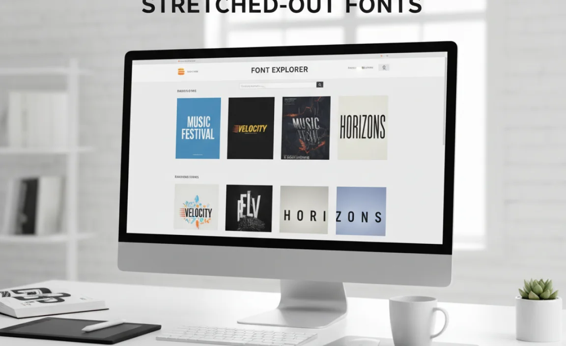
The world of typography is vast! Here are some excellent places to discover unique and effective stretched-out fonts:
- Google Fonts: A fantastic free resource. Search for terms like “extended,” “wide,” or “display” and browse the results. You can often adjust character spacing to achieve wider looks with some standard fonts too.
- Adobe Fonts: If you’re an Adobe Creative Cloud subscriber, you have access to a huge library of high-quality fonts, many of which are extended or can be modified for width.
- Font Squirrel: Another great resource for free fonts, often curated with commercial use in mind.
- MyFonts / Fontspring: These are premium font marketplaces where you can find a wide variety of professional, often unique, extended typefaces.
When searching, look for variations like “Extra Wide,” “Ultra Condensed” (ironically, some designers refer to ultra-wide as the opposite of ultra-condensed, so be adaptable in your search terms), or “Display Extended.”
Techniques for Using Stretched-Out Fonts Creatively
Beyond just typing text, you can elevate the use of stretched-out fonts with these creative techniques:
1. Letter Spacing (Tracking) Adjustments
Even standard fonts can be made to feel more “stretched” by increasing their letter spacing (tracking). While not a true extended font, this can achieve a similar effect of airy, spread-out text. Tools like Adobe InDesign or Figma allow precise control over this.
Pro-Tip: Use this technique sparingly. Over-spacing can destroy readability. This is a great hack for achieving a similar aesthetic without needing a special font file. Learn more about typography fundamentals at the Interaction Design Foundation’s Typography section.
2. Typographic Layouts
Use the visual weight of stretched fonts to influence your layout. They can act as strong anchors. Consider stacking words vertically, arranging them in shapes, or using them as background elements. For instance, a large, stretched word could fill the background of a poster, with a smaller, more readable font layered on top for details.
3. Color and Texture Overlays
Apply vibrant colors, gradients, or textures to your stretched-out font to make it even more eye-catching. This is particularly effective for display text and branding elements. A metallic gradient on a bold, wide font can exude luxury.
4. Negative Space and Contrast
The inherent width of these fonts means they occupy a significant visual area. Use negative space strategically around them to let them breathe and emphasize their impact. Contrast them boldly with tighter, more compact elements in your design.
5. Outlining and Distorting
For highly experimental designs, you can convert stretched-out text to outlines and then manipulate the shapes further. This allows for unique, custom typographic treatments that are truly one-of-a-kind. Be cautious, as this can sometimes render the text unreadable if taken too far.
When to Avoid Stretched-Out Fonts
While versatile, stretched-out fonts aren’t a universal solution. Here are situations where you should probably reconsider:
- Long Blocks of Body Text: As mentioned, they are generally not suitable for paragraphs. They strain the eyes and reduce reading speed.
- Tiny Sizes on Low-Resolution Screens: Extremely wide or thin extended fonts can become illegible at very small sizes or on displays with poor resolution.
- Designs Requiring Extreme Condensement: If your design is already very tight on space and you need the smallest possible font footprint, a condensed font would be a better choice.
- When a Subtle Message is Needed: If you want your typography to be calm, understated, or formal in a traditional sense, a widely stretched font might be too aggressive.
Always consider the overall aesthetic and functional requirements of your project before committing to a stretched-out font.
FAQ: Your Stretched-Out Font Questions Answered
Q1: Are stretched-out fonts the same as wide fonts or extended fonts?
Yes, these terms are often used interchangeably. They all refer to typefaces designed with increased horizontal width and spacing compared to standard fonts.
Q2: Can I make any font stretched-out?
You can approximate a stretched look by increasing the letter spacing (tracking) in your design software. However, true “stretched-out” or “extended” fonts are designed with wider letterforms from the start, offering a more balanced and often more aesthetically pleasing result.
Q3: Are stretched-out fonts good for body text?
Generally, no. Stretched-out fonts are best for headlines, titles, and display purposes where impact is more important than sustained readability. They can cause eye strain and slow down reading for longer passages.
Q4: What kind of projects benefit most from stretched-out fonts?
Projects requiring a strong visual presence, such as posters, billboards, logos, event graphics, and website hero banners, benefit greatly. They are excellent for conveying boldness, stability, and modernity.
Q5: How do I choose the right stretched-out font?
Consider its personality (modern, bold, industrial), its readability at your intended size, and how it will pair with other fonts in your design. Always test it in context!
Q6: Are there any free stretched-out fonts available?
Yes! Google Fonts and Font Squirrel offer many free extended and wide fonts. Just search for terms like “extended,” “wide,” or “display” to find options.
Conclusion
Stretched-out fonts, or extended typefaces, are far more than a niche design trend; they are powerful tools for creating impact and personality. By understanding their unique characteristics and creative applications, you can wield them effectively to elevate your designs, whether you’re crafting a brand identity, designing an eye-catching poster, or building a compelling website. Remember to always consider your audience, context, and the overall message you aim to convey. Experiment, play, and don’t be afraid to let your typography spread its wings – or rather, its width!


Leave a Comment