The University of Victoria Font is the official typeface used to represent the institution’s brand. This guide clarifies which fonts are approved for official use, ensuring consistency and professionalism in all communications.
Navigating university branding guidelines can feel like a maze, especially when it comes to something as specific as fonts. Many of you look for the “University of Victoria font” to ensure your materials, whether for a class project, a departmental brochure, or a personal website inspired by UVic, align with its visual identity. It’s a common question, and finding the right answers can be tricky. Don’t worry! We’re here to break down exactly what you need to know about the University of Victoria’s font choices in a simple, easy-to-understand way. Let’s make your design choices clear and consistent.
Understanding University Branding and Fonts

University branding is more than just a logo; it’s a visual language that communicates identity, prestige, and values. Fonts play a crucial role in this language. They shape how information is perceived and contribute significantly to the overall professional image of an institution. For a university like the University of Victoria (UVic), consistent use of its designated fonts ensures that all communications – from official documents and websites to marketing materials and signage – are recognizable and uphold a strong, unified brand.
This consistency helps build trust and reinforces the institution’s identity. When designers, students, faculty, and staff understand and correctly use the official fonts, they become ambassadors of the UVic brand, ensuring its visual integrity across all platforms.
The Official University of Victoria Font: Let’s Get Specific

When the University of Victoria refers to its official font, it’s talking about a primary typeface family that embodies its brand. This isn’t just about picking a font you like; it’s about selecting one that reflects the university’s characteristics: academic, innovative, approachable, and connected.
The University of Victoria primarily uses a serif font for its main branding. Serif fonts, characterized by small decorative strokes (serifs) at the ends of letterforms, often convey a sense of tradition, authority, and readability, making them suitable for formal and academic contexts.
What is the Primary UVic Font?
The core typeface family officially designated by the University of Victoria is Garamond.
Garamond is a classic and widely respected serif typeface with a long history, dating back to the 16th century. Its timeless elegance, excellent readability, and sophisticated appearance make it an ideal choice for an academic institution.
Serif Style: Adds a touch of tradition and professionalism.
Readability: Excellent for extended text, such as in reports, academic papers, and web content.
Versatility: Available in various weights and styles, allowing for consistent branding across different applications.
Why Garamond?
Garamond was chosen for its ability to convey a sense of academic rigor, timelessness, and clarity. It’s a font that speaks to tradition while remaining perfectly readable on modern screens and in print. Its balanced proportions and graceful lines contribute to a high-quality aesthetic, aligning with UVic’s commitment to excellence in education and research.
Where to Find and Use Garamond
Garamond is a widely available font. You can often find it pre-installed on most operating systems, including Windows and macOS. Many popular design software applications, such as Adobe Creative Suite, Microsoft Office, and Google Workspace, also include Garamond or similar variations.
When acquiring Garamond for professional design work, it’s always best to ensure you are using a high-quality digital version. Reputable sources for font licenses include:
Adobe Fonts: If you subscribe to Adobe Creative Cloud, Garamond is often available through this service.
Monotype: As one of the original foundries of Garamond, Monotype offers various high-fidelity versions.
Google Fonts: While not always a direct Garamond, Google Fonts offers excellent, free, and open-source alternatives that share similar characteristics, such as EB Garamond. You can access and download fonts from Google Fonts directly for web and print use.
Secondary and Supporting Fonts for UVic Branding
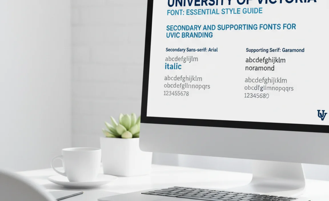
While Garamond is the primary identifier, a comprehensive brand style guide often includes secondary fonts. These are used to complement the primary font, provide contrast, and ensure readability in specific applications, especially for digital interfaces or when a more modern feel is desired.
For the University of Victoria, a sans-serif font is typically used as a secondary option. Sans-serif fonts, lacking the decorative serifs, offer a cleaner, more modern, and often more legible appearance in smaller sizes or on digital screens.
The Sans-Serif Companion
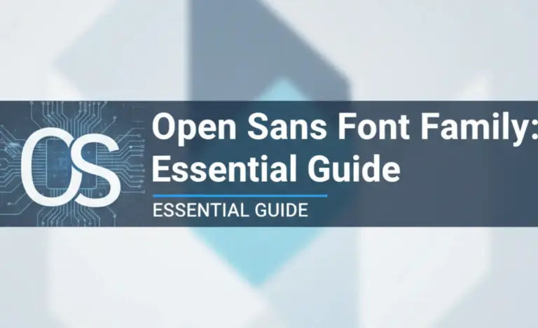
The common practice for universities is to pair a classic serif with a clean sans-serif. The University of Victoria encourages the use of Open Sans or similar neutral, highly readable sans-serif fonts for supporting text and digital applications.
Open Sans: This is a popular humanist sans-serif typeface designed by Steve Matteson. It’s optimized for print, web, and mobile interfaces, making it a versatile choice. Its open letterforms and friendly appearance ensure excellent legibility even at small sizes.
Key Characteristics of Open Sans:
Neutral and Friendly: Easy to read without distraction.
Versatile Weights: Available in various weights (light, regular, semi-bold, bold, etc.) for hierarchy.
Web Optimized: Designed to render well on all screens.
Why pair a serif with a sans-serif?
This classic typographic pairing creates a visual hierarchy and balance. The serif font (Garamond) establishes authority and tradition, while the sans-serif font (Open Sans) provides clarity and modernity, especially for headings, subheadings, and body text in digital contexts.
When to Use Secondary Fonts
Secondary fonts like Open Sans are ideal for:
Headings and Subheadings: Especially in digital formats where a crisper look is desired.
Body text in digital interfaces: Websites, apps, and presentations benefit from the readability of sans-serifs.
Captions and Labels: Where conciseness and clarity are paramount.
Informational Graphics: Charts, graphs, and diagrams.
Key Font Usage Guidelines for University of Victoria Materials
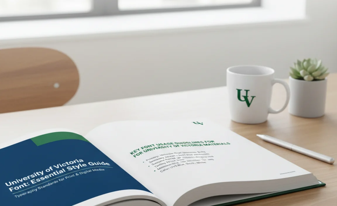
To maintain brand consistency, it’s essential to follow specific guidelines for using the approved fonts. These guidelines typically cover what fonts to use for different purposes, preferred weights, and how to ensure legibility.
1. Primary Use: Garamond
Official Letterhead and Stationery: Garamond should be the primary font.
Formal Reports and Academic Documents: Use Garamond for headings and body text to convey authority and academic tone.
Key Branding Elements: Logos (if applicable and dictated by specific brand assets), titles, and important announcements.
Print Materials: Brochures, posters, and publications where a refined appearance is desired.
2. Secondary Use: Open Sans (or similar)
Websites and Digital Platforms: Use Open Sans for body text, navigation, buttons, and less formal headings.
Presentations: For slides, use Open Sans for bullet points and supporting text to ensure easy reading.
Internal Communications (less formal): Memos or internal newsletters can use Open Sans for a more approachable feel.
Infographics and Data Visualizations: Clear, legible sans-serifs are best for presenting data.
3. Font Weights and Hierarchy
For Garamond, use regular for body text, medium or semi-bold for subheadings, and bold for main headings.
For Open Sans, use regular for body text, semi-bold or bold for headings and subheadings in digital contexts.
Always maintain a clear visual hierarchy. Use font size, weight, and spacing to guide the reader’s eye.
4. Color and Treatments
Fonts should generally be used in black, white, or approved brand colors.
Avoid excessive styling like shadows, outlines, or gradients, which can detract from readability and professionalism.
5. Licensing and Accessibility
Always ensure you are using legally licensed versions of fonts for professional and commercial use.
Prioritize readability for all audiences. Check contrast ratios for text against backgrounds, especially on digital platforms. The Web Content Accessibility Guidelines (WCAG) provide excellent standards for this.
Common Font Mistakes to Avoid

Even with clear guidelines, it’s easy to make mistakes when selecting and using fonts. Being aware of common pitfalls can save you from unintentional branding missteps.
Common Pitfalls in Font Usage
Using Unauthorized Fonts: Opting for “trendy” fonts not approved by the university’s brand identity.
Overuse of Bold/Italics: Making text difficult to read by using too many variations of font styles.
Poor Readability: Choosing fonts that are too decorative, too condensed, or too small for the intended medium.
Inconsistent Pairing: Mixing too many font families or pairing fonts that clash stylistically.
Ignoring Licensing: Using fonts without proper licenses, which can lead to legal issues.
Implementing UVic Fonts in Your Projects
Let’s walk through how you might practically apply these fonts in common scenarios.
Scenario 1: Creating a University Department Newsletter (Print)
Headline: Garamond Bold, large font size.
Subheadings within Articles: Garamond Semi-Bold, slightly smaller than headlines.
Body Text: Garamond Regular, standard body text size (e.g., 10-12pt), with adequate line spacing for readability.
Pull Quotes/Highlights: Garamond Italic or Semi-Bold, used sparingly.
Scenario 2: Designing a UVic Student Club Website
Main Title/Logo Area: Could use Garamond Bold for the club name to establish an official feel.
Navigation Menu: Open Sans Semi-Bold for clarity on screen.
Body Content on Pages: Open Sans Regular for optimal readability on various devices.
Section Headings: Open Sans Bold.
Event Details/Dates: Open Sans Regular.
Font Families vs. Specific Fonts: Understanding Nuances
The term “Garamond” can refer to a font family comprising many variations. Similarly, “Open Sans” also has different weights and styles. It’s important to understand that when the university specifies a font, it often refers to a particular version or a set of acceptable variations within that font family.
Garamond Variations
There are numerous digital interpretations of Garamond. Some popular and high-quality versions include:
Adobe Garamond Pro: A widely used and robust version available through Adobe.
EB Garamond: A free, open-source version available on Google Fonts, excellent for web use.
Garamond Premier Pro: Another high-quality option from Adobe.
When in doubt, check the official University of Victoria Communications Guide for the most precise specifications regarding which version of Garamond is preferred, or consult the university’s brand assets.
Open Sans Variations
Open Sans offers a spectrum of weights:
Light: For subtle emphasis or decorative use.
Regular: Standard body text.
Semi-Bold: For stronger emphasis or headings.
Bold: For prominent headings and calls to action.
The official guidelines will likely recommend specific weights to use for different purposes to ensure consistency.
Tools for Font Management and Implementation
To effectively manage and use the University of Victoria’s approved fonts, several tools can be incredibly helpful.
Recommended Software and Resources
Adobe Creative Cloud: This suite (Photoshop, Illustrator, InDesign) is essential for professional designers. Adobe Fonts provides easy access to licensed Garamond and many sans-serif options.
Microsoft Office Suite: Word, PowerPoint, and Publisher are commonly used for official documents. Garamond is usually pre-installed. For web-friendly sans-serifs, alternatives like Calibri or Arial are often acceptable if Open Sans isn’t readily available, though adhering to exact brand guidelines is always best.
Google Workspace: Google Docs, Slides, and Sheets offer access to fonts like EB Garamond and Open Sans directly through the platform, making them excellent free tools for students and staff.
Online Font Managers: Tools like FontBase or RightFont can help organize, activate, and manage your font libraries across different applications. This is particularly useful if you work with many different font families for various clients or projects.
Brand Guideline Documents: Always refer to the official UVic Brand and Visual Identity Guidelines. These documents are the definitive source for approved fonts, their usage, and other branding elements.
Table: University of Victoria Font Usage Summary
To provide a quick reference, here’s a summary table of the primary and secondary fonts and their typical uses according to UVic branding principles.
| Font Name | Category | Primary Use Cases | Typical Weights for Use | Notes |
|---|---|---|---|---|
| Garamond | Serif | Official Letterhead, Formal Reports, Academic Documents, Print Publications, Headlines in traditional media | Regular, Semi-Bold, Bold | Conveys tradition, authority, and readability for long-form text. |
| Open Sans (or similar sans-serif) | Sans-Serif | Website Body Text, Digital Interfaces, Presentations, Infographics, Subheadings in digital media | Regular, Semi-Bold, Bold | Ensures clarity and readability on screens, offers a modern contrast. |
Frequently Asked Questions (FAQ)
- What is the main font used by the University of Victoria?
- The primary font for the University of Victoria is Garamond. It’s used for official communications and materials to convey a sense of academic heritage and professionalism.
- Can I use Garamond on my website?
- Yes, you can use Garamond on your website, especially for headings or key text elements. For body text on digital platforms, a complementary sans-serif like Open Sans is often recommended for better screen readability. Ensure you’re using a licensed or freely available web version, like EB Garamond from Google Fonts.
- What if Garamond isn’t available on my computer?
- If Garamond isn’t pre-installed, you can often find it through font subscription services like Adobe Fonts if you’re an Adobe user. For a free alternative with a similar classic feel, consider EB Garamond available on Google Fonts.
- Is there a specific sans-serif font recommended for UVic?
- Yes, while not always as strictly enforced as the primary serif font, Open Sans is a widely recommended supporting sans-serif for its excellent readability on screens, making it suitable for web content and presentations.
- Can I use other decorative fonts for special projects?
- For official University of Victoria branded materials, it’s best to stick to the approved fonts (Garamond and recommended sans-serifs). Decorative fonts should generally be avoided to maintain brand consistency and professionalism, unless explicitly permitted by the brand guidelines for a very specific, limited application.
- Where can I find the official UVic font guidelines?
- You can find the most up-to-date official University of Victoria brand and visual identity guidelines, including typography recommendations, on the UVic Communications website. Look for sections on Visual Identity or Brand Standards.
Conclusion: Mastering the UVic Font for Professional Design
Understanding and correctly applying the University of Victoria’s designated fonts is key to creating professional, consistent, and recognizable brand materials. By adhering to the primary use of Garamond and leveraging supporting sans-serifs like Open Sans, you can ensure your designs speak the language of academic excellence and institutional integrity.
Whether you’re a seasoned graphic designer, a student working on an assignment, or a marketer building a campaign, these guidelines will help you navigate the nuances of UVic’s typographic identity. Remember to always refer to the official brand guidelines for the most precise specifications. With the right fonts, you can effectively communicate your message and contribute to the strong, unified visual presence of the University of Victoria. Happy designing!


Leave a Comment