Use Helvetica in CSS like a pro! This guide shows beginners how to easily leverage the versatile Helvetica font family for clean, modern, and readable web designs, covering basic implementation and common uses to elevate your site’s look and feel quickly.
Hey design enthusiasts! Ever scroll through websites and notice that clean, universally appealing typeface that just feels… right? Chances are, you’ve encountered Helvetica. It’s a legend in the design world, known for its straightforward elegance and incredible readability. But bringing this classic font to your own web projects using CSS can sometimes feel like a puzzle. Don’t worry, though! I’m here to break down exactly how to use the versatile Helvetica font family in CSS, making your website look polished and professional with minimal fuss. We’ll go step-by-step, so whether you’re just starting out or looking to refine your web typography skills, you’ll be harnessing Helvetica’s power in no time. Get ready to make your text sing!
Why Helvetica is Your Go-To Font for Web Design

Helvetica, oh Helvetica. It’s not just a font; it’s an institution. Born in 1957, this sans-serif typeface has graced everything from corporate logos to street signs, and for good reason. Its design is deceptively simple: generous spacing, open letterforms, and a neutral, friendly tone. This makes it incredibly readable across various screen sizes and resolutions, a crucial factor for any website aiming for clarity and accessibility.
In the realm of web design, consistency is key. Helvetica offers a familiar, trustworthy aesthetic that doesn’t distract from your content. It’s the font equivalent of a perfectly tailored suit – classic, functional, and always appropriate. Whether you need to convey information clearly for a business website, present sleek designs for a portfolio, or ensure your blog posts are easy to digest, Helvetica is a powerhouse.
Many designers, myself included, appreciate Helvetica for its sheer versatility. The family isn’t just one style; it encompasses a range of weights (light, regular, bold, black) and widths (condensed, regular, extended), allowing for significant typographic hierarchy and visual interest without ever feeling jarring. Ready to see how we can bring this amazing font to your website?
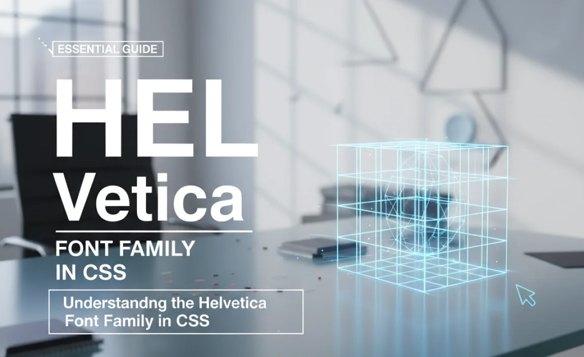
Understanding the Helvetica Font Family in CSS
Before we dive into the code, let’s talk about what makes up the “Helvetica font family” when you’re working with CSS. It’s not just one file. Think of it as a collection of related styles that share core design characteristics but differ in weight, slant, or width. When you specify Helvetica in CSS, you’re often referring to a set of widely available versions of this typeface.
The most common styles you’ll encounter and want to use are:
- Helvetica Neue: A more contemporary iteration of the original, often considered cleaner and more refined for digital use. It offers a wider range of weights and stylistic options.
- Helvetica: The original classic. While still excellent, some versions might appear a bit dated compared to Neue on modern screens.
The key point for CSS is how you reference these. Most operating systems and web browsers have built-in versions of Helvetica or very close fallbacks. This means you can often use it without needing custom font files, making implementation straightforward. We’ll explore how to ensure it’s displayed correctly across different devices and browsers.
Implementing Helvetica in Your CSS: The Basics
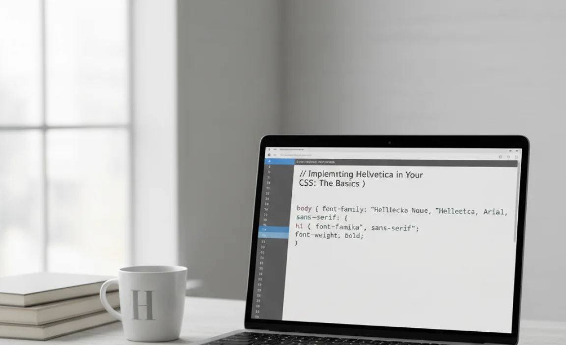
Getting Helvetica onto your webpage is surprisingly simple, thanks to its widespread availability. The primary way to do this is by using the `font-family` CSS property. Let’s look at the core syntax.
You’ll typically define this in your CSS stylesheet, targeting elements like the `body`, headings (`h1`, `h2`, etc.), or paragraphs (`p`).
Setting the Default Font for Your Page
To make Helvetica the default typeface for your entire website, you’d apply it to the `body` element. This ensures that all text, unless specifically overridden, will use Helvetica. Here’s how:
body {
  font-family: "Helvetica Neue", Helvetica, Arial, sans-serif;
}
Let’s break down that `font-family` declaration:
- `”Helvetica Neue”`: This is your first choice. We put it in quotes because the name has a space.
- `Helvetica`: This is your second choice. If “Helvetica Neue” isn’t available, the browser will try this.
- `Arial`: This is a very common fallback font that closely resembles Helvetica in its x-height and general proportions. It’s a safe bet for many systems.
- `sans-serif`: This is the ultimate fallback. If none of the named fonts are found, the browser will use its default sans-serif font. This ensures your text always renders in a readable sans-serif style, preventing a jarring shift to a serif font if all others fail.
The order is crucial. Browsers read this list from left to right and use the first font they find available on the user’s system. This “font stack” is a standard practice for ensuring consistent typography across diverse environments. For more on font stacks and web font best practices, feel free to explore resources like MDN Web Docs on font-family.
Styling Headings and Specific Elements
You can, and should, use different weights and styles from the Helvetica family to create visual hierarchy. For instance, you might want bold headings and regular body text.
Let’s say you want your main headings (`h1`) to be bold Helvetica Neue, while your subheadings (`h2`) are a lighter weight, and your body text remains regular.
h1 {
  font-family: "Helvetica Neue", Helvetica, Arial, sans-serif;
  font-weight: bold; / Or 700 /
}

h2 {
  font-family: "Helvetica Neue", Helvetica, Arial, sans-serif;
  font-weight: 500; / A common weight for semi-bold or medium /
}

p {
  font-family: "Helvetica Neue", Helvetica, Arial, sans-serif;
  font-weight: normal; / Or 400 /
  line-height: 1.6; / Improve readability /
}
Notice how we’re reusing the font stack but changing the `font-weight`. The specific numeric values for `font-weight` can vary slightly depending on the actual font files available on a system, but `normal` (400), `bold` (700), `500` (medium), and `300` (light) are common. Combining different weights within the same font family like this is a professional design technique that adds depth and guides the reader’s eye effectively.
Leveraging Helvetica’s Versatility: Weights and Styles
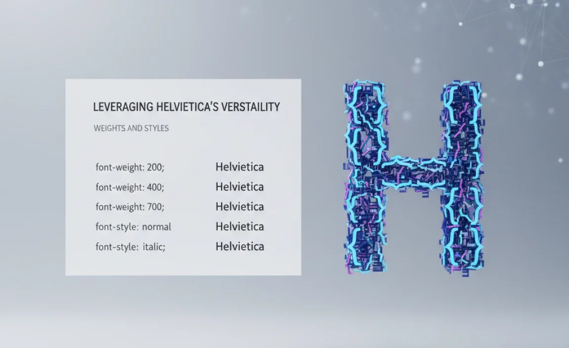
The true power of the Helvetica superfamily lies in its extensive range of weights and, in some versions like Helvetica Neue, its italic counterparts. This allows for sophisticated typographic treatments within a single, coherent style. Let’s explore how to use these effectively.
Font Weights for Hierarchy
Weights are essential for creating emphasis and structure. Helvetica offers a spectrum:
- Thin/Ultra Light: Very delicate, best for short, impactful labels or decorative elements.
- Light: Subtle and airy, good for secondary information or large blocks of lighter text.
- Regular/Roman: The standard, highly readable weight for body copy.
- Medium: A step up from regular, useful for slightly more emphasis without being as heavy as bold.
- Semibold: Stronger emphasis, great for subheadings or calls to action.
- Bold: Stands out clearly, ideal for prominent headings or important text.
- Black/Heavy: Maximum impact, typically used sparingly for very strong headings or headlines.
When coding, you’ll use the `font-weight` property. You can use keywords (`normal`, `bold`) or numeric values (100-900).
Italics for Emphasis
Many versions of Helvetica include an italic (often referred to as `oblique` in sans-serifs) style. This is perfect for subtle emphasis, quoting, or differentiating text without changing the weight.
.quote {
  font-family: "Helvetica Neue", Helvetica, Arial, sans-serif;
  font-style: italic;
  font-weight: normal; / Ensure it's not also bold /
}

.product-description {
  font-family: "Helvetica Neue", Helvetica, Arial, sans-serif;
  font-weight: 300; / Light weight /
  font-style: normal;
}
Using `font-style: italic;` is a straightforward way to add variety and nuance to your typography. Remember to ensure your font stack includes the italic version if you’re relying on custom fonts, but for system fonts like Helvetica, it’s usually bundled.
Condensed and Extended Variants
Some advanced versions of Helvetica offer condensed (narrower) and extended (wider) styles. These are fantastic for creative typographic layouts, fitting text into tight spaces, or making a bold statement.
If you have access to these styles (often through custom @font-face declarations or specific font services), you might use them like this:
.tight-space-title {
  font-family: "Helvetica Neue Condensed", Helvetica, Arial, sans-serif;
  font-weight: bold;
}

.wide-headline {
  font-family: "Helvetica Neue Extended", Helvetica, Arial, sans-serif;
  font-weight: normal;
}
Using these variants requires careful consideration of context. They can add a unique flair but can also impact readability if overused or used inappropriately.
When System Fonts Aren’t Enough: Using @font-face
While Helvetica is a system font, meaning it’s likely to be installed on most users’ computers, relying solely on it can lead to slight variations in appearance across different operating systems (macOS, Windows, Linux). For absolute design consistency, or if you want to guarantee access to specific weights or styles not present on all systems, you can use CSS’s `@font-face` rule to serve the font files directly.
This is where you host your font files (like .woff, .woff2, .ttf) on your web server and tell the browser to use them.
Steps to Implement @font-face for Helvetica (or its lookalikes)
- Obtain Font Files: You’ll need the actual font files for Helvetica or a licensed alternative that closely matches it. Many font foundries offer their versions of Helvetica or similar fonts (like Nimbus Sans L, which is metrically compatible). Ensure you have the necessary licenses for web embedding. Organizations like Google Fonts offer excellent, free alternatives if true Helvetica is cost-prohibitive. For instance, ‘Roboto’ or ‘Open Sans’ share some of Helvetica’s clean attributes and are highly versatile.
- Create a Font Folder: Usually, you’d create a `fonts` directory in your project’s root and place your font files there.
- Write the @font-face Rule: In your CSS file, define your custom font.
@font-face {
  font-family: 'MyHelvetica'; / Choose a unique name /
  src: url('fonts/helvetica-neue-regular.woff2') format('woff2'),
       url('fonts/helvetica-neue-regular.woff') format('woff');
  font-weight: normal;
  font-style: normal;
  font-display: swap; / Recommended for performance /
}

@font-face {
  font-family: 'MyHelvetica'; / Use the same unique name /
  src: url('fonts/helvetica-neue-bold.woff2') format('woff2'),
       url('fonts/helvetica-neue-bold.woff') format('woff');
  font-weight: bold;
  font-style: normal;
  font-display: swap;
}

/ Add more rules for other weights/styles as needed /
- `font-family`: This is the name you’ll use in your CSS to refer to this font (e.g., `MyHelvetica`).
- `src`: Specifies the path to your font files. Modern browsers prefer `woff2`. It’s good practice to include `woff` as a fallback.
- `font-weight`, `font-style`: Define which weight and style this particular font file represents.
- `font-display: swap;`: This is important for performance. It tells the browser to display text immediately using a fallback font while the custom font loads, then “swap” to the custom font once it’s ready. This prevents the “flash of invisible text” (FOIT) and improves perceived loading speed. You can learn more about `font-display` on resources like MDN.
Using Your Custom Font
Once the `@font-face` rules are set up, you can use your custom font name just like you would a standard font name:
body {
  font-family: 'MyHelvetica', Helvetica, Arial, sans-serif; / Include fallbacks! /
}

h1 {
  font-family: 'MyHelvetica', Helvetica, Arial, sans-serif;
  font-weight: bold;
}
This approach gives you ultimate control over the exact look and feel of Helvetica across all browsers and devices, ensuring perfect brand consistency.
Helvetica Use Cases in Web Design
Where does Helvetica shine on the web? Pretty much everywhere! Its clean lines and neutral demeanor make it suitable for a vast array of applications.
1. Corporate and Business Websites
Helvetica conveys professionalism, stability, and trustworthiness. It’s a near-perfect choice for company websites, official documentation, and financial services where clarity and serious tone are paramount.
/ Example for a corporate site /
.company-name {
  font-family: "Helvetica Neue", Helvetica, sans-serif;
  font-size: 2.5em;
  font-weight: bold;
  color: #333;
}

.section-heading {
  font-family: "Helvetica Neue", Helvetica, sans-serif;
  font-size: 1.8em;
  font-weight: 500;
  color: #555;
  margin-bottom: 20px;
}

.main-content {
  font-family: "Helvetica Neue", Helvetica, sans-serif;
  font-size: 1em;
  font-weight: normal;
  line-height: 1.7;
  color: #444;
}
2. UI Design and Interfaces
For user interfaces (like dashboards, apps, or software), Helvetica’s legibility at small sizes and clear distinctions between weights are invaluable. It helps users quickly scan and understand information.
/ Example for UI elements /
button {
  font-family: "Helvetica Neue", Helvetica, sans-serif;
  font-weight: bold;
  padding: 10px 15px;
  border: none;
  background-color: #007bff;
  color: white;
  cursor: pointer;
}

.menu-item {
  font-family: "Helvetica Neue", Helvetica, sans-serif;
  font-weight: normal;
  font-size: 0.95em;
  padding: 8px 12px;
  display: block;
}

.notification-count {
  font-family: "Helvetica Neue", Helvetica, sans-serif;
  font-weight: bold;
  font-size: 0.8em;
  background-color: red;
  color: white;
  padding: 2px 6px;
  border-radius: 3px;
}
3. Blogs and Content-Heavy Sites
When the goal is to inform and engage readers, readability is king. Helvetica excels at this, providing a comfortable reading experience for articles, tutorials, and reports.
To optimize for reading, consider slightly adjusting `line-height` and `letter-spacing` for body text:
p {

  font-family: "Helvetica Neue", Helvetica, Arial, sans-serif;

  font-weight: normal;

  font-size:


Leave a Comment