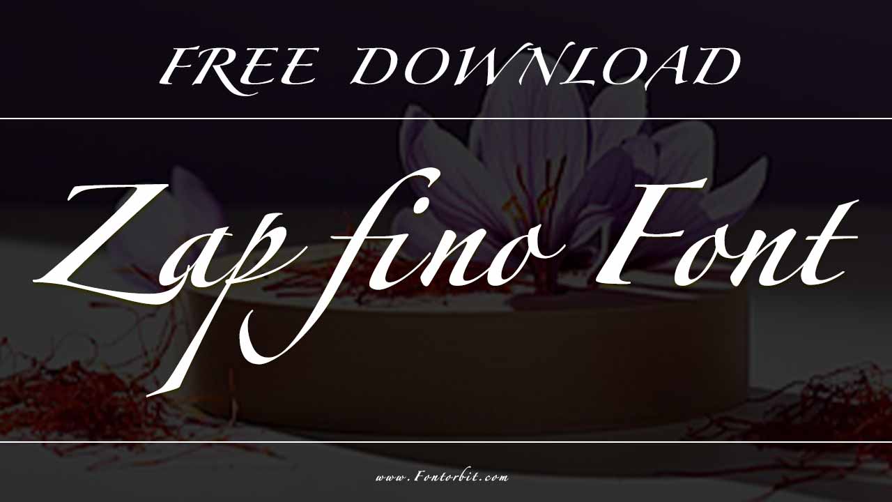
Zapfino is a calligraphic script font designed by Hermann Zapf, a renowned font designer and calligrapher. First introduced in 1998, the Zapfino typeface is known for its fluid and elegant strokes, making it a popular choice for high-end branding, invitations, and artistic projects. The font, available through the Linotype Library GmbH, is widely appreciated for its beautiful handwriting-like appearance and additional stylistic alternates.
However, pairing Zapfino with other fonts can be challenging due to its highly decorative nature. Choosing the wrong font style can make text hard to read or visually overwhelming. Let’s explore Zapfino font pairing ideas, designers’ common difficulties, and expert solutions to ensure readability and aesthetic balance.
Zapfino Font Live Preview Customizer:
Hello World!
Note: Download Only for Practice or Personal Use.
What Is The Zapfino Font Family?
Zapfino remains a top choice in today’s digital font technology, used in Mac OS systems and various software tools. Its advanced character variations and support for handwritten text make it an enduring favorite among calligraphy enthusiasts.
If you’re looking for a Zapfino font generator to experiment with, many online tools offer previews of different Zapfino family styles. Before exploring font pairings, it’s important to understand the Zapfino family and its variations. Here’s a quick breakdown of the most popular Zapfino font options:
- Zapfino
- Zapfino Extra
- Zapfino Extra W1G
- Zapfino Extra X
- Zapfino Arabic
- Zapfino Extra Forte
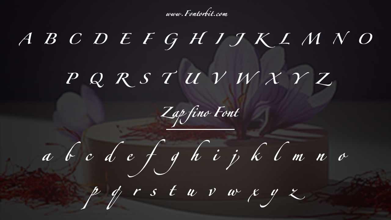
Zapfino Font Info Table:
| Name: | Zapfino Font |
| Format: | ttf |
| Files Count: | 16 |
| Size: | 2 MB |
| Style: | Script |
| License: | Practice/Personal Use Only |
Each of these fonts offers something unique: the extended character set, support for languages like Greek and Cyrillic, or special ligatures and swashes.
Best Pairings With Zapfino: Elevate Your Design
Many designers have shared their experiences working with Zapfino, praising its elegance while acknowledging its challenges. Wedding invitation designers often appreciate Zapfino’s decorative appeal, but readability can sometimes be an issue, especially for names and key details. To address this, many professionals pair Zapfino with a clean, sans-serif font to maintain both beauty and legibility.
The key to successful typography is pairing fonts to allow each typeface to shine. Here are some Zapfino font pairing ideas to make your designs look professional and polished.
1. Zapfino + Helvetica Neue
- Sans-Serif Contrast
- Zapfino: Calligraphic, fluid, ornate
- Helvetica Neue: Clean, modern, sans-serif
Pairing Zapfino with Helvetica Neue creates a beautiful contrast. Zapfino, with its calligraphic style and ornate features, pairs perfectly with the modern, minimalist look of Helvetica Neue. This combination is ideal for headlines or branding materials.
- Why it works: The sleek, modern look of Helvetica Neue contrasts beautifully with Zapfino’s handwritten elegance.
- Use case: Perfect for flyers, posters, and branding materials that require a balance between sophistication and clarity.
- Challenge: Helvetica Neue sometimes feels too stark next to Zapfino’s fluidity.
- Solution: Adjust color, spacing, and size to create harmony.
2. Zapfino + Garamond
- Serif for Classic Elegance
- Zapfino: Decorative, calligraphic
- Garamond: Classic, serif
If you want a pairing that leans more traditional, Zapfino and Garamond work beautifully together. Garamond’s serif styling complements Zapfino’s fluidity, making this combo perfect for elegant invitations or certificates.
- Why it works: Garamond’s timeless design complements Zapfino’s calligraphic font nature.
- Use case: Ideal for wedding invitations, book covers, and certificates.
- Challenge: Risk of both fonts appearing too ornate together.
- Solution: Use Zapfino sparingly for ornaments and Garamond for body text.
3. Zapfino Extra + Avenir
- Elegance Meets Modern Simplicity
- Zapfino Extra: Ornamented, expressive
- Avenir: Sleek, sans-serif
For something a little more contemporary, Zapfino Extra paired with Avenir creates an excellent balance between elegance and modernity. The Zapfino Extra font has a larger range of glyphs and features, while Avenir keeps the design grounded with its modern geometric style.
- Why It Works: Avenir’s smooth, modern lines provide a visual anchor for Zapfino Extra’s fluid, decorative script. This contrast creates a dynamic yet harmonious composition.
- Use Case: High-end invitations, fashion editorials, restaurant branding, and elegant website headers.
- Challenge: Zapfino Extra’s ornate details can feel overly elaborate compared to Avenir’s simplicity.
- Solution: Use Zapfino Extra sparingly for key elements like headlines or accents, while Avenir takes on the body text. Keeping a minimalist color palette helps unify the contrasting styles.
4. Zapfino + Times New Roman
- Classic Elegance with Readability
- Zapfino: Expressive, calligraphic
- Times New Roman: Traditional, serif
Combining Zapfino with Times New Roman offers a balance of style and readability for a timeless look. Zapfino is a focal point, while Times New Roman is a solid, readable body text. This pairing works well for formal documents or wedding invitations.
- Why It Works: Times New Roman’s classic serif design complements Zapfino’s calligraphic strokes without overpowering its decorative appeal. The contrast between the two adds visual interest while maintaining a sense of formality.
- Use Case: Wedding invitations, certificates, formal event programs, and high-end editorial layouts.
- Challenge: The contrast between Zapfino’s fluid script and Times New Roman’s rigid structure can feel disjointed.
- Solution: Use Zapfino for decorative elements like headers or names while relying on Times New Roman for body text. Keeping line spacing generous and choosing an elegant color scheme helps unify the typography.
5. Zapfino + Futura
- Modern & Traditional Mix
- Zapfino: Flowing, decorative
- Futura: Geometric, modern
For a more modern and bold look, pair Zapfino with Futura. Futura’s geometric structure contrasts nicely with Zapfino’s curved lines, making this pairing ideal for eye-catching headlines or creative posters.
- Why It Works: Futura’s geometric simplicity offsets Zapfino’s flowing script.
- Use Case: Luxury branding, product packaging, and advertisements.
- Challenge: The ultra-modern look of Futura may feel disconnected.
- Solution: Utilize similar character variations and color schemes to bridge the styles
Zapfino Extra And Its Variations
As you explore Zapfino Extra and other variants, it’s important to understand how these fonts can enhance your design. Zapfino Extra has several unique features:
- Ligatures and alternate glyphs for more customization
- Extended character set, including Greek and Cyrillic
- Ornaments and flourishes add elegance
This version, designed by Akira Kobayashi, offers more versatility with OpenType features, such as automatic ligatures and contextual glyph substitutions, making it ideal for complex designs.
Why Choose Zapfino For Your Design Projects?
Zapfino brings a unique, calligraphic style to any design. Whether you’re using the basic Zapfino font family or opting for the Zapfino Extra variants, this font is highly versatile. Here are some reasons why it’s a favorite among designers:
- Versatility: Works well in both digital and print designs
- Elegance: Ideal for creating elegant, high-end designs
- Character Variations: Offers a wide range of glyphs and stylistic alternates
- Dynamic: Can adapt to different contexts, from formal invitations to modern branding
Challenges Faced By Designers When Pairing And Solutions
Branding experts have also encountered difficulties when using Zapfino in digital formats. Due to its intricate letterforms, adjustments in kerning and font weight are often necessary to ensure clarity on screens. Careful spacing helps maintain the font’s visual impact without compromising readability.
1.Readability Issues
Zapfino’s elaborate swashes and flourishes can make long passages difficult to read. Use Zapfino only for headlines, short phrases, or as a decorative element.
2.Overuse Of Alternates And Glyphs
The Zapfino Extra X version includes many glyph variations, making text appear chaotic. Limit the number of additional stylistic alternates used per design.
3.Compatibility With Software
Some design tools may not fully support Zapfino’s advanced character map features. Use professional typography software like Adobe Illustrator or InDesign.
4.Finding Similar Fonts
Some designers seek similar fonts to Zapfino due to licensing costs. Consider free fonts like Great Vibes or Dancing Script, though they lack the full elegance of Linotype Zapfino.
For promotional materials such as flyers, designers have found that excessive flourishes can make a layout cluttered. To create a balanced composition, they recommend using Zapfino sparingly. Often for headlines or key elements while keeping the rest of the design simple and structured.
Conclusion
The basic Zapfino font family is an artistic masterpiece but requires careful pairing for maximum impact. Whether combined with sans-serif fonts like Helvetica Neue or elegant serifs like Garamond, thoughtful typography choices will ensure a balanced and visually stunning design.
For more insights, check out related articles on font pairing, typography trends, and the evolution of calligraphic typefaces!
FAQs
1.What Makes Zapfino Different From Other Calligraphic Fonts?
Zapfino is unique due to its wide range of glyphs, ligatures, and alternates, which allow for a highly personalized and elegant design.
2.Can Zapfino Be Used For Body Text?
While Zapfino is best suited for headlines and larger text, its swashes and ornaments make it difficult to use for long-body text.
3.Where Can I Find A Free Version Of Zapfino?
Unfortunately, Zapfino is not available for free, but Zapfino font generators or demo versions may be found online for testing.
4.What Is The Difference Between Zapfino And Zapfino Extra?
Zapfino Extra is an expanded version with additional features, such as more glyphs, ligatures, and language support like Cyrillic and Greek.
5.How Do I Install Zapfino On My Mac?
After purchasing the font, double-click the font file to install it on your Mac. It will then be available in apps like Adobe Illustrator, Photoshop, etc.
6.Can Zapfino Be Used In Commercial Projects?
Yes, Zapfino can be used in commercial projects, but you must purchase a commercial license through Linotype.
7.Is Zapfino Available For Windows?
Zapfino is available for Mac and Windows through Linotype and other font vendors.
8.What Type Of Design Projects Is Zapfino Best For?
Zapfino is ideal for invitations, branding, posters, and any design that requires an elegant, sophisticated touch.


Leave a Comment