Alice in Wonderland Font: Essential & Magical Designs
Yes, you can capture the whimsy of Wonderland with the right fonts! Explore essential Alice in Wonderland-inspired fonts and design tips to bring that magical, whimsical, and slightly curious feel to your projects. Perfect for invitations, branding, and creative displays, these fonts offer a journey down the rabbit hole of imagination.
Ever felt like you’re chasing a White Rabbit down a digital rabbit hole, trying to find that perfect font? The world of typography can sometimes feel overwhelming, especially when you’re aiming for a specific, enchanting vibe. If you’re dreaming of a look that’s playful, a little bit mad, and utterly captivating, like the story of Alice in Wonderland, you might be wondering where to start. Don’t worry! This guide is your looking glass into the delightful world of Alice in Wonderland fonts. We’ll break down what makes a font truly magical and show you exactly how to find and use them to bring your own bit of Wonderland to life.
Unlocking the Magic: What Makes an ‘Alice in Wonderland’ Font?
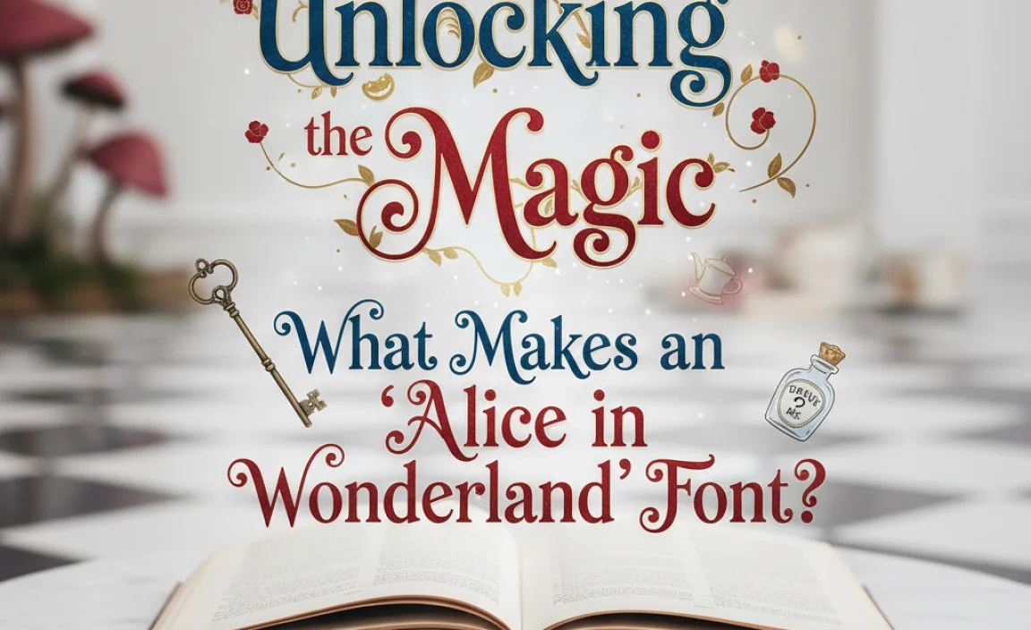
The story of Alice in Wonderland is full of wonder, absurdity, and a unique visual charm. When we talk about an ‘Alice in Wonderland font,’ we’re not just talking about one specific typeface. Instead, we’re referring to a style that evokes the spirit of Lewis Carroll’s beloved tale. These fonts often share several key characteristics:
- Whimsical and Playful: They have a lighthearted, often slightly exaggerated feel. Think of the playful illustrations that accompany the story.
- Curious and Eccentric: A touch of the unexpected is common. This might come through in unique letterforms, unusual curves, or a sense of movement.
- Handwritten or Calligraphic Vibe: Many fonts that capture this essence mimic the look of ornate handwriting, brush strokes, or even quirky lettering found in old storybooks.
- Decorative Elements: Some fonts might include flourishes, ligatures (connected letters), or swashes that add a decorative, almost magical touch.
- Varied Weights and Styles: Often, a good ‘Wonderland’ font will have variations that allow for different moods – from a more formal, slightly spooky invitation to a free-flowing, madcap banner.
It’s this blend of familiarity and surprise that draws us to fonts that echo the Alice character and her fantastical journey. They invite the viewer into a world where the ordinary becomes extraordinary.
Finding Your Wonderland: Essential Alice-Inspired Font Styles
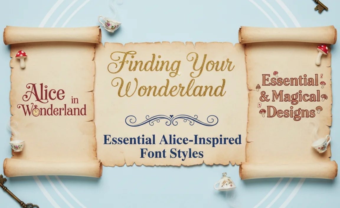
While there isn’t a single, officially licensed “Alice in Wonderland” font that every designer uses, many typefaces perfectly capture its spirit. These fonts often fall into categories like script, display, or decorative styles. Let’s explore some popular types and what makes them so fitting:
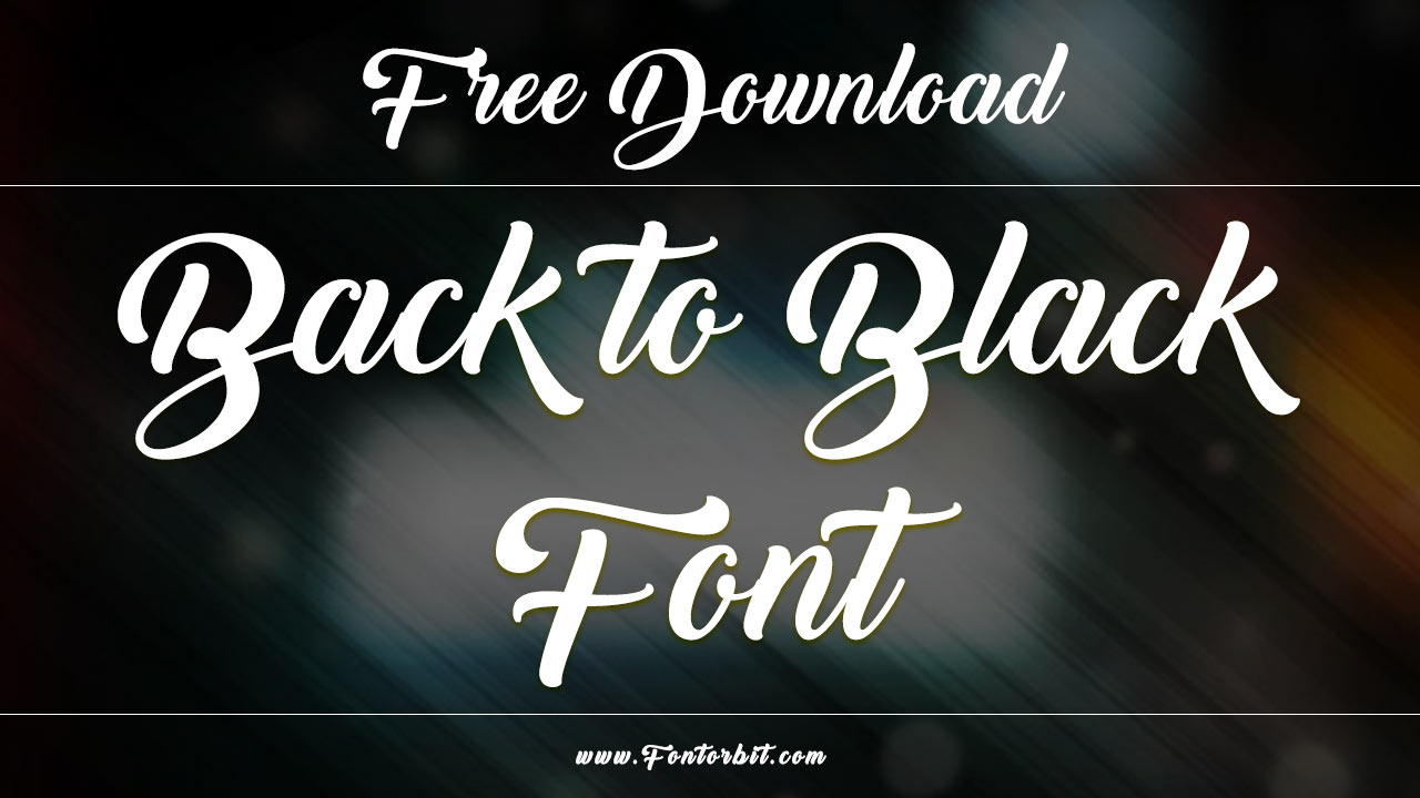
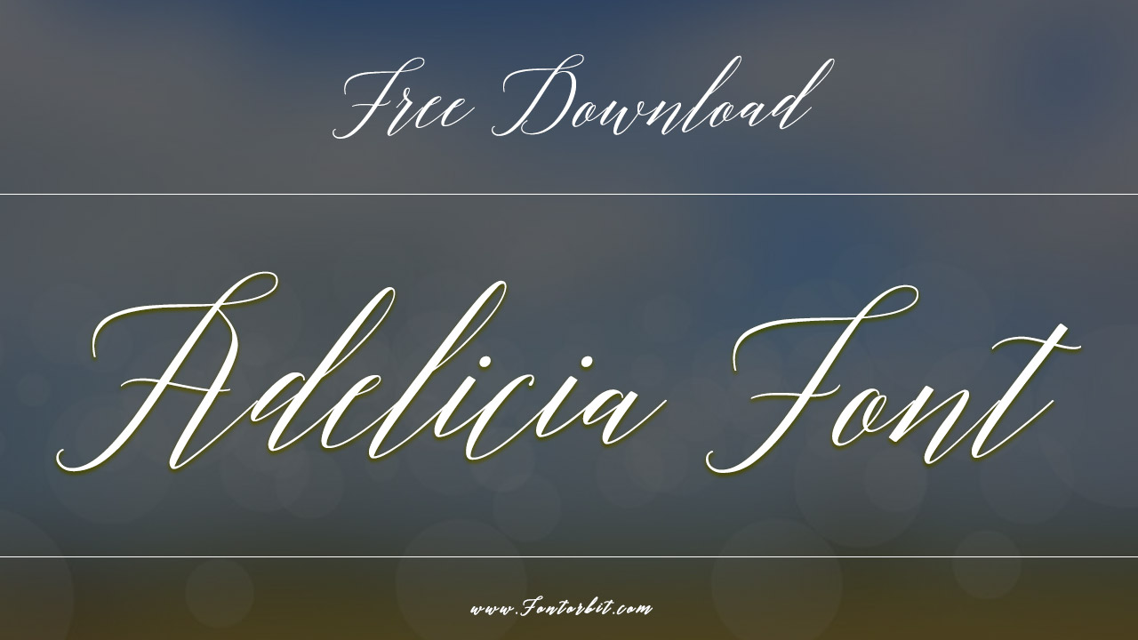
1. Whimsical Script Fonts
These fonts mimic the fluid, often elegant, and sometimes slightly uneven strokes of handwriting. They are excellent for creating a personal, enchanting, and inviting feel, much like a handwritten invitation from the Mad Hatter himself.
- What to Look For: Varied stroke widths, gentle curves, a sense of upward or downward flow, and occasional elaborate flourishes.
- Best For: Headlines, invitations, personal branding, quotes, and decorative elements.
- Example Concept: Imagine a font that looks like it was written with a quill dipped in ink, with letters that playfully dance across the page.
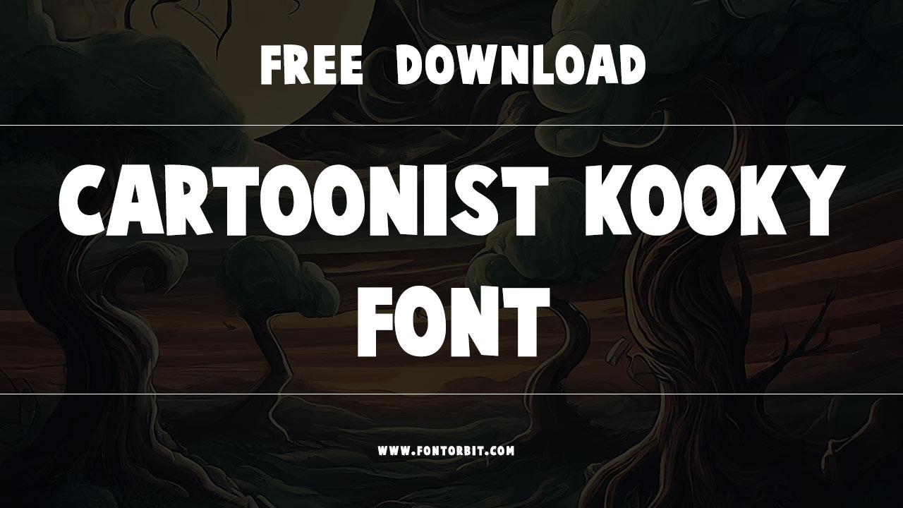
2. Enchanting Display Fonts
Display fonts are designed to grab attention. In the context of Wonderland, these fonts are often bolder, more decorative, and might feature unique shapes or proportions. They’re perfect for making a statement.
- What to Look For: Bold serifs, unusual letter shapes, decorative embellishments, or a slightly vintage storybook feel.
- Best For: Titles, logos, posters, book covers, and any design element that needs to stand out with personality.
- Example Concept: Think of oversized, ornate letterforms reminiscent of old circus posters or elaborate titles in classic storybooks, but with a touch of surrealism.
3. Quirky Handwritten Fonts
These fonts go for an even more casual, sometimes deliberately imperfect, handwritten look. They can feel very approachable and add a touch of charming authenticity.
- What to Look For: Irregular lines, varying letter heights, a relaxed baseline, and a friendly, approachable character.
- Best For: Casual branding, social media graphics, blog titles, packaging, and designs aiming for a friendly, unpretentious feel.
- Example Concept: Picture a font that looks quickly sketched, with a spontaneity that feels spontaneous and a little bit charmingly messy.
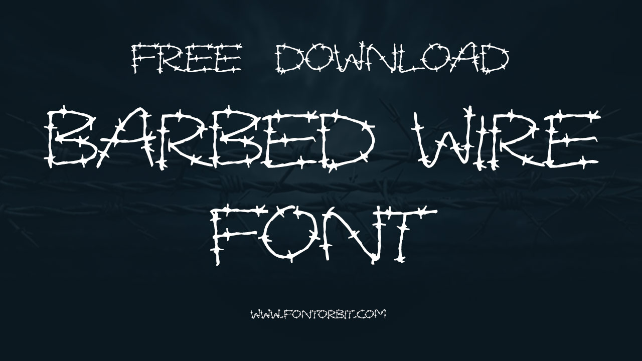
4. Decorative and Themed Fonts
Some fonts are explicitly designed with a specific theme in mind, and you can find typefaces that directly evoke Victorian eras, fantasy, or circus aesthetics, all of which connect strongly with the visual language of Alice in Wonderland.
- What to Look For: Ornate details, Victorian-inspired serifs, circus-style lettering, or even fonts with subtle thematic elements like playing card symbols or mushrooms.
- Best For: Highly thematic projects, party invitations, themed events, and designs where you want a very direct nod to the story.
- Example Concept: A font that combines Victorian elegance with a hint of the bizarre, perhaps with letters that seem to stretch or bend in unexpected ways.
Where to Discover Magical Fonts
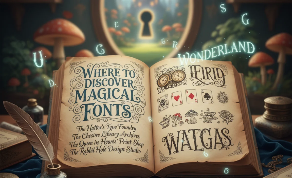
The good news is that finding these enchanting fonts is easier than finding a potion that makes you grow or shrink! Numerous online platforms offer a vast library of typefaces, many of which are free or available for affordable licensing. Here are some excellent places to start your font exploration:
| Font Resource | Description | Best For |
|---|---|---|
| Google Fonts | A massive library of free, open-source fonts. Search by style (e.g., “handwriting,” “display”) or browse their collections. Excellent for web design and many commercial uses. | Websites, digital graphics, print design (with proper licensing checks for commercial print). |
| Font Squirrel | Curated selection of free fonts, often with commercial licenses. They also have a great font identifier tool. | Commercial print projects, branding, websites. |
| Adobe Fonts | Included with Adobe Creative Cloud subscriptions, this is a vast, high-quality library. Easy to activate and use across Adobe apps. | Professional design projects, web design, print. |
| Creative Market | A marketplace for independent creators selling fonts, graphics, and more. You’ll find unique, handcrafted fonts here. | Unique branding, special projects, premium design needs. |
| MyFonts | One of the largest font marketplaces, offering a huge range from independent foundries and major distributors. | Professional design, broad selection for any project. |
When downloading fonts, always check the license. Free fonts often have generous licenses, but some may restrict commercial use. Platforms like Google Fonts provide clear licensing information for each typeface, ensuring you can use them legally and confidently.
Practical Tips for Using Alice in Wonderland Fonts Effectively
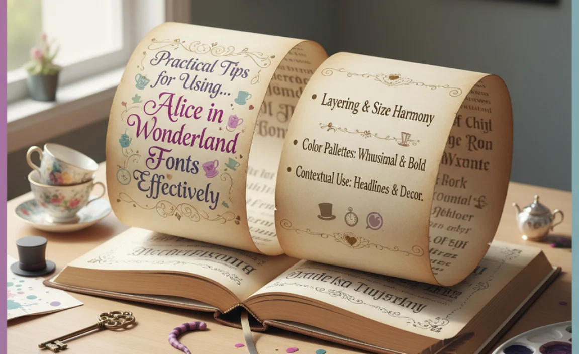
Selecting the right font is just the first step. Using it in a way that’s both magical and effective requires a little finesse. Here’s how to make your chosen ‘Wonderland’ font shine:
1. Balance is Key: Pair with Complementary Fonts
Highly decorative or whimsical fonts can be difficult to read in large blocks of text. The trick is to pair them strategically. Use your ‘Wonderland’ font for headlines, titles, or key phrases, and then choose a clean, legible font for body text.
- Rule of Thumb: If your display font is busy, choose a simple, sans-serif or serif font for readability.
- Great Pairings:
- Open Sans, Roboto, Lato (clean sans-serifs)
- Merriweather, Noto Serif, PT Serif (classic serifs)
For example, you might use a playful script font for your event’s main title and then switch to a readable serif font for the date, time, and location details. This contrast creates visual interest while ensuring your message is clear.
2. Legibility Over Allure (Mostly!)
While you want that magical feel, your audience still needs to be able to read what you’ve designed. If a font is too ornate, has letters that are too difficult to decipher, or is too small, it can frustrate your readers.
- Test Readability: Read your text aloud. If you stumble or find yourself confused, the font might be too much for the intended text.
- Consider Context: A logo might get away with slightly less readable, highly stylized lettering because it’s viewed in short bursts and its visual impact is paramount. Body copy needs to be crystal clear.
Think about the user experience. For a website, using an unreadable font for primary navigation would be a significant mistake, no matter how whimsical it looks. For a decorative element or a short, impactful quote, it can work wonders.
3. Leverage Color and Context
The ‘Alice in Wonderland’ theme is rich with visual cues. You can enhance the font’s impact by pairing it with a complementary color palette (think jewel tones, pastels, or bold primary colors) and relevant imagery.
- Color Psychology: Vibrant colors can amplify the playful nature of the font. Muted or darker tones might add a touch of mystery or elegance.
- Visual Hierarchy: Use font size, weight, and color to guide the reader’s eye. The most important information should be the most prominent.
Consider the original illustrations by John Tenniel. His detailed, often slightly dark, but whimsical drawings set a precedent. You can draw inspiration from these by using black and white elements alongside pops of color, or by incorporating illustrations that align with the font’s mood. The original John Tenniel illustrations offer a wealth of visual inspiration.
4. Use Gradients and Textures Sparingly
Some fonts, especially those with a vintage or decorative feel, can benefit from subtle gradients or textures. However, use these with caution. Too much can make the text look muddy and unreadable.
- Subtle Gradients: Can add depth and a touch of magic without compromising legibility.
- Texture Overlays: A slight distressed texture or subtle paper effect can enhance a vintage or storybook feel.
The goal is to add character, not clutter. A good way to approach this is to view your design from a distance to ensure the text remains clear.
5. Understand Licensing for Your Project
This is crucial, especially for commercial projects. Fonts come with licenses that dictate how you can use them. For personal projects like a private party invitation, free fonts are often perfectly fine. However, for business logos, websites, or products you sell, you’ll likely need commercial-use fonts or a license that covers that specific usage.
- Personal Use: For your own non-commercial projects.
- Commercial Use: For projects intended to generate revenue or promote a business.
- Webfont License: For use on websites, often priced based on traffic.
- Desktop License: For use in design software on your computer.
Many excellent ‘Wonderland’-style fonts are available through platforms like Google Fonts or Font Squirrel, which offer clear guidance on open-source and free commercial licenses. For premium fonts, always carefully review the terms of service provided by the font foundry or marketplace.
Designing with a Theme: Specific Use Cases
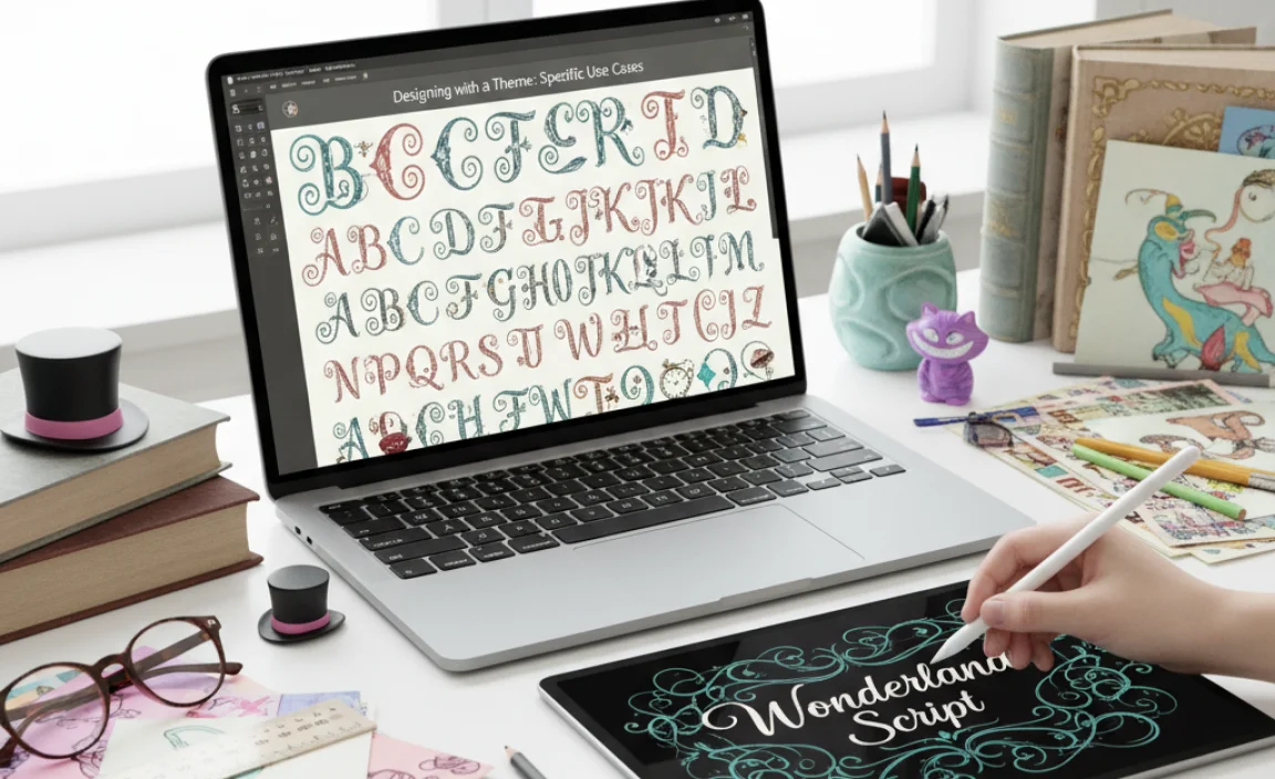
The ‘Alice in Wonderland’ aesthetic is incredibly versatile and can be applied to a surprising range of design projects. Here are a few ideas to spark your creativity:
Party Invitations
This is perhaps the most obvious and popular use. A vintage script or a playful display font can set the tone for a whimsical birthday party, a themed wedding, or a quirky Mad Hatter’s tea party.
- Elements to Include:
- A catchy, thematic headline (e.g., “You’re invited to a madly wonderful party!”).
- Decorative borders inspired by playing cards or vines.
- A color palette of soft pastels, rich purples, and pops of red.
- A handwritten-style font for the invitation details.
Branding for Creative Businesses
If your brand is all about creativity, imagination, or a touch of the whimsical, an ‘Alice’ inspired font can be a fantastic choice for your logo or marketing materials.
- Suitable Businesses: Toy stores, children’s book publishers, fantasy-themed shops, creative agencies, event planners, or artisanal bakeries.
- Logo Design: A unique display font can help your logo stand out and communicate your brand’s playful personality.
- Website Design: Use it for headings and calls to action to create an engaging user experience.
Book Covers and Editorial Design
For authors and publishers looking to create a sense of magic, adventure, or a journey into fantasy, an ‘Alice in Wonderland’ typeface can be the perfect choice for a book cover or the interior design of a fantasy novel.
- Cover Design: A bold, decorative font for the title can instantly attract readers.
- Interior Layout: Consider using a playful font for chapter titles or pull quotes to add visual flair.
Promotional Graphics and Social Media
Catch attention in a crowded digital space with graphics that pop. Use these fonts for social media posts, blog headers, or promotional banners to convey a fun and engaging message.
Consider using tools like Canva or Adobe Express (formerly Adobe Spark), which offer a wide selection of fonts and templates to help you create eye-catching designs quickly. Many include fonts that fit the whimsical theme.
Choosing a Font: A Quick Checklist
Before you commit to a font, run through this quick checklist to ensure it’s the right fit:
- Does it fit the mood? Does it evoke wonder, playfulness, or curiosity?
- Is it readable? Can your audience easily understand the text? Consider its use case.
- What is the license? Is it suitable for your project (personal/commercial)?
- Does it pair well? Can you find a good complementary font for body text?
- Does it have enough characters? Does it include all the letters, numbers, and punctuation you’ll need? (Some decorative fonts can be limited).
Frequently Asked Questions (FAQ)
What is the most common font associated with Alice in Wonderland?
There isn’t one single “official” font. However, fonts that mimic Victorian-era lettering, ornate scripts, or playful, slightly erratic handwritten styles are most often associated with the story’s whimsical aesthetic.
Can I use Alice in Wonderland fonts for commercial projects?
It depends on the specific font’s license. Many free fonts are only for personal use. Always check the license agreement before using any font for commercial purposes (like logos, websites, or products). Paid fonts usually come with clearer licensing options.
How do I make a whimsical font readable?
Pair it with a clean, simple font for body text. Use the whimsical font for headlines, titles, or short phrases where its decorative nature enhances impact without hindering clarity. Keep decorative fonts at larger sizes for better legibility.
Where can I find free fonts that look like they’re from Alice in Wonderland?
Websites like Google Fonts, Font Squirrel, and DaFont offer a vast selection of free fonts. Search for terms like “script,” “handwritten,” “display,” “decorative,” or “Victorian” to find suitable options.
What kind of imagery works well with Alice in Wonderland fonts?
Illustrations reminiscent of classic storybooks, vintage playing cards, mushrooms, teacups, clocks, or fantastical creatures (like flamingos and cheshire cats) complement these fonts perfectly. The original John Tenniel illustrations are a prime source of inspiration.
Should I use a font with a lot of swashes or flourishes?
Swashes and flourishes can add a lot of charm and a magical feel. However, use them judiciously, especially in longer texts, as they can sometimes decrease readability. They work best as decorative elements or in short, impactful phrases.


Leave a Comment