Bolded Quick Summary
Changing InDesign font color is straightforward! Select your text, then use the Color panel, Swatches panel, or the Character Formatting Controls panel to pick a new hue. You can choose from existing swatches, create new custom colors, or even use eyedropper tools for precise matching. This guide breaks down each method with simple steps.
Welcome to FontOrbit! As a fellow font lover and design enthusiast, I know how crucial the little details are. One of those details is font color. It might seem simple, but getting the color just right can dramatically impact your design’s readability, mood, and overall appeal. Sometimes, the default colors just don’t cut it, or you need to match a specific brand guideline. It can be a bit confusing when you’re starting out in Adobe InDesign to navigate all the options for changing text color. But don’t worry! We’ll walk through this together, step-by-step, so you can confidently tweak your text colors and make your InDesign projects shine.
Throughout this guide, we’ll explore the easiest ways to change your font color in InDesign, ensuring your designs look professional and intentional. Let’s dive in!
Why Font Color Matters in Design

Before we get our hands dirty with InDesign’s tools, let’s quickly chat about why this seemingly small change is so significant. Font color isn’t just about aesthetics; it’s a powerful communication tool.
- Readability: The most crucial function! The right color contrast between text and its background ensures your audience can read with ease. Poor contrast can lead to eye strain and a frustrating user experience.
- Emphasis: You can draw attention to specific words, phrases, or headlines by giving them a different color. This guides the reader’s eye and highlights key information.
- Branding: Consistent use of brand colors for text helps reinforce brand identity. Think of how Coca-Cola’s red or Google’s primary colors are instantly recognizable.
- Mood and Emotion: Colors evoke feelings. A bright, vibrant color might convey energy and excitement, while a muted, darker tone could suggest sophistication or seriousness.
- Hierarchy: Differing font colors can help establish a visual hierarchy, distinguishing between headings, subheadings, and body text.
Adobe InDesign offers a robust set of tools to manage color, giving you incredible control over your typography. Understanding these options is key to producing polished, effective designs.
Understanding Color Basics in InDesign
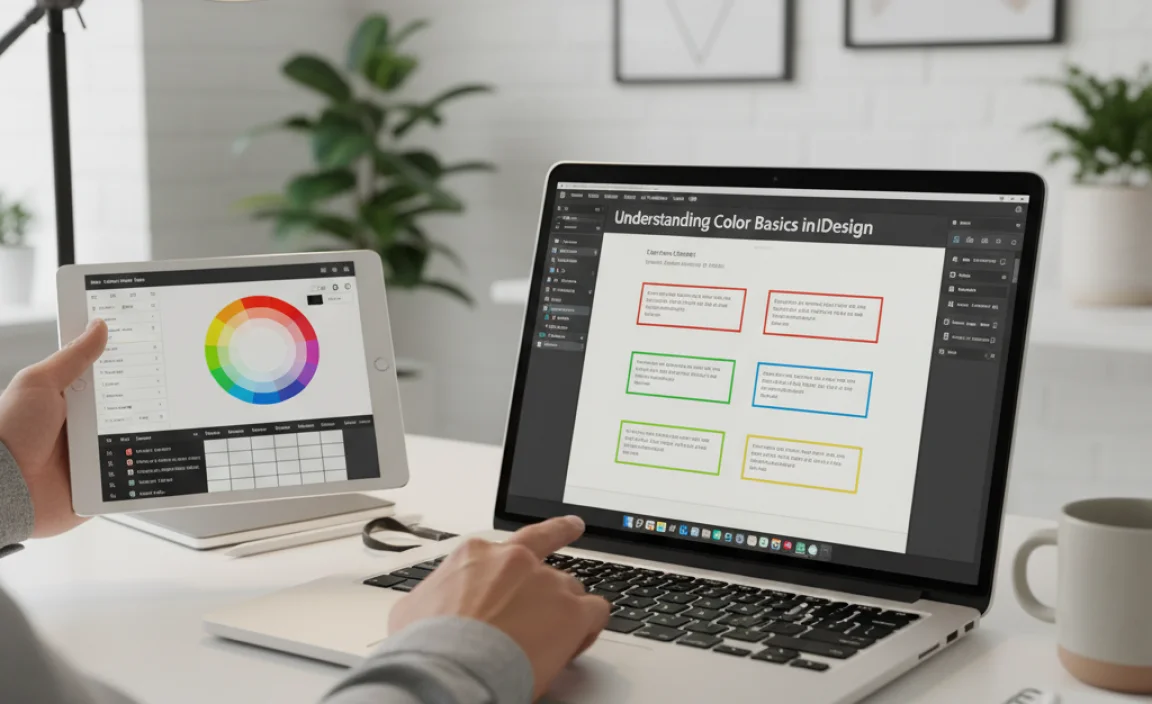
InDesign primarily works with two color modes that are important for designers: RGB and CMYK. Knowing the difference helps ensure your colors appear as intended, whether for print or digital use.
RGB (Red, Green, Blue): This is an additive color model used for digital displays like monitors, websites, and mobile screens. Colors are created by combining red, green, and blue light. When designing for screen, you’ll typically work with RGB colors.
CMYK (Cyan, Magenta, Yellow, Key/Black): This is a subtractive color model used for professional printing. Colors are created by subtracting light from a white surface using inks. If your project is destined for a printer (brochures, business cards, magazines), you’ll want to use CMYK colors.
InDesign allows you to switch between these modes and define your colors accordingly. When changing font color, you’ll often be selecting from predefined color swatches or creating your own, which can be either RGB or CMYK.
Method 1: Using the Swatches Panel
The Swatches panel is your go-to place for managing colors in InDesign. It stores all the colors used in your document, making it easy to apply and reuse them.
Step-by-Step: Changing Font Color with Swatches
- Select Your Text: First, you need to tell InDesign which text you want to color. Use the Type Tool (T) to click and drag over the text you wish to modify. You can select a single character, a word, a paragraph, or even an entire text frame.
- Open the Swatches Panel: If the Swatches panel isn’t already visible, go to the menu bar and select Window > Color Swatches. A panel with various color squares will appear.
- Choose a Color: In the Swatches panel, you’ll see a list of available colors. These might include default colors like [Paper], [Black], [Registration], and any custom colors you or others have added. Click on the color square representing the hue you want to apply to your selected text. The text will instantly update.
- Applying Stroke vs. Fill: Notice that when you select text, two small colored squares appear in the Tools panel and often in the Control panel: one for the Stroke (outline) and one for the Fill (the actual color of the text). Make sure the Fill square is active (it will have a darker border around it) before clicking a swatch. If the Stroke square is active, clicking a swatch will change the text’s outline color, not its fill. You can toggle which one is active by clicking on the respective square or pressing ‘X’ on your keyboard.
Tip: For print projects, always ensure your colors are CMYK. For web or screen-based projects, use RGB. You can check or set your document’s color mode under File > Document Setup.
Method 2: Using the Color Panel
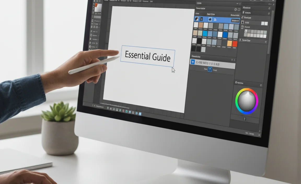
The Color panel offers a more direct way to select and define colors, especially if you want to create a new custom color on the fly.
Step-by-Step: Changing Font Color with the Color Panel
- Select Your Text: As before, use the Type Tool (T) to highlight the text you want to change.
- Open the Color Panel: Go to Window > Color. This panel allows you to define colors using sliders or by entering specific values.
- Activate the Fill Box: Ensure the Fill box (the square representing the text’s color) is active in the Color panel. You can click it, or press ‘X’ to ensure it’s in front.
- Choose Your Color Model: At the top of the Color panel, you can choose how you want to define your color:
- [Paper]: This is essentially white (or transparent, depending on the background).
- [Black]: A solid black.
- RGB Color: Click the circle icon to use the RGB model. Adjust the Red, Green, and Blue sliders or input numerical values (0-255) to create your desired color.
- CMYK Color: Click the square icon to use the CMYK model. Adjust the Cyan, Magenta, Yellow, and Black sliders or input numerical values (0-100%) to define your color.
- Apply the Color: As you adjust the sliders, the selected text will update in real-time. Once you’re happy with the color, you can continue working.
- Adding the New Color to Swatches (Optional but Recommended): To easily reuse this custom color later, click the “New Swatch” button at the bottom of the Swatches panel (it looks like a small page icon with a folded corner). This will add your newly created color to your document’s swatches. You can then double-click the new swatch to name it.
Pro Tip: When working with CMYK, be mindful that the full CMYK spectrum can generate very dark colors. For rich blacks (often used for body text), consider using a rich black build (e.g., C:30%, M:30%, Y:30%, K:100%) rather than 100% K alone for better depth in print. However, for small text sizes, 100% black is usually recommended to prevent misregistration.
Method 3: Using the Character Formatting Controls (Control Panel)
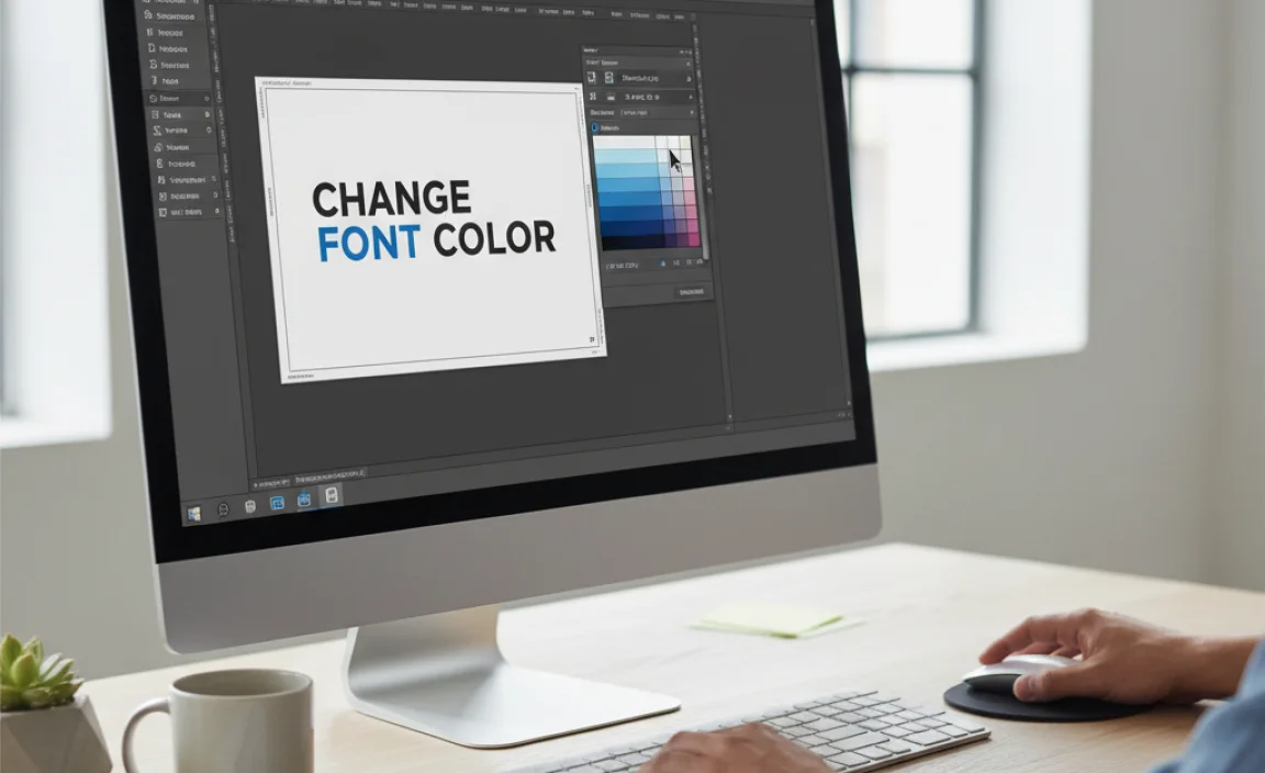
For quick adjustments directly on your layout, the Control panel is incredibly useful. It provides context-sensitive tools, showing options relevant to your current selection.
Step-by-Step: Changing Font Color with the Control Panel
- Select Your Text: Highlight the text you wish to color using the Type Tool (T).
- Locate the Control Panel: If the Control panel isn’t visible, go to Window > Control. This panel typically appears at the top or bottom of your InDesign workspace.
- Find the Fill Color Option: Look for a colored square icon labeled “Character Fill Color” or a similar indicator. It might be near the font family, size, and leading options.
- Click the Swatch Icon: Click the small arrow next to the Fill Color square. A dropdown menu will appear, showing your document’s swatches.
- Select a Swatch: Choose the desired color from the dropdown by clicking on its swatch. The selected text will update immediately.
- Applying Custom Colors: If you need to apply a color not yet in your swatches, you can click the “More Options” (three dots) or a similar button associated with the fill color to open a more detailed color picker, similar to the Color panel.
The Control panel is fantastic for on-the-fly changes without needing to open separate panels. It’s particularly helpful when you’re focused on layout and flow.
Method 4: Using the Eyedropper Tool
The Eyedropper tool is a lifesaver when you need to perfectly match a color from an image or another element within your InDesign document, or even from outside InDesign.
Step-by-Step: Using the Eyedropper Tool
- Select Your Text: Highlight the text you want to re-color using the Type Tool (T).
- Select the Eyedropper Tool: Find the Eyedropper Tool in the Tools panel (it looks like an eyedropper). Its shortcut is ‘I’.
- Set the Eyedropper to Target Fill: Click the Fill square in the Tools panel or Color panel to make sure the Eyedropper is set to “sample” and “apply” color to the fill of text.
- Sample the Color: Move your cursor over the color you want to sample. This could be a color from an imported image, a shape, or any other object on your page. Your cursor will change to show it’s picking up the color. Click once.
- Apply the Sampled Color: The sampled color is now applied to your selected text. If you plan to use this sampled color again, it’s a good idea to add it to your Swatches panel by clicking the “New Swatch” button in the Swatches panel.
Advanced Note: The Eyedropper tool can also sample font properties like font family, size, leading, and tracking. To do this, hold down Alt (Windows) or Option (Mac) while clicking on the source text. Then, with the Eyedropper still active, click on the target text to apply those properties.
Working with Gradients and Patterns as Font Colors
While solid colors are most common, InDesign also allows you to fill text with gradients and patterns for more dynamic effects. These are applied similarly to solid colors but through different panels.
Applying Gradients to Text
- Select Text: Highlight the text using the Type Tool (T).
- Create or Load a Gradient: Go to Window > Gradient. You can choose from existing gradients, edit them, or create new ones by clicking on the gradient bar and adjusting the colors that appear below.
- Apply the Gradient: With the text selected and the Fill box active, click on the gradient swatch in the Swatches panel or select a gradient from the Gradient panel. The text will now display the gradient.
- Adjusting Gradient Direction: To control how the gradient flows across your text, select the Gradient Swatch Tool (G). Click and drag across your text to define the start and end points and direction of the gradient.
Applying Patterns to Text
- Define or Load Patterns: Patterns need to be set up in your Swatches panel first. You can add predefined patterns or import them. For advanced pattern creation and management, you might use services like Adobe Illustrator to create custom vector patterns, then save them as swatches in InDesign.
- Apply the Pattern: Select your text. In the Swatches panel, click on the pattern you wish to apply to the text’s fill.
- Adjusting Pattern Scale and Rotation: If the pattern doesn’t look quite right, you might need to scale or rotate it. Use the Free Transform Tool (E) and hold down Shift if needed, then adjust the scaling percentage in the Control panel or Transform panel. For fine-tuned control over pattern placement within text, you can use the Object > Transform > Scale, Rotate, and Shear options, ensuring “Transform Patterns Only” is checked.
Color Settings for Print vs. Web
Choosing the right color mode is critical for professional output. Mixing up CMYK and RGB can lead to unexpected color shifts.
For Print Projects:
- Always set your InDesign document to CMYK color mode. Go to File > Document Setup and choose CMYK from the Intent or Color Mode dropdown.
- Use CMYK process colors or defined spot colors from a reputable color system like Pantone.
- Define your text colors using CMYK sliders in the Color panel or select CMYK swatches.
- If using custom CMYK builds, be aware of total ink limits, especially for large, solid areas. High ink coverage can cause issues like slow drying or smudging. For text, this is less of a concern unless it’s very large.
- A reliable resource for understanding print color profiles is Adobe’s own documentation on color management in InDesign.
For Digital/Web Projects:
- Set your document to RGB color mode.
- Choose colors using the RGB sliders.
- Be aware that screen colors can vary greatly depending on the monitor’s calibration. What looks bright on your screen might appear differently on another.
- When exporting for web, ensure your export settings (like JPEG or PNG) are configured for RGB.
Color Modes Comparison Table
| Feature | RGB | CMYK |
|---|---|---|
| Primary Use | Digital screens (web, apps, video, social media) | Professional printing (brochures, magazines, packaging) |
| Color Model | Additive (light) | Subtractive (ink) |
| Color Gamut | Wider range, more vibrant colors possible | Smaller range, colors can appear less saturated than RGB |
| InDesign Panel | Color Panel (RGB sliders), Swatches (RGB swatches) | Color Panel (CMYK sliders), Swatches (CMYK swatches) |
| Export for… | Web (JPG, PNG, GIF), Digital PDF | Print (PDF/X, TIFF), Print-ready files |
Tips for Effective Font Coloring
Beyond just knowing how to change the color, here are some expert tips to make your font choices impactful:
- Contrast is King: Always prioritize readability. Ensure enough contrast between your text color and its background. A general rule is that light text needs a dark background, and dark text needs a light background. Tools like Adobe Color (web) or contrast checkers in accessibility plugins can help verify this.
- Limit Your Palette: While InDesign offers millions of colors, using too many can make your design look chaotic. Stick to a defined color palette, often aligned with brand guidelines.
- Use Color Purposefully: Assign meaning to your colors. For instance, use a specific brand accent color only for calls to action or important keywords.
- Consider Accessibility: For designs viewed by a wide audience, especially online, ensure sufficient color contrast ratios to meet accessibility standards (like WCAG 2.0). Tools designed for web accessibility can offer guidance here. The Web Content Accessibility Guidelines (WCAG) provide detailed standards.
- Test Your Colors: If printing, get a proof to check how the colors appear on the
.lwrp.link-whisper-related-posts{
margin-top: 40px;
margin-bottom: 30px;
}
.lwrp .lwrp-title{
}.lwrp .lwrp-description{
}
.lwrp .lwrp-list-container{
}
.lwrp .lwrp-list-multi-container{
display: flex;
}
.lwrp .lwrp-list-double{
width: 48%;
}
.lwrp .lwrp-list-triple{
width: 32%;
}
.lwrp .lwrp-list-row-container{
display: flex;
justify-content: space-between;
}
.lwrp .lwrp-list-row-container .lwrp-list-item{
width: calc(25% – 20px);
}
.lwrp .lwrp-list-item:not(.lwrp-no-posts-message-item){
max-width: 150px;
}
.lwrp .lwrp-list-item img{
max-width: 100%;
height: auto;
object-fit: cover;
aspect-ratio: 1 / 1;
}
.lwrp .lwrp-list-item.lwrp-empty-list-item{
background: initial !important;
}
.lwrp .lwrp-list-item .lwrp-list-link .lwrp-list-link-title-text,
.lwrp .lwrp-list-item .lwrp-list-no-posts-message{
}@media screen and (max-width: 480px) {
.lwrp.link-whisper-related-posts{
}
.lwrp .lwrp-title{
}.lwrp .lwrp-description{
}
.lwrp .lwrp-list-multi-container{
flex-direction: column;
}
.lwrp .lwrp-list-multi-container ul.lwrp-list{
margin-top: 0px;
margin-bottom: 0px;
padding-top: 0px;
padding-bottom: 0px;
}
.lwrp .lwrp-list-double,
.lwrp .lwrp-list-triple{
width: 100%;
}
.lwrp .lwrp-list-row-container{
justify-content: initial;
flex-direction: column;
}
.lwrp .lwrp-list-row-container .lwrp-list-item{
width: 100%;
}
.lwrp .lwrp-list-item:not(.lwrp-no-posts-message-item){
max-width: initial;
}
.lwrp .lwrp-list-item .lwrp-list-link .lwrp-list-link-title-text,
.lwrp .lwrp-list-item .lwrp-list-no-posts-message{
};
}


Leave a Comment