Choosing the right widget font is crucial for usability, branding, and user experience. Select fonts that are highly readable, reflect your brand’s personality, and are optimized for digital displays to ensure your widgets are both functional and visually appealing.
Choosing the right font for your widget can feel like a big decision. It impacts how users see your brand and interact with your content. If the font is hard to read or doesn’t match your style, people might miss important information or click away. Don’t worry, though! I’m here to guide you through it step-by-step. We’ll break down how to pick a font that makes your widget look great and work perfectly. Let’s dive in and find the ideal font together!
Frequently Asked Questions
What is a widget font?
A widget font is the typeface used to display text within a digital widget, such as those found on websites, dashboards, or mobile applications. It’s the visual style of the words that users read and interact with.
Why is font choice important for widgets?
Font choice significantly impacts readability, user experience, and brand perception. A good font makes information easy to digest, guides user interaction, and reinforces your brand’s identity. A poor choice can lead to confusion and a negative impression.
What makes a font “readable” for widgets?
Readability in widget fonts means the text is easy to see and understand, especially at small sizes and on various screen resolutions. Key factors include clear letterforms, sufficient spacing, and good contrast with the background.
Can I use any font I like for my widget?
While you have many options, it’s best to choose fonts designed for digital use or those with excellent legibility. Highly decorative or very thin fonts might not render well on all screens or at small sizes, impacting usability.
How do I ensure my widget font works on different devices?
Use web-safe fonts or fonts available through reputable font services like Google Fonts or Adobe Fonts. These are optimized and readily available across different operating systems and browsers, ensuring consistency.
What’s the difference between serif and sans-serif fonts for widgets?
Sans-serif fonts (without feet) are generally preferred for digital interfaces and widgets because their clean lines are often clearer on screen. Serif fonts (with feet) can sometimes feel too busy or blurry at small sizes on digital displays.
How can a font convey my brand personality?
Fonts have distinct personalities. A sleek sans-serif can feel modern and professional, a rounded font can be friendly, and a more structured font might convey authority. Choosing a font that aligns with your brand values is key.
Choosing The Widget Font: An Essential Guide
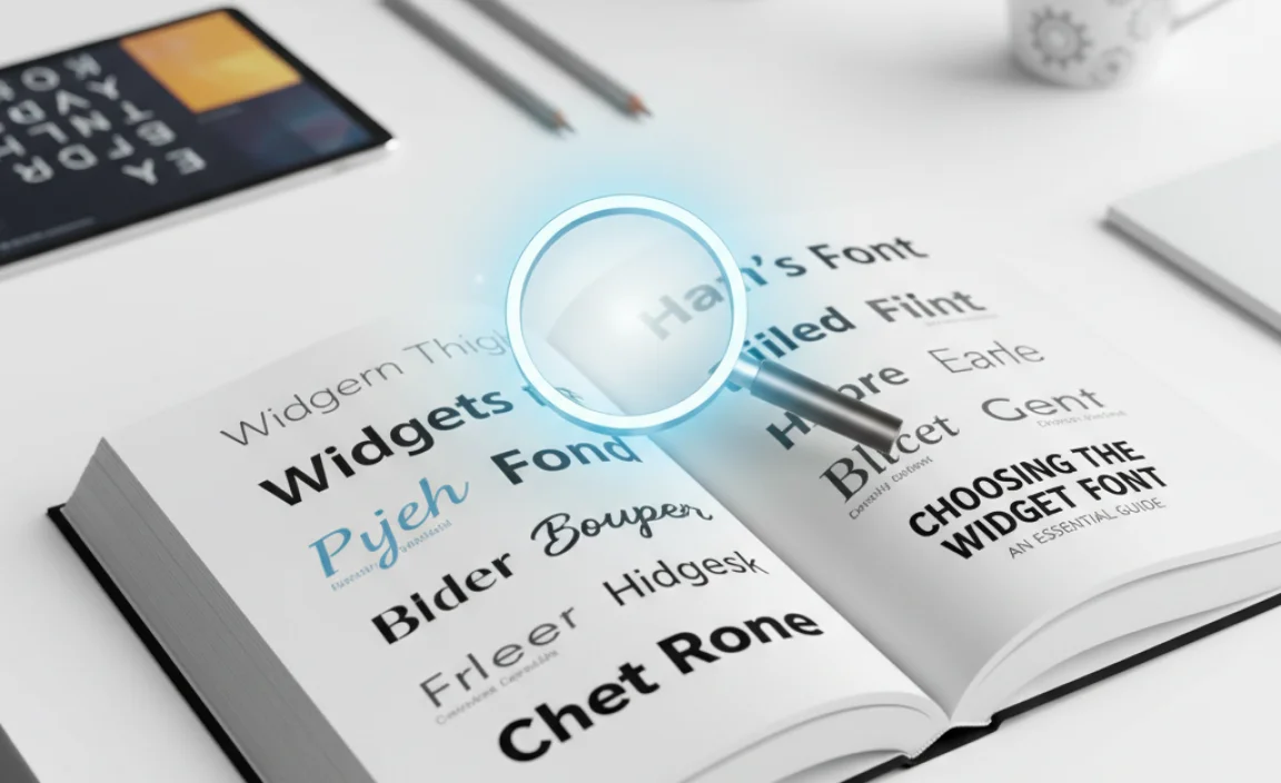
Picking the right font for your widget is more than just an aesthetic choice; it’s a critical step in ensuring great user experience and effective communication. A well-chosen font enhances readability, strengthens your brand identity, and can even improve the overall functionality of your digital product. Let’s explore how to make this important decision with confidence.
Step 1: Understand Your Widget’s Purpose and Audience
Before you even look at fonts, think about what your widget does and who will be using it. Is it a simple weather update? A complex data dashboard? A social media feed? Knowing this helps you tailor the font choice to the context.
Consider your audience:
- Age: Older audiences might benefit from larger font sizes and very clear, legible typefaces.
- Technical Savvy: Users familiar with digital interfaces might be more forgiving of less common fonts, but clarity should always be the priority.
- Context of Use: Will the widget be viewed on a large desktop screen or a small mobile device? This will heavily influence font size and weight choices.
A widget designed for quick glances on a mobile phone needs different font characteristics than one displaying detailed financial reports on a large monitor.
Step 2: Prioritize Readability Above All Else
This is the golden rule of widget font selection. If users can’t easily read the text, the widget fails its primary purpose. Readability is about how easily the characters can be distinguished and understood.
Key factors for readability include:
- Clear Letterforms: Avoid fonts with overly stylized or ambiguous characters. For example, ‘i’, ‘l’, and ‘1’ should be distinct, as should ‘0’ and ‘O’.
- Appropriate x-height: The x-height is the height of lowercase letters like ‘x’. Fonts with a larger x-height are generally easier to read at small sizes.
- Generous Spacing: Both letter spacing (kerning) and word spacing are vital. Too tight, and it becomes a blur; too loose, and it breaks the flow.
- Weight and Contrast: Choose font weights that offer good contrast with the background. Regular or medium weights are often best for body text in widgets.
Serif vs. Sans-Serif for Widgets
For digital interfaces, especially widgets where space can be limited and screens vary, sans-serif fonts are generally the preferred choice. Their clean lines tend to render more crisply on screens, especially at smaller sizes. Serif fonts, with their decorative strokes (serifs), can sometimes appear too busy or fuzzy on lower-resolution displays. However, some modern serif fonts are designed with digital readability in mind.
| Font Type | Pros for Widgets | Cons for Widgets | Best Use Cases |
|---|---|---|---|
| Sans-Serif | Excellent screen readability, clean appearance, modern feel, good for small sizes. | Can sometimes feel generic if not chosen carefully. | App UIs, dashboards, web buttons, small text elements, most content widgets. |
| Serif | Can add a touch of elegance or tradition, good for longer blocks of text (though less common in widgets). | May struggle with readability at very small sizes or on low-resolution screens; can feel dated if not a modern design. | Widgets requiring a classic look, titles, or sparingly in specific design contexts where readability is confirmed. |
Step 3: Select a Font Family That Matches Your Brand
Your widget is an extension of your brand. The font you choose should reflect your brand’s personality and values. Think about the emotions and associations you want your brand to evoke.
- Modern & Minimalist? Consider clean sans-serifs like Lato, Open Sans, or Roboto.
- Friendly & Approachable? Rounded sans-serifs like Nunito or Quicksand work well.
- Professional & Authoritative? Geometric sans-serifs like Montserrat or Poppins can convey this.
- Elegant & Sophisticated? Some carefully chosen display sans-serifs or even modern serifs might fit.
Consistency is key. The font used in your widget should harmonize with the fonts used on your website, in your logo, and across other marketing materials.
Step 4: Consider Font Weights and Styles
Most font families come with a range of weights (e.g., Light, Regular, Medium, SemiBold, Bold) and styles (Italic). These variations are essential for creating hierarchy and emphasis within your widget.
- Regular/Medium: Ideal for body text and general information where readability is paramount.
- SemiBold/Bold: Use sparingly for important headings, calls-to-action, or key data points you want to stand out.
- Light: Can be used for secondary information or as a stylistic choice, but ensure it remains readable.
- Italic: Useful for emphasis or quoting, but overuse can hinder readability.
A good font family will offer enough variety to create visual interest and guide the user’s eye without compromising clarity. For instance, using Roboto Medium for labels and Roboto Bold for values in a data widget creates a clear distinction.
Step 5: Test Your Font in Real-World Conditions
Never finalize your font choice without testing it thoroughly. What looks good in a design mockup might behave differently in a live environment.
Here’s how to test effectively:
- Small Screen Simulation: Use browser developer tools to simulate different mobile screen sizes. Check readability on a smartphone.
- Varying Resolutions: Test on displays with different resolutions and pixel densities.
- Different Browsers: Ensure the font renders consistently across major browsers (Chrome, Firefox, Safari, Edge).
- Contrast Checks: Look at your widget font against various backgrounds. Ensure sufficient contrast, especially for accessibility. The WebAIM contrast checker is a great tool for this.
- User Feedback: If possible, get feedback from actual users. Ask them if the text is easy to read and understand.
Consider using a font that is well-supported by CSS or common font libraries like Google Fonts. This helps ensure consistent rendering across platforms.
Step 6: Optimize for Digital Performance
Font files can impact your widget’s loading speed. Heavy font files or too many font variations can slow down your page or application. Luckily, there are ways to optimize.
- Choose Optimized Fonts: Many modern fonts are designed with efficiency in mind. Open-source libraries like Google Fonts are generally well-optimized.
- Load Only Necessary Weights: If your widget only uses a regular and bold weight, don’t load the light, italic, and black versions.
- Web Font Formats: Use modern web font formats like WOFF2, which offer superior compression. Most font delivery services handle this automatically.
- System Fonts: In some cases, using system fonts (fonts already installed on users’ devices) can be the fastest option, though it sacrifices design control. Examples include Arial, Helvetica, Times New Roman, Georgia.
For even deeper insights into web font loading and performance, resources from the MDN Web Docs on font display properties are invaluable.
Popular Widget-Friendly Fonts to Consider
Here are some highly recommended fonts that balance readability, brand versatility, and digital performance:
| Font Name | Brief Description | Best For | Where to Find |
|---|---|---|---|
| Open Sans | A neutral, highly legible sans-serif with an open temperament. Excellent for body text. | General content, long text blocks, a friendly yet professional look. | Google Fonts |
| Lato | A semi-rounded sans-serif that feels warm and stable. Great legibility. | Branding, UI elements, articles, any context needing a calm, dependable feel. | Google Fonts |
| Roboto | A neo-grotesque sans-serif developed by Google, optimized for screens. | Mobile apps, web interfaces, data visualization, a modern and technical feel. | Google Fonts |
| Montserrat | A geometric sans-serif inspired by old posters and signs in the Montserrat neighborhood of Buenos Aires. | Headings, titles, branding that needs a bold, geometric, urban edge. | Google Fonts |
| Source Sans Pro | Adobe’s first open-source font family. Designed for UI and desktop use, it’s clear and friendly. | Web interfaces, corporate branding, and any application needing a universally accessible font. | Google Fonts |
Common Pitfalls to Avoid
Navigating the world of fonts can sometimes lead to missteps. Being aware of common errors can help you steer clear of them.
- Over-reliance on decorative fonts: While they can be eye-catching, display fonts are often unreadable in small widget contexts.
- Using too many fonts: Stick to one or two font families for consistency and a clean look. Excessive font use looks unprofessional and confusing.
- Ignoring accessibility: Ensure your font choice and size meet accessibility standards for contrast and readability.
- Not testing on multiple devices/browsers: Fonts can render differently, leading to an inconsistent user experience.
- Choosing fonts without sufficient weights: Lacking bold or medium weights can limit your ability to create visual hierarchy.
Integrating Your Widget Font into Your Design
Once
.lwrp.link-whisper-related-posts{
margin-top: 40px;
margin-bottom: 30px;
}
.lwrp .lwrp-title{
}.lwrp .lwrp-description{
}
.lwrp .lwrp-list-container{
}
.lwrp .lwrp-list-multi-container{
display: flex;
}
.lwrp .lwrp-list-double{
width: 48%;
}
.lwrp .lwrp-list-triple{
width: 32%;
}
.lwrp .lwrp-list-row-container{
display: flex;
justify-content: space-between;
}
.lwrp .lwrp-list-row-container .lwrp-list-item{
width: calc(25% – 20px);
}
.lwrp .lwrp-list-item:not(.lwrp-no-posts-message-item){
max-width: 150px;
}
.lwrp .lwrp-list-item img{
max-width: 100%;
height: auto;
object-fit: cover;
aspect-ratio: 1 / 1;
}
.lwrp .lwrp-list-item.lwrp-empty-list-item{
background: initial !important;
}
.lwrp .lwrp-list-item .lwrp-list-link .lwrp-list-link-title-text,
.lwrp .lwrp-list-item .lwrp-list-no-posts-message{
}@media screen and (max-width: 480px) {
.lwrp.link-whisper-related-posts{
}
.lwrp .lwrp-title{
}.lwrp .lwrp-description{
}
.lwrp .lwrp-list-multi-container{
flex-direction: column;
}
.lwrp .lwrp-list-multi-container ul.lwrp-list{
margin-top: 0px;
margin-bottom: 0px;
padding-top: 0px;
padding-bottom: 0px;
}
.lwrp .lwrp-list-double,
.lwrp .lwrp-list-triple{
width: 100%;
}
.lwrp .lwrp-list-row-container{
justify-content: initial;
flex-direction: column;
}
.lwrp .lwrp-list-row-container .lwrp-list-item{
width: 100%;
}
.lwrp .lwrp-list-item:not(.lwrp-no-posts-message-item){
max-width: initial;
}
.lwrp .lwrp-list-item .lwrp-list-link .lwrp-list-link-title-text,
.lwrp .lwrp-list-item .lwrp-list-no-posts-message{
};
}


Leave a Comment