Font size refers to the height of a font character, measured from the top of the tallest ascender to the bottom of the lowest descender, in units called points (pt). It dictates how large text appears on a screen or in print, impacting readability and visual hierarchy. Choosing the right font size is crucial for effective communication and design.
Ever found yourself staring at font sizes, wondering what those numbers actually mean? It’s a common puzzle for designers, bloggers, and anyone creating content. You might see “12pt” or “16px” and think, “How big is that, really?” This can lead to text that’s too small to read easily or so large it overwhelms your design. But don’t worry! Understanding font size is simpler than you think. Let’s break down what font size means and how to use it like a pro to make your words shine.
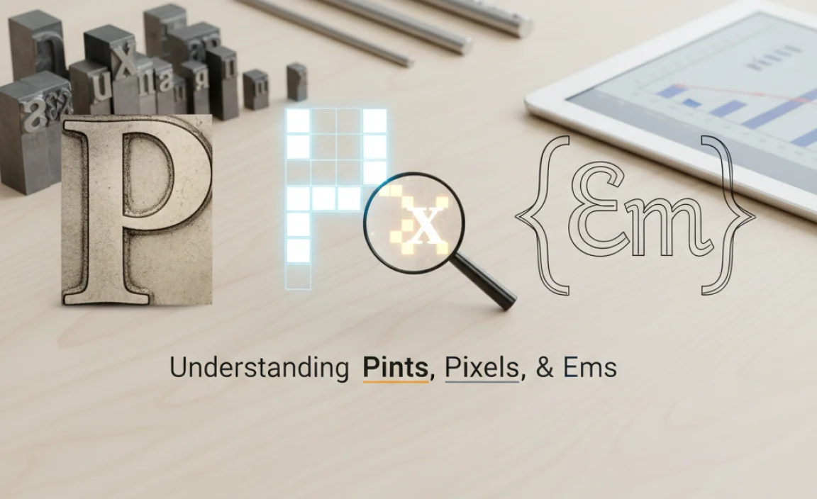
Understanding Pints, Pixels, and Emphas: What Font Size Really Is
When we talk about font size, we’re essentially talking about how large the text will appear. But the way this size is measured can be a bit confusing, especially with different units like points, pixels, and ems. Let’s demystify these terms.
The Standard Unit: Points (pt)
Historically, font size has been measured in points. A point is a tiny unit of measurement, and there are about 72 points in an inch. You’ll commonly see font sizes expressed in points for print materials like books, magazines, and brochures. For example, a standard body text size for print might be 10pt or 12pt.
A common misconception is that the point size directly relates to the height of the letters themselves. While it influences it, it’s not a direct measurement of character height. Instead, the point size refers to the height of the invisible box that each character sits within. This box includes space for ascenders (like the top of a ‘h’ or ‘b’) and descenders (like the bottom of a ‘p’ or ‘g’).
Here’s a simple way to visualize it:
- Ascenders: The parts of letters that extend upwards above the main body (e.g., the stem of ‘h’, ‘b’, ‘k’).
- Descenders: The parts of letters that extend downwards below the main body (e.g., the tail of ‘p’, ‘q’, ‘y’).
- X-height: The height of a lowercase letter without ascenders or descenders, typically like the letter ‘x’.
The actual visible height of your letters will depend on the font’s design. Some fonts are designed with larger x-heights, making them appear bigger at the same point size as fonts with smaller x-heights.
Digital Screens: Pixels (px)
In the digital realm, especially on websites and apps, font size is often measured in pixels (px). A pixel is the smallest controllable element on a screen. Unlike points, which are a fixed physical measurement, pixels are relative to the screen’s resolution and density.
This means that 16 pixels on a high-resolution Retina display might look smaller than 16 pixels on a lower-resolution screen. While convenient for web designers, this variability can make consistent sizing a challenge across devices. However, modern web development practices and responsive design techniques help manage this.
For web, a common body text size might range from 14px to 18px, with headings being significantly larger.
Flexible Sizing: Em and Rem Units
For more advanced web design and greater control over typography, designers often use em and rem units. These are relative units, meaning their size is based on another font size.
- em: One ’em’ is equal to the font size of the parent element. So, if a parent element has a font size of 16px, then 1em within that element will be 16px. If you set a child element to 1.5em, it will be 1.5 times the parent’s font size (24px in this case). This can sometimes lead to compounding effects if not managed carefully.
- rem: Stands for “root em.” A ‘rem’ is always relative to the font size of the root HTML element (usually the
<html>tag). This provides a more predictable and consistent way to scale typography across a website, as it doesn’t compound through nested elements like ’em’ can. A common practice is to set the root font size to 100% (which is typically 16px by default in most browsers) and then use rem units for all other font sizes.
Using rem units is generally recommended for better accessibility and easier site-wide font scaling. You can learn more about CSS units from resources like the Mozilla Developer Network (MDN), a comprehensive guide for web developers.
Why Font Size Matters: Readability and Visual Appeal

The choice of font size is far from arbitrary. It directly impacts how easily your audience can read your content and how professional your design looks. It plays a crucial role in:
- Readability: This is the most critical factor. Text that is too small strains the eyes, especially for extended reading. Too large, and it can be overwhelming or feel childish. Correct font size ensures comfortable reading.
- Hierarchy: Different font sizes help guide the reader’s eye. Larger sizes for headings and subheadings draw attention and structure the content, while smaller sizes are used for body text, captions, and fine print.
- Emphasis: Sometimes, you might want to make a specific word or phrase stand out. Increasing its size slightly can achieve this without a dramatic shift in design.
- Tone and Mood: Larger, bolder fonts can convey importance or excitement, while smaller, more delicate fonts might suggest sophistication or subtlety.
- Aesthetics: The overall visual harmony and balance of a design are significantly influenced by font sizes.
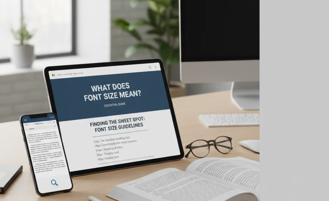
Finding the Sweet Spot: Font Size Guidelines
So, what are the “right” font sizes? While there are no absolute laws, there are widely accepted guidelines based on readability and common practice.
Print vs. Digital
The first major distinction is between print and digital media.
For Print:
- Body Text: Typically ranges from 9pt to 12pt. 10pt or 11pt is very common for books and articles.
- Headings: Can range from 14pt to 24pt or even larger, depending on the importance and design.
- Captions/Footnotes: Usually smaller, around 7pt to 9pt.
For Digital (Websites, Apps):
- Body Text: Generally starts at 15px or 16px and goes up to 18px or 20px for maximum readability, especially on larger screens. Mobile devices often benefit from slightly larger defaults.
- Headings: Much like print, headings are significantly larger, often from 24px to 48px or more.
- Captions/UI Elements: Similar to print, these might be around 12px to 14px.
It’s important to remember that these are starting points. The specific font you choose, its x-height, and the line-height (spacing between lines of text) all interact with font size to affect readability.
A Table of Common Font Sizes and Uses
Here’s a quick reference table to help you visualize common font sizes:
| Size (Approximate) | Print Use Example | Digital Use Example | Readability Notes |
|---|---|---|---|
| 7-9pt | Footnotes, legal disclaimers, captions | Small UI labels, secondary information | Best for short bursts of text, needs good contrast. Can be hard to read for some. |
| 10-12pt | Standard body text for books, articles, flyers | May be used for body text on some specific designs, but often considered small for web. | Classic print readability. Needs adequate line-height. |
| 14-18px (Digital) / 13-15pt (Print) | Slightly larger body text, subheadings | Standard body text for websites and apps. Good for accessibility. | Comfortable for most readers on most devices. |
| 20-24px (Digital) / 16-20pt (Print) | Prominent subheadings, larger body text | Larger body text, prominent headings, key information. | Very clear and easy to read. Good for making points stand out. |
| 24px+ (Digital) / 20pt+ (Print) | Main headings, titles, display text | Main headings, hero text, call-to-action buttons. | Designed to grab attention. Readability can depend heavily on font style and spacing. |
Considerations for Different Fonts
Not all fonts are created equal when it comes to size. A 12pt font of Arial might look quite different from a 12pt font of Times New Roman or a decorative script font like Pacifico.
- Serif vs. Sans-Serif: Serif fonts (like Times New Roman) have small decorative strokes at the ends of letters. These can sometimes help guide the eye in long blocks of text for print. Sans-serif fonts (like Arial or Open Sans) lack these strokes and are often favored for digital screens due to their clean, modern appearance.
- X-height: Fonts with a larger x-height (e.g., Arial, Verdana) tend to appear larger and more readable at smaller sizes compared to those with a smaller x-height (e.g., Georgia, Times New Roman).
- Weight and Style: Bold or condensed versions of a font will appear different from their regular or light counterparts, even at the same point size.
- Decorative Fonts: Display, script, brush, or handwritten fonts are often designed for impact in large sizes for headlines or logos. They might be very difficult to read in small body text.
How to Choose the Right Font Size

Selecting the appropriate font size involves a blend of technical understanding and creative judgment. Here’s a step-by-step approach:
Step 1: Define Your Medium
Are you designing for print or digital? This is your first decision.
- Print: Use points (pt). Aim for classic readability standards.
- Digital: Use pixels (px) or relative units (em, rem). Consider responsiveness across devices.
Step 2: Identify Your Content Type
What kind of text are you working with?
- Body Text: Needs to be highly readable for extended periods.
- Headings/Subheadings: Need to stand out and create hierarchy.
- Captions/Labels: Often supplementary, so can be smaller.
- Logos/Display Text: Designed for visual impact, size is flexible.
Step 3: Start with a Base Size
Based on your medium and content type, choose a starting font size.
- For web body text, 16px is a safe and accessible default.
- For print body text, 10pt or 11pt is a good starting point.
Step 4: Select Your Font Pairings
Choose the fonts you’ll use. A good design often uses a limited number of fonts. For example, one font for headings and another for body text. Consider how their styles interact. You can find great font resources at Google Fonts, which offers a vast library of free web fonts, and FontSquirrel for more curated selections.
Step 5: Adjust for Readability
This is where you test and refine.
- Display Your Text: View your design on the intended screen size or print a sample.
- Read Aloud: Read a paragraph of your body text aloud. Can you do it comfortably?
- Check for Strain: Ask others to read it. Do they squint or lean in?
- Evaluate Hierarchy: Do headings clearly stand out from body text? Is it easy to scan the page structure?
Step 6: Fine-tune Line Height (Leading)
Line height, often called leading, is the space between lines of text. It’s critical for readability. Too little space and text looks cramped; too much and it can break the flow. A common rule of thumb for body text is to set line-height to 1.4 to 1.6 times the font size.
- For 16px body text, a line-height of around 24px (1.5em) is often ideal.
- For 10pt body text, a line-height of 12pt to 14pt would be suitable.
Step 7: Consider Contrast and Context
Font size works hand-in-hand with color contrast. Black text on a white background is high contrast and very readable. Pale grey text on a white background at a small font size will be very difficult to read. Think about the environment where your content will be consumed – bright sunlight, a dimly lit room, on a small phone screen while walking?
Font Size Across Different Applications

The principles of font size apply across various design contexts:
Web Design
As mentioned, web design often uses pixels or rems. Responsive design is key here, ensuring text looks good on desktops, tablets, and mobile phones. Developers use CSS media queries to adjust font sizes based on screen width. For instance, body text might be 16px on desktop but scale up to 18px or 20px on a small mobile screen for better legibility.
Google’s Material Design guidelines, for example, offer recommendations for typography sizes to ensure a consistent and accessible user experience across all devices. You can explore their Typography system here.
Graphic Design (Print)
In print, points (pt) are the standard. Designers have more control over the final output because print resolution is fixed. However, the considerations for readability remain the same. When designing brochures, posters, or books, designers carefully consider the hierarchy, ensuring that headings draw viewers in and body text is comfortable to read. Print designers often use design software like Adobe InDesign, which provides precise control over typography metrics.
Branding & Logo Design
For logos, font size is less about readability in terms of reading blocks of text and more about visual impact and scalability. A logo needs to look good at various sizes – from a tiny favicon on a website to a large sign on a building. Therefore, the font chosen for a logo needs to be clear and distinctive even when very small, and its size within the logo design is crucial for balance and prominence. Designers often play with scale to make certain words or letters in a logo more impactful.
User Interface (UI) Design
In UI design, font size is paramount for usability. Every button label, menu item, and instruction needs to be easily readable. Designers use font size to differentiate between interactive elements and static text, guiding the user through an application. Consistent typography systems within a UI ensure that users can quickly understand and navigate the interface without visual strain.
Common Pitfalls to Avoid
Even with these guidelines, designers can fall into common traps:
- Too Small: The most common mistake, especially on the web, leading to poor user experience and accessibility issues.
- Inconsistent Sizing: Using too many different font sizes without a clear system, making the design feel chaotic.
- Ignoring Line Height: Setting font size without considering line spacing, which severely impacts readability.
- Using Font Size for Emphasis Alone: While size can emphasize, relying on it too much can disrupt hierarchy. Boldness, color, and placement are also key tools.
- Not Testing on Different Devices: Especially crucial for web and app designers. What looks good on a desktop might be unreadable on a phone.
Frequently Asked Questions About Font Size
What is the ideal font size for body text on a website?
The ideal font size for body text on a website is generally between 16px and 20px. For maximum accessibility, 16px is a great starting point, with 18px often being


Leave a Comment