Will help you understand the iconic typography used in the Doom video game series, how to identify it, where to find similar fonts, and how to use it to inject a sense of retro-futuristic, aggressive energy into your own designs.
The “Doom font” is more than just text; it’s a feeling. It’s the gritty, bold lettering that immediately transports you into the chaotic, demon-slaying worlds of the classic video games. If you’ve ever seen it and wondered what it’s called or how to get that same powerful vibe for your projects, you’re in the right place. Many creative folks struggle to pinpoint a font that captures that specific, aggressive, and retro sci-fi aesthetic. But don’t worry, we’re going to break it down. This guide will walk you through everything you need to know about the Doom font, from its history to practical applications. Get ready to unleash some serious typographic power!
What Exactly is the “Doom Font”?

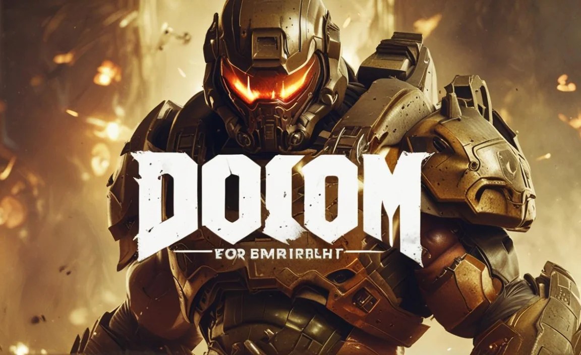
When people talk about the “Doom font,” they’re usually referring to the distinctive, thick, all-caps, sans-serif typeface that graced the original 1993 DOOM game’s title screen, logos, and in-game text. It’s characterized by its blocky, industrial feel, often with a slightly distressed or stencil-like quality. This wasn’t a single, commercially available font in the way we think of them today; rather, it was a custom-designed piece of typography specifically for the game.
However, the impact and recognition of this design have led to many similar fonts being created and adopted by designers. These derivative or inspired fonts aim to capture that same raw, futuristic, and aggressive spirit. Think of it as a style rather than one specific font file.
The Visual Characteristics of Doom-Inspired Typography
To truly understand the Doom font aesthetic, let’s break down its key visual elements:
Bold and Blocky: The letters are thick and solid, often appearing almost monolithic. There’s no subtlety here; it’s designed to be seen and have an immediate impact.
All Caps: Almost universally, the Doom style is presented in uppercase letters. This contributes to its commanding and forceful presence.
Industrial and Mechanical: The shapes often feel engineered, with sharp angles and straight lines. This gives it a sense of being part of machinery or military equipment.
Stencil Feel (Sometimes): Some variations and interpretations include cutouts or gaps within the letterforms, mimicking a stencil that might be sprayed onto a surface. This adds to the raw, utilitarian look.
Retro-Futuristic Vibe: It perfectly encapsulates the futuristic visions of the late 80s and early 90s – a blend of advanced technology with a gritty, less polished execution.
Slightly Distressed or Textured: To enhance the gritty feel, many versions feature subtle wear and tear, making it look like it’s been through a battle or applied in a harsh environment.
Tracing the Origins: The Typography of DOOM (1993)

The original DOOM game’s visual identity, including its iconic title font, was a collaborative effort primarily by the artists at id Software. While there isn’t one specific font designer credited for the DOOM title exclusively in the way a modern typeface would be developed, the overall visual direction was a hallmark of the game’s groundbreaking art style.
The font for the DOOM logo was carefully crafted to match the game’s themes: hellish landscapes, futuristic weaponry, and intense combat. It needed to feel powerful, imposing, and distinctly sci-fi, setting the tone from the moment players saw the title screen. This font wasn’t just decorative; it was an integral part of the game’s brand and atmosphere. It contributed significantly to the immersive experience of battling demons on Mars.
Finding Fonts That Evoke the Doom Aesthetic

While the original DOOM font itself isn’t a readily available digital typeface, there are many fonts that have been designed to capture its spirit, or that share enough characteristics to be used as excellent alternatives. When searching for these, think keywords like “sci-fi,” “industrial,” “tech,” “stencil,” “display,” or “gritty.”
Here are some popular and effective fonts that resonate with the Doom aesthetic:
Notable Doom-Inspired Fonts
Let’s explore some fonts that nail the Doom vibe. These are great for logos, posters, game titles, and any project needing that aggressive, retro-tech punch:
Action Force: This font often comes up in discussions. It’s blocky, bold, and has a strong military feel.
Bauhaus 93: A classic geometric sans-serif with rounded edges that, in its bolder weights and all caps, can lean into a retro-tech look, though less aggressive than pure Doom.
Metal Lord: A very popular choice for DOOM-like aesthetics, this font heavily features aggressive angles and a robust structure.
Badaboom BB: This is perhaps one of the most direct and popular fonts inspired by the original game title. It’s bold, impactful, and features that distinct stencil cutout.
Arnold Boecklin: While older and more decorative, its weighty presence can sometimes be adapted for a retro feel, though it’s a more ornate style.
Crimes Against Humanity: This font offers a rough, distressed, and industrial look that fits perfectly with the gritty side of the Doom aesthetic.
Orbitron: A modern geometric sans-serif with a distinct sci-fi feel. While cleaner, its angularity and futuristic design can be leveraged. You can explore its options on Google Fonts.
It’s important to note that many of these fonts are available through various font foundries or free font repositories. Always check the license for commercial use.
Where to Find These Fonts
Google Fonts: A fantastic resource for free, high-quality fonts, including many sci-fi and geometric options like Orbitron.
DaFont: A massive archive of free fonts, often with a good selection of display and techno styles. Be mindful of licenses.
Font Squirrel: Offers a curated collection of free fonts for commercial use, often with a variety of bold and impactful designs.
MyFonts / Fontspring: These are marketplaces for premium fonts. You’ll find a wider variety of professional and unique designs here, but they require purchase.
Using the Doom Font in Your Designs

The “Doom font” isn’t just for gaming nostalgia; it’s a powerful tool for creating specific moods. Its aggression, boldness, and retro-futuristic nature can inject energy and attitude into a wide range of projects.
Key Applications and Use Cases
Game Development: Obviously, for games that evoke a retro, sci-fi, or action-horror theme. It’s perfect for titles, UI elements, and promotional materials.
Logo Design: Ideal for brands that want to convey strength, technology, rebellion, or a cutting-edge, slightly edgy identity. Think tech startups, extreme sports brands, or even certain music genres.
Poster and Flyer Design: For events, movie posters, or album covers that need a bold, attention-grabbing headline with a distinct personality.
T-shirt Prints and Merchandise: The strong visual impact makes it a great choice for apparel and other merchandise where bold graphics are key.
Website Headers and Titles: Use sparingly for eye-catching headings that set a specific tone for your website content.
Tips for Effective Use
1. Hierarchy is Key: Due to its boldness, the Doom font is best used for headlines and titles. Avoid using it for long blocks of body text, as it can become difficult to read. Complement it with a plainer, more legible font for supporting text.
2. Consider Spacing (Kerning & Tracking): The thick strokes and blocky nature of these fonts can sometimes lead to letters bumping into each other or feeling too spread out. Adjusting the letter spacing (tracking) and the space between specific letter pairs (kerning) can significantly improve readability and visual appeal.
3. Embrace the Grittiness: Don’t be afraid to add subtle textures or distressed effects to the font if the design calls for it. This can enhance the industrial or battle-worn feel.
4. Color Palette Matters: Pair the Doom font with colors that enhance its intended mood. Dark reds, blacks, greys, metallic silvers, and electric blues often work well to create that high-contrast, intense atmosphere.
5. Context is Everything: Always consider the overall message and audience of your design. The Doom font is powerful, but it can easily overwhelm a design if not used thoughtfully. It’s best suited for themes of power, tech, action, or a rebellion against the ordinary.
6. Don’t Forget Readability: While it’s a display font, ensure that people can still read it. If you’re using it for a logo or a critical heading, test it at different sizes and on various backgrounds.
Comparing Doom-Inspired Fonts: A Visual Guide
To help you differentiate and choose, here’s a quick look at how some commonly cited fonts compare to the original DOOM title’s aesthetic.
| Font Name | Key Characteristics | Best For | Notes |
| Original DOOM Title | Blocky, thick, all-caps, industrial, stencil-like cutouts | Iconography, historical reference | Custom design, not a usable font file. Inspires many others. |
| Badaboom BB | Very close to original, strong stencil effect, bold | Titles, logos needing direct DOOM vibes | Excellent modern interpretation. |
| Metal Lord | Aggressive angles, sharp, robust, metallic feel | Sci-fi logos, action game titles, heavy branding | More overtly “metal” and less purely stencil than Badaboom BB. |
| Action Force | Solid, military-grade, clean-cut edges | Military themes, tech branding, bold headings | Less distressed, more straightforwardly industrial and strong. |
| Orbitron | Geometric, futuristic, clean, wide range of weights | Modern sci-fi, tech dashboards, clean UI | A more refined, modern take on a sci-fi aesthetic. Excellent for readability. |
| Crimes Against Humanity | Rough, distressed, heavily textured, industrial | Grunge designs, post-apocalyptic themes, edgy merch | Emphasizes the “gritty” and “worn” aspect of industrial fonts. |
This table is a simplified comparison. Many fonts share overlapping traits. Exploring them visually is often the best way to find the perfect fit for your project.
Technical Aspects: File Formats and Licensing
When you find a font you like, understanding its technical details is crucial for smooth implementation.
Font File Formats
Most modern fonts come in a few standard formats:
OTF (OpenType Font): This is the most versatile and widely used format today. It supports a vast range of characters and advanced typographic features. It works well on both Windows and macOS.
TTF (TrueType Font): An older but still very common format. TTF files are compatible with most systems and applications.
WOFF/WOFF2 (Web Open Font Format): Specifically designed for web use, these formats are compressed for faster loading times on websites. If you’re using a font for web design, you’ll likely encounter these.
Your operating system will usually install OTF and TTF files directly, making them available in most design software. For web use, you’ll often use CSS `@font-face` rules to implement WOFF/WOFF2 fonts, as recommended by resources like the W3C Web Fonts Guide.
Licensing: What You Need to Know
Fonts have licenses, and it’s vital to respect them.
Personal Use: Allows you to use the font for your own non-commercial projects (e.g., personal art, private documents).
Commercial Use: Allows you to use the font for business purposes, including logos, marketing materials, website designs, and products for sale.
Desktop License: Typically covers installation on a set number of computers for use in desktop applications.
Webfont License: Required for using the font on websites, often priced based on ad impressions or page views.
App License: For embedding fonts within software or mobile applications.
Always check the specific license agreement provided by the font creator or distributor. Fonts from reputable sites like Google Fonts and dedicated marketplaces usually have clear licensing information. If you download from a free font archive like DaFont, double-check the license because it can vary widely, from 100% free for commercial use to requiring attribution or being strictly for personal use only.
Beyond the Title: The Broader Impact of Doom’s Typography
The design choices made for DOOM extended beyond just its title. The in-game text, menus, and even weapon labels often carried a similar bold, industrial, and functional aesthetic. This consistency in visual language reinforced the game’s gritty, no-nonsense atmosphere.
The success of DOOM and its powerful visual identity had a ripple effect on game design and graphic design in general throughout the 90s and beyond. It demonstrated how typography could be a powerful storytelling tool, contributing directly to a product’s personality and player experience. This laid the groundwork for many other games and media to experiment with more aggressive, stylized typography for their own branding.
Frequently AskedQuestions about Doom Font
Got more questions about the Doom font? Here are some common ones answered for beginners.
What is the most accurate “Doom Font” to use today?
The font most often cited as the closest to the original 1993 DOOM title is Badaboom BB. It captures the blocky, stencil-like, all-caps feel very effectively.
Can I use the Doom font for my commercial logo?
If you use a font like Badaboom BB or another inspired by DOOM, you need to check its specific license. Many free fonts available for download come with licenses that restrict commercial use. Always verify the font’s license status to ensure it permits commercial use for your logo.
Is the original DOOM font a free font?
The original DOOM title font was custom-designed for the game and isn’t available as a free (or even paid) font file. However, many fonts inspired by it, like Badaboom BB or others found on free font sites, can be used freely, depending on their individual licenses.
How do I make text look like the Doom font?
To achieve a similar look, use a bold, all-caps, sans-serif font. Look for fonts with blocky letterforms, sharp edges, or stencil cutouts. You can also apply effects like slight distressing, adding a metallic sheen, or using dark, high-contrast color schemes to enhance the aesthetic.
Is the Doom font good for body text?
No, the Doom font style is generally not suitable for body text. Its bold, decorative, and often stencil-like nature makes it difficult to read in large blocks. It’s best used for headlines, titles, logos, and other short, impactful text elements where readability is not compromised.
Where can I find gothic or horror-themed fonts?
You can find gothic and horror-themed fonts on various platforms. Websites like DaFont, Font Squirrel, MyFonts, and Fontspring all host large collections. Searching for terms like “gothic,” “horror,” “dark,” “stencil,” or “industrial” can help you discover relevant typefaces.
How do I use a font like ‘Orbitron’ for a sci-fi look?
Orbitron is a great choice for a modern sci-fi look. Use it in its boldest weights for titles and headings to convey a futuristic, technological feel. Its geometric design works well for tech-related branding, game interfaces, and any project aiming for a clean, advanced aesthetic.
Conclusion
The “Doom font” aesthetic is a powerful and recognizable style that brings a unique blend of aggression, retro-futurism, and industrial grit to any design. While the original DOOM title was a custom creation, the spirit it embodies lives on through numerous inspired fonts available today.
By understanding the key visual characteristics—boldness, all-caps, blocky forms, and potential stencil effects—you can effectively identify and utilize these fonts. Whether you’re a graphic designer crafting a logo, a marketer creating a campaign, or a student exploring typography, embracing the Doom font style can add undeniable impact and personality to your work.
Remember to always consider readability, licensing, and the overall context of your project. Pair these strong display fonts with simpler, more legible fonts for body text, and pay attention to spacing and color to achieve the best results. With these insights, you’re well-equipped to harness the power of Doom-inspired typography and make your designs roar with intensity and style. So go forth, experiment, and unleash your creativity!


Leave a Comment