Looking for the perfect Fallout booth font? This guide unlocks the secrets to finding and using fonts inspired by the iconic Fallout series. Discover key font types, where to find them, and how to apply them for an authentic, retro-futuristic vibe. Get ready to make your designs pop with wasteland charm!
Designing with a distinct aesthetic can sometimes feel like navigating a post-apocalyptic landscape. One of the most recognizable visual elements from games like Fallout is their unique typography. This isn’t just about picking a random font; it’s about capturing a specific mood – a blend of retro optimism and gritty survival. Many of you have asked about the fonts used in the games, especially for projects that evoke that “Fallout booth” feel. Don’t worry, I’m here to guide you through the wasteland of typography and find fonts that truly capture that spirit. Let’s dive in and make your designs stand out!
Understanding the Fallout Font Aesthetic

The Fallout series has a signature visual style that’s instantly recognizable. A huge part of this is its typography. Think of the bold, often slightly distressed lettering on posters, terminal screens, Pip-Boy interfaces, and especially those classic diner-style booths. This aesthetic is a masterful blend of mid-20th-century design principles with a futuristic, often dystopian, twist.
When we talk about the “Fallout booth font,” we’re generally referring to a particular vibe:
Retro-Futurism: It harks back to the optimistic visions of the future from the 1950s and 60s, but with a darker, nuclear-age spin.
Bold and Sturdy: Many fonts lean towards sans-serif styles that feel solid and functional, like something built to last.
Slightly Stressed or Distressed: To convey age, wear, and tear, these fonts often have subtle imperfections, adding character and a sense of history.
Nostalgic but Gritty: It’s that feeling of an old diner sign that’s seen better days, but still holds a certain charm.
This combination creates a mood that’s both familiar and alien, inviting and dangerous – the perfect encapsulation of the Fallout universe. Understanding this core aesthetic is the first step to finding or creating the right fonts for your projects.
Key Font Categories for a Fallout Vibe

To achieve that authentic Fallout feel, consider these font categories. They represent the styles most commonly seen or that best capture the game’s essence.
Sans-Serif Fonts: The Backbone of the Wasteland
Sans-serif fonts, characterized by their lack of serifs (the small decorative strokes at the end of letters), are the stars of the Fallout typographic universe. They offer clarity, a modern-yet-retro feel, and a sense of strength.
Geometric Sans-Serifs: These are based on simple geometric shapes like circles and squares. Think of fonts like Futura or Kabel. They exude that mid-century modern optimism. In Fallout, they often appear on signs, advertisements, and official-looking documents.
Grotesque/Gothic Sans-Serifs: These are more utilitarian and less polished than geometric sans-serifs. They have a sturdy, no-nonsense feel. Examples include Franklin Gothic or Akzidenz-Grotesk. These are perfect for terminals, warning labels, and anything that needs to feel functional and a bit weathered.
Humanist Sans-Serifs: While less common as the primary “Fallout booth” font, some humanist sans-serifs with friendly characteristics can add a touch of warmth, especially for specific in-game elements. However, for the bold, iconic look, we usually lean towards geometric or grotesque styles.
Display Fonts: Making a Statement
Display fonts are designed for headlines and large text. They are often more decorative and attention-grabbing, perfect for capturing specific moods.
Retro Script Fonts: While not the main “booth” style, you’ll see script fonts reminiscent of 1950s diners and advertisements. These add a touch of kitsch and nostalgia.
Stencil Fonts: Used frequently for military stencils, warning labels, and industrial signage, stencil fonts have a rugged, utilitarian appeal that’s core to the Fallout aesthetic.
Distressed or Textured Fonts: Fonts that simulate wear and tear, scratches, or a weathered look are crucial for authenticity. These add character and history, making them feel like they’ve survived the apocalypse.
Spotlight: The “Fallout New Vegas” Font Connection

Many people specifically search for the “Fallout New Vegas Font” because it features some of the most iconic typography in the series, particularly for its bold, distinctive title and menu elements. While there isn’t one single official font that dictates every piece of text, the title font and much of the in-game signage draw heavily from a specific style.
The primary typeface used for titles and prominent headings in Fallout: New Vegas and many other Fallout games often evokes fonts like Bank Gothic or similar condensed, all-caps sans-serifs with a strong, blocky presence. These fonts have a slightly wide stance and a robust feel, making them ideal for impactful titles and branding.
For in-game elements like terminals and general text, a more utilitarian grotesque sans-serif is often employed, providing readability and reinforcing the functional, retro-tech aesthetic.
Let’s break down the characteristics often associated with the Fallout: New Vegas font style:
All Caps (Uppercase): Almost universally used for impact and a sense of officialdom.
Condensed or Semi-Condensed: The letters are often taller than they are wide, giving a stacked, strong appearance.
Monochromatic or Limited Color Palette: Usually seen in stark whites, greens, blues, or reds against dark backgrounds, mimicking old CRT screens or distressed signs.
Subtle Imperfections: Some appearances might include slight glitches, worn edges, or pixelation to fit the game’s lore and technology.
Finding fonts that mimic these characteristics is key to achieving that precise Fallout: New Vegas feel.
Where to Find Fallout-Inspired Fonts

You don’t need to be a font designer to find exceptional typefaces. The internet is a treasure trove! Here are some excellent resources and types of fonts to search for.
Free Font Resources
These sites offer a vast selection of fonts, many of which can be used for free for personal or commercial projects (always check the license!).
Google Fonts: A massive library of high-quality, open-source fonts. Search for terms like “sans serif,” “condensed,” “retro,” or “display.”
Font Squirrel: Curated free fonts that are licensed for commercial use. They also have a great font identifier tool.
DaFont: A popular site with a huge collection, though you must be diligent about checking licenses for commercial use. Look in categories like “Techno,” “Sci-Fi,” “Retro,” or “Gothic.”
1001 Free Fonts: Similar to DaFont, offering a wide variety of free fonts.
When searching, use keywords like:
“Retro sans serif”
“Condensed gothic”
“50s font”
“Industrial font”
“Stencil font”
“Sci-fi font”
Premium Font Marketplaces
For the highest quality, unique, and professionally crafted fonts, consider these paid options. Often, premium fonts include more weights, styles, and better licensing.
MyFonts: One of the largest online marketplaces for fonts, with a professional curation.
FontSpring: Another excellent source for premium fonts with clear licensing information.
Creative Market: A fantastic place for designers to buy curated font bundles and individual typefaces.
Specific Font Recommendations (Examples)
While direct “Fallout” fonts aren’t available due to copyright, many come close. Here are a few examples that capture elements of the style:
| Font Name Example | Style Description | Best Use Case in Fallout Aesthetic | Where to Look (General) |
| Bank Gothic | Bold, condensed sans-serif. | Title treatments, prominent signage, branding. | Premium marketplaces |
| Oswald | Condensed sans-serif. | Headlines, subheadings, reinforcing bold text. | Google Fonts (Free) |
| League Gothic | Very condensed, tall sans-serif. | Highly impactful titles, retro posters. | League of Moveable Type |
| Orbitron | Geometric sans-serif with sci-fi flair. | Terminal text, futuristic UI elements, logos. | Google Fonts (Free) |
| Carter One | Bold, rounded display sans-serif. | Diner signs, fun retro branding, characterful headlines. | Google Fonts (Free) |
| Metal Gear Solid | Evokes similar gritty, industrial feel. | Warning labels, distressed elements, gritty signage. | Search for “industrial,” “distressed,” “stencil” |
| Bebas Neue | Tall, condensed sans-serif. | Captions, secondary titles, strong informational text. | Google Fonts (Free) |
Note: Always double-check font licenses for commercial use.
Implementing Fallout Fonts in Your Designs
Once you’ve found a font that screams Fallout, the next step is to use it effectively. It’s not just about picking the font; it’s about how you use it to tell a story.
Step-by-Step Implementation Guide
1. Define Your Project’s Purpose: What are you designing? A logo? A website header? A game asset? Knowing your goal helps you select the right font and style.
2. Gather Your Font Options: Based on the “Fallout booth” aesthetic and your project, select a few promising fonts. Look for strong sans-serifs, possibly with condensed or bold variants.
3. Consider Licensing: Crucially, ensure the fonts you choose are licensed for your intended use (personal, commercial, web, print, etc.). Resources like Font Squirrel and Google Fonts are great for finding commercially-friendly options.
4. Apply to Key Elements: Use your chosen bold, condensed sans-serif for titles, headings, or important labels (like “Danger,” “Caution,” “Vault-Tec”). Think about how these would appear on a retro sign or terminal screen.
5. Pair with Complementary Fonts: Don’t use just one font. Pair your bold display font with a more readable, clean sans-serif for body text or smaller details. This creates hierarchy and visual interest. A classic monospace font can work wonderfully for terminal-like text.
6. Add “Wasteland” Effects (Subtly): This is where the magic happens!
Distress/Texture: Apply a subtle grunge texture overlay to your text. You can find these textures online or create them yourself. Tools like Adobe Photoshop or Affinity Photo can help.
Color Palette: Stick to a limited, often desaturated color palette. Think muted greens, grays, off-whites, oranges, and blacks, common in the Fallout games.
Outline/Stroke: A thin, contrasting outline can help text pop and mimic old signage.
Slight Imperfections: Consider adding subtle glitches, scuff marks, or uneven edges to text for a worn-out feel.
7. Context is Key: Place your typography strategically. Does it look like it belongs on a weathered metal sign, a flickering computer screen, or a diner menu?
8. Test Readability: Especially for body text, ensure your chosen fonts and effects don’t hinder readability. The goal is to be atmospheric, not illegible.
Typography Pairing: Creating Contrast and Harmony
Effective font pairing is crucial for making your design balanced and professional. For a Fallout aesthetic, consider these pairings:
Bold Display + Clean Sans-Serif: Use a strong, condensed title font (like Bank Gothic-inspired) for headings, and pair it with a more readable, neutral sans-serif (like Open Sans or Roboto) for body text or descriptions.
Retro Title + Monospace Detail: A classic retro font for main titles, with a monospace font (like Courier New) for anything that simulates computer output or data logs.
Distressed Headline + Simple Subheading: A heavily textured or distressed font for the main headline, balanced by a clean, all-caps sans-serif for subheadings.
Here’s a table illustrating some effective pairings:
| Primary Font (Headline/Title) | Secondary Font (Body/Details) | Aesthetic Goal |
| Bank Gothic (or similar condensed) | Open Sans (Regular, Italic) | Bold retro-futurism, clear information |
| League Gothic (or similar tall) | Roboto Condensed (Light) | Strong impact, modern but slightly vintage feel |
| Stencil Font (e.g., Strikethru) | Arial, Helvetica (for UI elements) | Industrial, utilitarian, military-inspired |
| Carter One (or similar bold display) | Lato (Light) | Nostalgic diner feel, friendly but still robust |
| Bebas Neue (or similar condensed) | Source Sans Pro (Regular) | Clean, functional, mid-century modern influence |
Utilizing Textures and Effects
The Fallout universe is inherently gritty. Typography often reflects this.
Distressing: You can find grunge texture packs or brushes online. Overlay these onto your text layer in your design software and set the blend mode to multiply or overlay. Adjust opacity for subtlety.
Halftones: Simulating old print methods with halftone effects can add a vintage print feel.
Glows and Glitches: For terminal screens or Pip-Boy interfaces, subtle neon glows or digital glitch effects can enhance the retro-tech appearance.
Bevel and Emboss: These Photoshop/Affinity Photo effects can give text a raised, metallic, or carved appearance, fitting for signs.
Remember, the key is consistency and restraint. Overdoing effects can make your design look messy rather than authentic.
Fonts in Action: Real-World Examples

Seeing how these fonts are used can spark your own creativity.
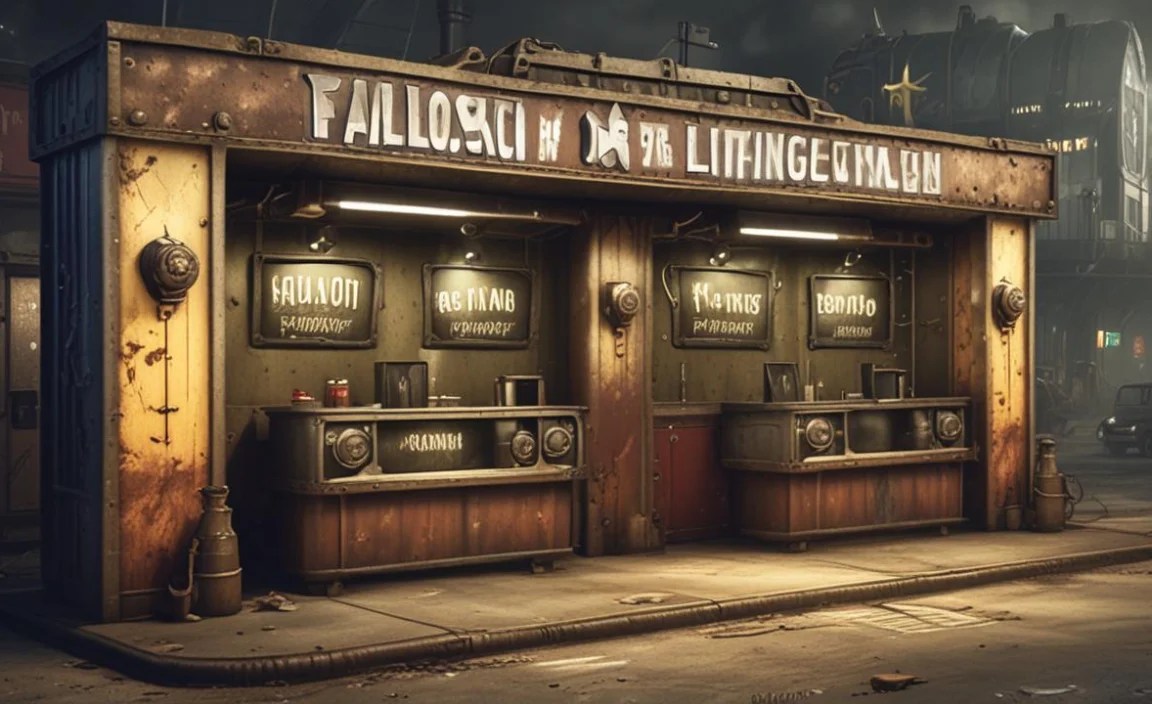
Fallout Booth Signage and Menus
Think of the classic diner booths. The menus and signs in the Fallout universe often use bold, slightly rounded sans-serifs for headings and categories, paired with a more functional sans-serif for item descriptions.
Example: A menu with “BURGERS” in a bold, all-caps, slightly condensed font, and then individual burger names and descriptions in a cleaner, more standard sans-serif. The price might be in a smaller, stark font.
Font Style Cue: Look for fonts that feel slightly whimsical yet robust, like a 1950s diner sign that’s stood for decades.
Pip-Boy and Terminal Interfaces
The Pip-Boy is a mobile computer, and terminals are the remnants of pre-war technology. This means you’ll often see:
Monospaced Fonts: These are fonts where every character, including the space, takes up the same amount of horizontal space (like `Courier New`). They are highly readable on screens and have a distinctly technical feel. Essential for terminal text that mimics old computer output.
Green or Amber Glow: Applying a monochrome color scheme with a characteristic glow is vital for this aesthetic.
Minimalist Sans-Serifs: Sometimes, clean, utilitarian sans-serifs are used for menus and options within these interfaces.
You can find excellent monospaced fonts and retro-tech sans-serifs on Google Fonts and other free resources. For example, “VT323” on Google Fonts has a fantastic retro screen feel.
Advertisement and Poster Typography
The pre-war world of Fallout was filled with optimistic advertising. This is where you’ll find:
Geometric Sans-Serifs: Think of clean, circular or square-based fonts that convey mid-century optimism.
Script Fonts: Used sparingly for a touch of retro flair, akin to hand-lettered advertisements.
Distressed Versions: Even optimistic ads would have weathered elements, so applying texture here adds the Fallout twist.
Consider fonts that were popular in the 1940s-1960s for inspiration.
Designing Your Own Fallout-Inspired Logos
Creating a logo with a Fallout vibe involves blending recognizable typographic elements with unique branding.
1. Identify Core Values: What does your brand represent? Is it rugged survival, retro charm, technological advancement, or a quirky business?
2. Select a Primary Font: Choose a bold, thematic font that embodies the core of your brand and the Fallout aesthetic you’re chasing. For a diner, a rounded retro font; for a modder, a more industrial stencil.
3. Choose a Secondary Font: A legible sans-serif for your brand name or tagline if the primary font is too decorative for longer text.
4. Incorporate Textural Elements: Apply subtle distress, wear, or a limited color palette to your logo.
5. Consider Symbolism: Does your logo include graphics? Ensure they also fit the retro-futuristic, post-apocalyptic theme.
6. Simplicity is Key: While texture is important, the logo itself should be clear and recognizable at various sizes.
For instance, a survival gear brand might use a strong, slightly weathered stencil font. A retro-themed café might opt for a friendly, bold script or rounded sans-serif.


Leave a Comment