A Golden Christmas Font adds essential sparkle to your holiday designs, offering elegance and festive charm. Choose fonts with decorative flourishes, metallic textures, or a sophisticated script style for eye-catching invitations, greetings, and branding that capture the magic of the season.
The holiday season is a magical time, and we all want our designs to reflect that joy and wonder. If you’re looking to add that special festive touch, especially with a touch of elegance, a golden Christmas font can be your secret weapon. It’s not just about the gold color; it’s about the feeling it evokes – warmth, luxury, and celebration. But sometimes, finding the perfect golden Christmas font feels like searching for a specific snowflake. Don’t worry, we’ll walk through how to pick and use them to make your projects shine.
—
Why Golden Christmas Fonts Capture the Holiday Spirit

Gold inherently signifies richness, celebration, and a touch of magic. During Christmas, this association is amplified. Think of gilded ornaments, twinkling lights reflecting off golden baubles, and the warm glow of a fireplace. A golden Christmas font taps into these very feelings, instantly elevating any design from ordinary to extraordinary. It’s a visual cue that whispers “special occasion” and “festive cheer.”
These fonts aren’t just about color; their design often incorporates classic holiday elements. You might find them with:
Elegant Serifs: Reminiscent of traditional holiday cards and formal invitations.
Flowing Scripts: Mimicking the art of calligraphy, perfect for a sophisticated touch.
Subtle Flourishes: Swirls and decorative accents that add a playful, yet refined, sparkle.
Textured Appearances: Some fonts are designed to look like brushed gold, metallic foil, or even glitter, adding a tactile sense of opulence.
Using such a font can make your Christmas cards feel hand-crafted and luxurious, your event invitations more enchanting, and your marketing materials stand out with a festive, premium appeal.
—
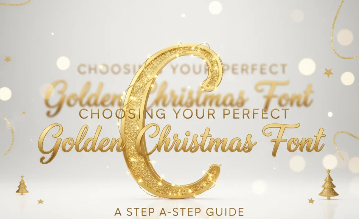
Choosing Your Perfect Golden Christmas Font: A Step-by-Step Guide
Selecting the right font involves more than just liking how it looks. It needs to fit your message, your audience, and your overall design aesthetic. Here’s how to navigate the choices:
Step 1: Define Your Project’s Vibe
Before diving into font libraries, consider what you want your design to communicate. Are you aiming for:
Classic & Elegant: Think formal Christmas parties, elegant wedding invitations, or upscale brand promotions.
Whimsical & Playful: Perfect for children’s events, fun family greetings, or lighthearted blog posts.
Modern & Chic: Suitable for contemporary brand campaigns, stylish party invites, or sophisticated digital assets.
Rustic & Cozy: Ideal for handmade crafts, country-themed events, or a warm, homey feel.
Step 2: Understand Font Categories and Their Holiday Suitability
Different font styles lend themselves to different holiday moods. While many golden fonts fall into script or decorative categories, understanding the nuances helps.
Common Font Styles for Golden Christmas Designs
| Font Style | When to Use for Golden Christmas | Example Moods |
|---|---|---|
| Script/Cursive | Ideal for elegant invitations, personal greetings, and adding a handwritten feel. Look for flowing, graceful scripts. | Romantic, Sophisticated, Personal |
| Serif | Great for a traditional, classic, or formal look. Think old-fashioned Christmas cards. | Traditional, Formal, Timeless |
| Slab Serif / Display | Can offer a bold, festive, and often quirky feel. Good for headlines and eye-catching elements. | Bold, Festive, Fun |
| Handwritten/Brush | Adds a personal, artistic, or rustic touch. Perfect for a more casual, yet still charming, holiday message. | Artistic, Casual, Warm |
| Decorative/Themed | Fonts specifically designed with holiday motifs, snowflakes, or unique stylistic elements. Use sparingly for impact. | Exotic, Themed, Unique |
Step 3: Look for “Golden” Qualities
A “golden Christmas font” doesn’t always mean it’s pre-colored gold. It can refer to fonts that look good when styled with a gold gradient or texture. Key characteristics to seek include:
Clean Lines: Fonts with well-defined strokes and curves will render metallic effects beautifully. Jagged or overly complex fonts can lose clarity when styled.
Sufficient Weight: For display purposes (like headlines or logos), a medium to bold weight is often best to ensure readability and impact.
Balanced Flourishes: If a font has decorative elements, they should be complementary, not overwhelming. Too many flourishes can make text hard to read.
Versatility: Can the font work for both short titles and slightly longer phrases?
Step 4: Test for Readability
This is crucial! A beautiful font is useless if no one can read it.
Size Matters: How does the font look at different sizes? A font that’s stunning in large headlines might be illegible in small print.
Kerning & Spacing: Check the space between letters (kerning) and words. Poor spacing can create awkward gaps or make text appear cramped. Many modern fonts are well-optimized, but it’s worth a glance.
Context: Will you be using it on a busy background? A simpler, bolder font might be better than an overly ornate one.
You can preview fonts with your own text on most font websites. This is invaluable for checking readability.
Step 5: Consider Licensing and Usage Rights
This is a vital step, especially for commercial use.
Personal Use: Free fonts are often available for personal projects like home printing or non-monetized social media.
Commercial Use: If you’re using the font for a business, website, product, or anything that makes money, you’ll typically need a commercial license. This can range from a one-time fee to a subscription.
Font Foundries: Reputable sites like Google Fonts offer many free options with open licenses. Premium fonts can be found on marketplaces like MyFonts, Creative Market, or directly from type foundries. Always check the specific license agreement.
—
Where to Find “A Golden Christmas Font”

The internet is brimming with fantastic typography. Here are some of the best places to start your search, catering to different needs and budgets:
Free Font Resources
These are excellent for personal projects or for trying out styles before investing.
Google Fonts: While not exclusively “Christmas” themed, you can find many elegant script and serif fonts that look stunning when styled with gold. Search terms like “script,” “serif,” “elegant,” or “display” might yield great results. Their licenses are typically very permissive for most uses.
Font Squirrel: Offers a curated collection of high-quality free fonts, expertly vetted for commercial use. Their search filters are quite robust.
DaFont / UrbanFonts: These sites have vast libraries, but be extra careful to check the licensing for each font. Many are free for personal use only.
Premium Font Marketplaces & Type Foundries
For professional projects and unique designs, investing in premium fonts is often worthwhile.
MyFonts: One of the largest collections of professional fonts, with extensive search filters and often good sales during holiday periods.
Creative Market: A popular place for independent designers to sell their font creations. You’ll find many unique and handcrafted styles here, often bundled with other Christmas-themed graphics.
Font Bundles: Similar to Creative Market, offering individual fonts and bundles, frequently with deals.
Adoniss Studio / Nicky Laatz / Calligrapher’s Dream (and similar designers): Many individual font designers specialize in beautiful script and display fonts that are perfect for holiday themes. Searching for “Christmas script fonts” or “Christmas display fonts” on these sites can be very fruitful.
Tips for Styling Your Font with Gold

Once you’ve chosen your font, the “golden” appearance is usually achieved through design software.
1. Use a Gold Gradient: In programs like Adobe Photoshop, Illustrator, or even online tools like Canva, create a gradient that mimics the sheen of gold. This typically involves colors ranging from deep yellow to light golden yellow, with an orange or brown undertone for depth.
2. Apply Textures: Look for “gold foil texture” or “gold metallic texture” online (ensure you have rights to use it). You can then overlay these textures onto your text.
3. Add Subtle Effects: A slight inner shadow or bevel effect can add dimension and make the gold look more realistic and less flat.
4. Consider Contrast: Ensure your gold text has enough contrast against its background to be easily readable. A dark background (like navy, deep green, or black) often makes gold pop beautifully.
—
Creative Ways to Use a Golden Christmas Font
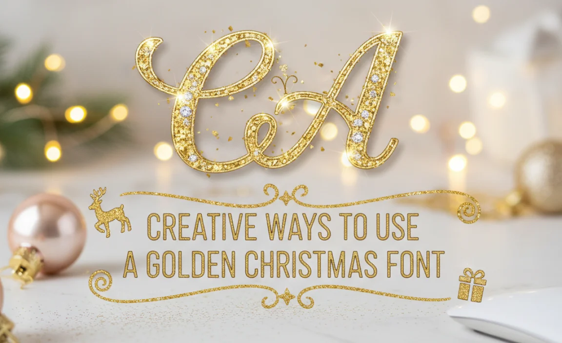
“A Golden Christmas Font” isn’t just for one type of project. Its versatility makes it suitable for a wide range of festive applications.
1. Holiday Greeting Cards and Invitations
This is perhaps the most classic use. Whether you’re designing for a formal business holiday party, a cozy family gathering, or sending out season’s greetings, a golden font adds an immediate sense of occasion and warmth.
For Cards: Use an elegant script for “Merry Christmas” or “Happy Holidays” on the front, and a simpler, readable font inside for the main message.
For Invitations: A bold, decorative golden font for the event title (“Christmas Gala”) paired with a clear, legible serif or sans-serif for details like date, time, and location.
2. Festive Social Media Graphics
Boost your online presence with eye-catching posts.
Instagram Captions/Quotes: Highlight festive quotes with a beautiful golden script font.
Event Banners/Posters: Create visually appealing graphics for Facebook events or holiday sales promotions.
Story Highlights: Use golden text for attractive icons to categorize your Christmas-themed stories.
3. Website and Blog Design Elements
Make your digital space shine during the holidays.
Website Banners: A festive banner announcing holiday sales or opening hours.
Blog Post Titles: Use a striking golden font for seasonal articles, like “Our Favorite Golden Christmas Decor” or “Top Holiday Gift Ideas.”
Call-to-Action Buttons: For seasonal offers, a golden font on a button can draw attention.
4. Branding and Marketing Materials
Elevate your brand’s holiday campaign.
Logos/Watermarks: A temporary holiday logo incorporating a subtle golden font for a sophisticated seasonal identity.
Flyers and Brochures: Announce holiday specials, events, or seasonal product lines.
Packaging: Add a touch of luxury to product labels or gift tags.
5. Printables and DIY Projects
Inspire your crafty side.
Christmas Gift Tags: Design unique tags for presents.
Holiday Party Games: Use golden fonts for titles of print-and-play games.
DIY Signs: Create festive signs for your home decor.
—
Examples of Golden Christmas Fonts in Action
Let’s visualize how different font styles can bring that golden sparkle to life:
Scenario: Christmas Party Invitation
Headline: “You’re Invited to a Golden Christmas Soiree!”
Font Choice: A sophisticated, sweeping script font like “Edwardian Script” or a more modern, flowing script like “Brush Script MT” (when styled correctly).
Why it works: The curves and elegance mimic formal handwriting and convey a sense of occasion and festivity. Styling it with a metallic gold gradient will make it shimmer.
Details (Date, Time, Venue):
Font Choice: A clean, readable serif font like “Merriweather” or a classic sans-serif like “Lato”.
Why it works: These fonts maintain legibility for important details, ensuring guests can easily read the crucial information without being distracted by ornate styles. A subtle gold or dark color works well here.
Scenario: Social Media Post Announcing a Holiday Sale
Main Message: “50% Off Everything! Golden Christmas Savings!”
Font Choice: A bold, eye-catching display font or a strong, stylized serif like “Abril Fatface” or “Playfair Display”.
Why it works: These fonts are designed to grab attention. When filled with a bright, textured gold, they communicate excitement and a significant offer.
Sub-Message/Tagline: “Shop now for festive gifts!”
Font Choice: A simpler, complementary sans-serif like “Open Sans” or “Montserrat”.
Why it works: Provides clarity and directs the audience immediately.
—
Best Practices for Using Golden Christmas Fonts
To ensure your designs are effective and not overwhelming, follow these best practices:
1. Don’t Overuse Gold
Gold is a powerful accent color. Using it everywhere can diminish its impact and make a design look gaudy. Reserve golden fonts for headlines, key phrases, or important decorative elements.
2. Prioritize Readability First
A beautiful font that is difficult to read defeats its purpose. Always test your chosen font in different sizes and contexts to ensure clarity. If your main message needs to be highly legible, opt for a simpler gold treatment on a clearer font.
3. Pair Wisely with Other Fonts
A common mistake is using too many fonts. If you’re using an ornate golden script for your headline, choose a clean, simple font for body text. A good rule of thumb is to pair a display font with one or two complementary, highly readable fonts.
Contrast is Key: Pair ornate scripts with straightforward sans-serifs. Pair bold, decorative fonts with elegant serifs.
Limit Your Palette:Stick to 2-3 font families at most for a single design project.
4. Consider the Background
Gold often looks best on contrasting backgrounds. Darker colors like navy, deep green, black, or dark burgundy create a luxurious backdrop. Lighter backgrounds might require a bolder, more textured gold to stand out.
5. Ensure High Resolution for Print
If you’re printing your designs, ensure your golden font effects are created at a high enough resolution (e.g., 300 DPI) to avoid pixelation or blurry results.
6. Accessibility Check
For digital use, consider users with visual impairments. Ensure sufficient contrast between text and background. Some decorative gold styles might be difficult for screen readers or individuals with certain vision conditions to process.
—
Troubleshooting Common Golden Font Issues
Even with the best intentions, you might run into a few snags. Here’s how to fix them:
Issue: My gold text looks flat and uninspired.
Solution: This usually means your gradient or texture needs more depth. Try adding more color variation to your gradient (from a deep brass to a bright yellow). Experiment with adding a subtle shadow, bevel, or emboss effect in your design software. Look for high-quality textures that include variations in light and shadow.
Issue: The font is too hard to read, especially the smaller details.
* Solution: Choose a different “golden” font that is designed with better readability for small sizes, or use your current font only for very large, prominent headings. Alternatively, simplify the golden effect – sometimes a solid gold color with a subtle shine is more readable than a complex textured effect. Ensure adequate spacing between letters and words. For body text, switch to a completely different, clear font and use a muted gold or


Leave a Comment