Google Maps font significantly impacts user experience by ensuring clarity, legibility, and efficient navigation. The right font choice makes map information instantly readable, guiding users quickly and intuitively, thus reducing confusion and frustration.
Ever found yourself squinting at a map on your phone, trying to decipher tiny street names or landmark labels? It’s a common frustration, and often, the culprit is the font used. When we’re on the go, trying to find our way, every second counts. A clear, easy-to-read font on a map isn’t just a design choice; it’s crucial for a smooth user experience. This is especially true for a service as widely used as Google Maps. Let’s dive into how the font Google Maps uses makes a big difference and what we can learn from it for our own design projects. We’ll uncover the secrets behind its readability and explore how thoughtful typography can guide us, literally and figuratively.
Understanding Google Maps Font’s Impact on User Experience

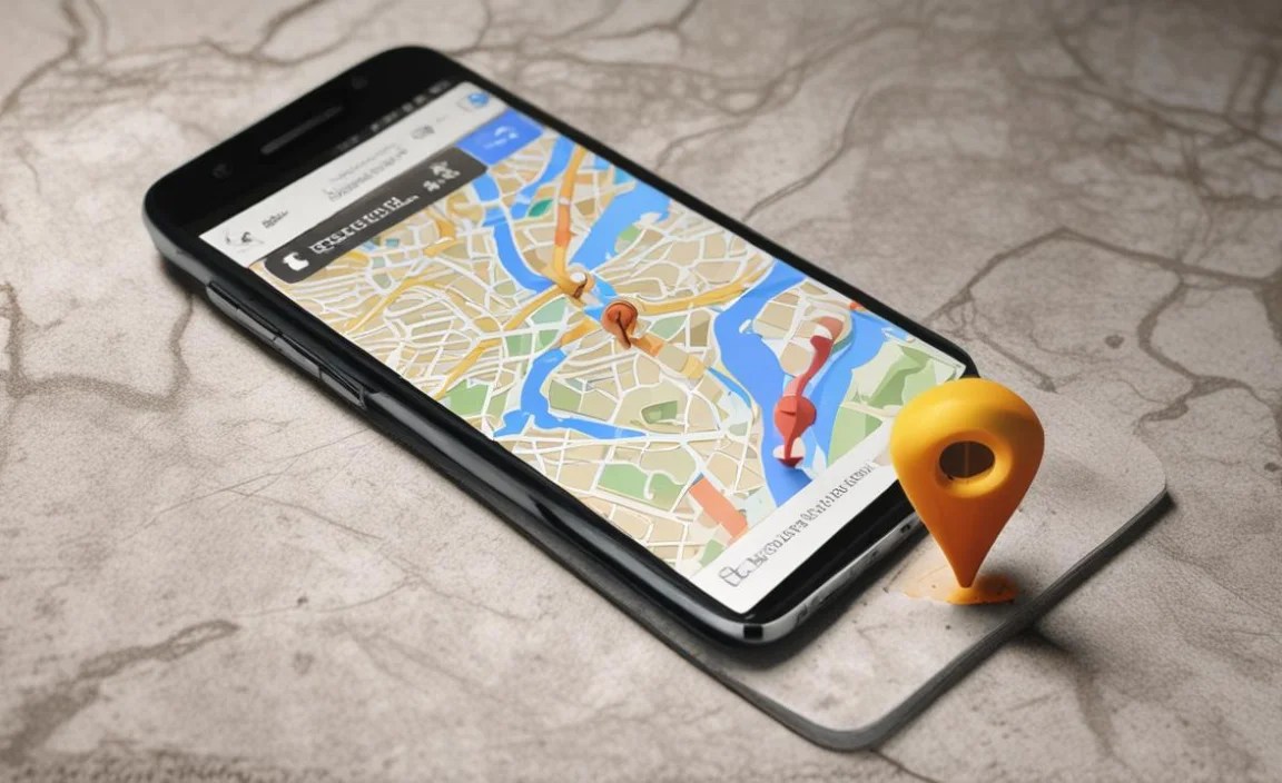
When you open Google Maps, what’s one of the first things you notice? It’s the text. Street names, business listings, public transit stops – they all need to be instantly understandable. This isn’t accidental; it’s the result of careful design, especially when it comes to the font choices. The font isn’t just there to fill space; it actively shapes how you interact with the map, how quickly you can find what you need, and even how stressful your journey might be.
Think about a cluttered city map. If the street names are in a thin, wispy font, or if similar letters like ‘I’ and ‘l’ look identical, you’re going to waste time deciphering them. This is where the magic of good typography comes in. Google Maps uses fonts that are specifically designed for digital screens and for the critical task of navigation. This means prioritizing clarity above all else. The font is a silent guide, working hard to make your experience seamless and efficient. It’s a prime example of how a seemingly small design element can have a massive impact on usability.
The Challenge of Map Typography
Designing for maps presents unique challenges. Unlike a book or a website where you might have more space and context, maps are often viewed on small screens under varying lighting conditions. They need to convey a wealth of information – roads, landmarks, businesses, addresses, public transport routes – in a way that’s quick and easy to digest. At the same time, the map needs to remain visually appealing, not cluttered or overwhelming.
The text on a map needs to serve multiple purposes simultaneously. It identifies places, indicates routes, and provides details. This means the font must be:
- Highly Legible: Letters must be easily distinguishable from one another, even at small sizes.
- Clear and Crisp: Characters should render sharply on digital displays, avoiding blurriness or pixelation.
- Efficiently Spaced: Appropriate kerning (space between characters) and leading (space between lines) are vital to prevent text from crowding.
- Hierarchical: Different font weights or styles might be used to differentiate between highway names, street names, and business titles, guiding the user’s eye.
The font used in Google Maps is a direct response to these challenges. It’s a carefully chosen tool to ensure that vital geographic information is accessible to everyone, everywhere, anytime.
Google Maps’ Font Choice: The Power of Google Sans
At the heart of Google Maps’ visual interface is its typography. For many years, Google Maps has leveraged its proprietary typeface, Google Sans. This sans-serif font is not just a choice; it’s a statement about Google’s design philosophy: clarity, modernity, and user-centricity. Google Sans was designed from the ground up for digital interfaces, aiming to provide excellent legibility across a wide range of applications and screen sizes.
Why Google Sans?
Google Sans is a geometric sans-serif font with a friendly yet highly functional appearance. Its key characteristics that make it ideal for Google Maps include:
- Open Letterforms: The apertures of letters like ‘c’, ‘e’, and ‘s’ are wide and open, preventing them from visually closing up at small sizes or during fast reading.
- Distinct Characters: Letters like ‘I’, ‘l’, and ‘1’, or ‘0’ and ‘O’, are designed with subtle differences to avoid confusion.
- Good X-Height: The relatively large x-height (the height of lowercase letters) means that lowercase text is quite prominent and easy to read.
- Balanced Weight: The default weight provides a good balance between being substantial enough to be seen easily and not so heavy as to dominate the map.
- Controlled Spacing: Careful attention has been paid to the spacing of characters and words, ensuring text doesn’t feel cramped.
This deliberate design makes Google Sans exceptionally well-suited for the demanding environment of a digital map. It helps users quickly scan names, distinguish different types of locations, and follow directions without the visual strain that might come from less optimized fonts.
How Specific Font Features Enhance Usability
It’s not just about picking “a nice font.” Specific attributes of Google Maps’ chosen typeface directly contribute to a superior user experience. These are the subtle design choices that, collectively, make navigation smoother and less stressful. Let’s break down what these features are and why they matter:
Legibility and Clarity at Speed
On a map, users are often in a hurry. They might be driving, walking, or cycling, and need to identify a street or landmark in a split second. A legible font ensures that each character is immediately recognizable.
- Distinct Forms: Letters that look alike (like ‘o’ and ‘0’, or ‘a’ and ‘e’) are subtly different in Google Sans, preventing misreads.
- Open Counters: The white space within letters (like the inside of an ‘o’ or ‘p’) is kept open. This clarity is vital when text is rendered at small point sizes on mobile devices.
- Sans-Serif Structure: The lack of serifs (small decorative strokes at the ends of letter strokes) provides a cleaner, more modern look that translates well to digital screens, avoiding fuzziness.
Impact of Font Weight and Style Hierarchy
Not all information on a map is equally important. Google Maps uses different font weights and styles to guide your eye and help you prioritize information. This is known as typographic hierarchy.
- Primary Locations: Major roads or cities might use a bolder weight.
- Secondary Information: Smaller streets, businesses, or points of interest might use a regular or lighter weight.
- Labels vs. Titles: Sometimes, different styles are used for different types of labels, helping users distinguish between, for example, highway names and local street names.
This visual cueing is incredibly powerful. It allows users to quickly absorb the most critical information first, without having to consciously analyze every piece of text. It’s like an unspoken language that directs attention effectively.
Performance and Scalability on Different Devices
Google Maps is accessed on a vast array of devices, from large desktop monitors to tiny smartwatch displays. The chosen font needs to perform well across all of them. Google Sans is designed for scalability, meaning it retains its legibility even when shrunk down significantly.
- Vector-Based Design: When fonts are designed using vector graphics, they can be scaled infinitely without losing quality, ensuring crisp text on any screen resolution.
- Optimized for Pixels: Font designers also consider how characters will render on a pixel grid. Google Sans is engineered to look sharp and clear, minimizing aliasing (jagged edges).
This attention to detail ensures that whether you’re using the app on a brand-new flagship phone or a budget device, the text will remain readable. This consistency is a cornerstone of good user experience.
Environmental Factors and Font Design
We often use maps in less-than-ideal conditions: bright sunlight on a car windshield, shaky hands on public transport, or at night with minimal ambient light. The font design accounts for these real-world scenarios.
- Contrast: The design ensures sufficient contrast between the letterforms and their background, which is crucial for readability in varying light.
- Simplicity: Overly complex or decorative fonts would become illegible under distracting conditions. The straightforward nature of Google Sans helps cut through the noise.
For example, consider a user glancing at their phone through a sun-drenched window. A font with thin strokes or closed-off counters would be almost impossible to read. Google Sans’s robust and clear design makes it more forgiving in these challenging situations.
Applying Google Maps Font Insights to Other Projects

The principles behind Google Maps’ font choices are incredibly valuable for anyone designing digital products, especially those involving complex information displays like navigation, data visualization, or even dense website content. You don’t have to use Google Sans itself to benefit from the reasoning behind its selection.
Choosing the Right Font for Your Needs
When you’re selecting a font for your own project, ask yourself these key questions:
- What is the primary function of the text? Is it for navigation, data display, branding, or body copy?
- Where will the text be viewed? On small screens, large displays, in print, or a mix?
- Who is your audience? What are their potential needs or limitations (e.g., visual impairments)?
- What is the context? Will users be in a hurry, relaxed, or under stress?
Key Characteristics to Look for in Fonts
Based on the Google Maps example, here are attributes to prioritize:
- Sans-Serif is Often Best: For digital interfaces and clear information display, sans-serif fonts generally offer superior legibility.
- Generous X-Height: Fonts with a larger x-height make lowercase text more prominent and easier to read.
- Distinguishable Characters: Ensure similar letters and numbers have noticeable differences.
- Open Apertures and Counters: Avoid fonts where the openings in letters like ‘c’, ‘e’, ‘s’, or ‘a’ are too narrow.
- Readability at Various Sizes: Test your chosen font at both small and large sizes to ensure it scales well.
- Legible Weights: Opt for fonts with a range of weights that provide clear hierarchy without becoming too thin or too bold.
Examples of Great Readable Fonts
Beyond Google Sans, consider these fonts that share similar usability characteristics:
- Open Sans: A highly popular, friendly, and open sans-serif font available on Google Fonts.
- Roboto: Another Google typeface, designed for optimal legibility across screens. It has a dual nature of mechanical skeleton and friendly form.
- Lato: A sans-serif font that feels “transparent” when used in body text but has distinctive details when viewed in larger size.
- Source Sans Pro: Adobe’s first open-source font family, clean, modern, and highly versatile.
- Inter: A widely used font for UI design, optimized for clarity on digital screens.
These fonts share the ability to remain clear and accessible, making them excellent choices for applications where information must be understood quickly and accurately.
Typographic Hierarchy in Practice
Just like Google Maps, you can use font variations to guide your users:
- Bold for Emphasis: Highlight key terms, titles, or calls to action.
- Varying Weights: Use lighter weights for secondary details and bolder weights for primary information.
- Color Contrast: Ensure sufficient contrast between text and background, especially important for accessibility. You can check contrast ratios using tools like the WebAIM Contrast Checker.
- Size and Spacing: Differentiate information types through font size and the use of white space. Larger font sizes and more space generally indicate higher importance.
Testing Your Font Choices
The ultimate test of a font is how users interact with it. Always test your designs in real-world scenarios:
- Device Testing: View your design on a variety of devices with different screen sizes and resolutions.
- User Testing: Get feedback from your target audience. Ask them to perform tasks that involve reading and interacting with text.
- Accessibility Checks: Ensure your font choices and their application meet accessibility standards, such as WCAG guidelines.
Table: Font Comparison for Usability
| Font Feature | Impact on User Experience | Google Maps Font (Google Sans) Example | Other Recommended Fonts |
|---|---|---|---|
| Legibility (Clear Letterforms) | Enables quick scanning and reduces misreads, especially at small sizes. | Open apertures and distinct characters (‘I’ vs ‘l’). | Open Sans, Roboto, Lato |
| Scalability | Maintains clarity and crispness across all screen sizes. | Sharp rendering on mobile and desktop. | Source Sans Pro, Inter, Montserrat |
| Typographic Hierarchy | Guides user’s eye to important information, improving efficiency. | Use of different weights (e.g., bold for main roads). | Consistent use of bold/regular weights and sizes. |
| Performance in Varied Conditions | Ensures readability under challenging lighting or high-distraction environments. | Robust design that cuts through visual noise. | Fonts with good stroke contrast and clear strokes. |
| Overall Aesthetic | Contributes to a clean, modern, and trustworthy interface. | Friendly yet functional geometric sans-serif. | Modern, clean sans-serifs. |
Frequently Asked Questions About Google Maps Font and User Experience
What font does Google Maps use?
Google Maps primarily uses the “Google Sans” font family, which is a custom sans-serif typeface developed internally by Google. This font is optimized for digital interfaces, offering excellent readability across various screen sizes.
Why is font readability so important on maps?
On maps, readability is paramount because users need to quickly identify locations, read street names, and understand directions without hesitation. Poor font choice can lead to misinterpretations, delays, and a frustrating user experience.
How does Google’s font choice help users?
Google Sans, used in Google Maps, is designed with clean lines, generous spacing, and distinct letterforms. This ensures that even at small sizes or on lower-resolution screens, text remains crisp and easy to scan, supporting quick decision-making.
Can I change the font in Google Maps?
As a user, you generally cannot change the font within the Google Maps application itself. The font is a core part of the app’s design, controlled by Google to ensure a consistent and optimal experience for all users.
What design principles make Google Maps’ font effective?
Effectiveness comes from principles like legibility (easy to distinguish letters), clarity (unambiguous forms), and hierarchy (font variations to distinguish different types of information). Google Sans excels in these areas, making it ideal for a utilitarian application like a navigation map.
How can I choose a good font for my own map-based app or website?
When selecting a font for your own map project, prioritize sans-serif typefaces known for excellent legibility. Look for fonts with clear letterforms, good x-height (the height of lowercase letters like ‘x’), and avoid overly decorative or condensed styles for critical map labels. Testing on different devices is also key.


Leave a Comment