The “Guardians of the Galaxy Font” isn’t a single, official typeface but a style inspired by the movies. It’s characterized by bold, adventurous, and often retro-futuristic lettering, combining strong sans-serif elements with unique decorative touches to evoke a sense of cosmic exploration and quirky heroism. Finding or creating this look involves understanding its core design principles.
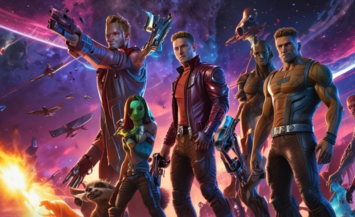
Hey there, design explorers! Ever marveled at the electrifying movie posters and logos for “Guardians of the Galaxy” and wondered about that incredible font? You know, the one that screams adventure, a touch of rebellion, and cosmic fun? If you’re looking to capture that same vibrant, intergalactic energy for your own projects, you’re in the right place. It can be a bit puzzling when a popular font style doesn’t have a single, definitive name. But don’t worry! We’re about to demystify the visual magic behind the “Guardians of the Galaxy Font” and equip you with everything you need to find or create something similar.
Unpacking the “Guardians of the Galaxy Font” Aesthetic

The “Guardians of the Galaxy Font” isn’t a specific licensed font you can just download. Instead, it’s a stylistic concept that brilliantly blends a few key typographic elements. Think bold, prominent letterforms, often with a retro-futuristic vibe, evoking classic sci-fi posters from the mid-20th century but with a modern, dynamic twist. It’s playful, impactful, and full of personality. This style is perfect for anything that needs to stand out and feel a little bit extraordinary!
The essence of this aesthetic lies in its powerful presence. It’s designed to grab your attention, much like a speeding Star-Lord on his Milano. This means we’re often looking at:
- Strong, Geometric Sans-Serifs: These form the backbone of the style, providing a solid, readable base.
- Slightly Distressed or Textured Finishes: Adding a touch of grit and character, hinting at adventures across the galaxy.
- Bold Outlines or Shadows: Creating depth and making the text pop out from its background.
- Unique Ligatures or Alternating Characters: Sometimes, custom lettering adds that special, iconic flair.
- A Hint of Nostalgia: It often borrows from vintage sci-fi movie titles, giving it a familiar yet fresh feel.
Finding Fonts that Capture the Guardians’ Spirit

Since there isn’t one official font, the goal is to find typefaces that share the same DNA. We want fonts that feel adventurous, bold, and possess that distinct retro-futuristic charm. These are generally display fonts, meaning they’re best used for headlines, titles, and short bursts of text, rather than body copy. The key is to look for fonts with personality!
Here are some characteristics to keep an eye out for when searching for your own “Guardians of the Galaxy Font” alternatives:
- Geometric Construction: Look for fonts where the letters are built from simple geometric shapes like circles and straight lines.
- Slab Serif or Bold Sans-Serif: These can provide the necessary weight and impact.
- Distressed or Stencil Variants: These can add a rugged, adventure-worn feel.
- Extended or Condensed Styles: Playing with width can add to the visual interest and impact.
- Outlined or Layered Options: Some fonts come with built-in effects that mimic the layered look often seen in movie titles.
Top Font Categories and Examples
To help you navigate the vast world of typography, let’s break down the categories of fonts that often embody the “Guardians of the Galaxy Font” feel. We’ll explore some popular choices and where you might find them.
Bold Geometric Sans-Serifs
These fonts are the workhorses for achieving that strong, confident look. They are clean, impactful, and provide a great base for further customization or for standing alone.
- Montserrat: A popular, free Google Font, Montserrat has a strong geometric structure and comes in a wide range of weights. Its boldest versions are fantastic for headlines.
- Bebas Neue: Another free favorite from Google Fonts, Bebas Neue is a condensed, all-caps sans-serif that exudes uppercase power. It’s excellent for maximizing space and creating a commanding presence.
- Oswald: Inspired by classic grotesques, Oswald is a highly versatile sans-serif available in various weights. Its slightly condensed nature makes it great for impactful titles.
Retro-Inspired Display Fonts
These fonts often pull inspiration from mid-century designs, space-age aesthetics, and vintage signage, giving them that unique, nostalgic flair. They are perfect for adding character and a story to your design.
- Orbitron: This is a fantastic free font from Google Fonts, explicitly designed for display purposes with a futuristic, geometric feel. It’s a strong contender for that intergalactic vibe.
- Audiowide: Another free Google Font, Audiowide has a distinct wide, geometric style with a retro-futuristic feel that pairs well with sci-fi themes.
- Space Grotesk: A proportional sans-serif inspired by the Space Mono font, it offers a modern take on retro tech aesthetics and is available via Google Fonts.
Slab Serifs with a Punch
Slab serifs, with their thick, block-like serifs, can provide an incredibly robust and eye-catching title font. They offer a slightly different, often more industrial or grounded, kind of boldness.
- Russo One: This free Google Font is a bold, condensed slab serif with a strong, impactful presence ideal for headlines and titles needing a solid foundation.
- Anton: A very bold, condensed sans-serif from Google Fonts that leans towards a slab-like impact. It’s excellent for titles where space is limited but impact is paramount.
Distressed and Textured Options
To add that “been-through-it” adventure feel, distressed or textured fonts are invaluable. They suggest history, grit, and lived experiences, much like our beloved Guardians.
- Metal Macabre: While perhaps more gothic, its distressed nature and bold forms can be adapted. Look for bold, textured fonts on marketplaces.
- Army of Darkness: A bold, textured font often found on font marketplaces that can evoke a gritty, heroic feel.
Where to Find These Fonts

The good news is that many of these visually striking fonts are readily available, often for free! Here are some of the best places to start your search:
- Google Fonts: An extensive library of free, high-quality fonts licensed for commercial and personal use. It’s an excellent starting point for almost any project. You can explore categories like “Display” or “Techno” to find suitable options.
- Font Squirrel: Offers a curated collection of free fonts, many of which are suitable for commercial use. They often have excellent quality and varied styles.
- Adobe Fonts: If you’re an Adobe Creative Cloud subscriber, you have access to a vast library of professional fonts that can be activated for use across your Adobe apps.
- Creative Market and MyFonts: These are premium marketplaces where you can purchase individual fonts or font families. If you’re looking for something truly unique or highly specific, these platforms are invaluable.
Creating Your Own “Guardians of the Galaxy” Style

Sometimes, the perfect font doesn’t exist off the shelf. This is where your creativity can really shine! You can take an existing font and modify it, or even create something entirely new. Here’s how you can approach it:
Step-by-step Customization
Start with a strong, bold font that has the basic structure you like. Then, employ graphic design software like Adobe Photoshop, Illustrator, or even free alternatives like Canva or GIMP to add those distinctive touches.
- Choose a Base Font: Select a bold, geometric sans-serif or a simple retro-style font. Think about its overall width and height.
- Experiment with Layering: Create duplicates of your text. Use one layer for the main character, another for a bold outline, and perhaps a third for a shadow effect. This layering is key to creating depth.
- Add Textures: Import subtle grunge textures, cosmic dust, or metallic effects and create clipping masks or blend modes with your text layers to apply them realistically. Resources like Pexels Textures can offer inspiration.
- Distress or Inset: Gently roughen the edges of your letters using a distressed brush or apply an inner shadow effect to give them a worn or sculpted look.
- Custom Ligatures or Glyphs: For a truly unique feel, consider subtly altering specific letter combinations (ligatures) or individual letterforms (glyphs). This requires a bit more design skill but can yield outstanding results.
- Color Palette: Don’t forget color! Bold contrasts, metallic sheens, and vibrant, cosmic hues are essential. Think deep blues, vibrant purples, fiery oranges, and electric greens, often with metallic gradients.
Tools for Customization
Here are some essential tools:
- Vector Graphics Software: Adobe Illustrator, Affinity Designer, Inkscape (free). Ideal for creating scalable logos and text effects.
- Raster Graphics Software: Adobe Photoshop, GIMP (free), Photopea (web-based, free). Perfect for applying textures, brushes, and complex layer effects.
- Font Management Software: For organizing your font library.
- Online Design Tools: Canva offers templates and easy-to-use effects that can help beginners achieve a similar look quickly.
Applying the Guardians’ Font Style to Your Projects
This dynamic font style isn’t just for movie posters. It’s versatile and can bring energy and character to a wide range of creative endeavors.
Graphic Design Applications
- Logos: Perfect for brands that want to convey adventure, innovation, or a quirky, playful spirit. Think tech startups, adventure travel companies, or creative agencies.
- Posters and Flyers: Ideal for events, concerts, or promotions where you need something that pops and grabs attention.
- Album Art or Book Covers: Instantly communicates a genre that might be sci-fi, action, or something with a retro twist.
Web and Digital Use
- Website Headlines: Use sparingly for your main site title or section headers to add personality and draw users in. Ensure it remains readable on various devices.
- Social Media Graphics: Create eye-catching banners, post graphics, or story elements that stand out in busy feeds.
- Video Titles and Intros: For YouTube videos, explainer content, or short films that require a strong visual identity.
- App Interfaces: As a distinctive display font for app titles or key navigation elements to give your app a unique character.
Considerations for Readability
While this style is all about impact, it’s crucial not to sacrifice readability. Bold, distressed, or highly stylized fonts can become hard to read, especially at smaller sizes or in large blocks of text.
Best Practices for Readability:
- Use for Headlines and Titles Only: Reserve these bold fonts for the most important text elements.
- Pair with a Readable Body Font: Always complement your display font with a clean, legible sans-serif or serif font for body copy.
- Ensure Sufficient Contrast: Make sure your text color stands out clearly against its background, especially with textured or layered effects.
- Test on Different Devices: What looks great on a desktop monitor might be unreadable on a mobile screen. Always test your designs across various screen sizes.
- Kerning and Spacing: Pay close attention to the spacing between letters (kerning) and words. This is vital for making even complex display fonts easier to read.
A Quick Comparison Table: Font Styles
To help you visualize the spectrum, here’s a table comparing general font categories and how they relate to the “Guardians of the Galaxy” aesthetic.
| Font Style | Key Characteristics | Guardians-esque Vibe | Best For |
|---|---|---|---|
| Geometric Sans-Serif | Clean lines, circular forms, modern. | Provides strong, bold foundation for titles. | Logos, headlines, UI elements. |
| Retro-Futuristic Display | Vintage sci-fi influences, unique shapes, decorative. | Directly captures the cosmic, adventurous spirit. | Movie titles, posters, themed branding. |
| Slab Serif | Thick, block-like serifs, sturdy. | Offers robust, impactful presence, slightly grounded. | Strong headlines, industrial themes, print. |
| Distressed/Textured | Gritty, worn, sometimes rough edges. | Adds a sense of adventure, history, and resilience. | Labels, badges, weathered looks. |
FAQ: Your Guardians Font Questions Answered
What is the official font used in the Guardians of the Galaxy movies?
There isn’t one single official font. The titles and logos are often custom-designed or heavily stylized using a combination of existing fonts and unique lettering to achieve the distinct retro-futuristic, adventurous look.
Can I use the “Guardians of the Galaxy Font” for my business logo?
Since it’s not a specific, licensed font, you can’t use the actual movie logo. However, you can absolutely use fonts that emulate the style for your business logo to convey a similar adventurous and bold spirit. Just ensure you have the correct license for any font you use.
Are there free fonts that look like the Guardians of the Galaxy Font?
Yes! Fonts like Orbitron, Audiowide, Space Grotesk, Montserrat (Bold weights), and Bebas Neue from Google Fonts share many characteristics and are excellent free options for achieving a similar aesthetic.
What makes a font “retro-futuristic”?
Retro-futurism in fonts typically combines design elements from past eras (like mid-century modern or 1970s sci-fi) with concepts of the future. This might include geometric shapes, rounded edges, bold outlines, and a sense of optimism or excitement about technology and space exploration.
How do I make text look “distressed” or “textured”?
You can achieve this effect in design software by applying textures (like grunge, paper, or metallic surfaces) to your text layers using clipping masks or blend modes. You can also use distressed brushes to roughen letter edges or add subtle damage.
Is it okay to mix fonts in a Guardians-style design?
Absolutely! Mixing a bold, stylized display font for titles with a clean, readable sans-serif for body text is a common and effective design practice. It ensures your main message has impact while keeping supporting information accessible.
Conclusion
The “Guardians of the Galaxy Font” style is all about capturing a feeling: one of thrilling adventure, quirky charm, and boundless cosmic exploration. While it’s not a single typeface, by understanding the core elements—boldness, retro-futuristic flair, and a touch of personality—you can effectively find or create designs that resonate with this exciting aesthetic. Whether you opt for readily available free fonts like Orbitron or choose to customize existing typefaces with textures and clever layering, the key is to experiment and let your creativity soar across the galaxy!


Leave a Comment