The official Las Vegas Raiders font is Raiders, a custom typeface designed to embody the team’s bold, rebellious, and iconic spirit. While not directly downloadable as a free font, understanding its characteristics and finding similar alternatives is key for authentic fan designs and professional branding.
Ever admired that unmistakable Raiders look? That powerful lettering on jerseys, helmets, and merchandise? It’s instantly recognizable, isn’t it? The “Las Vegas Raiders font” is more than just letters; it’s a statement. For fans wanting to create their own Raiders-themed graphics, or designers looking to capture that iconic essence, finding the right font can feel like a quest. But don’t worry! We’re going to break down exactly what makes the Raiders font so special and how you can achieve that signature style in your own projects.
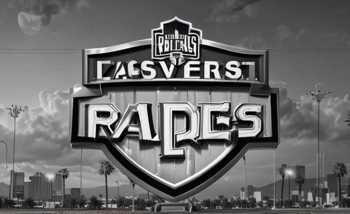
Unpacking the Raiders’ Typographic Identity

The Las Vegas Raiders font is a distinct and custom-designed typeface. Officially known as “Raiders,” it was developed to perfectly reflect the team’s identity: strong, aggressive, and undeniably cool. It’s not a readily available free font you can simply download from any website, which adds to its exclusivity and the challenge for designers wanting to perfectly replicate it.
This typeface is characterized by:
- Sharp Serifs: The serifs are prominent and pointy, giving the letters a strong, almost warlike edge.
- Bold Weight: It’s a heavy, robust font that commands attention and conveys power.
- Slightly Condensed Feel: While bold, the letters have a unified, almost tight spacing that enhances its impact.
- Unique Letterforms: Certain letters have distinctive shapes, especially the ‘R’ and ‘A’, that are central to its iconic status.
The Raiders typeface is primarily used for the team’s official branding, including their wordmarks, jersey lettering, and helmet decals. Its consistent use across all official materials solidifies its status as an essential element of the Raiders’ visual identity, much like the Silver and Black color scheme itself.
Why the “Raiders Font” Matters for Your Designs

Whether you’re a devoted fan creating a tribute or a professional designer working on a sports-related project, using a font that captures the essence of the Las Vegas Raiders is crucial. The right typeface can transform a generic design into something that screams “Raider Nation.”
Here’s why getting the font right is essential:
- Authenticity: For official or semi-official branding, using the correct or a very close replica font ensures legitimacy and bypasses copyright issues if you’re aiming for a look-alike rather than an exact copy.
- Brand Recognition: The Raiders font is a powerful symbol. Using it instantly connects your design to the team and its legacy.
- Visual Impact: The font is designed to be bold and impactful. It grabs attention, conveying strength and determination, which is perfect for sports themes.
- Fan Connection: For fans, a design featuring the correct font is a clear signal of belonging and understanding of the team’s culture.
Finding the Closest Alternatives to the Official Raiders Font

Since the official “Raiders” font isn’t publicly available for download, the key for most designers and fans is to find fonts that closely mimic its characteristics. This involves looking for typefaces that share the sharp serifs, bold stature, and overall aggressive feel. Here are some popular and effective alternatives:
1. Impact
Impact is a classic choice for a reason. It’s a condensed sans-serif font known for its extreme boldness and strong presence. While it lacks serifs, its sheer weight and condensed nature can offer a similar sense of power.
Why it works:
- Extremely bold and impactful.
- Condensed letterforms.
- Widely available and often free for personal use.
Considerations: It’s a sans-serif, so it won’t have the signature sharp serifs of the official Raiders font. You might need to stylize it further.
2. Trajan Pro
Trajan Pro is a serif font inspired by inscriptions on the base of the Trajan’s Column in Rome. It’s known for its classic, sturdy look with sharp, well-defined serifs. Its inherent gravitas makes it a strong contender.
Why it works:
- Features prominent, sharp serifs.
- Strong and authoritative feeling.
- Often used in movie posters and titles, conveying importance.
Considerations: Trajan Pro is a bit more formal and classical than the aggressive Raiders font. Its capitals-only nature might also be a limitation if you need lowercase.
3. Stymie Black
Stymie is a slab serif font, meaning it has thick, block-like serifs. The “Black” variant is appropriately heavy and bold. Slab serifs share a sense of robustness with the Raiders font.
Why it works:
- Thick, squared-off serifs.
- Very bold and solid appearance.
- Offers a good balance between classic and modern.
Considerations: Stymie’s serifs are typically blockier and less sharp than the Raiders font’s, but the overall weight is comparable.
4. Bebas Neue (with modifications)
Bebas Neue is a popular, free uppercase sans-serif font. While it’s sans-serif and not as heavy as the Raiders font, its condensed style and clean lines make it a versatile base. You can stylize it to add weight or even decorative elements.
Why it works:
- Free and widely accessible.
- Condensed style.
- Good for all caps display text.
Considerations: It’s a sans-serif and needs significant styling to achieve the Raiders’ look. You’d likely need to add serifs or alter letterforms.
5. League Gothic
Similar to Bebas Neue, League Gothic is a free sans-serif font that is tall and condensed. It’s designed for headlines and displays and offers a commanding presence that can be a starting point.
Why it works:
- Free and open-source.
- Tall and condensed, making it feel powerful.
- Excellent for display purposes.
Considerations: Lacks serifs and the specific quirks of the Raiders font. Modifications would be necessary for a closer match.
Understanding Font Licensing and Usage
It’s important to touch on font licensing, especially when dealing with officially branded typefaces or their commercial alternatives. The official “Raiders” font is proprietary intellectual property of the Las Vegas Raiders/NFL. This means it’s protected, and its use is typically restricted to official team merchandise and communications. Using it without permission could lead to legal issues.
When you use fonts that are similar but not identical:
- Personal Use: Most free fonts (like Bebas Neue, League Gothic, Impact) are available for personal projects without issue.
- Commercial Use: If you’re using a font for a business, website, or product you sell, especially one that references a team, you MUST check the specific license. Many fonts have different licenses for personal versus commercial use.
- Avoiding Infringement: When creating designs that evoke the Raiders’ style for commercial purposes without explicit licensing, aim to create something inspired by the Raiders font, rather than a direct copy. This means using similar characteristics from legally available fonts and perhaps adding your own unique touches. For example, a company that designs licensed NFL merchandise would have specific agreements.
For more on font licensing, resources like Graphic Q’s guide on font licensing can offer valuable insights.
DIY: Customizing Fonts for the Raiders Feel

Sometimes, the best way to get that exact Raiders look is through a bit of DIY graphic design. If you’ve chosen a base font like Impact or Trajan Pro, you can alter it to get closer to the official typeface.
Steps to Customizing:
- Start with a Bold Base: Select a font that is already very bold and has some structural similarities.
- Adjust Letter Spacing (Kerning/Tracking): Use your design software (like Adobe Illustrator or Photoshop) to tighten the spacing between letters. The Raiders font often has a unified, compact look.
- Modify Serifs: If you’re using a serif font, you might need to manually adjust the shape, length, and angle of the serifs to be sharper and more aggressive. For sans-serif fonts, you might very carefully add pointed serifs.
- Alter Letterforms: Pay attention to specific letters in the Raiders logo. For instance, the ‘R’ has a distinctive leg. You might need to modify the shape of such letters to match.
- Add a Subtle Roughness (Optional): The Raiders’ visual branding often includes a rugged, almost distressed quality. You could apply a subtle texture overlay to your custom text.
Tools like Adobe Illustrator are invaluable for this. Vector-based editing allows you to precisely manipulate each curve and line. For texture overlays, online resources often provide free brush packs or texture images you can integrate.
Case Study: Recreating Raiders-Inspired Team Gear
Imagine you’re tasked with designing fan merchandise for a local youth football team that wants to capture the “Raiders vibe” without infringing on trademarks. Here’s how you might approach it:
Objective: Create a bold, iconic look for custom t-shirts that says “Raiders-inspired.”
1. Font Selection: Based on research, you decide on ‘Stymie Black’ for its slab serif and bold weight. You also consider ‘Trajan Pro’ for its sharp serifs.
2. Customization:
- Using ‘Stymie Black’, you adjust the kerning so the letters are closely packed.
- You manually sharpen the squared serifs of ‘Stymie Black’ to give them a more aggressive point.
- For the team name, say “Vegas Vipers,” you might tweak the ‘V’ and ‘S’ to have a more predatory sweep.
3. Color Palette: You stick to variations of silver, black, and white, perhaps adding a dark grey or charcoal for depth. Avoid the exact Raiders’ silver and black if you want to be extra cautious about imitation.
4. Supporting Graphics: You design a simple, angular shield or lightning bolt graphic that complements the font’s style, avoiding direct use of the Raiders’ shield or pirate logos.
Result: A t-shirt design that clearly evokes the powerful, edgy spirit of the Raiders through typography and color, but remains distinct enough to be its own entity. This approach respects intellectual property while fulfilling the client’s aesthetic needs.
Where to Find Font Resources and Inspiration
Navigating the world of fonts can be overwhelming, but there are excellent resources to help you find inspiration and potential alternatives.
Reputable Font Marketplaces & Libraries:
- Adobe Fonts: If you subscribe to Adobe Creative Cloud, you have access to a vast library of high-quality fonts, many of which have commercial licenses.
- Google Fonts: A fantastic resource for free, open-source fonts that are excellent for web and print.
- MyFonts: A huge marketplace for both free and premium fonts, with extensive search filters.
- Font Squirrel: This site curates free fonts that are licensed for commercial use, making it easier to find professional-grade typography.
Inspiration and Analysis:
- Official Las Vegas Raiders Website: Observe how the team uses its branding and typography in official communications.
- Sports Branding Blogs: Many design blogs analyze sports team logos and typography, offering insights into type choices and their effectiveness.
- Typographic Databases: Websites like Typography.com offer deep dives into font families and their histories, helping you understand design principles.
By exploring these resources, you can gain a better understanding of different font styles and find suitable options for your projects.
Frequently Asked Questions About the Las Vegas Raiders Font
What is the official font of the Las Vegas Raiders?
The official font is officially named “Raiders.” It’s a custom-designed typeface created specifically for the team by its branding department, characterized by sharp serifs and a bold, aggressive style.
Can I download the Las Vegas Raiders font for free?
No, the official “Raiders” font is proprietary and not available for public download, especially not for free. It is a trademarked asset of the Las Vegas Raiders.
What are good alternatives if I can’t use the official font?
Excellent alternatives that capture a similar feel include fonts like Trajan Pro, Stymie Black, Impact, Bebas Neue, and League Gothic. These offer bold weights, strong serifs, or condensed styles that can be adapted.
Is it legal to use a fan-made Raiders font in my designs?
Using unofficial “Raiders” fonts for personal projects like fan art is generally tolerated. However, using them for commercial purposes (selling merchandise, business branding) without proper licensing from the NFL or Raiders organization can lead to legal issues like trademark infringement.
How can I make a font look more like the Raiders font?
You can customize available fonts by adjusting letter spacing (kerning), sharpening serifs, altering specific letterforms, and potentially adding a subtle texture or rough effect, all within graphic design software.
Where can I find fonts similar to the Raiders font that are safe for commercial use?
Look on reputable font sites like Adobe Fonts, MyFonts, or Font Squirrel and search for terms like “slab serif,” “bold serif,” “display serif,” or “impact fonts.” Always check the specific license for commercial use rights.
What makes the Raiders font so iconic?
Its iconic status comes from its consistent use with the team’s potent imagery, its aggressive and bold design that mirrors the team’s “Just Win, Baby” mentality, and its association with a rich, rebellious history in professional football.
Conclusion: Mastering the Raiders’ Bold Typography
The Las Vegas Raiders font, officially known as “Raiders,” is a powerful typographic symbol that speaks volumes before a single word is read. While its custom nature means you can’t simply download and use it, understanding its core design principles — sharp serifs, bold weight, and aggressive attitude — empowers you to find excellent alternatives and even customize them to perfection. You can achieve that unmistakable Raiders style for fan projects, sports-themed designs, or any endeavor needing a touch of bold, rebellious spirit.
By exploring fonts like Trajan Pro, Stymie Black, or even styling free options like Bebas Neue with careful edits, you can effectively capture the essence of Raider Nation’s typography. Always be mindful of font licensing to ensure your creative work is both impactful and legally sound. With these insights and resources, you’re well-equipped to bring that essential Raiders style to your own designs. Go get ’em!


Leave a Comment