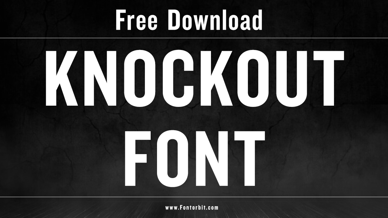
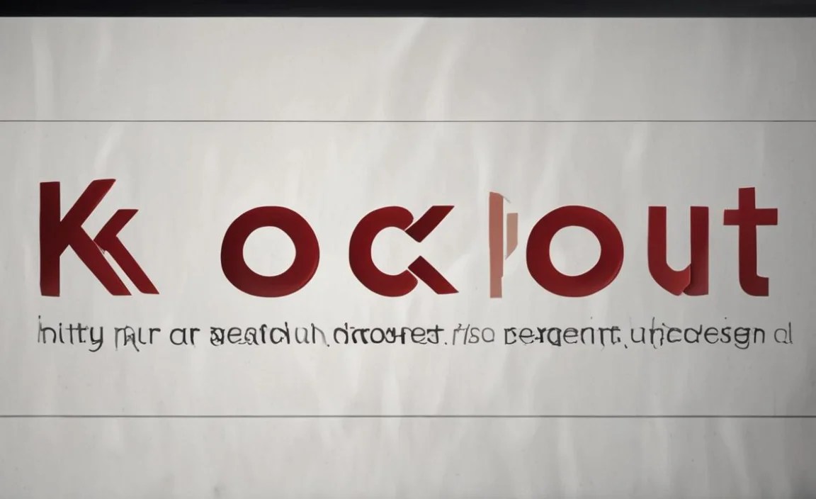
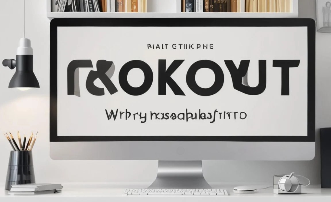
Knockout is a sans-serif typeface designed by Jonathan Hoefler of Hoefler & Co. It was developed between 1994 and 1998 and officially released in 1999.
Knockout’s design is notable for its 19th-century American wood type influence, which gives it a bold, utilitarian look. It’s part of a large family of fonts known for their versatility across design projects. You can find a free version of this font on some font repositories, though commercial licenses are available.
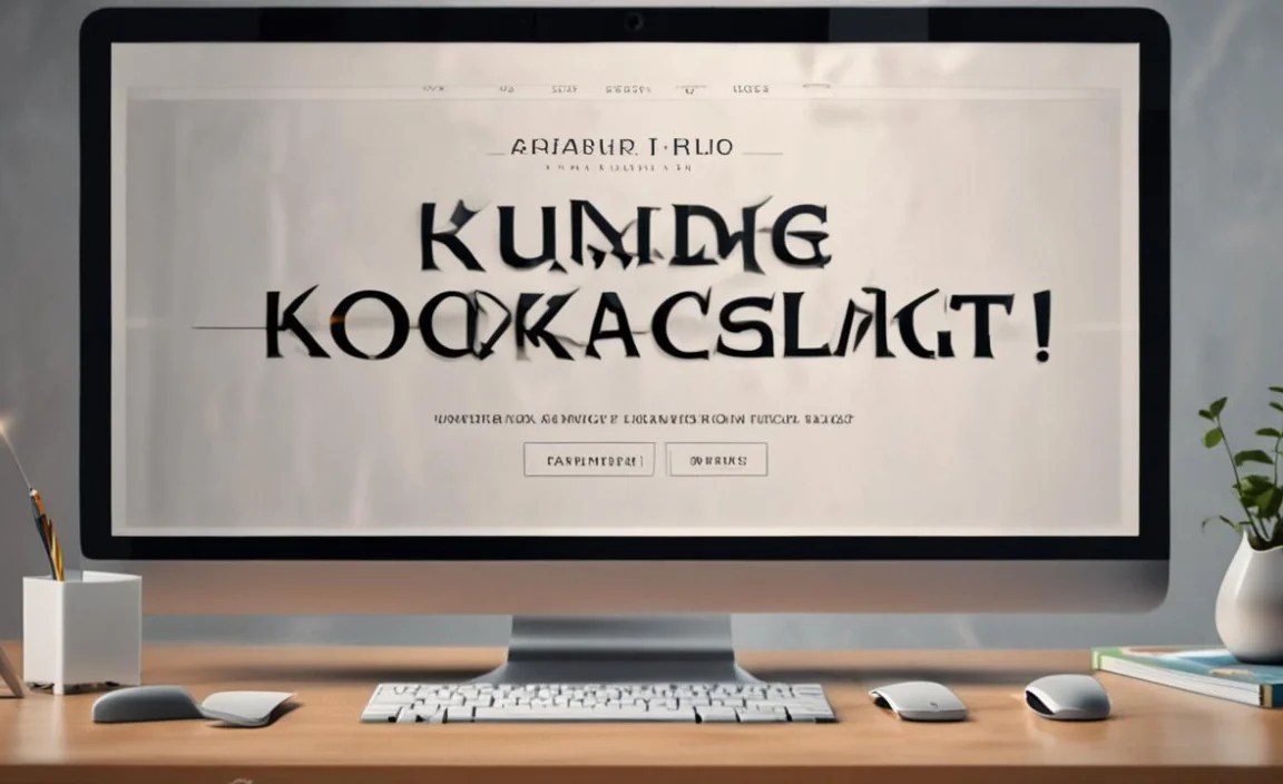
Knockout Font Live Preview Customizer:
Hello World!
Note: Download Only for Practice or Personal Use.
Knockout Family Includes
Knockout offers a broad range of styles. It consists of nine widths and four weights, allowing it to adapt to different text lengths and visual needs. This flexibility makes Knockout a favorite for editorial designers and magazine layouts.
Here are some of the styles:
- Knockout Normal
- Knockout No. 26 Junior Flyweight
- Knockout No. 27 Junior Bantamweight
- Knockout No. 28 Junior Featherweight
- Knockout No. 29 Junior Lightweight
- Knockout No. 30 Junior Welterweight
- Knockout No. 31 Junior Middleweight
- Knockout No. 32 Junior Cruiserweight
- Knockout No. 33 Junior Heavyweight
- Knockout No. 34 Junior Sumo
- Knockout No. 46 Flyweight
- Knockout No. 47 Bantamweight
- Knockout No. 48 Featherweight
- Knockout No. 49 Lightweight
- Knockout No. 50 Welterweight
- Knockout No. 51 Middleweight
- Knockout No. 52 Cruiserweight
- Knockout No. 53 Heavyweight
- Knockout No. 54 Sumo
- Knockout No. 66 Full Flyweight
- Knockout No. 67 Full Bantamweight
- Knockout No. 68 Full Featherweight
- Knockout No. 69 Full Lightweight
- Knockout No. 70 Full Welterweight
- Knockout No. 71 Full Middleweight
- Knockout No. 72 Full Cruiserweight
- Knockout No. 73 Full Heavyweight
- Knockout No. 74 Full Sumo
- Knockout No. 90 Ultimate Welterweight
- Knockout No. 91 Ultimate Middleweight
- Knockout No. 92 Ultimate Cruiserweight
- Knockout No. 93 Ultimate Heavyweight
- Knockout No. 94 Ultimate Sumo
Knockout Font Info Table:
| Name: | Knockout Font |
| Available File | Knockout-HTF49Liteweight-Regular.otf |
| Format: | otf |
| Files Count: | 1 |
| Size: | 33 KB |
| Style: | Sans-serif |
| License: | Practice/Personal Use Only |
| Get for Commercial | Visit Original Source -> |
Where Should I Use This Font?
Knockout’s strong, structured look makes it ideal for projects where a bold, assertive style is needed. Its flexibility across widths and weights makes it suitable for various applications:
- Logos
- Magazines
- Editorials
- Poster Design
- Branding
- Digital and Print Advertising
Similar Font Options
If you’re looking for alternatives to Knockout, consider these similar typefaces:
- Ringside Font
- Oswald Font
- Champion Gothic Font
- Brandon Grotesque Font
- FS Dillon Bold Font
- FTN Bruhn Sans Font
- GT Pressura Font
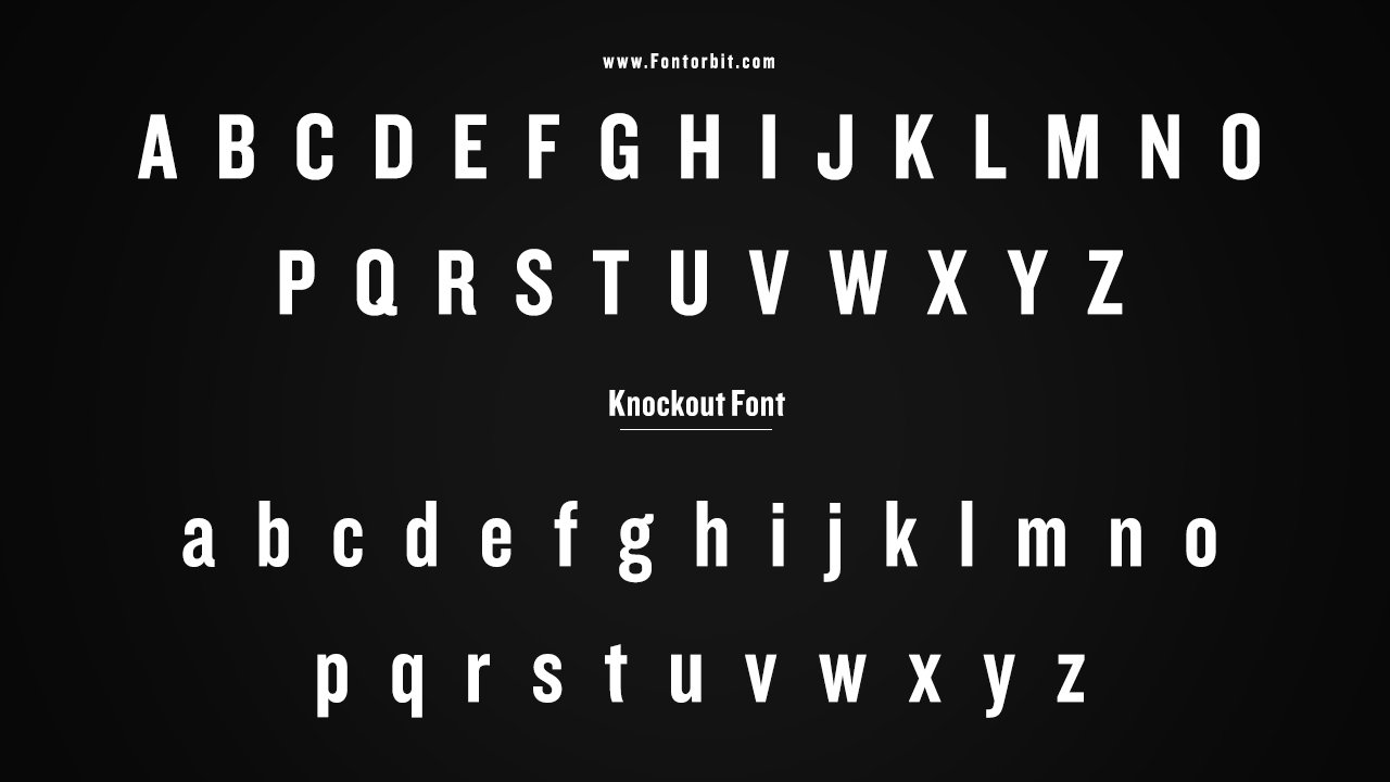
Knockout Font Character Map:
| A | B | C | D | E | F | G | H | I | J | K | L | M |
| N | O | P | Q | R | S | T | U | V | W | X | Y | Z |
| a | b | c | d | e | f | g | h | i | j | k | l | m |
| n | o | p | q | r | s | t | u | v | w | x | y | z |
| 0 | 1 | 2 | 3 | 4 | 5 | 6 | 7 | 8 | 9 | |||
| . | , | : | ; | @ | # | ! | – | / | ? | < | > | |
| & | * | ( | ) | [] | $ |
Last Words
Knockout stands out as a versatile, powerful sans-serif that offers a retro-modern aesthetic rooted in American wood type traditions. Its extensive family makes it a highly adaptable choice for designers looking for flexibility and strength in typography.
FAQs
1. Is Knockout Free?
No, Knockout is a premium font and requires a purchase from foundries like Hoefler & Co. or other font retailers.
2. What Is Knockout Commonly Used For?
Knockout is commonly used in branding, editorial design, and advertising due to its versatile, bold, and condensed sans-serif style.
3. Does Knockout Have Multiple Styles?
Yes, Knockout offers a wide range of styles and widths, multiple weights, and variations to suit diverse design needs.
4. Can I Use Knockout For Web Design?
Yes, Knockout can be licensed for web use and is popular for headlines and bold statements on websites.
5. Is Knockout Suitable For Small Text?
Knockout is not ideal for small text because its bold and condensed structure is better suited for larger, attention-grabbing headlines and display use.


Leave a Comment