Bolded Quick Summary: The “Nerds Candy Font” isn’t a single font, but a visual style inspired by the brand’s playful, quirky lettering. Achieving this look involves combining uneven, rounded, sans-serif characters with bright, contrasting colors and a touch of haphazard charm for a fun, energetic design.
Ever seen those candy packages that just scream fun and excitement? Often, the lettering on them plays a huge role. It’s not just words; it’s an invitation to a sugary adventure. Sometimes, especially with brands like Nerds, the font feels as lively and irregular as the candy itself. It’s a design choice that perfectly captures the product’s spirit.
But what exactly makes this “Nerds Candy Font” style work so well? And how can you capture that same feeling in your own designs? It might seem tricky, but it’s all about understanding a few key elements. Let’s break down this essential and genius design approach, step by step.
What is the “Nerds Candy Font” Style?
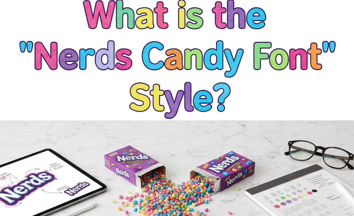
When we talk about the “Nerds Candy Font,” we’re usually referring to the distinctive lettering seen on Nerds candy packaging and branding. It’s not a commercially available font that you can simply download and install. Instead, it’s a custom-designed typographic style that embodies the brand’s personality: playful, energetic, a bit chaotic, and undeniably fun.
The core characteristics of this style include:
- Rounded, Irregular Shapes: The letters are typically rounded, with uneven strokes and varying baselines. They don’t follow strict geometric or organic rules, giving them a hand-drawn, slightly wobbly appearance.
- Sans-Serif Base: The underlying structure is generally a sans-serif (no decorative strokes at the ends of letters), which keeps it feeling modern and approachable.
- Varying Letter Sizes: Different letters might be slightly larger or smaller than their neighbors, adding to the playful, unpolished feel.
- Bold, Bright Colors: The lettering is always presented in eye-catching, often contrasting colors, mirroring the vibrant flavors of the candy.
- Slightly Slanted or Angled: Sometimes, the letters might appear to be tilted at odd angles, further enhancing the sense of movement and zany energy.
Think of it as a visual representation of the candy itself – tiny, colorful, and bursting with flavor and fun. The design doesn’t aim for perfect uniformity; it celebrates its delightful imperfections.
Why is This “Nerds Candy Font” Style Essential for Branding?
The genius of the “Nerds Candy Font” style lies in its effectiveness as a branding tool. It’s not just about looking cool; it serves a vital purpose in connecting with its target audience and conveying the brand’s essence.
1. Capturing Playfulness and Fun
The primary goal of Nerds candy is to be a fun, playful treat. The lettering style directly communicates this. The irregular, bouncy nature of the characters evokes a sense of joy, spontaneity, and childhood delight. For the target audience, which often includes children and those seeking nostalgic, fun-to-eat snacks, this typographic choice is instantly appealing.
2. Enhancing Product Differentiation
In a crowded candy market, standing out is crucial. A unique and memorable visual identity helps a brand get noticed. The distinctive “Nerds Candy Font” style makes the packaging instantly recognizable, setting it apart from competitors with more conventional or generic typography.
3. Evoking Texture and Taste
The visual style can subtly hint at the sensory experience of eating Nerds. The unevenness might suggest the slightly irregular shapes of the candy pieces, and the bright colors vividly represent the intense fruit flavors. This synesthetic connection between visual and taste is a powerful design strategy.
4. Creating a Memorable Brand Personality
Typography is a significant component of brand personality. The “Nerds Candy Font” style contributes to a brand personality that is quirky, energetic, and a little bit mischievous. This consistent personality across all brand touchpoints builds recognition and emotional connection with consumers.
5. Driving Impulse Purchases
Bright, energetic, and fun packaging is designed to grab attention on the shelf and encourage impulse buys. The lively typography of Nerds candy contributes significantly to this, making the product look irresistible to potential customers, especially younger ones.
How to Achieve the “Nerds Candy Font” Look in Your Designs
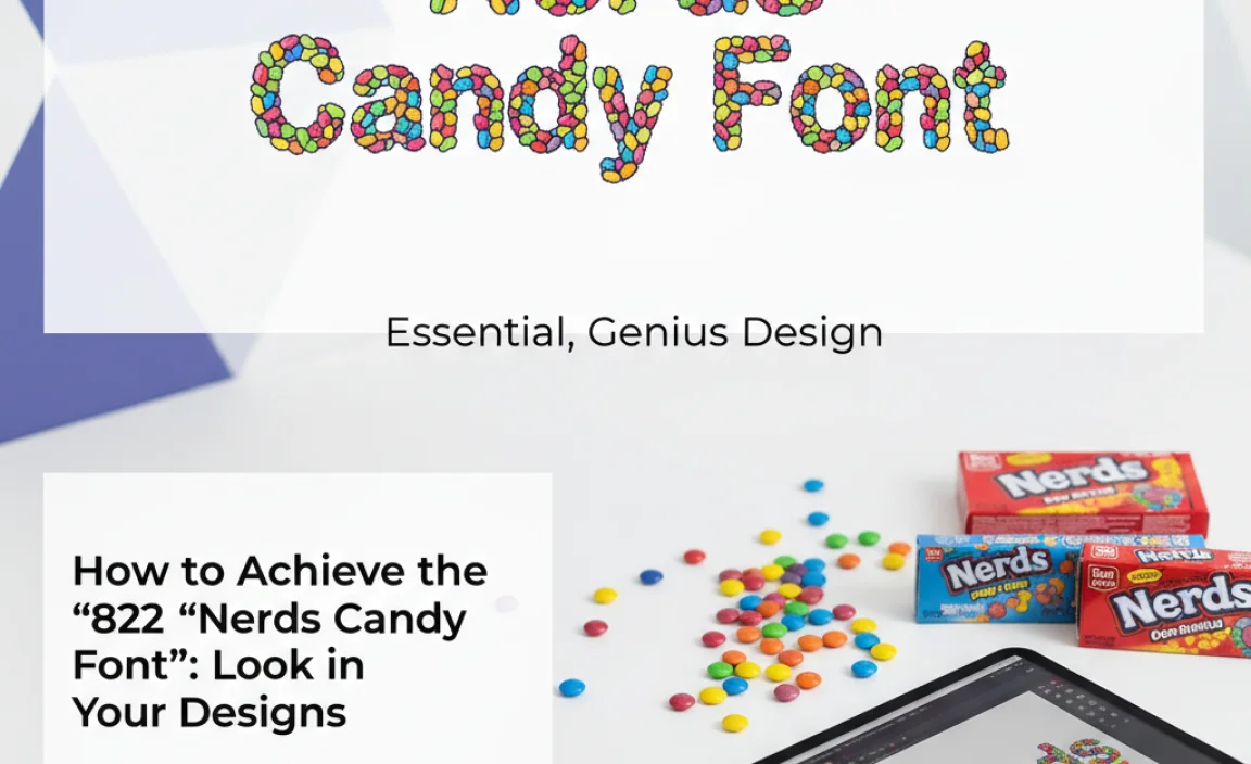
While you can’t download an exact “Nerds Candy Font,” you can absolutely capture the essence of its design style. It’s about understanding the principles and applying them creatively. Here’s a breakdown of how to achieve that essential, genius look:
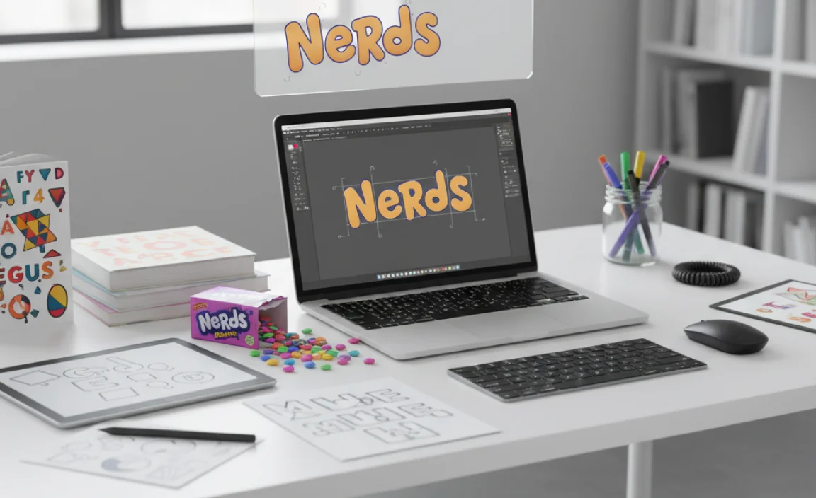
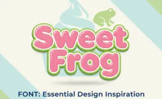
Step 1: Start with a Friendly Sans-Serif Base
Choose a font that has rounded terminals and a generally friendly, approachable feel. It doesn’t need to be perfectly geometric; slight imperfections or variations in stroke width can be beneficial. Look for fonts that are playful but still legible.
Recommended Font Styles to Explore (for inspiration, not exact matches):
- Chubby or rounded sans-serifs
- Hand-drawn sans-serifs with imperfect lines
- Fonts with a slightly bouncy or uneven baseline
You can find many options on reputable font sites. For example, Google Fonts offers a wide range of free, high-quality options, many of which have rounded characteristics. Exploring categories like “Rounded” or “Handwritten” (though be cautious with overly decorative handwritten fonts) can yield good starting points. For more professional options or unique styles, consider sites like Adobe Fonts, Fontspring, or MyFonts.
Step 2: Introduce Irregularity and Playfulness
This is where the magic happens. The key is to move away from perfect, uniform typography. Here are several techniques:
- Manual Adjustments: If you’re using vector software (like Adobe Illustrator or Affinity Designer), you can manually adjust individual letters. Slightly tweak their size, baseline, rotation, and kerning (space between letters). Make each letter feel slightly “off” in a charming way.
- Distortion Effects: Apply subtle warp or distortion effects. A ‘wave’ or ‘bulge’ effect can create a sense of movement and irregularity. Use these sparingly so the text remains readable.
- Varying Letter Weights: If your chosen font family has different weights (light, regular, bold), try using multiple weights for different letters within the same word. This adds visual interest and breaks up uniformity.
- Uneven Word Spacing: Slightly adjust the spacing between letters within a word (kerning) and between words themselves. Avoid perfect, even spacing.
Step 3: Color Palette – Bold, Bright, and Contrasting
Color is paramount to the “Nerds Candy Font” aesthetic. Think vibrant, saturated hues that pop.
- High Contrast: Juxtapose bright colors with each other. Think electric blue next to lime green, or hot pink beside bright yellow.
- Multiple Colors: Assign a different bright color to each letter, or even to parts of a single letter. This mimics the multi-colored nature of the candy.
- Color Gradients: Consider subtle color gradients within letters or across words to add depth and vibrancy.
- Consider the Background: Ensure your brightly colored text has a background that allows it to stand out. White or a very light pastel often works well, but a contrasting dark color can also be effective depending on the overall design.
For inspiration on effective color combinations, take a look at color theory resources. Understanding complementary and analogous color schemes can help you create vibrant and harmonious palettes. For instance, websites like Adobe Color or Coolors.co offer tools to explore and generate color palettes.
Step 4: Adding Texture and Depth (Optional but Recommended)
To further enhance the playful, candy-like feel, consider adding subtle textures or layer effects:
- Slight Shadow/Outline: A thin, contrasting outline or a subtle drop shadow can make the letters look more like they’ve been printed or applied onto a surface, giving them a distinct visual weight.
- Simple Patterns: For a more complex look, you could fill letters with simple, repeating patterns that are also brightly colored.
- Glossy Effect: A subtle gradient or highlight can mimic the shiny, almost lacquered look of some candies.
Step 5: Context is Key – Where to Use It
This style is best suited for specific applications where its energetic and playful nature will be an asset:
- Brand Logos for Fun Products: Especially for food, toys, or entertainment brands aimed at a younger audience or those seeking a nostalgic vibe.
- Event Invitations: For parties, festivals, or children’s events where a fun, informal tone is desired.
- Marketing Collateral: Flyers, social media posts, or website elements for campaigns that need to feel energetic and exciting.
- Packaging Design: For products that want to convey a sense of joy, sweetness, and playfulness.
Be mindful of readability. While this style is about fun, ensure your message is still clearly conveyed, especially for essential information.
Tools and Resources for Creating the “Nerds Candy Font” Style
To bring this creative vision to life, you’ll want to leverage the right tools. Fortunately, many are accessible and user-friendly.
1. Vector Graphics Software
These are essential for manipulating individual letter shapes, applying distortion, and fine-tuning spacing. The industry standard tools include:
- Adobe Illustrator: Powerful and feature-rich, offering precise control over vector shapes, text, and effects.
- Affinity Designer: A strong, professional alternative to Illustrator with a one-time purchase model.
- Inkscape: A free, open-source vector graphics editor that’s capable of sophisticated design work.
With these programs, you can convert text to outlines, allowing you to modify each letter’s anchor points and paths to create unique, irregular shapes.
2. Font Libraries
As mentioned, you’ll need a starting font. Explore these platforms:
- Google Fonts: A vast collection of free, high-quality fonts that you can use for any project. Excellent for finding rounded sans-serifs.
- Adobe Fonts: Included with Creative Cloud subscriptions, offering a premium selection of fonts suitable for professional design.
- Fontspring / MyFonts: Marketplaces for purchasing commercial fonts, where you can find highly specialized and unique display typefaces.
3. Color Palette Generators
To nail the vibrant color schemes, these tools are invaluable:
- Adobe Color: Allows you to explore color trends, generate pallets, and extract colors from images.
- Coolors.co: A fast color scheme generator that helps you create, save, and share palettes.
- Canva Color Palette Generator: Simple tool to create color schemes from uploaded images.
4. Font Pairing Explanations
While the “Nerds Candy Font” style focuses on the lettering itself, understanding how it might interact with other typography is important. Learn about font pairings to ensure your overall design is cohesive. Resources like Google Fonts’ typography guide on pairing offer excellent insights.
Pros and Cons of Using the “Nerds Candy Font” Style
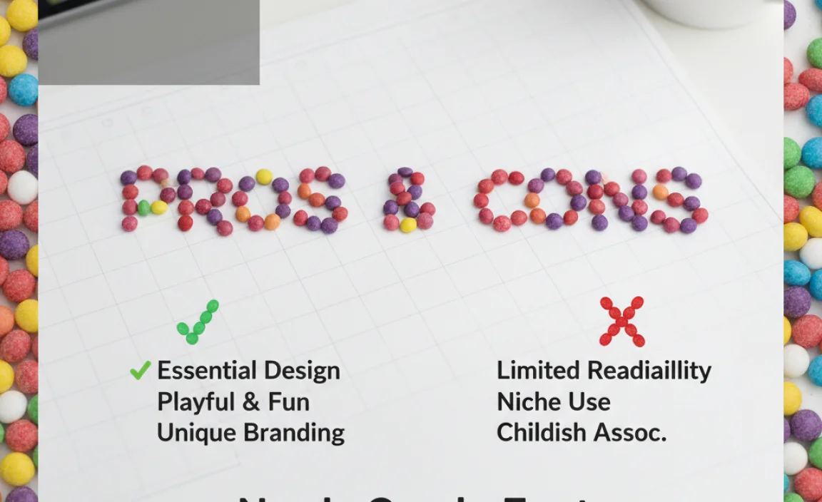
Like any design choice, this playful typographic style comes with its advantages and disadvantages. It’s important to weigh these before adopting it for your brand.
Pros:
- High Engagement: Its playful nature immediately captures attention and encourages interaction, especially with younger demographics.
- Memorability: The unique, irregular style makes texts and brands highly memorable.
- Conveys Fun and Excitement: Perfectly suited for brands that want to communicate joy, energy, and a lighthearted attitude.
- Strong Brand Identity: Helps create a distinctive personality that stands out in crowded markets.
- Versatility in Application: Can be adapted for logos, packaging, marketing materials, and digital content.
Cons:
- Readability Issues: Overdoing the irregularity or using it for large blocks of text can severely impact readability, especially for older audiences or those with visual impairments.
- Limited Professionalism: May be perceived as too informal or childish for certain industries (e.g., finance, legal, high-end luxury).
- Can Appear Overly “Trendy”: If not executed carefully, the style can look dated quickly if it relies too heavily on fleeting design trends.
- Requires Skillful Execution: Achieving the right balance of playfulness and legibility requires a good eye and proficiency with design software.
- Potential for Misinterpretation: In some contexts, it might not convey the necessary seriousness or authority a brand needs.
It’s essential to consider your target audience and brand message when deciding if this style is the right fit. As the Interaction Design Foundation notes, typographic personality is key to conveying brand values effectively.
Case Study: Brands That Nail Playful Typography
While Nerds candy is the prime example, many other brands effectively use playful, irregular typography to connect with their audience. Observing them can provide further inspiration:
1. Jollibee
The iconic Filipino fast-food chain uses a cheerful, rounded, sans-serif font that feels dynamic and friendly. The slightly bouncy baseline and rounded edges of their wordmark perfectly convey their brand’s joyful and family-oriented atmosphere.
2. Mailchimp
Mailchimp has evolved its branding over time, but its use of custom typography has consistently been friendly and approachable. Their current wordmark and supporting fonts often incorporate rounded elements and a welcoming feel that balances professionalism with playfulness, making their complex service feel more accessible.
3. Fanta
Fanta’s branding often features bubbly, rounded lettering with vibrant, contrasting colors. The overall effect is one of refreshing fun and fruity effervescence, directly reflecting the product and appealing to a youthful audience.
These brands demonstrate that while replicating the exact “Nerds Candy Font” might not be the goal, understanding the strategic use of playful, rounded, and irregularly styled typography can be a powerful asset for building a memorable and engaging brand identity.
FAQ: Decoding the “Nerds Candy Font”
Here are some frequently asked questions about the “Nerds Candy Font” style:
- What font does Nerds candy actually use?
- Nerds candy uses custom lettering for its branding, not a single off-the-shelf font. The design is crafted to be unique to the brand, capturing its playful and irregular spirit.
- Can I use this style for my business logo?
- Yes, if your business has a playful, energetic, or fun-loving brand personality. It works well for products or services aimed at younger audiences or those seeking a lighthearted experience. Avoid it for very formal or serious brands.
- What makes this style “genius”?
- It’s considered genius because the typography perfectly embodies the product’s essence (fun, colorful, chaotic) and effectively communicates the brand’s personality, making it highly memorable and appealing to its target audience.
- How do I make my text look wobbly like Nerds candy?
- You can achieve this by manually adjusting the baseline, size, and rotation of individual letters in vector software. Subtle distortion effects can also create a “wobbly” or bouncy appearance.
- What colors work best for this style?
- Bold, bright, and highly contrasting colors are key. Think electric blues, vibrant greens, hot pinks, sunny yellows, and intense oranges. Using multiple colors for different letters enhances the effect.
- Is this style good for all types of design projects?
- No, it’s best for projects where playfulness and high energy are desired. It’s less suitable for formal reports, academic papers, or brands that need to convey a sense of gravitas or tradition.
- Where can I find fonts that are similar to the Nerds candy style?
- Look for rounded, informal, or slightly irregular sans-serif fonts. Search for terms like “playful sans-serif,” “bouncy font,” or “rounded display font” on font libraries like Google Fonts, Adobe Fonts, or MyFonts.
Conclusion: Embracing Playful Typography
The “Nerds Candy Font” style is more than just quirky lettering; it’s a masterclass in visual communication. By deliberately embracing irregularity, vibrant color, and a friendly, rounded aesthetic, brands can craft an identity that is not only instantly recognizable but also deeply resonant with their audience. Its success lies in its ability


Leave a Comment