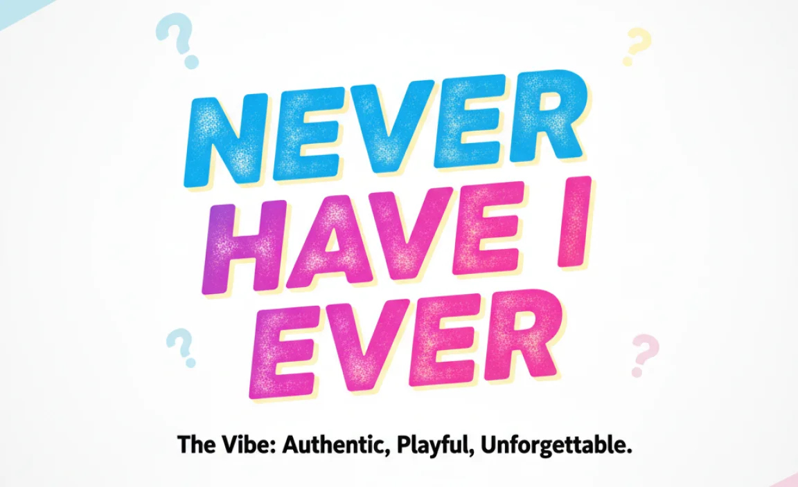
The “Never Have I Ever” font is a playful, handwritten-style typeface that brings a casual, conversational, and engaging feel to designs, making it an excellent choice for informal branding, party invitations, and personal projects.
Ever found yourself scrolling through design inspiration, wondering how to capture that perfectly laid-back, yet stylish, vibe? You’ve seen it on invitations, social media posts, and even quirky branding – a font that feels like a friendly chat. This is often the magic of a “Never Have I Ever” style font. It’s not just text; it’s personality.
Many beginners struggle to pick fonts that truly reflect their message. You might end up with something too formal, too serious, or just plain boring. But don’t worry! Choosing the right font can be simple and fun. We’re going to break down what makes these kinds of fonts so special and how you can use them to make your projects pop. Get ready to discover how to infuse your designs with that unforgettable, personal touch.
What Exactly IS the “Never Have I Ever” Font Vibe?
When we talk about the “Never Have I Ever” font, we’re not usually referring to a single, specific font file released by a foundry. Instead, it evokes a style that’s become incredibly popular, largely due to its use in contexts like the “Never Have I Ever” Netflix series. This style is characterized by its:
Key Characteristics of the “Never Have I Ever” Font Style:
- Handwritten Feel: It looks like it was written with a pen or marker, not typed. The strokes are often a bit uneven, with a natural flow.
- Casual & Conversational: It’s friendly and approachable, like a note from a friend. It avoids stiff, formal appearances.
- Expressive & Playful: There’s often a sense of fun and personality. Letters might have slight variations or unique curves that give them character.
- Readable but Not Stiff: While it’s informal, it’s still designed to be easy to read. The letters are generally clear and well-formed, avoiding overly elaborate calligraphy that can be difficult to decipher.
- Slightly Imperfect: This is crucial. It’s the subtle imperfections – a little wobble, a slightly different slant, variations in stroke width – that make it feel authentic and human.
Think of it as the visual equivalent of someone leaning in to tell you an interesting story. It’s engaging and draws you in.
Why is This Font Style So Popular?

The rise of the “Never Have I Ever” font style isn’t accidental. Several factors contribute to its widespread appeal, especially in today’s digital landscape:
- Desire for Authenticity: In an increasingly digital and often overly polished world, people crave genuine connection. Handwritten fonts feel more authentic and personal than rigid sans-serif or serif fonts.
- Relatability and Approachability: Brands and content creators want to connect with their audience on a more personal level. This font style bridges the gap, making complex topics or serious messages feel more accessible.
- Visual Storytelling: Fonts are powerful tools for storytelling. A casual, handwritten style instantly communicates a narrative of fun, youth, personal experience, or candid conversation.
- Social Media Trend: Platforms like Instagram and TikTok thrive on casual, engaging content. This font style fits perfectly with the aesthetic of personal stories, behind-the-scenes glimpses, and lighthearted interactions.
- Nostalgia: For some, it evokes a sense of nostalgic handwriting from school days or personal letters, creating a warm, familiar feeling.
This style taps into a deep human need for connection and authenticity, making it a smart choice for anyone looking to build rapport with their audience.
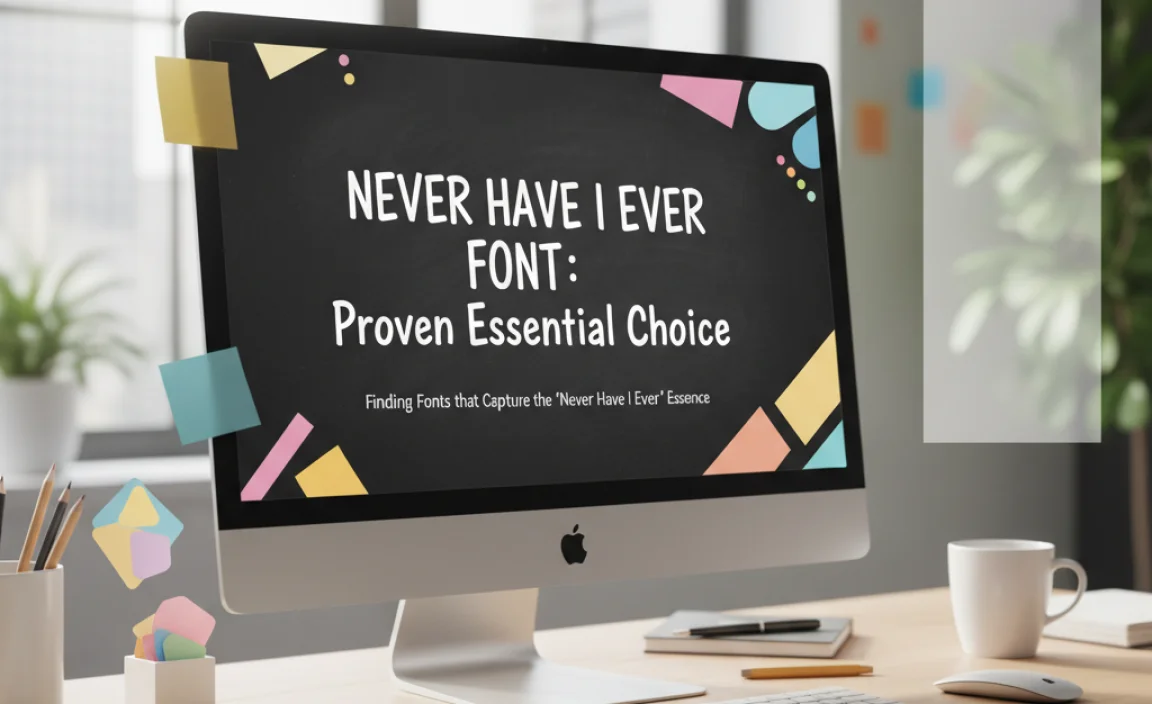
Finding Fonts that Capture the “Never Have I Ever” Essence
While there isn’t one official font, there are many typefaces that embody this charming, handwritten spirit. When searching, you’ll look for categories like:
- Casual Script Fonts: These mimic natural handwriting with flowing connections between letters.
- Handwritten Sans-Serif Fonts: These have the readability of sans-serifs but with the uneven, slightly bouncy strokes of handwriting.
- Brush Fonts: Often bolder and more expressive, they can capture a dynamic, energetic handwritten feel.
- Marker Fonts: These replicate the look of writing with a felt-tip marker, offering a distinct informal character.
Where to Find These Fonts:
You can discover fonts with this “Never Have I Ever” vibe from various sources. Here are some popular and reliable platforms:
- Google Fonts: A fantastic resource for free, high-quality fonts. Look for their handwriting or script categories. For example, fonts like “Kalam” or “Permanent Marker” offer a distinctly handwritten feel.
- Adobe Fonts: If you’re an Adobe Creative Cloud subscriber, you have access to a vast library of fonts, many of which fit this casual, handwritten aesthetic.
- Creative Market: This platform offers a huge selection of premium fonts, often with unique styles and extensive character sets. Search for “handwritten,” “script,” or “casual” fonts.
- Font Bundles / DaFont: These sites offer a mix of free and premium fonts. Be sure to check the licensing terms, especially for commercial use. Use search terms like “brush,” “pen,” or “script handwriting.”
Always check the font’s license to ensure it’s suitable for your intended use, especially if you’re using it for commercial projects.
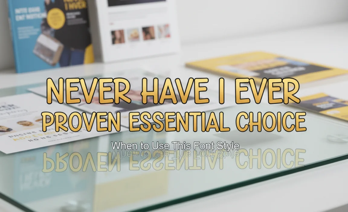
Proven Essential Choice: When to Use This Font Style
The “Never Have I Ever” font style is incredibly versatile, but it shines brightest in specific applications where its casual, personal vibe enhances the message. Here are some proven use cases:
Top-Tier Applications:
- Social Media Graphics: Perfect for Instagram stories, Pinterest pins, Facebook posts, and TikTok captions where you want to convey personality and encourage engagement. Think quotes, prompts, or behind-the-scenes content.
- Invitations and Announcements: For events with a relaxed atmosphere – birthday parties, casual weddings, baby showers, or even informal engagement parties. It makes the event feel more personal and exciting.
- Personal Blogs and Websites: If your content is conversational, reflective, or shares personal experiences, this font style can build an immediate connection with your readers.
- Quirky Branding: For small businesses, artists, or creators whose brand personality is playful, approachable, and a little unconventional. Think coffee shops, artisan makers, or creative service providers.
- Journaling and Planners: To add a touch of personal expression within digital or printable planners and journals.
- Game Night or Party Prompts: Like the Netflix show itself, this font is ideal for games, trivia, or any activity that encourages candid sharing among friends.
- Children’s Books or Educational Material (Younger Audiences): A friendly, handwritten style can make learning feel less intimidating and more fun for very young children.
When to Approach with Caution:
While versatile, this font style isn’t a one-size-fits-all solution. It’s best to avoid it for:
- Formal Business Documents: Legal contracts, official reports, or high-stakes corporate presentations.
- Extremely Serious or Sensitive Topics: Where gravitas and authority are paramount.
- Body Text for Long-Form Content: Unless carefully chosen for readability, overly informal handwritten fonts can be tiring to read in large blocks of text.
- Luxury or High-End Brands: In industries where elegance, sophistication, and extreme refinement are key, a casual font might undermine the brand image.
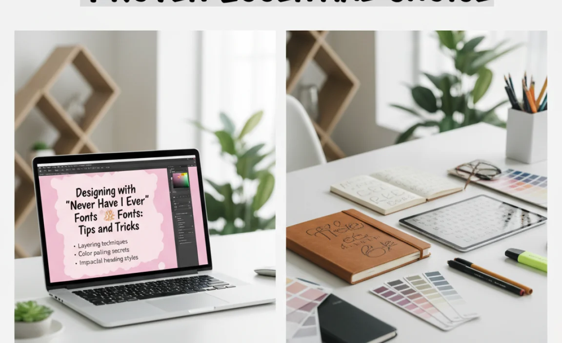
Designing with “Never Have I Ever” Fonts: Tips and Tricks
Choosing the right font is just the first step. To make it truly effective, consider these design tips:
Making the Font Shine:
- Pairing is Key: Don’t use a handwritten font for everything. Pair it with a more neutral, readable font (like a clean sans-serif or a simple serif) for headings or body text. This creates contrast and hierarchy.
- Consider Readability: Always test your chosen font in its intended size and medium. Can people easily read it? If the letters are too squished or too elaborate, it defeats the purpose. Referencing typography guidelines from reputable sources like the Typography Glossary by Typography.com can help you understand the nuances of letterforms.
- Use Color Wisely: The color of your font can significantly impact its mood. Bright, cheerful colors enhance the playful aspect, while darker, richer tones can add a touch of warmth without losing the casual feel.
- Embrace Imperfection: The charm of these fonts lies in their human touch. Don’t try to make them look perfectly uniform. Let the slight variations add to their character.
- Keep it Concise: This font style is best for short phrases, headlines, or calls to action. For longer paragraphs, opt for a more readable font to avoid fatigue.
- Consider Weight and Stroke: Different handwritten fonts have different weights (light, regular, bold) and stroke thicknesses. Choose one that fits the overall aesthetic you’re aiming for – a thin marker font feels different than a thick brush script.
- Letter Spacing (Kerning): Some handwritten fonts have beautifully natural letter spacing, while others might need a little adjustment. If letters are too far apart or overlapping awkwardly, subtle kerning adjustments can improve flow.
- Context is Everything: Always ask yourself: Does this font style match the overall message and tone of my project? For example, pairing “Never Have I Ever” with overly formal or somber imagery would clash.
Examples: Font Styles that Embody the Vibe
Let’s look at a few specific font styles that often capture that “Never Have I Ever” essence. These are not necessarily named this way, but they share common design traits.
Illustrative Font Types:
| Example Font Name Style | Description | Best For | Vibe |
|---|---|---|---|
| Kalam (Google Fonts) | A handwritten font inspired by the handwriting of the grandmother of one of its designers. It’s simple, slightly irregular, and very readable. | Body text in informal blogs, journaling, casual notes. | Genuine, warm, approachable. |
| Permanent Marker (Google Fonts) | Mimics writing with a thick permanent marker. It’s bold, slightly quirky, and has a lot of personality. | Headlines, titles, short phrases, posters, party invitations. | Bold, energetic, playful, slightly retro. |
| Pacifico (Google Fonts) | A flowing, brush-like script font. It’s friendly, elegant in its casualness, and has a retro vibe. | Greetings, declarations, romantic invitations, branding for lifestyle products. | Smooth, friendly, retro-cool, expressive. |
| Satisfy (Google Fonts) | Another script font with a distinct, slightly dramatic flow. It feels handwritten but with a confident flair. | Titles, logos, statements where a touch of artistic flair is desired. | Artistic, confident, dynamic, personal. |
| Caveat (Google Fonts) | A light, airy handwritten font that feels like quick, informal notes. | Bullet points, annotations, short captions, personal correspondence. | Light, breezy, quick, personal. |
It’s important to explore these types and see which characteristics best match your specific project needs.
Frequently Asked Questions About “Never Have I Ever” Fonts
Here are some common questions beginners have when exploring this popular font style:
What is the difference between a script font and a handwritten font?
While the terms are often used interchangeably, script fonts typically feature connected letters that mimic cursive handwriting, often with more flourish. Handwritten fonts are a broader category that includes script styles but also fonts designed to look like printing, block letters, or even marker scribbles, all with an informal, personal touch.
Can I use a handwritten font for my logo?
Absolutely! A handwritten font can be a fantastic choice for a logo if your brand is meant to be perceived as friendly, approachable, or creative. It works particularly well for small businesses, artists, creators, or brands targeting a younger demographic. Ensure the font is readable at small sizes and that it conveys the right brand message.
How do I ensure a handwritten font is readable for my website or blog?
For website body text, choose handwritten fonts that are specifically designed for readability. Look for clear letterforms, adequate spacing, and a moderate weight. It’s often best to use a handwritten font for headlines, subheadings, or short quotes, and pair it with a clean, highly readable sans-serif or serif font for longer blocks of text to ensure a good user experience.
What are some good resources for finding free handwritten fonts?
Great free resources include Google Fonts (search for “handwriting” or “script” categories), DaFont, and Font Squirrel. Always check the license for each font to understand if it can be used for commercial projects. For example, many fonts on Google Fonts offer open-source licenses, allowing for broad use.
How do I make my handwritten font look more personal without being messy?
The key is to select a font that inherently has a good balance of personality and structure. Look for fonts that have subtle irregularities, slight variations in stroke, or a natural, uneven baseline. Avoid fonts that are overly decorative or have overly thin strokes that can become illegible quickly. Sometimes, simply adjusting the letter spacing (kerning) slightly can enhance its natural flow.
What’s the difference between a brush font and a marker font?
Brush fonts often have a more painterly, fluid feel, mimicking the broad strokes of a paintbrush. They can be quite dynamic and artistic. Marker fonts tend to look like they were written with a felt-tip or broad-tipped pen, offering a cleaner, more consistent line width than many brush fonts but still retaining that informal, handwritten character.
Conclusion: Infuse Your Designs with Personality
The “Never Have I Ever” font style, with its inherent warmth and casual charm, is far more than just a trend. It’s a powerful tool for designers and creators looking to connect with their audience on a genuine level. By understanding its characteristics, knowing where to find and how to use these fonts effectively, you can imbue your projects with personality, approachability, and a storytelling quality that resonates.
Remember that the goal is to communicate clearly and effectively while also conveying a specific feeling. Whether you’re crafting a social media post, designing event invitations, or building a brand identity, choosing a font that feels human and authentic can make all the difference. Don’t be afraid to experiment with different styles, pay attention to readability, and always, always consider your audience and your message. With these insights, you’re well-equipped to make “Never Have I Ever” – or at least its spirit – an essential and successful choice in your design toolkit.


Leave a Comment