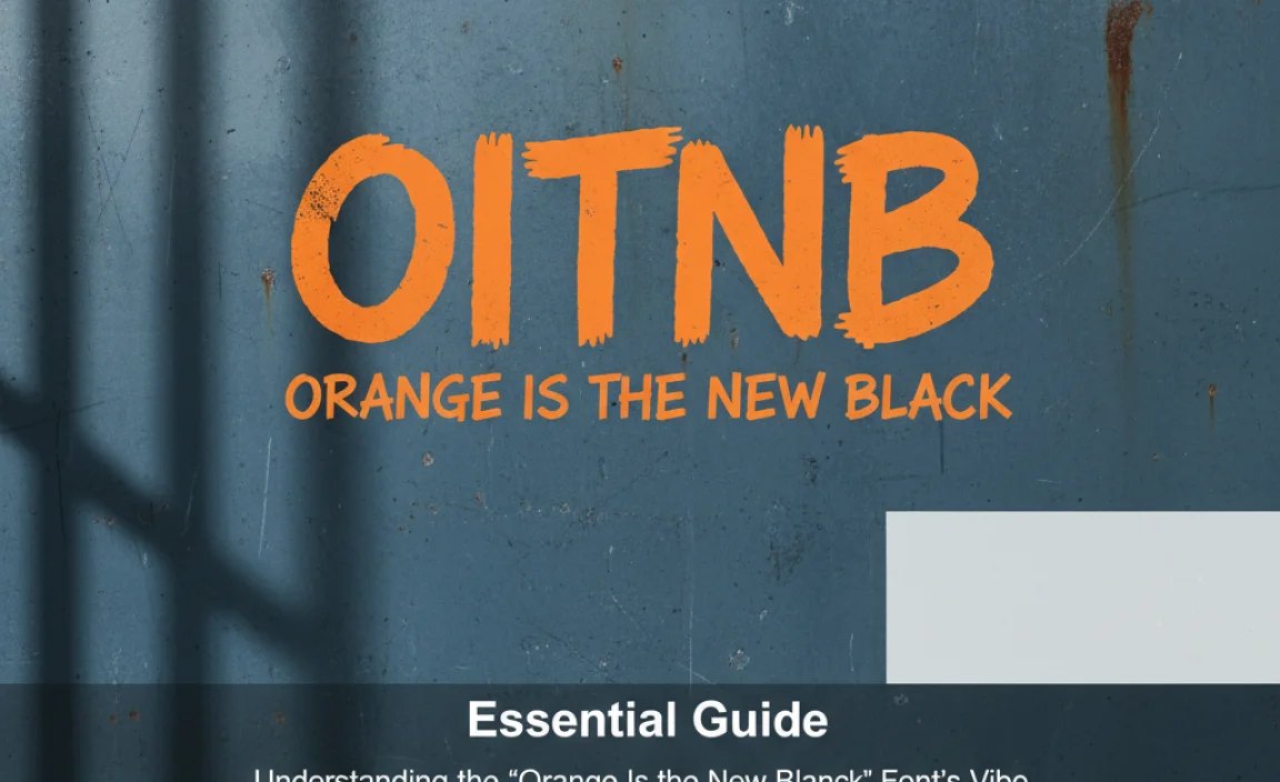
Orange Is the New Black Font: The distinct, bold, and slightly rough font used in the iconic “Orange Is the New Black” logo is an expressive typeface that blends a vintage feel with modern urgency. It’s often identified as a brush script or handwritten font, capturing the show’s raw and unfiltered narrative.
Ever seen a logo and instantly thought of a show? That’s the power of good design! The “Orange Is the New Black” logo is a prime example. Its distinctive font grabs your attention. It feels both stylish and a little rebellious. Many creative folks, from designers to bloggers, want to know: what exactly is that striking font? If you’ve been hunting for it, feeling a bit lost in the sea of typeface options, you’re not alone. It’s a common quest for anyone inspired by strong visual identities. But don’t worry, we’re here to break it down. We’ll explore the font that makes the OITNB logo so memorable. Prepare to discover its unique charm and how you might use a similar style in your own projects!
Understanding the “Orange Is the New Black” Font’s Vibe
The “Orange Is the New Black” (OITNB) logo isn’t just letters; it’s a feeling. It instantly communicates the show’s essence: gritty, authentic, and full of personality. The font choice plays a huge role here. It’s not a perfectly clean, corporate font. Instead, it has character, a touch of imperfection that mirrors the complex lives of the characters. This isn’t your everyday Times New Roman!
Imagine dipping a brush in ink and quickly writing something with passion. That’s the energy the OITNB font captures. It’s bold, often a little uneven, and feels very human. This makes it incredibly effective for a show that deals with deep emotional journeys and the realities of prison life.
Key Characteristics of the OITNB Font Style
Let’s break down what makes this style of font so recognizable and impactful. When people talk about the “Orange Is the New Black font,” they’re usually referring to a set of visual traits:
- Brush Stroke Effect: The letters look like they were painted with a brush. You can often see variations in the thickness of the strokes, just like real brushwork.
- Handwritten Feel: It’s not rigidly uniform. There’s a natural flow and slight imperfections that suggest it was made by hand, giving it an authentic touch.
- Bold and Impactful: The font is typically thick and commanding. It needs to stand out and make a statement.
- Slightly Distressed or Textured: Sometimes, there’s a subtle roughness or texture to the letters, adding to the vintage or slightly worn-down aesthetic.
- Expressive and Energetic: The overall impression is one of dynamism and vivid character, not static formality.
What Font is The “Orange Is the New Black” Font Really?

Pinpointing the exact font used for the OITNB logo can be a bit tricky. Logos are often custom-designed or modified versions of existing fonts. This means there might not be a single, readily available font that is a 100% perfect match. However, designers and fans have identified several fonts that are very close in style and capture the same spirit.
The most commonly cited inspiration and closest matches are often found within the “brush script” or “handwritten display” font categories. These fonts are designed to mimic the look of natural brush lettering, often with bold strokes and a dynamic, informal feel. Think of it as a stylistic family rather than one specific font.
Commonly Associated Font Styles
While the original might be a unique creation, several commercial and free fonts share its core characteristics. These are excellent alternatives if you’re aiming for that OITNB-esque look:
Brush Script Fonts: This broad category is where you’ll find the closest relatives. These fonts are defined by their simulated brush strokes, varying line weights, and often a lively, energetic baseline. They can range from elegant and flowing to bold and aggressive.
Handwritten Display Fonts: These are designed to look hand-drawn but aren’t always strictly “brush” scripts. They can be messy, quirky, or very stylized, prioritizing a unique personality over strict calligraphy rules.
Fonts That Capture the OITNB Spirit
Here are a few examples of fonts that evoke a similar feeling to the “Orange Is the New Black” logo. These are great starting points for your own design explorations:
- Bebas Neue (Modified): While the core Bebas Neue is a sans-serif, variations and its bold, condensed nature can sometimes be played with to achieve a similar impact, though it lacks the brush stroke element. It’s more about the boldness and impact.
- Desyrel: This is a popular free font option that offers a strong, brush-like feel with a raw, imperfect texture. It’s got that gritty, handwritten vibe that’s crucial.
- Playlist Script: This is a very popular brush script that’s energetic and free-flowing, capturing a lot of the manual feel.
- Lobster: A well-known and widely available font from Google Fonts, Lobster has a strong brush script feel. It’s friendly yet bold.
- Pacifico: Another Google Fonts favorite, Pacifico is a flowing script that feels casual and handwritten, though perhaps a bit smoother than the OITNB logo’s rougher edges.
- Brush Script MT: This is a classic font found on many systems. It’s a more traditional brush script that can still deliver a powerful, artistic effect.
Remember, the exact font for a major logo is often a proprietary design. The goal is to find a font that feels right and achieves a similar visual impact. Exploring fonts within the brush script and bold handwritten categories is your best bet.
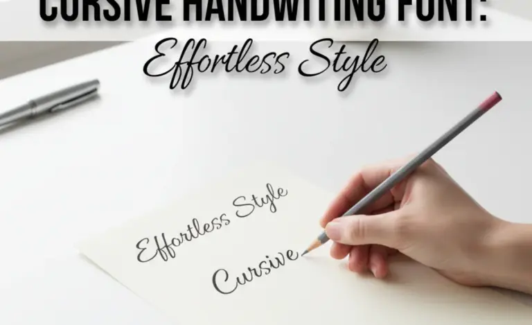
How to Find and Use Fonts Like the OITNB Logo
![]()
Finding the perfect font can feel like a treasure hunt. But with the right approach, you can discover fonts that capture the essence of what you’re looking for. It’s about understanding the style and then searching for fonts that match.
Step-by-Step Font Finding Process
Here’s a practical way to go about discovering and selecting fonts similar to the OITNB logo’s style:
- Identify the Core Style: First, recognize the key features we discussed: brush strokes, handwritten feel, boldness, potential texture.
- Use Font Identification Tools: Tools like WhatTheFont! or Font Squirrel’s Matcherator can analyze an image of the OITNB logo (or a similar font you find) and suggest similar typefaces.
- Explore Font Databases: Browse major font libraries. Sites like Google Fonts, Adobe Fonts, Font Squirrel (for free fonts), and MyFonts (for commercial options) are excellent resources.
- Use Specific Search Terms: When searching these databases, use keywords such as “brush script,” “handwritten,” “display font,” “grunge,” “rough,” “bold script,” or “ink.”
- Filter by Characteristic: Many font sites allow you to filter by style (script, brush), weight (bold), and even impression (handmade, vintage).
- Test and Compare: Download a few promising options (especially if they are free) or view them on the foundry’s site. Type out short phrases to see how they look and feel.
Where to Find These Fonts
Different sources offer different types of fonts, from free to premium:
- Google Fonts: A fantastic resource for high-quality, free, open-source fonts. Great for web use. Look for scripts and handwritten styles.
- Adobe Fonts: If you have an Adobe Creative Cloud subscription, you have access to a massive library of professional fonts.
- Font Squirrel: Curates a collection of free, commercially-usable fonts. Excellent for designers who need quality without the cost.
- DaFont / 1001 Free Fonts: Offer a huge selection of free fonts, but be sure to check the licensing carefully for commercial use. Many are for personal projects only.
- MyFonts / Fontspring / Creative Market: These are key marketplaces for purchasing premium, professional fonts. You’ll find highly curated and unique options here.
Tips for Using Brush & Handwritten Fonts Effectively
Once you’ve found a font you love, how do you use it so it looks as good as the OITNB logo?
- Readability is Key: Brush scripts can sometimes be difficult to read in small sizes or for long blocks of text. Use them primarily for headlines, titles, logos, or short, impactful phrases.
- Pairing Fonts Wisely: A bold, expressive font like the OITNB style often pairs best with a clean, simple sans-serif or serif font for supporting text. This contrast helps the display font shine and ensures readability.
- Consider the Context: Does the font’s vibe match your brand or project? A gritty brush font might be perfect for a rebellious brand or a dramatic movie poster, but might not fit a conservative business.
- Kerning and Tracking: Sometimes, handwritten fonts benefit from slight adjustments to the spacing between letters (kerning) or overall character spacing (tracking) to improve their flow and legibility.
- Layering and Effects: Don’t be afraid to experiment. Applying subtle textures, shadows, or even slight distortion can further enhance the handwritten, imperfect feel if that’s your goal.
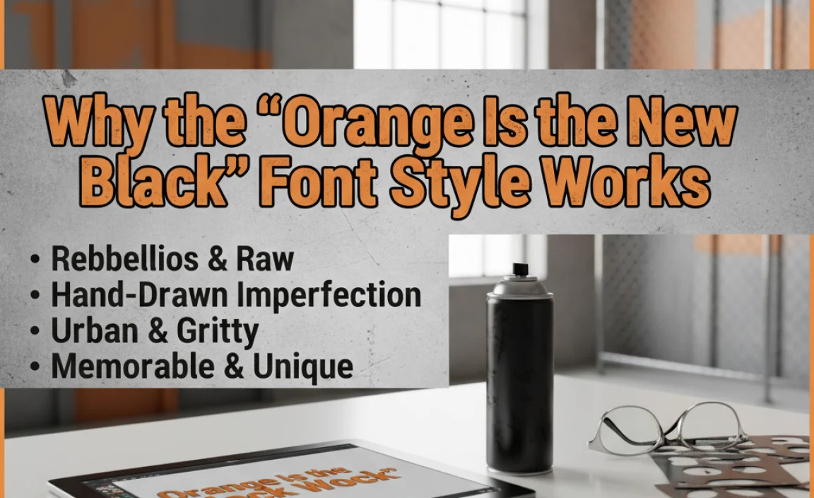
Why the “Orange Is the New Black” Font Style Works
The success of the OITNB logo font isn’t accidental. It’s a deliberate design choice that resonates with the show’s themes and audience. Let’s explore why this stylistic approach is so effective.
Emotional Connection and Brand Identity
The “Orange Is the New Black” font immediately signals that this isn’t a typical drama. It hints at raw emotion, a sense of urgency, and a story told from the ground up. This kind of font can:
- Convey Authenticity: The handwritten, slightly imperfect nature feels real and unpolished, mirroring the show’s commitment to realistic storytelling and complex characters.
- Add Personality: It gives the show a distinct visual identity that stands out from more traditional, sleek branding. It’s memorable and unique.
- Evoke a Specific Mood: Depending on the exact style, it can suggest rebellion, struggle, creativity, or a deep, personal narrative. For OITNB, it’s a blend of toughness and vulnerability.
Visual Impact and Memorability
In a crowded media landscape, visual elements need to grab attention. The OITNB font achieves this through:
- Boldness: The strong strokes ensure the title is easily visible on posters, channel guides, and online thumbnails.
- Uniqueness: It avoids generic typography, making it instantly recognizable.
- Storytelling Through Design: The font itself tells a part of the story before anyone reads a single word. It’s a powerful tool in visual communication.
Table: Comparing Font Styles for Similar Impact
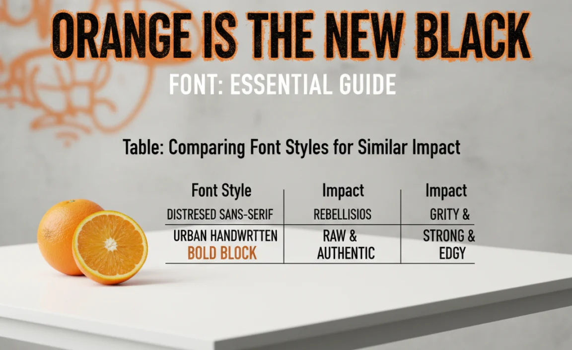
To help you visualize what makes a font similar to the OITNB style, let’s compare some common font categories. This table highlights key attributes:
| Font Style | Key Characteristics | OITNB Similarities | Best Use Cases |
|---|---|---|---|
| Brush Script | Simulated brush strokes, varying line weight, energetic flow, often informal. | High. Captures manual feel, boldness, and expressiveness. | Logos, headlines, posters, invitations, packaging. |
| Handwritten/Scribble | Looks like natural handwriting, can be messy or clean, unique character. | Medium-High. Captures the human touch and informality. | Branding, personal blogs, creative projects, social media graphics. |
| Modern Sans-Serif | Clean lines, geometric or humanist forms, uniform weight, no serifs. | Low. Lacks manual, expressive qualities of OITNB font. | Body text, website UIs, corporate branding, minimalist designs. |
| Vintage/Distressed Serif | Traditional letterforms with small decorative strokes (serifs), often with rough texture. | Low-Medium. Can convey age or a story, but lacks the brush stroke dynamism. | Book covers, retro branding, editorial design, labels. |
Legal and Licensing Considerations
It’s crucial to remember that using fonts, especially for commercial projects, comes with legalities. The exact font used for the “Orange Is the New Black” logo is likely proprietary and owned by the show’s creators or their design agency.
Understanding Font Licenses
When you download or purchase a font, it comes with a license agreement. This dictates how you can use it. For example:
- Personal Use License: Many free fonts allow use in personal projects (like a hobby blog or a school assignment) but prohibit use in anything that generates revenue.
- Commercial Use License: This license permits use in business logos, marketing materials, websites, and products that you sell. Commercial licenses can vary in cost and scope.
- Webfont License: If you plan to use a font on a website, you might need a specific webfont license, often based on traffic volume.
- Desktop License: This allows you to install and use the font on your computer for design work.
Always read the license agreement carefully! For example, licensing information for fonts on Google Fonts is generally very permissive, often under the Open Font License (OFL), which is very friendly for both personal and commercial use. For commercial marketplaces like MyFonts, each font will have its own specific EULA (End-User License Agreement). Incorrect font usage can lead to legal issues.
FAQ: Your “Orange Is the New Black” Font Questions Answered
Here are some common questions beginners have about the “Orange Is the New Black” font style:
What’s the difference between a brush script and a regular script font?
Brush scripts mimic the bold, varied strokes of a paintbrush, often having a rougher, more dynamic feel. Regular script fonts can be more varied, sometimes resembling elegant calligraphy (like pointed pen) or casual handwriting, often with smoother, more consistent lines than brush scripts.
Is the OITNB font available for free?
The exact font used for the official logo is likely a custom design and not freely available. However, many free fonts similar in style can be found on sites like Google Fonts and Font Squirrel.
Can I use a brush script font for my business logo?
Yes, absolutely! A brush script font can be fantastic for a logo if it aligns with your brand’s personality. It’s especially good for brands that want to convey creativity, passion, authenticity, or an edgy vibe. Just ensure you have the correct commercial license.
How do I make text look more “handwritten” in design software?
Use fonts designed to look handwritten! You can also achieve this by using a brush font, slightly rotating individual letters, adding subtle texture overlays, or even hand-drawing elements if you have the artistic skill and are using them for specific graphic elements.
What if a brush script font is hard to read for my website title?
If readability is a concern, consider a modified display font that captures the essence of the OITNB style—boldness and a handmade feel—but with clearer letterforms. Alternatively, use a very robust brush font and ensure it has good contrast against its background, or pair it with a more readable tagline in a simple font.
Are there risks in choosing a very trendy font?
Trendy fonts can sometimes feel dated quickly. While the OITNB font style has a timelessly rebellious feel due to its brush nature, overused or overly “trendy” fonts might not have long-term appeal. For a logo, it’s often safer to pick a font with enduring character rather than chasing a fleeting digital fad.
Conclusion: Embrace Vibrant Typography
The “Orange Is the New Black” font style is a brilliant case study in how typography can convey character, mood, and theme. It’s more than just letters; it’s an attitude. By understanding the characteristics of brush scripts and expressive handwritten fonts, you can effectively tap into this vibrant aesthetic for your own projects.
Whether you’re designing a logo, a website header, or a social media graphic, remember the power of a font that feels alive. It can communicate authenticity, spark emotion, and create a memorable visual identity. Don’t be afraid to experiment with different styles, explore the vast resources available (both


Leave a Comment