Quantum Break Font: Essential Guide
The Quantum Break font isn’t a single, official typeface but rather a style inspired by the game’s unique aesthetic, often featuring bold, futuristic, and slightly distressed lettering. Discover how to find and use this distinctive look for your projects in this guide.
Welcome to FontOrbit! Ever stumbled across a font that just screams “cool” and “futuristic”? That’s often the feeling people get when they see designs inspired by the game Quantum Break. Its distinctive look has captured the imagination of many, sparking a desire to recreate that same vibe. Sometimes, finding the exact font used in a game or movie can feel like a quest in itself. But don’t worry, we’re here to demystify this popular style. This guide will walk you through understanding the Quantum Break font vibe, finding similar typefaces, and using them effectively in your own creative projects. Get ready to add a touch of that time-bending magic to your designs!
—
Understanding the Quantum Break Font Aesthetic
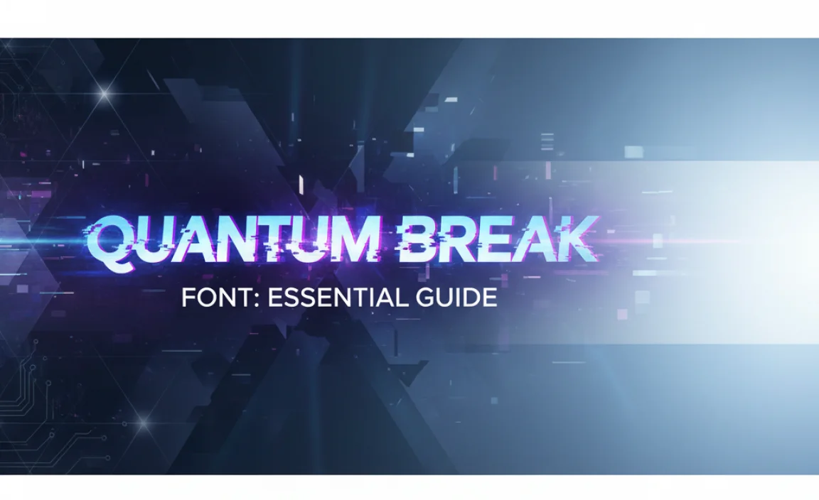
When we talk about the “Quantum Break font,” we’re not usually referring to one officially named typeface released by Remedy Entertainment. Instead, it points to a style that evokes the game’s unique atmosphere. This style is characterized by a few key elements that make it instantly recognizable.
The game’s visual identity is heavily influenced by its narrative: fractured time, explosive action, and a blend of gritty realism with sci-fi elements. The fonts used within the game’s UI, marketing materials, and in-game text all contribute to this feeling.
Key Characteristics of the Quantum Break Font Style:
- Bold and Impactful: The typeface typically carries a strong presence. Think headlines that grab attention immediately.
- Futuristic Edge: There’s often a sense of modernity, sometimes with sharp angles or geometric structures.
- Distressed or Gritty Texture: To reflect the game’s narrative of time breaking and chaos, fonts might appear slightly worn, glitchy, or textured, as if aged or damaged.
- Legibility at Scale: Despite its stylistic flair, the font needs to remain readable, especially for game interfaces and promotional materials.
- Sans-Serif Foundation: Most often, the look is built upon a sans-serif base, providing a clean yet impactful structure.
Imagine a font that looks like it could be used for a high-stakes action movie poster or the central text on a cutting-edge tech gadget. That’s the territory we’re exploring.
Finding Fonts Similar to the Quantum Break Style
Since there isn’t one official “Quantum Break font,” the strategy is to find commercially available or free fonts that share its core aesthetic. This involves looking for typefaces that embody those characteristics we just discussed. Many font creators have been inspired by similar visual trends, so you’ll find some great options.
Here’s how to approach your search:
Search Terms to Use:
- Futuristic sans-serif
- Sci-fi font
- Distressed display font
- Action movie font
- Bold geometric sans-serif
- Glitch font
- Modern industrial font
Where to Look for Fonts:
- Google Fonts: A fantastic resource for free, high-quality fonts. Many are open-source and easy to use on websites.
- Adobe Fonts: If you’re an Adobe Creative Cloud subscriber, you have access to a vast library of professional fonts.
- MyFonts, Fontspring, Creative Market: These are popular marketplaces where you can purchase premium fonts from independent designers.
- Dafont, Font Squirrel: Great for finding free fonts, but always check the licensing for commercial use.
For example, when browsing Google Fonts, exploring categories like “Display” or “Sans Serif” and applying filters for weight (like “Bold” or “Black”) can yield promising results. Sites like Dafont often have sections dedicated to sci-fi or techno fonts where you might find something close.
Top Font Categories for the Quantum Break Vibe
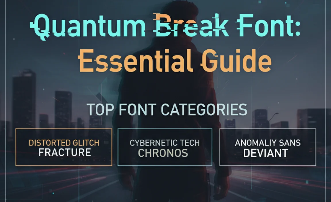
To narrow down your search, consider these font categories. Each offers a slightly different interpretation of the Quantum Break aesthetic.
1. Bold Geometric Sans-Serifs
These fonts build on simple, clean geometric shapes. They often have a very modern and techy feel. If the Quantum Break style you’re aiming for is clean and futuristic, this is your starting point.
- Characteristics: Clear, often mono-weight strokes, circular bowls, straight horizontals and verticals.
- Examples: Montserrat, Oswald, Raleway (though Raleway has some flair), Exo 2.
2. Distressed or Textured Fonts
These typefaces deliberately incorporate imperfections. They might look like they’ve been stamped, printed on rough surfaces, or subjected to digital glitches. This is perfect for reflecting the game’s themes of decay and breakage.
- Characteristics: Frayed edges, ink bleeds, scuffs, grain effects, digital noise.
- Examples: Many found on Creative Market or Fontspring by searching “distressed” or “grunge.” For free options, check “grunge” or “script” (sometimes they have textured styles) sections on Dafont.
3. Industrial or Military-Style Stencil Fonts
Sometimes, the stark, bold lettering in games has roots in military or industrial signage. Stencil fonts, with their characteristic breaks in letters, can lend a rugged, utilitarian feel.
- Characteristics: Visible stencil cuts, strong blocky forms, often uppercase only.
- Examples: OCR A Extended (though more technical), many stencil fonts found on marketplaces.
4. Display and Sci-Fi Specific Fonts
Many designers create fonts specifically for a sci-fi or futuristic theme. These often incorporate unique cuts, sharp terminals, or stylized letterforms that mimic futuristic interfaces.
- Characteristics: Highly stylized, sometimes sharp or angular, may include unique ligatures or alternate characters.
- Examples: Look for fonts labeled “Sci-Fi,” “Futuristic,” “Tech,” or “Cyberpunk” on font marketplaces.
Comparing Similar Fonts: A Visual Guide
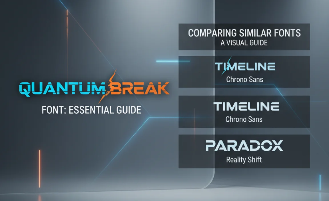
To help you choose, let’s look at a few example fonts that capture aspects of the Quantum Break aesthetic. Note that pricing and licensing vary, especially for premium fonts.
| Font Name | Type | Key Characteristics | Typical Use Case | Where to Find (Examples) | Estimated Price (Premium) |
|---|---|---|---|---|---|
| Exo 2 | Geometric Sans-Serif | Clean, modern, slightly technical feel, good range of weights. | Website headers, app interfaces, branding. | Google Fonts (Free) | N/A (Free) |
| Oswald | Condensed Sans-Serif | Tall, condensed, bold. Great for impactful titles where space is limited. | Headlines, posters, impactful statements. | Google Fonts (Free) | N/A (Free) |
| Bebas Neue | Condensed Sans-Serif | Very popular, bold, uppercase-focused, highly legible for its condensed form. | Marketing materials, titles, wherever strong headlines are needed. | Google Fonts (Free), Font Squirrel (Free) | N/A (Free) |
| Bank Gothic | Slab Serif / Futuristic | Geometric, strong presence, often used in tech and sci-fi contexts. Has a distinct “bank” or official feel. | Logos, movie posters, strong titling. | MyFonts, Adobe Fonts | Starts around $39-$49 for a single style. |
| Massive Display Font (Example of a Distressed type) | Distressed Display | Heavy grunge, textured, looks like it’s seen combat or time decay. | Album art, posters, gritty branding. | Creative Market, Envato Elements | Variable, often bundled or ~$20 per font. |
| Blade Runner Font (Unofficial, but indicative) | Custom/Inspired Sci-Fi | Highly stylized, sharp angles, often with unique cuts and lines reminiscent of classic sci-fi films. | Thematic projects, fan art, retro-futuristic designs. | Various free font sites (check licenses), or custom creation. | Often free for personal use; commercial use varies or requires purchase. |
When selecting, consider not just the look but also the intended use. A distressed font might be perfect for a poster but difficult to read in a body of text. A clean geometric sans-serif (like Exo 2) is highly versatile.
How to Use the Quantum Break Font Style in Your Projects
Once you’ve found a font or a set of fonts that capture the Quantum Break essence, how do you best implement them? It’s all about context and balance.
Logo Design
If you’re creating a logo, a bold, distinct font is key.
- Consider a strong, uppercase sans-serif for a modern tech company.
- For a gaming-related brand, a distressed or angular font might convey action and excitement.
- Always ensure your logo is legible at small sizes.
Website and Branding
For websites and broader branding, use these impactful fonts sparingly.
- Headlines and Titles: This is where these fonts shine. Use them for your main titles, section headers, or call-to-action buttons.
- Subheadings: You might use a slightly less bold variant of the same font or a complementary font that offers a bit more readability for subheadings.
- Body Text: Avoid using highly stylized or distressed fonts for long blocks of text. Opt for a clean, highly readable sans-serif or serif font here. This contrast helps the display font stand out more.
Marketing Materials
For posters, social media graphics, or advertisements, these fonts can create immediate impact.
- Pair a bold, futuristic font with imagery that reinforces its theme (e.g., urban landscapes, digital effects, or high-energy action shots).
- Use contrast effectively. A bright, clean font might stand out against a dark, textured background, and vice-versa.
Video and Game Development
If you’re working on a game, video intro, or motion graphics:
- These fonts are ideal for title screens, loading screens, or any UI elements that need to convey a sense of urgency or futuristic technology.
- Consider animating the text to enhance its futuristic or glitchy feel.
Best Practices for Utilizing Display Fonts
Display fonts, like those mimicking the Quantum Break style, are designed for impact, not extended reading. Here are some best practices:
- Hierarchy is Key: Use these fonts for the most important text elements—the ones you want people to notice first.
- Pair Wisely: Always pair a display font with a highly legible “workhorse” font. This subordinate font will handle your body copy and ensure your content is accessible. A common pairing might be a bold, stylized font for headers and a clean font like Open Sans or Lato for paragraphs.
- Mind the Spacing: Pay attention to the kerning (space between individual letters) and tracking (overall spacing of a block of text). Sometimes, too much or too little spacing can ruin the impact of a bold font.
- Test Across Devices: What looks great on a large monitor might be unreadable on a small mobile screen. Always test your font choices on various devices and screen sizes.
- Consider the Mood: Does the font fit the overall tone and message of your project? A gritty, distressed font might not work for a formal business proposal, but it could be perfect for a band’s album cover.
Licensing and Legality: What You Need to Know
This is a crucial step often overlooked by beginners. When you download or purchase a font, you’re not buying the font itself, but a license to use it. This license dictates how and where you can use the font.
Types of Licenses:
| License Type | Description | Common For | Where Found |
|---|---|---|---|
| Personal Use | For non-commercial projects. You can’t make money from it directly or indirectly. | Hobby projects, personal blogs, fan art. | Many free font sites (Dafont, FontSpace). |
| Commercial Use (Desktop/App) | Allows use in print materials, logos, and desktop publishing software for business purposes. Often limited to a certain number of users. | Branding, marketing materials, signage. | Premium font vendors (MyFonts, Fontspring). |
| Webfont License | Allows embedding the font on websites. Usually priced based on traffic (pageviews) or number of domains. | Website design. | Font vendors, often with dedicated webfont packs. |
| App/Broadcast License | For use in mobile applications, software, or broadcast media. Typically more expensive due to wider distribution potential. | Mobile games, video content. | Premium font vendors. |
Always check the EULA (End User License Agreement)! This document details exactly what you can and cannot do with a font. For instance, some free fonts might allow commercial use on logos but not in merchandise like t-shirts without an upgrade. Reputable font foundries and marketplaces make these licenses clear.
For example, if you find a font on Google Fonts, it’s typically released under the SIL Open Font License (OFL), which is very permissive for both personal and commercial projects, including embedding in websites and apps. However, fonts from places like Dafont can be trickier; look for clear indications of “100% Free” or “Free for Commercial Use.”
Alternatives to “Quantum Break Font”: Broader Design Inspiration
If you’re looking to capture a similar vibe without necessarily finding a direct match, explore broader design movements that influenced Quantum Break.
- Neo-Noir Aesthetics: Often characterized by dark palettes, atmospheric lighting, and sharp, impactful typography.
- Cyberpunk Themes: Expect futuristic tech, gritty urban settings, and often glitchy or highly stylized digital fonts.
- Deconstructed/Glitch Art: This movement plays with digital or physical degradation, perfect for textured, broken, or distorted fonts.
- Brutalist Design: Emphasizes raw, industrial, and utilitarian aesthetics, which can translate to bold, stencil-like fonts.
Looking at the stylistic connections can open up a wider array of font choices. For instance, fonts used in cult classic sci-fi films like Blade Runner or Akira can provide excellent inspiration, even if they aren’t direct matches for Quantum Break.
Frequently Asked Questions (FAQ)
Q1: Is there an official font for Quantum Break?
A: No, there isn’t one single, officially named font for the game Quantum Break. The term usually refers to the style of bold, futuristic, and sometimes distressed fonts used throughout its branding and interface.
Q2: Where can I find fonts similar to the Quantum Break style for free?
A: You can find similar free fonts on platforms like Google Fonts, Font Squirrel, and Dafont. Use search terms like “futuristic,” “sci-fi,” “bold sans-serif,” or “distressed.” Always check the license to ensure it permits your intended use.
Q3: Can I use these kinds of fonts for a commercial logo?
A: Yes, but only if the font’s license specifically allows commercial use. Premium fonts purchased from marketplaces usually come with commercial licenses, while free fonts require careful checking of their EULA.
Q4: What’s the difference between a display font and a text font?
A: Display fonts are designed for large sizes and impact (like headlines and logos) and often have more stylistic flair. Text fonts are designed for readability in smaller sizes and longer passages of text (like body copy).
Q5: How do I make a font look “distressed” or “glitchy” if it’s not already?
A: You can use graphic editing software like Adobe Photoshop or Affinity Photo. Apply texture overlays, blur effects, noise filters, or use warp tools to create imperfections. There are also readily available texture assets you can incorporate.
Q6: Are geometric sans-serif fonts the same as futuristic fonts?
A:




Leave a Comment