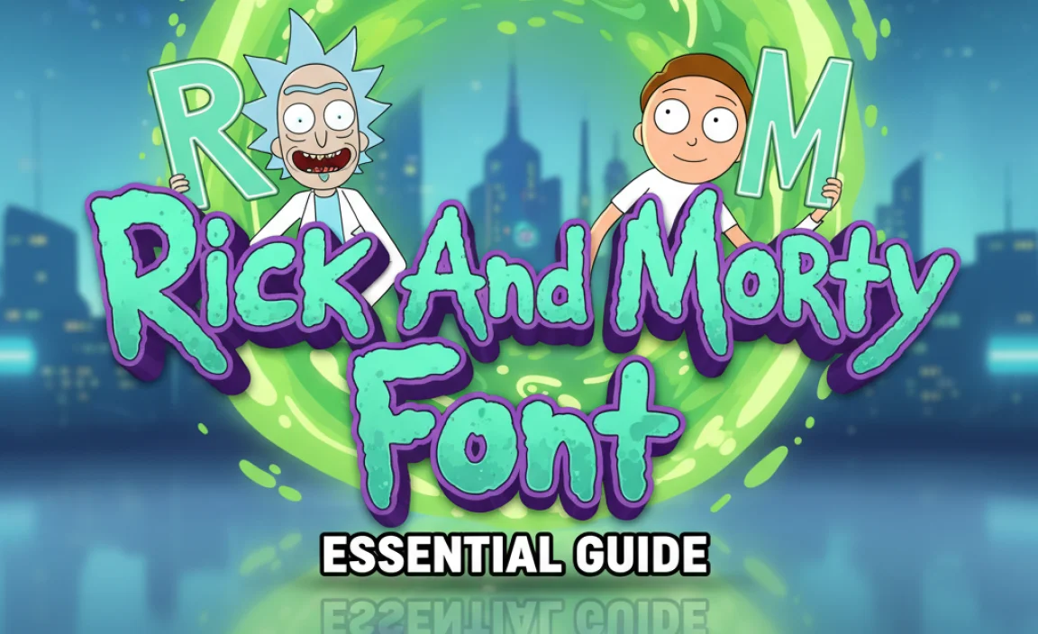
The “Rick and Morty font” isn’t one single font, but rather several similar sans-serif styles that capture the show’s quirky, sci-fi vibe. This guide helps you find and use fonts that evoke that iconic look for your projects.
Ever scrolled past a design and thought, “That feels like Rick and Morty!”? You’re not alone! The show’s visual identity, from its bold logos to its frantic interdimensional adventures, is instantly recognizable. A big part of that magic comes from its distinctive typography. Finding the right font to match that energy can feel a bit like navigating the multiverse – exciting but potentially overwhelming. But don’t worry! This guide is here to help you decode the Rick and Morty aesthetic and find the perfect fonts to bring that adventurous, slightly chaotic spirit to your own creations.
Understanding the “Rick and Morty Font” Vibe
When people talk about the “Rick and Morty font,” they’re usually referring to a few key characteristics that define the show’s typographic style. It’s not just about one specific typeface; it’s about the overall feel it projects.
- Geometric & Modern: The fonts used often have clean, straight lines and simple shapes, giving them a modern, almost futuristic feel. Think circles, squares, and sharp angles.
- Bold & Impactful: These fonts are designed to grab attention. They are typically sans-serif, meaning they lack the small decorative strokes (serifs) found at the ends of letters in fonts like Times New Roman. This makes them feel direct and powerful.
- Slightly Quirky/Hand-Drawn Feel: While geometric, there’s often a subtle unevenness or a slightly off-kilter quality that adds to the show’s unique, hand-crafted, and sometimes chaotic charm. It’s not perfectly rigid.
- Versatile: The style works well for titles, logos, and even body text in smaller doses, conveying a sense of science fiction, adventure, and dark humor.
These elements combine to create a look that’s both familiar and unique, perfectly mirroring the show’s blend of high-concept science fiction and down-to-earth (or down-to-Earth-like) character dynamics.
The Closest Matches: Finding Your Rick and Morty Font
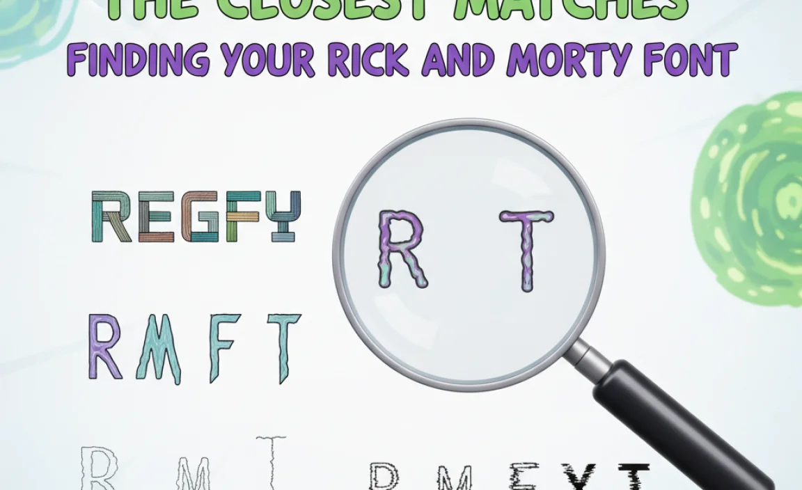
While the exact font used in the official Rick and Morty logo is proprietary and not publicly available, there are several excellent free and paid fonts that come incredibly close. These fonts capture the essence of that sci-fi, slightly edgy, and modern sans-serif look.
Popular Free Font Alternatives
For those looking to achieve the Rick and Morty font effect without breaking the bank, these free options are fantastic starting points:
- Exo 2: This is often cited as one of the closest free alternatives. Exo 2 is a geometric sans-serif font that comes in a wide range of weights (from Thin to Black), making it incredibly versatile. It has that clean, modern, and slightly futuristic vibe that’s crucial for the Rick and Morty aesthetic. You can find it on Google Fonts, which is a great resource for high-quality, freely available typefaces.
- Orbitron: As the name suggests, Orbitron has a distinctly sci-fi feel. It’s another geometric sans-serif with a strong, modern presence. Its slightly wider letterforms and sharp terminals give it a futuristic and technological feel that aligns perfectly with the show’s themes. Orbitron is also readily available on Google Fonts.
- Bebas Neue: While a bit more condensed than some other options, Bebas Neue is a hugely popular sans-serif known for its bold, all-caps style. It’s excellent for impactful headlines and titles. Its strong, straight lines and relatively uniform character width make it a good candidate for capturing that striking Rick and Morty title card look. You can download it from platforms like Google Fonts.
- Audiowide: This font has a unique character with its wide, open forms and a slight futuristic flair. It offers a modern, slightly techy feel without being overly sterile. It’s a great choice if you want something similar but with a touch more distinct personality. It’s also available on Google Fonts.
Premium Font Options
If you’re looking for professional-grade fonts with extensive character sets and even more customization options, consider these premium alternatives:
- Gotham: While not a direct match, Gotham is a highly versatile geometric sans-serif that’s often associated with a clean, modern, and authoritative look. Its popularity in branding means it often evokes a sense of sophistication similar to how the show balances complex sci-fi with relatable characters. You can purchase licenses from type foundries like Hoefler&Co.
- Brandon Grotesque: This font offers a warm yet geometric sans-serif feel. It has a friendly and approachable quality while maintaining a clean, modern structure. Its legibility and range of weights make it a solid choice for projects that need a bit of that classic geometric sans-serif appeal. Available from various premium font marketplaces.
- Proxima Nova: A widely used and highly versatile font, Proxima Nova bridges the gap between classic grotesque and modern geometric styles. Its balanced proportions and clean design make it a safe and effective choice for a wide range of applications, including those aiming for a sci-fi or modern aesthetic. Licensed through Adobe Fonts and other distributors.
When choosing, consider the specific applications. For bold titles and logos, a font like Bebas Neue or a heavier weight of Exo 2 might be ideal. For slightly more nuanced or extended text, fonts like Exo 2 or Orbitron in their lighter weights could work well.
How to Use the Rick and Morty Font for Your Projects
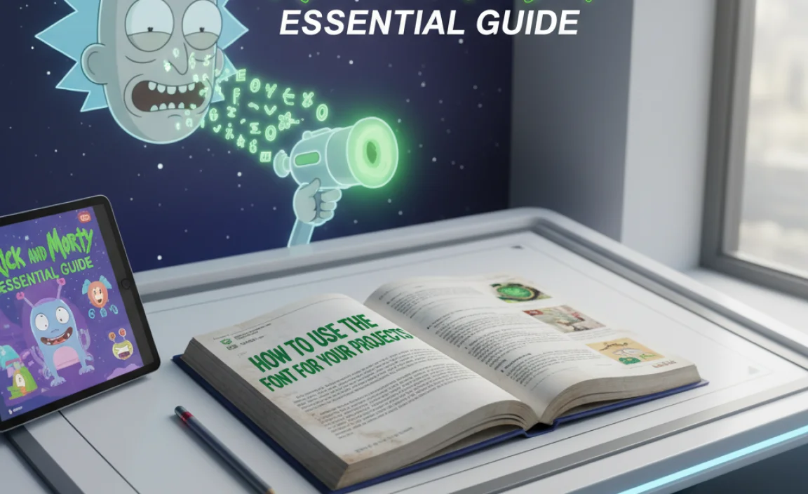
Now that you know some excellent font options, let’s talk about how to use them effectively to capture that Rick and Morty essence.
1. Logo Design
The Rick and Morty logo itself is distinctive. To create a similar impact:
- Choose a Bold Sans-Serif: Select a font with strong, clean lines. Think about the weight – often, the show uses a relatively bold or even black weight for its main titles.
- Consider Customization: You might want to slightly alter letterforms. For instance, sometimes a sharp, pointed ‘R’ or a slightly unconventional ‘M’ can add character. Experiment with tweaking key letters to make it unique.
- All Caps are Key: The show’s logo is typically in uppercase. This adds to its boldness and impact.
- Simple Color Palette: Stick to stark contrasts – often white text on a dark background, or vice-versa.
2. Website Headings and Titles
For blogs, websites, or any digital content:
- Hierarchy is Important: Use your chosen font for main headings (H1, H2) to create visual interest and hierarchy.
- Pair Wisely: Pair a bold display font for headings with a more legible, simpler sans-serif for body text. This ensures readability while maintaining the desired aesthetic for key information. A font like Open Sans or Lato works well for body text when paired with a more stylized heading font.
- Spacing Matters: Pay attention to kerning (space between letters) and leading (space between lines). The slightly wider, more open feel of some geometric sans-serifs can enhance the modern, sci-fi appeal.
3. Marketing Materials
From social media graphics to posters:
- Highlight Key Information: Use the font to draw attention to headlines, calls to action, or key selling points.
- Embrace the Energetic Feel: The font can help convey excitement, adventure, or a bit of wackiness. Consider slightly angled text for a dynamic feel, but use sparingly to maintain readability.
- Consistency is Crucial: If this font is part of your brand identity, use it consistently across all your marketing assets.
4. Creative Projects
For fan art, custom merchandise, or personal projects:
- Experiment with Weights: Play around with different font weights (light, regular, bold) to see how they affect the mood. A lighter weight can feel more futuristic, while a heavier weight conveys more power.
- Combine with Imagery: The font will often be paired with bold, vibrant, or abstract imagery. Think nebulae, portal effects, or chaotic patterns.
- Don’t Be Afraid to Be Bold: The Rick and Morty aesthetic leans into the unconventional. Use the font in ways that feel exciting and a little bit daring.
Tools and Resources for Finding Fonts
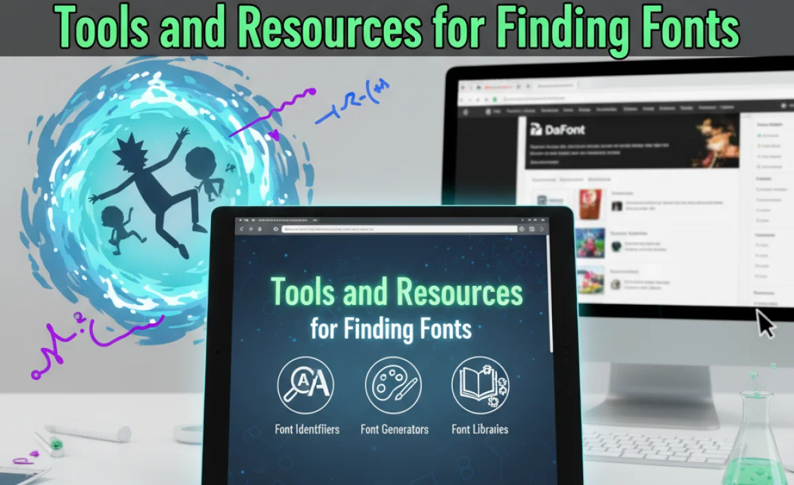
Securing the right font for your project is made easier with a variety of online tools and resources. Here are some essentials:
Font Discovery Platforms
- Google Fonts: Google Fonts is an indispensable resource. It offers a vast library of high-quality, open-source fonts that are free for commercial and personal use. You can preview fonts, see them in different sizes, and download them easily. It’s my go-to for finding excellent free alternatives.
- Font Squirrel: Another fantastic site for discovering free fonts. Font Squirrel curates commercially licensed fonts, meaning you can use them in your projects with confidence. They often feature handy font collections and web font options.
- Adobe Fonts: If you’re an Adobe Creative Cloud subscriber, you have access to a massive library of premium fonts through Adobe Fonts. This is a great way to access professional typefaces like Proxima Nova or Futura (which is also a great inspiration for the geometric sans-serif look).
- MyFonts and Fontspring: These are premier marketplaces for purchasing premium fonts. If you need a specific look, have a larger budget, or require extensive licensing for commercial use, these sites offer the widest selection of professional typefaces.
Font Identification Tools
Sometimes you see a font you love but don’t know its name. These tools can help:
- WhatTheFont: Developed by MyFonts, this tool allows you to upload an image containing text, and it will analyze the characters to suggest similar fonts from their collection. It’s incredibly helpful for identifying fonts used in logos or designs.
- Font Identifier (Adobe Photoshop Plugin): Adobe Photoshop has a built-in font matching tool that can suggest similar fonts from your installed library or Adobe Fonts based on an image.
Remember to always check the licensing for any font you download, especially if you plan to use it for commercial projects. Google Fonts and Font Squirrel generally offer clear licensing information, often under the Open Font License (OFL).
Web Font Implementation
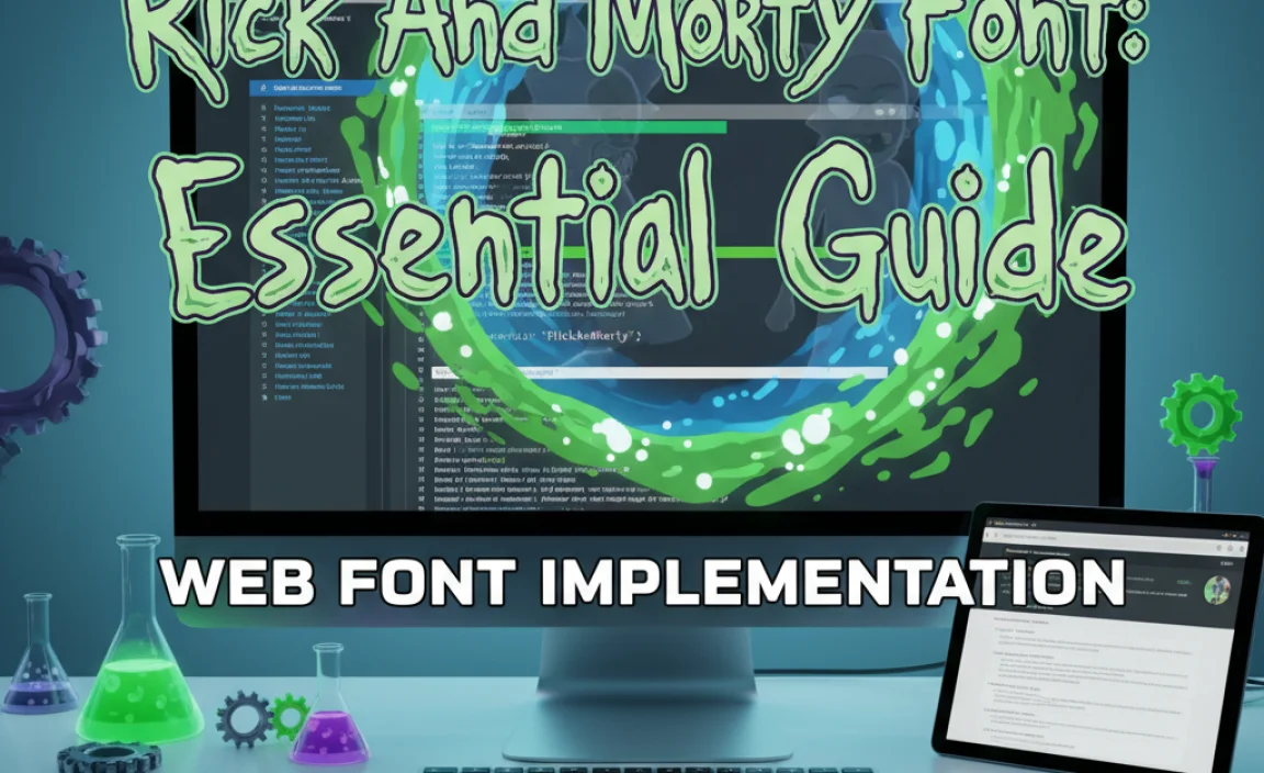
Getting that Rick and Morty font look on your website is straightforward thanks to web font services. If you’re using a font from Google Fonts, like Exo 2 or Orbitron, implementation is quite simple:
Using Google Fonts
- Explore and Select: Go to Google Fonts, find your chosen font, and click “Select this style” for the weights you need.
- Get the Code: On the right-hand sidebar, you’ll see a section titled “Selected families.” Here, you’ll find links to either embed the font using “ tags in your HTML’s “ section or import it via CSS.
- Link in HTML: Copy the “ code and paste it into the “ section of your HTML file.
- Apply in CSS: In your CSS file, use the `font-family` property to apply the font to your desired elements (e.g., `h1 { font-family: ‘Exo 2’, sans-serif; }`). Always include a fallback font (like generic `sans-serif`) in case the chosen font doesn’t load.
This ensures your website visitors see the font exactly as you intended, be it a bold heading or a unique brand element.
What Makes a Font “Look Like” Rick and Morty? An Analysis
Let’s dive a little deeper into why certain fonts evoke that specific Rick and Morty feeling. It’s a combination of form, function, and a touch of attitude.
Geometric Purity vs. Imperfection
Many sci-fi fonts, including those used by Rick and Morty, draw heavily from geometric principles. This means letters are often constructed from perfect circles, clean lines, and precise angles. This creates a sense of order, technology, and the future.
However, the “Rick and Morty” aesthetic isn’t purely sterile. The show’s animation often has a hand-drawn quality, and this translates into its typography. Even the most geometric fonts can feel slightly off-kilter, sometimes due to uneven weights, subtle variations in stroke width, or just the sheer energy they convey when used in rapid succession.
The Role of Sans-Serifs
Sans-serif fonts, by definition, lack serifs—those little decorative feet at the end of strokes. This absence contributes to:
- Modernity: Sans-serifs are strongly associated with 20th and 21st-century design, giving them a contemporary or futuristic feel.
- Readability on Screens: They tend to render clearly on digital displays, which is crucial for a show heavily broadcast and discussed online.
- Boldness: Without serifs, letterforms can appear cleaner and more direct, lending themselves well to bold statements and impactful titles.
The specific geometric sans-serifs that mirror the Rick and Morty style often feature:
- Large x-height: The height of lowercase letters (like ‘x’) relative to uppercase letters. A larger x-height often improves readability.
- Open apertures: The openings in letters like ‘c’, ‘e’, and ‘s’. More open apertures contribute to better legibility at smaller sizes.
- Uniform stroke width (often): While not always perfect, many geometric sans-serifs have a consistent stroke width, adding to their clean, technical appearance.
Emotional Resonance
Beyond the shapes, the context in which these fonts are used imbues them with meaning. The show’s blend of:
- High-Concept Sci-Fi: Advanced technology, aliens, dimensions.
- Dark Humor & Cynicism: Rick’s nihilistic outlook.
- Relatable Character Drama: Family dynamics, personal struggles.
These elements create a complex emotional landscape. A font that is modern and clean can juxtapose with slightly chaotic animation, energetic editing, and darkly witty dialogue, creating a unique tension and appeal. It suggests intelligence, a bit of danger, and a unique perspective—all hallmarks of Rick Sanchez himself.
A Comparison of Key Features
To help you visualize the similarities, here’s a table comparing some of the recommended fonts against the general characteristics of the “Rick and Morty font” style.
| Font Name | Style | Geometric? | Modern/Sci-Fi Feel? | Versatility | Availability |
|---|---|---|---|---|---|
| Exo 2 | Geometric Sans-Serif | Yes | High | Very High (many weights) | Google Fonts (Free) |
| Orbitron | Geometric Sans-Serif | Yes | Very High | High (good for display) | Google Fonts (Free) |
| Bebas Neue | Condensed Sans-Serif | Moderate | High (especially for titles) | Moderate (best for headlines) | Google Fonts (Free) |
| Audiowide | Geometric Sans-Serif | Yes | High | Moderate (distinctive) | Google Fonts (Free) |
| Gotham | Geometric Sans-Serif | Yes | High | Very High (professional) | Premium (Hoefler&Co.) |
| Proxima Nova | Hybrid Sans-Serif | Moderate/High | High | Very High (all-purpose) | Premium (Adobe Fonts, etc.) |
This table highlights that while there isn’t one single “Rick and Morty font,” fonts like Exo 2 and Orbitron offer the most direct free approximations due to their strong geometric designs and sci-fi leanings. Premium options like Gotham and Proxima Nova provide more refined, professional takes on the geometric sans-serif aesthetic.
Frequently Asked Questions (FAQ)
What is the official font used in the Rick and Morty logo?
The exact font used for the official “Rick and Morty” logo is not publicly disclosed or readily available. It’s likely a custom-designed or heavily modified typeface created specifically for the show’s branding to


Leave a Comment