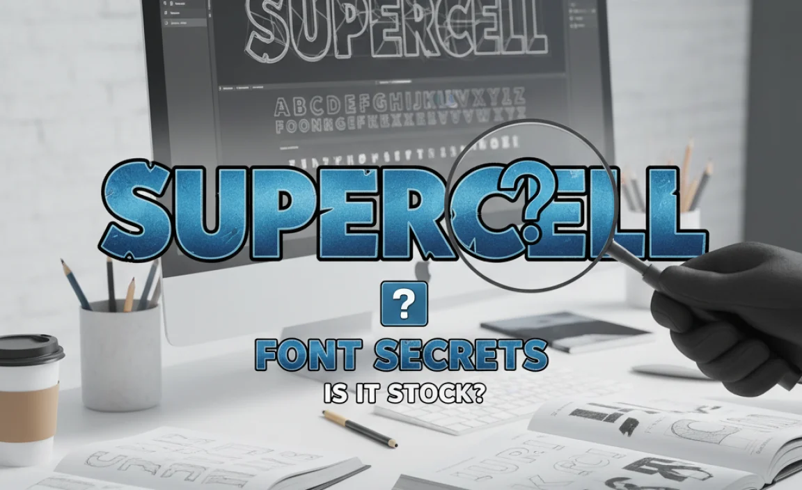
The Supercell logo font is a custom-designed typeface that evokes strength and modernity, featuring bold, slightly geometric letterforms with subtle curves. While not publicly available, its style can be approximated using similar sans-serif fonts that offer a clean, impactful, and technologically advanced feel for branding.
Ever wondered about the sharp, distinctive font used in the Supercell logo? It’s a question many designers and brand enthusiasts ponder when aiming for that same impactful look. That iconic Supercell font possesses a digital yet sturdy feel, instantly recognizable and hinting at the innovative games the company creates. Recreating that exact visual vibe can feel like a puzzle. But don’t worry! We’re here to break down the design elements and guide you toward finding fonts that capture that same powerful essence. Let’s dive in and unlock the secrets behind that unforgettable Supercell logo font.
Unpacking the Supercell Logo Font: What Makes It Stand Out?
![]()
The Supercell logo font is more than just letters; it’s a visual statement. It communicates strength, precision, and a forward-thinking approach. When you look at it, what comes to mind? Probably words like ‘modern,’ ‘bold,’ ‘techy,’ and ‘reliable.’ These aren’t accidental. The font’s design choices are deliberate, crafted to reflect the company’s brand identity and the immersive worlds of its games.
Key characteristics include:
- Boldness: The font is undeniably strong and commands attention. This makes it highly readable at various sizes, from tiny app icons to large banners.
- Geometric Shapeliness: Many letters have a structured, almost geometric feel. Think of clean lines and precise angles, suggesting order and engineering.
- Subtle Curves: Despite the geometric leaning, there are often gentle curves and humanist touches that prevent it from feeling too rigid. This adds a touch of approachability and dynamism.
- Modernity: It avoids ornamental flourishes, opting for a clean, contemporary look that aligns with digital and gaming aesthetics.
This combination creates a font that feels both robust and sophisticated. It’s the visual equivalent of a well-built, high-performance piece of technology – reliable and exciting.
The Quest for the “Supercell Font”: Is It a Stock Font?
This is where things get interesting for many. Is the Supercell logo font something you can just download and use? The short answer is often no. Many large companies, especially in the tech and gaming industries, commission custom fonts or heavily modify existing ones for their logos. This ensures uniqueness and a distinct brand identity that can’t be easily replicated.
Supercell’s approach is likely no different. They would have worked with typographers and designers to create a typeface that perfectly encapsulates their brand spirit. This custom creation means that the exact “Supercell font” isn’t available in standard font libraries. However, the good news is that understanding its design principles allows us to find excellent alternatives that give a similar impression.
Why do companies go custom?
- Brand Uniqueness: A custom font is like a signature. It makes your brand instantly recognizable and separates you from competitors.
- Perfect Fit: It can be tailored precisely to the brand’s message, values, and visual style.
- Legal Protection: Custom fonts offer strong brand protection and prevent unauthorized use.
While you might not get the Supercell font, you can certainly get a font that feels very much like it. That’s where our design secrets come in!
Design Secrets: How to Mimic the Supercell Logo Font’s Impact
![]()
To get that Supercell-esque feel, we need to look for specific font characteristics. Here’s how to break it down and find fonts that hit the mark:
1. Embrace Strong, Bold Sans-Serifs
The foundation of the Supercell look is a sans-serif typeface. Sans-serif fonts lack the small decorative strokes (serifs) found at the end of typically large strokes in fonts like Times New Roman. This makes them appear cleaner, more modern, and often more legible on digital screens.
Look for fonts that are:
- Heavy or Black Weights: The Supercell logo uses a very thick stroke for its letters. Opting for the boldest weights (like ‘Black,’ ‘Heavy,’ or ‘ExtraBold’) of a sans-serif font is crucial.
- Open Counters: These are the enclosed or partially enclosed negative spaces within letters like ‘O,’ ‘B,’ ‘P,’ ‘R,’ ‘A,’ or ‘D.’ Fonts with open counters tend to be more readable, especially at smaller sizes.
2. Seek Geometric Influences
Many of Supercell’s letters have a geometric structure. This means they are built on simple shapes like circles, squares, and straight lines. Think of the letter ‘O’ being a near-perfect circle, or the ‘A’ and ‘V’ having sharp, clean angles.
When browsing fonts, pay attention to:
- Uniform Stroke Widths: Letters where the thickness of the lines is consistent throughout.
- Precise Angles: Sharp, clean corners and junctions rather than rounded or soft ones.
- Circularity: Round letters that are very round, not oval.
However, a pure geometric font can sometimes feel too cold. Supercell’s font has a touch of warmth, which leads to our next point.
3. Appreciate the “Humanist” Touches
While geometric, the Supercell font isn’t rigidly mechanical. There are subtle curves and variations that add a touch of personality and human touch. This makes the font feel more dynamic and less sterile.
These humanist elements might appear as:
- Slightly varied stroke weights: Even in bold fonts, there can be tiny variations.
- Subtle calligraphic influences: Sometimes, a slight broadening of strokes at certain points can hint at handwriting.
- Open apertures: The openings in letters like ‘c’ or ‘e’ might be slightly wider than in purely geometric counterparts.
Finding a font that balances these geometric and humanist traits is key to achieving that specific Supercell aesthetic.
Top Font Families Inspired by the Supercell Logo Style
![]()
Since the exact font isn’t available, let’s explore some excellent sans-serif font families that share similar DNA. These are fonts that often appear in branding for tech, gaming, and modern companies, aiming for a similar feel of strength and digital prowess.
Here are a few categories and examples:
Category 1: Modern Geometric Sans-Serifs
These fonts lean heavily into the clean, precise geometry, offering a very contemporary and structured look.
Example: Montserrat
Montserrat is a popular choice known for its versatility. It has a geometric foundation but incorporates some warmer, more open characteristics. Its various weights, especially the heavier ones, can evoke a similar impact to the Supercell logo. It’s also open-source and widely available, making it an accessible option for many projects. You can explore Montserrat on platforms like Google Fonts, a great resource for designers.
Example: Poppins
Poppins is another fantastic geometric sans-serif family. It’s characterized by its perfectly circular letterforms and clean lines. The heavier weights are quite impactful and lend themselves well to strong branding. Poppins is also available through Google Fonts, offering a vast range of weights and styles.
Category 2: Humanist Sans-Serifs with Boldness
These fonts offer more organic shapes and open apertures while still providing the necessary boldness and modern appeal.
Example: Lato
Lato is described as a humanist sans-serif that feels “transparent” in text. However, in its bolder weights, it gains significant presence and a friendly yet strong character. The letters are warm and structured, with a good balance between geometric clarity and subtle curves. Lato is also available via Google Fonts.
Example: Raleway
Raleway is a distinctive sans-serif font that balances elegance with a modern, geometric structure. While it has a unique character (like the distinctive ‘W’), its bolder weights can capture a powerful and contemporary feel. It features some interesting details and a good range of styles, making it a strong contender for a Supercell-inspired look.
Category 3: Display & Commercial Options
For those seeking something a bit more specialized or willing to invest in a unique font, there are commercial foundries with remarkable options. These often push aesthetic boundaries while maintaining legibility and impact.
Example: Bebas Neue (with modifications or in bold context)
While primarily a condensed sans-serif, in its boldest forms and when used with ample spacing, Bebas Neue projects immense impact and a strong, almost blocky, modern feel often associated with gaming. It’s a popular free font, but remember it’s condensed, so test for readability. For an even more impactful look similar to Supercell, designers sometimes pair it with other fonts or use it strategically.
Example: Gotham (Black or X-Black weights)
Gotham is a renowned geometric sans-serif typeface that offers a wide range of weights, from light to ‘Black’ and ‘Extra-Black.’ Its clean, architectural forms and excellent legibility make it a favorite for corporate and modern branding. The heavier weights of Gotham truly embody the bold, strong, and modern aesthetic without feeling overly rigid. While a commercial font, its widespread use and recognizable form make it a benchmark for this style.
Font Selection Table: Inspired by Supercell
To help you visualize, here’s a quick comparison of some font characteristics compared to the Supercell logo’s essence:
| Font Family | Primary Style | Geometric Leanings | Humanist Touches | Impactful Weights Available | Best For |
|---|---|---|---|---|---|
| Montserrat | Geometric Sans-Serif | High | Moderate | Yes (Black, ExtraBold) | Logos, Headlines, UI Elements |
| Poppins | Geometric Sans-Serif | High | Low | Yes (Bold, ExtraBold, Black) | Logos, Digital Interfaces, Marketing Materials |
| Lato | Humanist Sans-Serif | Moderate | High | Yes (Black, Bold) | Body Text, Headlines, Branding that needs warmth |
| Raleway | Geometric/Grotesque Sans-Serif | Moderate | Moderate | Yes (Bold, ExtraBold) | Distinctive Headlines, Branding |
| Gotham (X-Black) | Geometric Sans-Serif | High | Low | Yes (Black, X-Black) | Premium Branding, High-Impact Logos |
Beyond the Font: Logo Design Principles
![]()
While the font is a huge part of the Supercell logo’s identity, other design elements contribute to its overall power and recognition. When aiming for a similar brand impact, consider these factors:
- Color Palette: Supercell often uses a strong, vibrant, or sometimes dark and powerful color scheme. The choice of colors significantly amplifies the font’s message.
- Shape and Iconography: The logo itself might incorporate a simple, iconic shape. The synergy between the font and any accompanying graphic element is crucial.
- Spatium (Whitespace): How the letters are spaced (kerning and tracking) and how the logo is presented with surrounding space affects its impact. Supercell’s logo typically has well-balanced spacing, making it clean and readable.
- Simplicity: Complex logos can become muddled. Supercell’s logo design is strong because it’s relatively simple and easily recognizable.
When you’re choosing a font, think about how it will interact with these other elements within your own brand identity. The font needs to be a team player!
Where to Find Supercell Logo Font Alternatives
Ready to start searching? Here are some reliable places to find high-quality fonts that can help you achieve a similar aesthetic:
- Google Fonts: (fonts.google.com) This is an excellent, free resource with a vast library of open-source fonts. You can filter by style (sans-serif), weight, and more. It’s a fantastic place for beginners and professionals alike.
- Adobe Fonts: (fonts.adobe.com) If you have an Adobe Creative Cloud subscription, you get access to a massive, curated collection of high-quality commercial fonts, including many modern sans-serif options.
- MyFonts, Fontspring, Typekit (part of Adobe Fonts): These are leading marketplaces for commercial fonts. You’ll find an incredible range of professional typefaces here, often with more unique characteristics. Be prepared for licensing costs.
- Font Squirrel: (www.fontsquirrel.com) A great source for free, commercially licensed fonts. They often curate high-quality free options that can rival paid ones.
When you’re exploring these sites, use keywords like “geometric sans-serif,” “bold sans-serif,” “modern sans-serif,” “display sans-serif,” or even try searching for the characteristics we discussed (e.g., “open counters”).
Tips for Using Your “Supercell-Inspired” Font
Once you’ve found a font you love, here’s how to make it sing:
- Use Bold Weights: As mentioned, Supercell uses a very thick font. Don’t shy away from the ‘Bold,’ ‘ExtraBold,’ or ‘Black’ weights.
- Consider Letter Spacing (Kerning & Tracking): Pay attention to the space between individual letters (kerning) and the overall spacing of words and phrases (tracking). A well-spaced Supercell-esque font will feel clean and professional, not cramped.
- Context is Key: A bold font works best for headlines, logos, and short bursts of text. For longer paragraphs, you might need a lighter weight of the same font or a complementary, more readable font.
- Test Across Devices: Always check how your chosen font looks on different screens and at various sizes. What looks great on a desktop might need adjustments for a mobile app.
Frequently Asked Questions About the Supercell Logo Font
Q1: Is the Supercell logo font custom-made?
A1: Yes, it is widely believed that the Supercell logo font is a custom-designed typeface created specifically for the company to ensure brand uniqueness and a distinct visual identity.
Q2: Can I download and use the exact Supercell font?
A2: No, because it’s a custom font, it is not publicly available for download or commercial use. Companies typically keep their custom logos and typefaces proprietary.
Q3: What is the closest free font to the Supercell logo font?
A3: While no free font is identical, fonts like Montserrat, Poppins, or Lato (in their bolder weights) available on Google Fonts share similar characteristics like geometric structure and bold strokes, making them good free alternatives.
Q4: What makes the Supercell font look so modern and strong?
A4: Its modern and strong appearance comes from its bold weight, clean sans-serif design, precise geometric shapes, and a balanced use of open counters and subtle curves, avoiding decorative elements.
Q5: How can I choose a font that has a similar feel for my own brand?
A5: Look for sans-serif fonts with heavy or black weights. Prioritize those with geometric construction but also a hint of humanist warmth. Consider clarity and impact across different sizes, keeping your brand’s personality in mind.
Q6: Are there any paid fonts that closely resemble the Supercell style?
A6: Yes, commercial fonts like Gotham (especially the ‘Black’ or ‘X-Black’ weights) and Futura PT (heavy weights) offer very similar robust and geometric characteristics that align with the Supercell logo font’s aesthetic.
Q7: When should I use a bold, geometric font like the Supercell one?
A7: Bold, geometric fonts are excellent for logos, headlines, calls to action, and any branding element that needs to grab attention and convey strength, modernity, and reliability. They are particularly effective in digital contexts like gaming and technology.
Conclusion: Crafting Your Own Bold Brand Identity
The Supercell logo font is a masterclass in effective logo typography. It’s bold, modern, and instantly recognizable, embodying the brand’s innovative spirit. While you can’t get your hands on the exact custom typeface, you now have the knowledge to find fonts that capture its essence. By focusing on bold sans-serifs with geometric influences and a touch


Leave a Comment