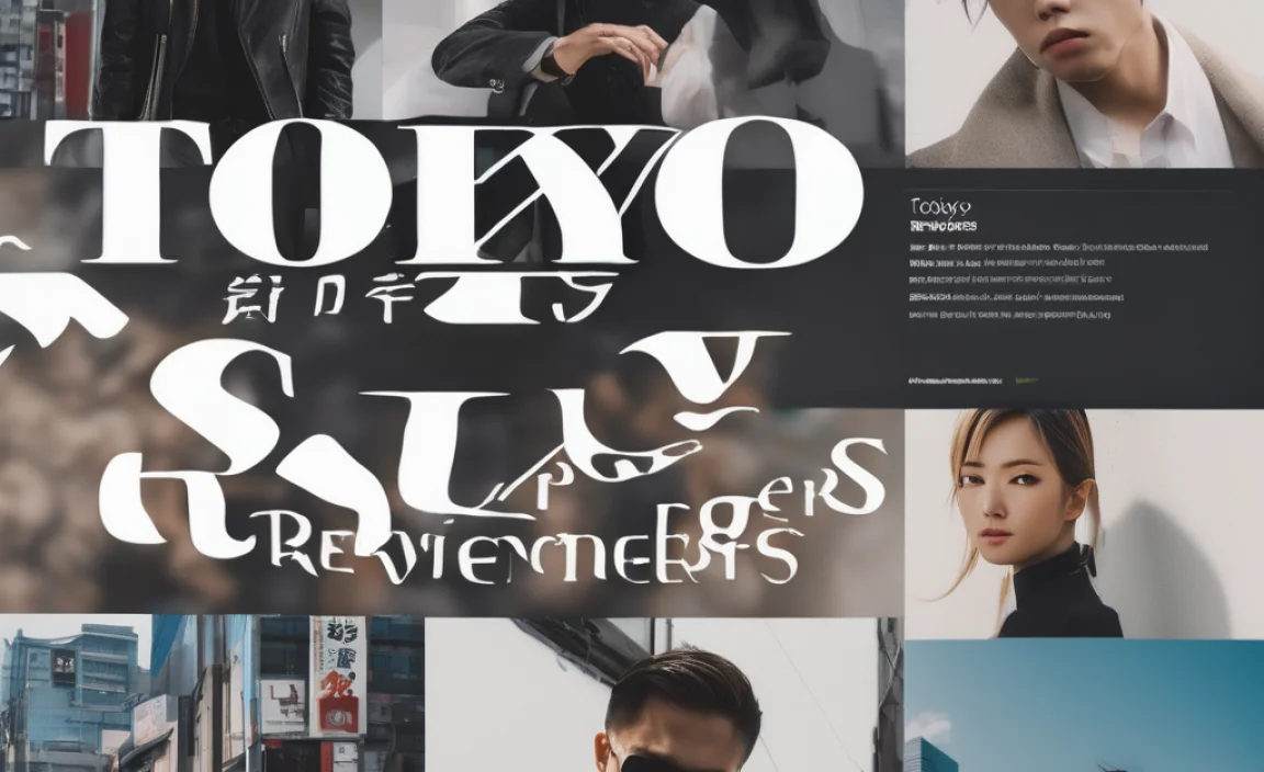
The “Tokyo Revengers Font” isn’t a single font but a style. It blends bold, impactful sans-serif lettering with a gritty, handwritten feel, often seen in the manga and anime. To capture this essence, you’ll typically use a strong base font and add distinctive stylistic elements for an anime-inspired, action-packed look.
Hey design enthusiasts! Ever stumbled upon the electrifying titles or character names in Tokyo Revengers and wondered how to get that same dynamic vibe for your own projects? That unmistakable style that’s both impactful and a little rough around the edges? You’re not alone! Many creatives find themselves drawn to this unique typography but aren’t sure where to start. It can feel a bit tricky to nail that perfect blend of boldness and character. But don’t worry, by the end of this guide, you’ll have the know-how to reproduce that signature Tokyo Revengers font style, whether for a fan project, a cool graphic, or even a personal brand.
Unpacking the Visual Identity of Tokyo Revengers
The visual language of Tokyo Revengers is as essential to its identity as its compelling narrative of time-traveling delinquents fighting for a better future. The typography plays a huge role in this, instantly communicating energy, rebellion, and intensity. It’s not just about choosing a font; it’s about evoking a feeling.
When we talk about the “Tokyo Revengers Font,” we’re not referring to one specific typeface officially declared by the creators. Instead, it’s an aesthetic that has evolved through the manga’s title treatments, character name cards, and promotional materials. This style is primarily characterized by:
- Boldness and Impact: The lettering is almost always thick and commanding, demanding attention.
- A Gritty, Hand-Drawn Feel: Despite its boldness, there’s often an imperfection, a slight irregularity that suggests hand-lettering or brush strokes, hinting at the messy, chaotic world of the story.
- Dynamic Angles and Distortions: Text isn’t always straight. It can be tilted, stretched, or have a sense of movement, reflecting the action and emotional turmoil within the series.
- High Contrast: Often seen in black and white within the manga, the font style emphasizes strong silhouettes and legibility even in high-action scenes.
This unique combination makes the Tokyo Revengers style instantly recognizable and highly desirable for anyone looking to inject a similar amount of punch into their designs.
Key Elements of the Tokyo Revengers Font Style
To truly recreate the Tokyo Revengers font style, we need to break down its core components. Think of these as the building blocks you’ll use to construct your own visually striking typography.
1. The Base Font: Finding Your Bold Sans-Serif
The foundation of the Tokyo Revengers aesthetic is typically a strong, assertive sans-serif font. These fonts are chosen for their clarity and power, easily conveying a sense of urgency and strength. They are often:
- Geometric or Grotesque Sans-Serifs: These have clean lines and consistent stroke widths, offering a solid, modern feel.
- High X-Height: Fonts with a taller x-height (the height of lowercase letters like ‘x’) tend to look more robust and legible, even at smaller sizes.
- Good Weight: Look for fonts that come in bolder weights like ‘Bold’, ‘ExtraBold’, or ‘Black’.
Some popular font families that embody this type of base letterform include:
- Bebas Neue: A highly popular, free, all-caps font known for its condensed, tall, and bold appearance. It’s incredibly versatile for headlines and impactful text.
- Impact: As its name suggests, this classic font is designed for impact. It’s condensed and very bold, making it a staple for attention-grabbing titles.
- Anton: Another excellent free option, Anton is a condensed sans-serif that’s both utilitarian and striking.
- Oswald: Available on Google Fonts, Oswald offers a range of weights and a slightly condensed, practical feel that works well for impactful titles.
When selecting your base font, always consider its legibility. While a font might look striking, if it’s too condensed or has unusual letterforms that hinder reading, it might not serve your purpose. For the Tokyo Revengers style, clarity is key, especially since the lettering often accompanies fast-paced action.
2. The Grunge and Texture: Adding Character
What truly elevates a standard bold font to the Tokyo Revengers style is the addition of texture and a slightly imperfect, hand-crafted feel. This element injects personality and reflects the often-harsh realities and struggles of the characters.
How can you achieve this? Here are a few methods:
- Brush Strokes and Ink Bleed: Imagine letters painted with a slightly worn brush, where ink might bleed or have uneven saturation. This can be simulated with textured brushes in design software.
- Distress and Abrasion: Subtle scratches, worn edges, or a grainy texture can make the font look like it’s been through a fight. Think about fonts that naturally have a distressed appearance or applying distress effects digitally.
- Rough Edges: Instead of perfectly sharp corners, slightly rounded or irregular edges can lend a more organic, less polished look.
You can find fonts that already incorporate these textures. Look for terms like “brush,” “distressed,” “grunge,” or “handwritten” when searching for typefaces. For example, some popular brush script or hand-drawn fonts can provide a great starting point, though you’ll want to ensure they are still bold enough to carry the weight of the Tokyo Revengers aesthetic.
3. Dynamic Effects: Movement and Energy
The Tokyo Revengers style isn’t static. It’s alive with energy, and the typography often reflects this. This can be achieved through various visual manipulations:
- Slanting and Italicization: Giving text a slight, aggressive slant can suggest speed and forward momentum. This is different from a formal italic; it’s more of an intentional, forceful lean.
- Warping and Distortion: Slightly bending, stretching, or skewing letters can create a sense of chaos or extreme exertion, mirroring the fight scenes. Be careful not to overdo this, as it can quickly become unreadable.
- Outline and Shadow Effects: Often, bold lettering is enhanced with contrasting outlines or dynamic shadows that add depth and make the text pop, especially against busy backgrounds.
- Layering and Overlap: Text elements might overlap each other, creating a sense of density and visual excitement.
These effects are best applied strategically. For instance, character names might have more pronounced distortion than a chapter title, depending on the mood you want to convey.
How to Create the Tokyo Revengers Font Style: A Step-by-Step Guide
Ready to put your design skills to the test? Here’s a practical, step-by-step approach to creating your own artwork with the Tokyo Revengers font style. We’ll focus on common design software, but the principles apply broadly.
Step 1: Choose Your Base Font
Start by selecting a bold, impactful sans-serif font. As mentioned earlier, Bebas Neue, Impact, Anton, or Oswald are great free choices. For this example, let’s assume we’re using Bebas Neue because of its excellent availability and strong verticality.
- Open your design software (e.g., Adobe Photoshop, Illustrator, Affinity Designer, or even a free tool like Canva).
- Create a text layer and type out your desired word or phrase (e.g., “TOKYO REVENGERS,” a character name like “MIKEY,” or a tag line).
- Apply your chosen font (Bebas Neue) in a bold weight, likely all caps for maximum impact. Ensure the tracking (space between letters) is set appropriately to avoid letters looking too cramped or too far apart.
Step 2: Add Basic Stylistic Enhancements
Now, let’s begin to imbue the text with some of the series’ signature dynamism.
A. Adjusting Width and Slant:
- Scaling: If Bebas Neue feels too narrow, you can cautiously increase its horizontal scale. In most software, you can do this via the character/text properties panel. Aim for a slightly wider, more dominant presence without making it look unnaturally stretched. A scale of around 110-120% might be a good starting point.
- Slanting: Apply a synthetic oblique (or italic, if the font has one) to give it a forward lean. A slant of 5-15 degrees often works well. Don’t overdo it; the goal is energy, not illegibility.
B. Outline and Stroke:
- Add a thick stroke or outline to your text. The color of the stroke is crucial. Often, a contrasting color to the fill of the text works best. For example, if your text is red, a white or black outline can be very effective. Experiment with stroke thickness until it feels substantial.
- Tip: In Photoshop, you can use Layer Styles > Stroke. In Illustrator, Object > Path > Outline Stroke, and then Unite the shapes, or use the Appearance panel to add multiple strokes.
Step 3: Introduce Grunge and Texture
This is where the text really starts to feel like it belongs in the world of Tokyo Revengers.
A. Using Textured Brushes:
- In Raster Software (Photoshop, Procreate):
- Create a new layer above your text layer(s).
- Clip this new layer to the text layer below (Alt/Option-click between layers). This confines your brush strokes to the shape of the text.
- Select a textured brush that mimics ink splatters, rough edges, or a grainy feel. You can find many free or paid brush packs online. Websites like Freetousesounds offer free Photoshop grunge brushes you can adapt.
- Use this brush with a color that contrasts slightly with your text fill or outline to add details like roughened edges, subtle ink bleeds, or a general worn look.
- In Vector Software (Illustrator, Affinity Designer):
- For a vector approach, you can use textured fills or apply effects.
- ‘Roughen’ Effect: Go to Effect > Distort & Transform > Roughen. Adjust the size and detail to get a subtle, worn-out edge.
- Texture Overlays: You can import a texture (like a grunge paper scan) into a separate vector shape that matches your text, set it to a clipping mask, and then group it with your text.
B. Applying Distress Textures:
- Find a high-resolution grunge texture image (paper, concrete, scratched metal).
- Place this texture image over your text artwork.
- Set the texture layer’s blend mode to ‘Multiply’, ‘Overlay’, or ‘Soft Light’, and reduce its opacity until you achieve a subtle but noticeable distressed effect. You might need to clip this texture to your text or group it for cleaner results.
Step 4: Add Advanced Dynamic Effects (Optional)
For that extra punch, consider these advanced techniques.
A. Warping and Liquify:
- If you want to simulate extreme action or distortion, use a Warp transform or the Liquify tool.
- In Photoshop, select your text layer (or a duplicated layer for safety), go to Edit > Transform > Warp, and experiment with the grid and handles.
- The Liquify filter (Filter > Liquify) offers more granular control for subtle pushes and pulls, but it can quickly make text unreadable if misused. Use these tools sparingly and with intention.
B. Dynamic Shadows and Glows:
- Add outer glow effects or drop shadows with specific settings to make the text feel like it’s illuminated dramatically or has a powerful aura.
- Experiment with colors for shadows and glows that complement the existing palette. A deep red or black shadow can enhance the gritty feel, while a neon glow can add an anime-like energy.
C. Layering and Depth:
- If you’re working with multiple text elements (e.g., a main title and a subtitle), experiment with overlapping them.
- Use the shape of one text element to partially obscure another, creating a sense of layered depth and complexity that mimics the busy, action-packed panels of a manga.
Step 5: Color Palette and Final Touches
Color is how you finalize the mood. The Tokyo Revengers aesthetic often uses high-contrast, bold colors, or stark black and white with accents.
- High Contrast: Think bold reds, blacks, whites, and electric blues. These colors grab attention and convey a sense of danger and urgency.
- Monochromatic with Accent: A black or white text with a single, vibrant accent color can be very powerful. This mirrors the limited color palettes often used in manga to draw focus to key elements.
- Grayscale: For a direct manga feel, sticking to shades of gray, black, and white is highly effective.
Ensure your final piece has a clear focal point. The text should be legible enough to draw the viewer in without overwhelming them. It’s a balance between raw power and clear communication.
Tools and Resources for Creating the Style
To help you along your journey, here are some essential tools and resources that can make crafting the Tokyo Revengers font style much easier.
Recommended Fonts
Finding the right base font is crucial. While many free options exist, exploring paid libraries can offer even more unique and robust choices.
| Font Name | Style | Availability | Key Features for TR Style |
|---|---|---|---|
| Bebas Neue | Condensed Sans-Serif | Free (Google Fonts) | Tall, bold, excellent for all-caps titles. |
| Impact | Condensed Sans-Serif | System Font (Windows/macOS) | Extremely bold, wide appearance despite being condensed. |
| Anton | Condensed Sans-Serif | Free (Google Fonts) | Modern, strong, impactful letterforms. |
| Oswald | Sans-Serif | Free (Google Fonts) | Versatile, comes in various weights, slightly narrower than Impact. |
| League Gothic | Condensed Sans-Serif | Free (League of Moving Objects) | Very tall and condensed, similar to Bebas but with slightly different character shapes. |
| Abel | Condensed Sans-Serif | Free (Google Fonts) | Narrow and tall, good for very compact headlines. |
Texturing and Brush Resources
Adding grit and character is where many textures and brushes come in handy.
- Free Brush Packs: Many websites offer free Photoshop and Procreate brushes. Searching for “grunge brushes,” “ink splatter brushes,” or “distressed brushes” will yield great results. Resources like Design Tuts+ often compile such lists.
- Grunge Textures: Look for high-resolution images of concrete, paper, metal, or scratches. Websites like Pexels or Unsplash have free stock photos you can use for textures.
- Premium Font Foundries: If you have a budget, sites like MyFonts or Fontspring offer a vast selection of fonts, including many hand-drawn and distressed options that could fit the aesthetic perfectly.
Design Software
While the specific software isn’t as

Leave a Comment