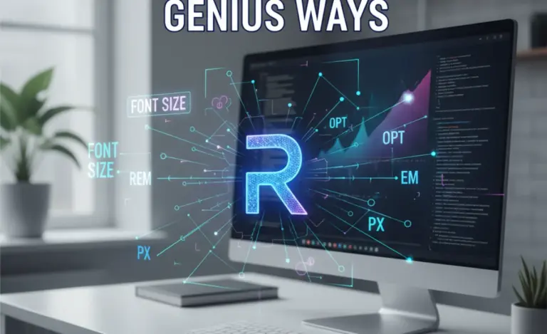
The Windows 10 logo font is a custom-designed typeface based on Segoe UI, expertly crafted for clarity, accessibility, and a modern, friendly appeal. Its genius lies in meeting diverse user needs and brand identity goals with elegant simplicity.
Ever glanced at the Windows 10 logo and wondered about that clean, distinctive font? It’s a design question many creatives and everyday users ponder. The Windows 10 logo font, while appearing simple, is a masterclass in accessible design and brand representation. This isn’t just any font; it’s a carefully chosen or custom-developed typographic element that significantly impacts how we perceive the operating system. Many find understanding the choices behind iconic logos a bit mystifying, leading to a common frustration when trying to replicate similar clarity in their own projects.
But don’t worry! We’re about to break down exactly what makes the Windows 10 logo font so effective. From its origins to its design principles and how it influences modern branding, this guide will equip you with the knowledge to appreciate and even apply similar design thinking to your own creative ventures. Get ready to see the Windows logo, and typography in general, with fresh eyes.
Understanding the Windows 10 Logo Font: More Than Just Letters
The Windows logo has evolved over the years, and each iteration reflects the technological and aesthetic trends of its time. The Windows 10 logo, in particular, stood out for its move towards a flatter, more geometric design. This shift wasn’t just visual; it was a strategic decision to align with a more modern, user-centric computing experience.
At its core, the font used in the Windows 10 logo is a testament to thoughtful branding. It aims to be instantly recognizable, incredibly readable across countless devices and screen sizes, and evoke a sense of reliability and approachability. It’s not about loud, flashy lettering; it’s about subtle elegance and functional perfection.
The Genesis: Where Did the Windows 10 Logo Font Come From?
The Windows 10 logo’s wordmark, often seen alongside the iconic four-pane window, utilizes a typeface that is closely associated with Microsoft’s brand identity. While not a publicly available font for direct download and use in its exact logo form (logotypes often have custom kerning and slight modifications), the style is heavily derived from Microsoft’s own font family, Segoe UI.
Segoe UI was specifically designed by Microsoft to be a humanist sans-serif typeface, meaning it has characteristics that make it feel more organic and readable than purely geometric sans-serifs. It’s built for user interfaces, optimized for clarity on screens, and has a friendly, open feel. This makes it a perfect candidate for a global brand like Windows, which needs to communicate effectively with billions of users worldwide.
You can learn more about the principles of sans-serif fonts and their historical impact on design, including early UI design, by exploring resources like the Library of Congress’s Graphic Design and Advertising Collections, which offers insights into visual communication across eras.
Why Segoe UI? The Design Philosophy Explained
The choice of Segoe UI (or a font very similar to it) for the Windows 10 branding wasn’t accidental. Here’s a breakdown of why it’s such a smart choice:
Readability: Segoe UI is renowned for its exceptional legibility, even at small sizes on low-resolution screens. This is crucial for an operating system interface and its associated branding. The open counters (the enclosed or partially enclosed negative space in letters like ‘o’ or ‘e’) and clear letterforms ensure that text is easy to scan.
Modern and Friendly Aesthetic: It avoids the sharp, corporate feel of some older sans-serifs. Instead, Segoe UI possesses a warm, approachable quality. The slight variations in stroke width and the subtle humanist touches make it feel less robotic and more welcoming.
Versatility: This typeface family includes a wide range of weights and styles, making it adaptable for various branding applications – from bold headlines and logos to body text within applications and on websites.
Accessibility: A key tenet of modern design is inclusivity. Segoe UI’s design prioritizes clarity, which is a fundamental aspect of accessibility. Users with visual impairments or cognitive differences benefit greatly from fonts that are easy to decipher. Microsoft’s commitment to accessibility is a significant part of its design ethos.
Brand Consistency: By using Segoe UI across its product ecosystem, Microsoft creates a coherent visual language. Anyone familiar with Windows or other Microsoft products will recognize the typographic style, reinforcing brand identity.
The Genius of Specific Design Choices in the Windows 10 Logo
Beyond the base font, the actual presentation of the word “Windows” in the logo often involves:
Custom Spacing (Kerning): While based on Segoe UI, the letter spacing in the official logo is meticulously adjusted. This is called kerning, and it ensures that every pair of letters has the optimal visual distance between them, creating a smooth, balanced look that a standard font might not achieve out-of-the-box.
Weight and Style: The logo typically uses a specific weight of the font (often regular or semi-bold) that provides a good balance between presence and readability without being overpowering.
Color and Context: The logo’s letters are usually presented in a clean, flat color palette that complements the overall Windows brand. The simplicity of the letterforms allows the color to stand out without distraction.
Breaking Down Key Font Features for Logo Design
When we talk about fonts for logos, especially those aiming for the clarity and impact of something like the Windows 10 logo, several characteristics come into play. Understanding these can elevate your own logo design process.
1. Sans-Serif vs. Serif Fonts
The Windows 10 logo font is a sans-serif. This means it lacks the small decorative strokes (called serifs) at the ends of the main strokes of letters. Why is this important for logos?
- Sans-serif: Generally perceived as modern, clean, straightforward, and approachable. Excellent for digital interfaces and minimalist branding. Examples include Arial, Helvetica, and indeed, Segoe UI.
- Serif: Often associated with tradition, elegance, authority, and trustworthiness. They can convey a sense of heritage or sophistication. Examples include Times New Roman, Georgia, and Garamond.
The Windows 10 logo’s sans-serif choice reinforces its image as a contemporary and user-friendly operating system.
2. Legibility and Readability
These two terms are often used interchangeably, but they have subtle differences in the context of typography:
Legibility: How easily individual letters can be distinguished from one another. A legible font ensures that an ‘a’ doesn’t look like an ‘o’, or an ‘H’ doesn’t look like an ‘N’.
Readability: How easily blocks of text can be read. This involves factors like letter spacing, word spacing, line height, and the overall flow of the text.
The Windows 10 logo font excels in both. The clear letterforms (legibility) combined with appropriate spacing and weight make the brand name instantly accessible (readability).
3. X-Height
The x-height is the height of a lowercase letter, such as ‘x’, above the baseline. Fonts with a larger x-height tend to appear larger and are more readable at smaller sizes. Segoe UI has a generous x-height, contributing to its excellent legibility on screen.
Impact on Logos: A larger x-height can make a logo feel more prominent and easier to read quickly. This is especially valuable for brand names that appear on signage, app icons, or small digital displays.
4. Open Counters
These are the spaces inside letters like ‘o’, ‘e’, ‘a’, ‘p’, ‘b’, ‘d’, ‘q’. Fonts with more open counters are generally more legible, as the internal spaces are clearly defined and less likely to fill in at small sizes or low resolutions.
Impact on Logos: Open counters prevent the logo from appearing cluttered or fuzzy, especially when viewed from a distance or on smaller screens.
5. Personality and Brand Alignment
Every font carries an emotional tone. The Windows 10 logo font’s personality can be described as:
Modern: Sleek, up-to-date.
Clean: Uncluttered, minimalist.
Approachable: Friendly, inviting, not intimidating.
Reliable: Stable, trustworthy.
This personality aligns perfectly with Microsoft’s goal for Windows 10: to be a powerful yet accessible operating system for everyone.
Practical Application: Choosing Your Own Logo Font
Inspired by the Windows 10 logo’s approach? Here’s how you can apply these principles when selecting a font for your own brand.
Step-by-Step Font Selection Guide
- Define Your Brand Identity: What message do you want to convey? Modern? Traditional? Playful? Serious? Identify 3-5 keywords that describe your brand’s personality.
- Consider Your Audience: Who are you trying to reach? Their age, profession, and cultural background can influence how they perceive different font styles.
- Prioritize Readability: This is paramount. Your logo needs to be clear at any size. Test potential fonts by shrinking them down to icon size and enlarging them to billboard size.
- Explore Font Categories:
- Sans-serifs: Great for modern, minimalist, tech-focused, or approachable brands.
- Serifs: Ideal for established, luxurious, trustworthy, or traditional brands.
- Script/Handwritten: Use sparingly for a personal, artistic, or artisanal feel. Ensure they are still legible!
- Display Fonts: Often decorative and best used for very specific, high-impact branding where legibility isn’t the primary concern for the full wordmark.
- Look for Versatility: Does the font have different weights (light, regular, bold) and styles (italic)? This will be helpful for different applications of your brand.
- Check Licensing: Ensure the font license allows for commercial use in logos. Many free fonts have restrictions. Check the Creative Commons license guide for general understanding of open licenses, and always check the specific license for any font you use.
- Test, Test, Test: Don’t just look at the letters on a screen. Mock up your logo with the font on business cards, websites, social media profiles, and even imaginary products.
- Consider Customization: For a truly unique logo, consider hiring a designer to customize a font or create lettering specifically for your brand.
Tools and Resources for Font Discovery
Finding the perfect font can be a fun journey. Here are some reliable places to start:
- Google Fonts: A vast library of customizable, open-source fonts. You can filter by category, weight, and even language support. (fonts.google.com)
- Adobe Fonts: If you have an Adobe Creative Cloud subscription, you have access to a premium library of fonts, including many professional-grade options.
- Font Squirrel: Offers a curated collection of free fonts that are licensed for commercial use, often with helpful web font kits. (www.fontsquirrel.com)
- MyFonts / FontShop: Two of the largest marketplaces for commercial fonts. Great for browsing high-quality, often unique typefaces.
Font Families and Logo Design: A Deeper Dive
When designers work with fonts for branding, they often think in terms of font families. A font family is a set of related typefaces. For example, Segoe UI is a family that includes Segoe UI Light, Segoe UI Regular, Segoe UI Semibold, Segoe UI Bold, and their italic counterparts. The Windows 10 logo leverages this systematic approach.
The Impact of Font Weights
The weight of a font refers to its thickness. common weights include:
| Font Weight | Typical Use | Perceived Effect |
|---|---|---|
| Thin/Light | Subtle branding, secondary text, elegant accents | Delicate, sophisticated, airy |
| Regular | Body text, standard branding elements, interfaces | Neutral, balanced, readable |
| Medium/Semibold | Headlines, important labels, logos needing presence | Strong, noticeable, clear |
| Bold | Headlines, calls to action, bold statements | Impactful, authoritative, attention-grabbing |
| Black/Heavy | Very strong headlines, display use | Powerful, dominant, arresting |
Microsoft likely chose a weight that offered a substantial presence without being aggressive, ensuring the word “Windows” is instantly recognizable and feels stable.
Understanding Font Pairings
While the Windows 10 logo itself uses one primary typeface, many brands need to pair fonts. For instance, a logo might use a bold sans-serif for the company name, while a more traditional serif font is used for a tagline or body text on their website.
Basic Pairing Rules:
- Contrast is Key: Pair a serif with a sans-serif, or a formal font with a more casual one. Avoid pairing two fonts that are too similar.
- Harmony: Ensure the chosen fonts have some shared characteristic, like similar x-heights or a common mood, so they don’t clash.
- Limit Your Choices: Stick to two, maybe three, fonts maximum for your brand. Too many can look unprofessional.
FAQs About the Windows 10 Logo Font
Here are some common questions beginners have about typography and logos like Windows 10:
What font is in the Windows 10 logo?
The font used in the Windows 10 logo wordmark is very similar to, or a customized version of, Microsoft’s Segoe UI font family. While Segoe UI is widely available and used by Microsoft, the exact logo may feature custom kerning and minor modifications.
Can I use the Windows 10 logo font for my own logo?
You can use the Segoe UI family of fonts for your brand identity if your license permits commercial use. However, you cannot directly use the exact “Windows” wordmark from the Microsoft logo, as that is copyrighted intellectual property. Always check font licenses carefully before using them commercially.
What makes a font “good” for a logo?
A “good” logo font is highly legible at various sizes, reflects the brand’s personality and values, is versatile enough for different applications, and is legally usable for commercial purposes. It should also be memorable and distinctive.
How do I find fonts that are free for commercial use?
Websites like Google Fonts and Font Squirrel offer extensive libraries of free fonts. When using these sites, always look for the specific license information associated with each font to confirm it allows for commercial use in logos and branding.
What is kerning and why is it important for logos?
Kerning is the adjustment of space between specific pairs of letters to visually balance them. For logos, precise kerning ensures the brand name looks aesthetically pleasing and professional, avoiding awkward gaps or overlaps that can detract from the design.
Is Segoe UI the same as Segoe Print?
No, Segoe UI and Segoe Print are different fonts within the Segoe family. Segoe UI is a clean, modern sans-serif designed for user interfaces. Segoe Print is a handwritten-style font, designed to look informal and organic, like handwriting on paper. The Windows 10 logo uses the UI version, not the Print version.
Conclusion: Typography as a Cornerstone of Design
The Windows 10 logo font, rooted in the versatile and accessible Segoe UI, is a brilliant example of how typography plays a critical role in brand identity. It’s not just about filling space with letters; it’s about communicating a message, fostering trust, and ensuring a positive user experience. The brilliance lies in its simplicity, clarity, and perfect alignment with the brand’s modern, user-friendly ethos.
As you navigate the world of graphic design and branding, remember the lessons from iconic logos. Prioritize readability, understand the personality of different font styles, and always consider your audience. Whether you’re a seasoned designer or just starting, appreciating the
.lwrp.link-whisper-related-posts{
margin-top: 40px;
margin-bottom: 30px;
}
.lwrp .lwrp-title{
}.lwrp .lwrp-description{
}
.lwrp .lwrp-list-container{
}
.lwrp .lwrp-list-multi-container{
display: flex;
}
.lwrp .lwrp-list-double{
width: 48%;
}
.lwrp .lwrp-list-triple{
width: 32%;
}
.lwrp .lwrp-list-row-container{
display: flex;
justify-content: space-between;
}
.lwrp .lwrp-list-row-container .lwrp-list-item{
width: calc(25% – 20px);
}
.lwrp .lwrp-list-item:not(.lwrp-no-posts-message-item){
max-width: 150px;
}
.lwrp .lwrp-list-item img{
max-width: 100%;
height: auto;
object-fit: cover;
aspect-ratio: 1 / 1;
}
.lwrp .lwrp-list-item.lwrp-empty-list-item{
background: initial !important;
}
.lwrp .lwrp-list-item .lwrp-list-link .lwrp-list-link-title-text,
.lwrp .lwrp-list-item .lwrp-list-no-posts-message{
}@media screen and (max-width: 480px) {
.lwrp.link-whisper-related-posts{
}
.lwrp .lwrp-title{
}.lwrp .lwrp-description{
}
.lwrp .lwrp-list-multi-container{
flex-direction: column;
}
.lwrp .lwrp-list-multi-container ul.lwrp-list{
margin-top: 0px;
margin-bottom: 0px;
padding-top: 0px;
padding-bottom: 0px;
}
.lwrp .lwrp-list-double,
.lwrp .lwrp-list-triple{
width: 100%;
}
.lwrp .lwrp-list-row-container{
justify-content: initial;
flex-direction: column;
}
.lwrp .lwrp-list-row-container .lwrp-list-item{
width: 100%;
}
.lwrp .lwrp-list-item:not(.lwrp-no-posts-message-item){
max-width: initial;
}
.lwrp .lwrp-list-item .lwrp-list-link .lwrp-list-link-title-text,
.lwrp .lwrp-list-item .lwrp-list-no-posts-message{
};
}

Leave a Comment