Choosing the right standard font is crucial for clear communication and great design. It impacts readability, brand identity, and overall user experience. This guide provides essential best practices to help you select fonts that are both functional and stylish, ensuring your message shines through effectively.
Ever found yourself staring at a screen, overwhelmed by endless font options? You’re not alone! Picking the perfect standard font for your logo, website, or design project can feel like a huge decision. It’s easy to get lost in fancy styles, but sometimes, the simplest choices make the biggest impact. Don’t worry; choosing the right font doesn’t have to be a headache. We’ll walk you through it step-by-step, turning complex typography into easy decisions. Get ready to make your words look as good as they sound!
Why Choosing The Right Standard Font Matters So Much
Fonts are more than just pretty letters; they’re the voice of your brand and the backbone of your content’s readability. The right font can make your message instantly understandable and appealing. The wrong one? It can confuse your audience, make your text a chore to read, and even harm your brand’s professional image. Think of it like wearing the perfect outfit for an occasion – it conveys confidence and respect for the event. A well-chosen font does the same for your communication.
Readability: The Undisputed Champion
At the heart of any good font choice is readability. Can people easily scan your text? Does it feel comfortable to read, even for extended periods? This is especially critical for body text on websites, in books, or any content where a lot of reading is involved. A font that’s hard to read can frustrate users and drive them away from your content.
Brand Personality and Tone
Fonts carry emotions and personalities. A bold, strong font might convey authority and reliability, while a lighter, more elegant font could suggest sophistication or creativity. Your chosen font should align with how you want your brand or message to be perceived. It’s a silent but powerful communicator of your brand’s true nature.
Accessibility and Inclusivity
Choosing fonts that are clear and legible is also a matter of accessibility. Many users, including those with visual impairments or learning differences like dyslexia, rely on clear, well-spaced letterforms. Opting for readable fonts ensures your content is accessible to a wider audience, making your message more inclusive.
Visual Hierarchy and Design
Fonts play a key role in guiding the reader’s eye. Different font weights, sizes, and styles can create a visual hierarchy, telling readers what’s most important (like headings) and what’s secondary (like body text). This helps organize information and makes complex documents or web pages easier to navigate.
Understanding Font Classifications: A Foundation for Choice

Before diving into specific fonts, it’s super helpful to understand the basic categories they fall into. This knowledge acts like a compass, guiding you toward suitable options for your needs. The two broadest categories you’ll encounter are Serif and Sans Serif fonts.
Serif Fonts: The Classic Touch
Serif fonts are those with small decorative strokes, or “serifs,” at the ends of the main strokes of letters. Think of fonts like Times New Roman or Georgia. These little feet give text a traditional, elegant, and often more academic feel. They are traditionally considered excellent for long blocks of print text because the serifs can help guide the eye along a line of text, creating a smoother reading experience for many.
- Characteristics: Small feet (serifs) at the end of strokes.
- Common Uses: Books, newspapers, magazines (especially for body text), formal documents, and designs aiming for a classic or sophisticated look.
- Examples: Times New Roman, Georgia, Garamond, Baskerville.
Sans Serif Fonts: The Modern Cleanliness
Sans serif fonts, as the name suggests (“sans” means “without” in French), lack these serifs. They have clean, straight edges. Popular examples include Arial, Helvetica, and Open Sans. Sans serif fonts often feel more modern, minimalist, and straightforward. They tend to perform exceptionally well on digital screens, especially at smaller sizes, due to their clean lines.
- Characteristics: No serifs; clean, straight strokes.
- Common Uses: Websites, mobile apps, digital interfaces, signage, headlines, and designs seeking a contemporary or minimalist aesthetic.
- Examples: Arial, Helvetica, Open Sans, Roboto, Lato.
Other Font Styles to Consider (Briefly)
While serif and sans serif are the workhorses for standard text, you might also encounter or consider other styles for specific purposes:
- Slab Serif: Similar to serif fonts but with thicker, block-like serifs. Often feels sturdy and a bit retro.
- Script Fonts: Mimic handwriting or calligraphy. Best used sparingly for decorative purposes or short headings, as they are often difficult to read in length.
- Display Fonts: Highly stylized fonts designed for impact, usually in headlines or logos. Not suitable for body text.
Essential Best Practices for Choosing Standard Fonts
Now that you understand the basics, let’s get into the practical steps and golden rules for making your font selection. These practices are designed to ensure your chosen fonts are effective, functional, and visually appealing.
1. Define Your Project’s Purpose and Audience
Before you even look at fonts, ask yourself: Who am I trying to reach, and what feeling do I want to evoke? Are you creating a formal report for a corporate client? A playful blog for young adults? A sophisticated website for a luxury brand? The answers to these questions will drastically narrow down your font choices.
- Audience: Consider their age, education level, and expectations.
- Purpose: Is it for a website, a print ad, a book, a logo? Each has different typographic needs.
- Brand Tone: Fun, serious, elegant, edgy, trustworthy?
2. Prioritize Readability Above All Else
This is the golden rule. No matter how beautiful a font looks, if it’s difficult to read, it’s the wrong font for body text. When evaluating readability, consider:
- X-Height: The height of lowercase letters like ‘x’. A larger x-height generally improves legibility.
- Letter Spacing (Kerning & Tracking): Ensure letters aren’t too cramped or too spread out. Good default spacing is key.
- Stroke Contrast: The difference between thick and thin strokes in a letter. High contrast can be less readable in small sizes.
- Openness of Forms: Letters like ‘a’, ‘e’, and ‘s’ should have clear, open counters (the enclosed or partially enclosed negative space).
For a deeper dive into what makes text readable, resources like the Interaction Design Foundation offer valuable insights into the nuances of text perception.
3. Test Fonts in Different Sizes and Contexts
A font might look fantastic in a large headline but become a blurry mess at 12 points. Always test your potential fonts:
- Body Text Size: How does it look at typical reading sizes (e.g., 14-18px for web, 10-12pt for print)?
- Headline Size: Does it have enough presence for headings?
- All Caps: Some fonts are difficult to read in all capital letters.
- Mixed Case: Check how it handles both uppercase and lowercase letters together.
4. Consider Font Pairing (If Using More Than One Font)
Most designs benefit from a combination of two fonts: one for headings and one for body text. This creates visual interest and helps establish hierarchy. A good rule of thumb is to pair a serif with a sans serif, or two sans serifs with different personalities. They should complement each other, not compete.
Tips for Font Pairing:
- Contrast Wisely: Pair a more decorative or bold font for headings with a simple, highly readable font for body text.
- Harmony: Ensure the fonts share some underlying characteristics, like a similar level of formality or a shared geometric feel.
- Avoid Overlap: Don’t pair two very similar fonts, as this can create a jarring effect.
Many design resources, like Google Fonts’ Font Pairings, offer great starting points and inspiration.
5. Check for Font Weights and Styles
A robust font family will offer various weights (Light, Regular, Medium, Bold, Black) and styles (Italic). These variations are essential for creating emphasis, hierarchy, and a dynamic visual flow within your design without needing to switch fonts entirely.
- Regular: Your go-to for body text.
- Bold: For emphasis, subheadings, or important keywords.
- Italic: For quotes, foreign words, or stylistic emphasis.
- Light/Semi-bold: For subtler variations in hierarchy.
A font with limited weights might force you to use all caps or different font families just to achieve simple emphasis, which can look amateurish.
6. Look for Versatility and Availability
Will this font work across different media? Is it readily available? For web projects, consider web-safe fonts or those with readily available web font versions (like from Google Fonts, which offers free, high-quality fonts licensed for web use). For branding, ensure you have the necessary licenses if you’re using commercial fonts.
Consider:
- Web vs. Print: Ensure the font renders well in both environments.
- Licensing: Understand the terms of use for commercial projects.
- File Formats: For web, you’ll often need WOFF/WOFF2. For print, TTF/OTF are common.
7. Consider the Nuances of Each Font
Even within categories, fonts have unique personalities. Pay attention to:
- Geometric vs. Humanist Sans Serifs: Geometric sans serifs (like Futura) are built on simple shapes (circles, squares), feeling very modern and structured. Humanist sans serifs (like Open Sans) are inspired by handwriting, feeling warmer and more organic.
- Old Style vs. Transitional vs. Modern Serifs: These classifications refer to the evolution of serifs and stroke contrast, influencing their perceived formality and readability.
Understanding these subtle differences helps you match the font’s character to your brand’s character.
Common Pitfalls to Avoid
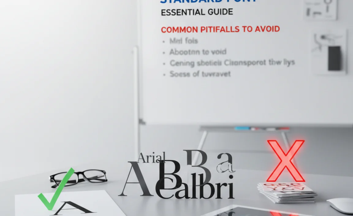
As you navigate the world of typography, it’s helpful to know what mistakes to sidestep. Avoiding these common traps will help you make more confident and effective font choices.
1. Overuse of Decorative Fonts
It’s tempting to use that cool, unique font you found. However, using highly stylized or decorative fonts for anything other than short headlines or logos can quickly make your content unreadable and unprofessional.
2. Too Many Fonts
A common beginner mistake is to use too many different fonts in one design. This creates visual chaos and detracts from your message. Stick to one or two, maximum three, well-chosen fonts for a cohesive look.
3. Ignoring Display vs. Text Use
Fonts are designed for different purposes. A font that excels as a display font for a large, bold headline might be a terrible choice for paragraphs of text, and vice versa. Always match the font’s intended use to your design need.
4. Forgetting About White Space
The space around and within your letters is just as important as the letters themselves. Fonts with tight spacing or poor kerning can feel crowded and difficult to read, even if the letterforms themselves are clear.
5. Relying Solely on Looks
A font might look attractive in a font preview, but its true functionality – its readability, its personality in context, its performance at different sizes – is what truly matters. Functionality must always win out over pure aesthetics for text-heavy applications.
Examples of Great Standard Font Choices and Their Uses
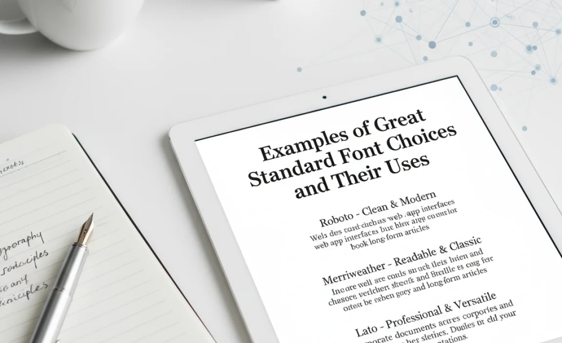
Let’s look at some popular and versatile standard fonts and where they shine. These are excellent starting points that you’ll find used across many successful brands and websites.
Top Sans Serif Picks
| Font Name | Key Characteristics | Best Use Cases |
|---|---|---|
| Open Sans | Humanist, friendly, highly readable, wide range of weights. | Extensive use on the web for body text, headlines, UI elements. Excellent accessibility features. |
| Lato | Warm, semi-rounded, clear, professional. | Versatile for both web and print: body text, headlines, branding. Feels modern yet approachable. |
| Roboto | Neo-grotesque, geometric, clean, adaptable. | Default Android font, excellent for digital interfaces, apps, and web content needing a clean, structured feel. |
| Montserrat | Geometric, strong, stylish, good for display and text. | Great for headers, branding, and short blocks of text. Offers a vibrant, urban feel. |
| Source Sans Pro | Open, friendly, readable, designed for UI. | By Adobe, designed for user interfaces, performs exceptionally well for body text on screens. |
Top Serif Picks
| Font Name | Key Characteristics | Best Use Cases |
|---|---|---|
| Merriweather | Serif, highly readable on screens, sturdy. | Excellent for blog body text, articles, and designs aiming for a classic, literary feel that works well online. |
| Lora | Contemporary serif, well-balanced, good for body text. | Offers a blend of modern and traditional, suitable for articles, extended reading, and editorial content. |
| Playfair Display | High contrast, elegant, dramatic. | Ideal for sophisticated headlines, titles, and short, impactful text where elegance is key. Not for body text. |
| EB Garamond | Classic, elegant, traditional, refined. | A timeless choice for books, formal documents, and designs aiming for historical or literary gravitas. Use with caution at small screen sizes. |
The availability of these fonts on platforms like Google Fonts makes them incredibly accessible for designers and businesses worldwide.
Step-by-Step to Choosing Your Perfect Font
Ready to put it all into practice? Follow these steps:
- Brainstorm Your Needs: Jot down your project’s goals, target audience, and desired brand tone.
- Categorize Your Search: Decide if you need a serif, sans serif, or a combination. For most standard text, focus on these two.
- Gather Potential Candidates: Explore font libraries (like Google Fonts, Adobe Fonts, or font foundries). Look for fonts that seem to fit your initial brief.
- Test for Readability: Type out sample text—headlines, body paragraphs—in your chosen fonts. Pay close attention to legibility at different sizes.
- Evaluate Font Weights and Styles: Ensure the font family has enough variations for hierarchy and emphasis.
- Check Pairing Potential: If you’re using two fonts, see how they actually look together. Do they complement or clash?
- Consider Context: Will it be used on a website, in print, on a mobile app? Test it in the intended medium.
- Get a Second Opinion: Sometimes an outside perspective can highlight issues you missed.
- Make Your Decision: Choose the font that best balances readability, brand fit, and aesthetic appeal.
Frequently Asked Questions (FAQ)
What is the most readable font for body text?
There isn’t one single “most readable” font, as legibility can depend on the reader, the medium, and the specific design context. However, fonts like Open Sans, Lato, Roboto, Source Sans Pro (sans serifs), and Merriweather, Lora (serifs) are consistently praised for their excellent readability in long-form text.
Can I use more than two fonts?
While it’s possible, it’s generally not recommended, especially for beginners. Using more than two fonts can make your design look cluttered and unprofessional. If you must use a third, ensure it’s for a very specific, limited purpose (like a unique logo element) and that it doesn’t detract from the primary fonts.
How do I know if a font is licensed for commercial use?
For most large font libraries like Google Fonts, the licenses are quite permissive for commercial use, often under an Open Font License (OFL). For commercial foundries, always check the specific license agreement. If you’re unsure, it’s best to contact the font
.lwrp.link-whisper-related-posts{
margin-top: 40px;
margin-bottom: 30px;
}
.lwrp .lwrp-title{
}.lwrp .lwrp-description{
}
.lwrp .lwrp-list-container{
}
.lwrp .lwrp-list-multi-container{
display: flex;
}
.lwrp .lwrp-list-double{
width: 48%;
}
.lwrp .lwrp-list-triple{
width: 32%;
}
.lwrp .lwrp-list-row-container{
display: flex;
justify-content: space-between;
}
.lwrp .lwrp-list-row-container .lwrp-list-item{
width: calc(25% – 20px);
}
.lwrp .lwrp-list-item:not(.lwrp-no-posts-message-item){
max-width: 150px;
}
.lwrp .lwrp-list-item img{
max-width: 100%;
height: auto;
object-fit: cover;
aspect-ratio: 1 / 1;
}
.lwrp .lwrp-list-item.lwrp-empty-list-item{
background: initial !important;
}
.lwrp .lwrp-list-item .lwrp-list-link .lwrp-list-link-title-text,
.lwrp .lwrp-list-item .lwrp-list-no-posts-message{
}@media screen and (max-width: 480px) {
.lwrp.link-whisper-related-posts{
}
.lwrp .lwrp-title{
}.lwrp .lwrp-description{
}
.lwrp .lwrp-list-multi-container{
flex-direction: column;
}
.lwrp .lwrp-list-multi-container ul.lwrp-list{
margin-top: 0px;
margin-bottom: 0px;
padding-top: 0px;
padding-bottom: 0px;
}
.lwrp .lwrp-list-double,
.lwrp .lwrp-list-triple{
width: 100%;
}
.lwrp .lwrp-list-row-container{
justify-content: initial;
flex-direction: column;
}
.lwrp .lwrp-list-row-container .lwrp-list-item{
width: 100%;
}
.lwrp .lwrp-list-item:not(.lwrp-no-posts-message-item){
max-width: initial;
}
.lwrp .lwrp-list-item .lwrp-list-link .lwrp-list-link-title-text,
.lwrp .lwrp-list-item .lwrp-list-no-posts-message{
};
}


Leave a Comment