Choosing the right style guide font is crucial for consistent branding and effective visual communication. Focus on readability, brand personality, and legibility across all mediums. Select fonts that complement your brand’s message and ensure they render well on screens and in print.
Hey typography lovers! Jillur Rahman here from FontOrbit. Picking the perfect font for your brand’s style guide can feel like a big decision. It’s like choosing the voice for your brand – it needs to sound right! A good font makes your brand instantly recognizable and easy to read. A confusing one? Not so much. Don’t worry, this guide will walk you through choosing fonts that make your brand shine, simply and effectively.
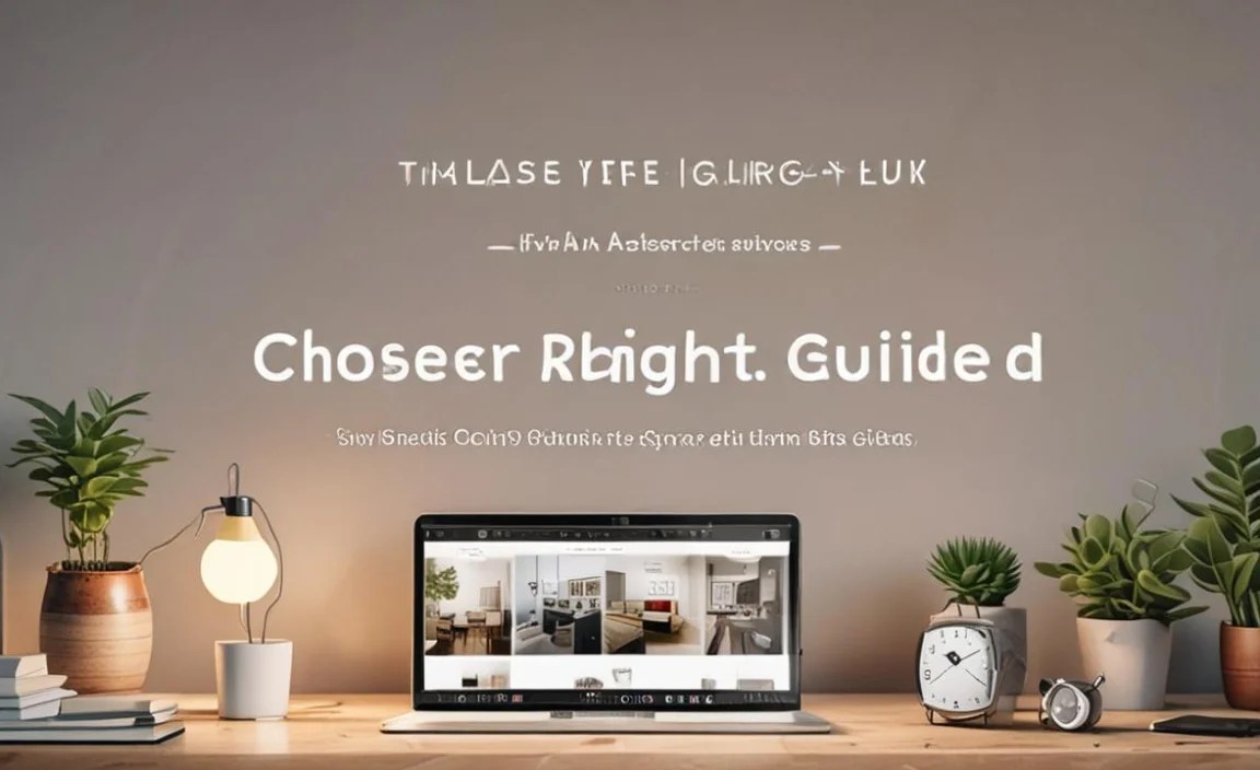
The Power of a Well-Chosen Style Guide Font

Your brand’s style guide is the bible for all its visual communications. At its heart, the font choice is a silent ambassador, conveying personality, professionalism, and trust. When you select the right fonts, you’re not just picking pretty letters; you’re embedding a feeling, a tone, and a promise into every piece of content your brand produces.
Think about your favorite brands. Chances are, you probably recognize their logo or the way their text looks, even before you read the name. That’s the magic of a consistent and well-chosen typography. It builds familiarity and makes your brand memorable.
But what makes a font “right”? It’s a blend of factors, from how easily your audience can read it on a tiny phone screen to how it reflects your brand’s core values. Let’s dive into how to make that crucial choice.
Understanding Font Classifications: Your Starting Point
Before we pick, let’s get to know the main players. Fonts can be broadly categorized, and understanding these groups helps narrow down your choices significantly. It’s like knowing the difference between a sedan and a sports car before you decide which suits your needs.
Serif Fonts: The Classic Charm
Serif fonts are easily identifiable by the small decorative strokes (serifs) at the ends of their letterforms. Think fonts like Times New Roman or Georgia. They often evoke feelings of tradition, reliability, and sophistication.
- Characteristics: Small strokes at the end of letter lines.
- Best For: Body text in print, formal documents, conveying trust and authority.
- Pros: Excellent readability in long printed texts, established and professional feel.
- Cons: Can sometimes look dated on screen if not chosen carefully, serifs can disappear at very small sizes on digital displays.
Sans-Serif Fonts: The Modern Edge
Sans-serif fonts, as the name suggests, do not have these small strokes. They are clean, straightforward, and very popular in modern design. Examples include Arial, Helvetica, and Open Sans. They often feel contemporary, approachable, and clear.
- Characteristics: Clean lines, no decorative strokes.
- Best For: Digital interfaces, headlines, brands aiming for a modern, minimalist, or friendly vibe.
- Pros: Highly legible on digital screens, versatile, looks clean and fresh.
- Cons: Can sometimes lack the traditional gravitas of serifs, needs careful pairing to avoid feeling generic.
Script Fonts: The Elegant Flow
Script fonts mimic handwriting or calligraphy, ranging from formal and elegant to casual and playful. They add a personal, artistic touch. Think of fonts that look like they were written with a pen or brush.
- Characteristics: Flowing, connected letterforms, cursive-like appearance.
- Best For: Invitations, decorative headings, accents, brands focused on luxury, creativity, or a personal touch.
- Pros: Unique and highly expressive, can add personality and flair.
- Cons: Poor readability for extended text, often struggle at small sizes or high-impact digital contexts, can easily look unprofessional if misused.
Display Fonts: The Statement Makers
Display fonts are designed for impact and aren’t meant for long blocks of text. They come in an endless variety of styles, from quirky and artistic to bold and futuristic. They are your showstoppers.
- Characteristics: Highly stylized, unique, attention-grabbing design.
- Best For: Headlines, logos, posters, marketing materials where you want to make a strong visual statement.
- Pros: Excellent for branding and creating a unique identity, can convey specific moods or themes vividly.
- Cons: Almost never suitable for body text, can be challenging to find versatile ones, readability is often secondary to style.
Key Factors When Choosing Your Style Guide Fonts

Now that you know the basic types, let’s get practical. Choosing fonts for a style guide involves more than just personal preference. It’s about strategic decisions that serve your brand’s purpose and audience.
1. Readability and Legibility: The Foundation
This is non-negotiable. If people can’t read your content, everything else is secondary. Readability refers to how easy it is to read long passages of text. Legibility is about distinguishing one letter from another.
- For Body Text: Opt for classic serif or clean sans-serif fonts with good x-height (the height of lowercase letters like ‘x’) and generous spacing. Check how they look at 12-16px for web and 9-11pt for print.
- For Headlines: You have more flexibility here. A well-chosen sans-serif or even a carefully selected serif or display font can grab attention effectively. Ensure it contrasts well with your body font.
Web fonts need to be particularly robust. Services like Google Fonts offer a vast library of free, web-optimized fonts. Ensuring your chosen fonts load quickly and display crisply across different devices is essential. For more on web font performance, resources from the Mozilla Developer Network are invaluable.
2. Brand Personality and Tone
Your font should whisper (or shout!) your brand’s personality. Are you modern and innovative? Classic and trustworthy? Fun and playful? The typeface is a powerful tool to communicate this.
- Formal & Professional: Look to serif fonts or classic sans-serifs.
- Modern & Minimalist: Clean sans-serifs are usually the go-to.
- Creative & Artistic: Consider unique sans-serifs, elegant scripts, or stylized display fonts for accents.
- Friendly & Approachable: Rounded sans-serifs or even some more casual handwritten styles can work well.
Imagine a luxury watch brand using a bubbly, childlike font – it wouldn’t align, right? The right font creates visual harmony with your brand’s voice and values.
3. Versatility and Application
A style guide font needs to work everywhere. Think about where your brand will appear: websites, social media, print materials, presentations, apps, and even merchandise. Your chosen font(s) should perform well in all these contexts.
This often means selecting a font family that offers a wide range of weights (light, regular, bold, etc.) and styles (italic). This allows for hierarchy and emphasis within your designs without introducing new, potentially clashing fonts.
Consider a font that:
- Has multiple weights (e.g., Thin, Light, Regular, Medium, Bold, Black).
- Includes italic versions for emphasis.
- Works well at both very small (captions) and very large (headlines) sizes.
- Is available in a web-safe format if your brand is digital-heavy.
4. Licensing: The Legal Side
This is a critical, often overlooked, aspect. Fonts are software, and like any software, they require licenses for use. Using a font without the proper license can lead to legal issues for you or your company.
- Desktop vs. Web Fonts: Desktop licenses are typically for installation on your computer for design work. Webfont licenses are for use on websites and often priced based on traffic or page views. App licenses, server licenses, and more exist too.
- Check the EULA: Always read the End-User License Agreement (EULA) for any font you plan to use. Foundries like Adobe Fonts offer broad licensing within their subscription, while others like MyFonts or Fontspring provide various individual licenses. Independent foundries also have their own licensing terms.
If you’re building a brand, investing in proper font licensing is as important as registering your domain name. It protects your brand’s integrity and your business.
5. Contrast and Harmony: Font Pairing
Most brands, especially in their style guides, use at least two fonts: one for headlines and one for body text. The key is to create contrast that aids readability while maintaining a harmonious overall look.
A common and effective strategy is pairing a serif with a sans-serif. For example, a bold sans-serif for headlines can pair beautifully with a readable serif for body text. Or, a decorative display font for a key heading might contrast with a simple sans-serif for supporting text.
Here’s a simple table showing popular pairing strategies:
| Headline Font Type | Body Font Type | When to Use |
|---|---|---|
| Sans-Serif (Bold, impactful) | Serif (Readable, classic) | For a modern yet trustworthy feel, good for editorial content. |
| Serif (Emphatic, traditional) | Sans-Serif (Clean, modern) | To convey expertise and tradition with modern clarity. Excellent for digital. |
| Display (Unique, bold) | Sans-Serif (Neutral, clear) | When headlines need to make a strong visual statement, and body text needs to be unobtrusive. |
| Sans-Serif (Clean, geometric) | Sans-Serif (Humanist, softer) | For a very contemporary, clean, and often minimalist aesthetic. Requires attention to detail for hierarchy. |
Avoid pairing fonts that are too similar. Two very similar sans-serifs, for instance, can create visual confusion.
Practical Steps to Choose Your Style Guide Fonts

Feeling ready to pick? Here’s a step-by-step approach to make the process smoother.
-
- Define Your Brand’s Personality: Before looking at fonts, jot down 3-5 adjectives that describe your brand. (e.g., Reliable, Innovative, Playful, Elegant, Bold).
- Identify Your Primary Need: Will this font primarily be for digital content, print, or both? This impacts technical needs like web rendering and licensing.
- Set the Goal for Each Font: Decide what role each font will play. Usually, you’ll need one for headlines/display and one for body text. You might also consider a third for accents or UI elements.
- Research and Gather Options: Explore font libraries. Start with your preferred font classification based on brand personality.
- Google Fonts: Excellent for free, web-ready options.
- Adobe Fonts: Great if you have an Adobe Creative Cloud subscription.
- Type Foundries: Browse sites like MyFonts, Fontspring, or directly from foundries like Typography.com for premium selections.
- Test, Test, Test: This is the most crucial phase. Don’t just look at the font; use it.
- Type out your brand name.
- Write a few sample headlines.
- Set a paragraph of lorem ipsum text.
See how it looks in different sizes and weights. Check it on a desktop browser, a mobile browser, and imagine it in print.
- Check for Licensing: Once you have strong contenders, verify their licensing terms. Ensure they cover your intended usage.
- Finalize Your Pairings: Select your headline and body fonts. Ensure they offer enough contrast and harmony.
- Document in Your Style Guide: Clearly list the chosen fonts, their weights and styles, and usage guidelines. Include links to official foundries or purchase pages if necessary.
Beyond the Basics: Exploring More Specialized Fonts
While serif and sans-serif fonts are the workhorses, don’t shy away from others for specific applications.
Handwritten and Brush Fonts
These add a very personal, organic touch. They are fantastic for brands that want to feel authentic, artisanal, or extremely approachable. They can communicate warmth and creativity.
- Best For: Small businesses, craft brands, personal blogs, food-related industries, or to add a unique flair to marketing collateral.
- Caveats: Ensure they are still legible. Avoid overly complex or thin brush strokes for body text or small digital use.
Variable Fonts
A newer development, variable fonts allow for a single font file to contain many different styles (weights, widths, etc.). This can improve website performance as fewer files are needed.
- Best For: Modern web design, brands looking for cutting-edge technology and fine-tuned control over typography.
- Where to find them: Many foundries and Google Fonts now offer variable font options.
Exploring these can give your brand a unique edge, but always prioritize readability and brand fit.
Common Pitfalls to Avoid
Even with the best intentions, some missteps can lead to a suboptimal font choice. Be mindful of these:
- Overly Trendy Fonts: What’s hip today can be passé tomorrow. Choose fonts with lasting appeal.
- Using Too Many Fonts: Stick to 1-3 fonts maximum for a cohesive brand.
- Ignoring Licensing: This can cause significant legal headaches down the line.
- Prioritizing Style Over Readability (Especially for Body Text): A beautiful font is useless if nobody can read your message.
- Not Testing Across Devices: A font might look great on your design software but render poorly on a mobile phone.
Frequently Asked Questions
Q1: How many fonts should I use in my style guide?
Typically, 1-3 fonts are ideal. You’ll likely need one primary font for headlines and a different one for body text. A third font can be used for accents or specific call-to-actions if needed, but avoid going over three to maintain consistency.
Q2: Are free fonts from Google Fonts good enough for commercial use?
Yes, most fonts on Google Fonts are licensed under an open-source license (like the SIL Open Font License) which generally allows for free use, including commercial use, modification, and distribution. Always double-check the specific license for each font, but for the vast majority, they are safe to use.
Q3: How do I know if a font is legible on a mobile screen?
Test it! While sans-serifs are generally more legible on screens, choose a font with a clear x-height, good letter spacing, and distinct letterforms. View your designs on actual mobile devices in various lighting conditions and at different zoom levels.
Q4: What’s the difference between a brand font and a UI font?
A brand font is used across all marketing and communication materials to build identity. A UI (User Interface) font is specifically chosen for the readability and functionality within digital interfaces like apps or websites. While they can be the same, sometimes a more robust, clear font is chosen for UI elements for optimal performance.
Q5: Can I use a script font for my logo?
Yes, but with caution! Script fonts can add elegance and personality. However, ensure your logo is still legible at small sizes and when reproduced in black and white. Many successful logos use script, but it was likely chosen after extensive testing for its unique readability and brand fit.
Q6: What is an “OpenType font file”?
OpenType (.otf) is a modern font file format developed by Adobe and Microsoft. It’s an advancement over older formats like TrueType. OpenType fonts can contain a vast range of characters and glyphs, supporting advanced typographic features such as ligatures, alternates, and small caps within a single file, making them very powerful for designers.
Conclusion
Choosing the right font for your style guide is a foundational step in building a strong, recognizable brand. It’s a creative process deeply intertwined with strategic thinking. By understanding font classifications, prioritizing readability and legibility, aligning with your brand’s personality, ensuring versatility, navigating licensing, and mastering font pairing, you set your brand up for clear and impactful.


Leave a Comment