Cursive tattoo fonts offer an elegant and personal touch, blending artistic flair with meaningful expression. Choose wisely by considering readability, style, and placement for a timeless and stunning result. FontOrbit guides you through selecting the perfect cursive font for your next tattoo.
Ever admired a tattoo script that just feels right—flowing perfectly with the skin, telling a silent story? That’s the magic of a well-chosen cursive tattoo font. But finding that perfect script can sometimes feel like searching for a needle in a haystack. Many beautiful fonts look great on screen but lose their charm when inked small or in a busy design. Don’t worry! This guide will help you navigate the elegant world of cursive tattoo fonts. We’ll explore stunning designs, understand what makes them work (and what doesn’t!), and give you the confidence to pick a font that will look amazing for years to come.
Let’s dive into creating a tattoo that’s as uniquely yours as your own handwriting.
What Exactly Are Cursive Tattoo Fonts?

at its core, a cursive tattoo font is a style of lettering designed to mimic handwriting, where letters are joined together in a flowing, connected manner. Think of classic calligraphy or elegant, handwritten notes. These fonts aim to capture that natural, personal touch, making them incredibly popular for tattoos that carry emotional weight or a sense of individuality.
The appeal is undeniable:
- Personal Connection: They can feel like your own signature or a loved one’s handwriting.
- Elegance and Flow: The connected letters create a beautiful, organic movement.
- Versatility: From short words to full phrases, they can adapt to various tattoo placements.
However, this elegance comes with a caveat. Not all cursive fonts are created equal, especially when it comes to the permanence of a tattoo. We need to ensure they remain readable and visually appealing over time.
Why Choose Cursive for Your Tattoo?
The decision to get a tattoo is deeply personal, and the font you choose plays a huge role in its impact. Cursive fonts have a special place in the tattoo world for several compelling reasons:
- Expressing Emotion: Cursive inherently conveys a softer, more intimate feel than block lettering. This makes it ideal for names, dates, meaningful quotes, or lyrics that hold deep personal significance.
- A Touch of Sophistication: A well-executed cursive script can add a layer of sophistication and timeless beauty to a design. It speaks of elegance and refinement.
- Unique Personalization: While many fonts exist, the feel of cursive can seem more unique, almost like a personal message etched into your skin. It can evoke a sense of handwriting from a loved one or your own developing style.
- Fluidity in Design: The flowing nature of cursive letters can complement the curves of the body, allowing for tattoos that wrap around limbs or follow body contours gracefully.
However, it’s crucial to balance this aesthetic appeal with practical considerations. Readability is key for any tattoo, and with cursive, it’s even more important to choose a style that won’t blur or become illegible over time.
Essential Factors for Choosing a Cursive Tattoo Font

Picking the right cursive font is like choosing the perfect pen for a heartfelt letter – it needs to be beautiful, clear, and fitting for the message. Here are key things to keep in mind:
1. Readability is King
This is the single most important factor. A tattoo font, especially cursive, must be legible. What looks like a delicate swirl on a screen can become an indecipherable blob of ink as it ages or if it’s too small.
- Sizing Matters: Very small or densely packed cursive can lose definition.
- Letter Spacing (Kerning): Ensure there’s enough space between letters so they don’t bleed together.
- Complexity: Overly elaborate flourishes or extremely thin lines are risky.
2. Style and Personal Connection
Cursive fonts vary wildly. Do you want something:
- Classic & Elegant: Think traditional calligraphy with defined strokes (e.g., a font inspired by Spencerian script).
- Modern & Minimalist: Clean lines, less ornamentation, often sans-serif inspired but still connected.
- Bold & Brush-like: More expressive, with varied line weights, like a painter’s brush strokes.
- Handwritten & Casual: Mimics everyday handwriting, often simpler and more relaxed.
Consider the message. A deeply philosophical quote might suit a classic script, while a single word of empowerment could work with a bolder, more modern style.
3. Tattoo Placement and Size
Where will the tattoo go? This heavily influences font choice.
- Larger Areas (e.g., back, thigh): Offer more space for detailed or larger lettering, allowing for more elaborate cursive styles.
- Smaller Areas (e.g., wrist, ankle, finger): Require simpler, bolder cursive fonts that won’t blur. Think about the natural curves of the body too.
Always discuss potential size and placement with your tattoo artist. They have invaluable experience in how ink settles and ages on different body parts.
4. Line Weight and Ink Coverage
The thickness of the lines in a font is crucial. Thin, wispy lines can fade and blur over time, while thicker lines tend to hold up better.
- Thick Lines: Generally age better and remain readable.
- Thin Lines: High risk of fading, blurring, and losing detail.
- Varying Line Weights: Common in brush scripts, these can look dynamic but need careful execution to ensure all parts remain distinct.
5. Longevity and How It Ages
Tattoos are permanent. A font that looks stunning today should still be recognizable in 10, 20, or 50 years. Scripts with excessive detail, very fine lines, or tight spacing are more prone to becoming a “slurry” of ink over time.
6. Artist Expertise
Not all tattoo artists specialize in lettering. Find an artist who has a strong portfolio of script tattoos. They can offer advice on which fonts will translate well and how to best execute them.
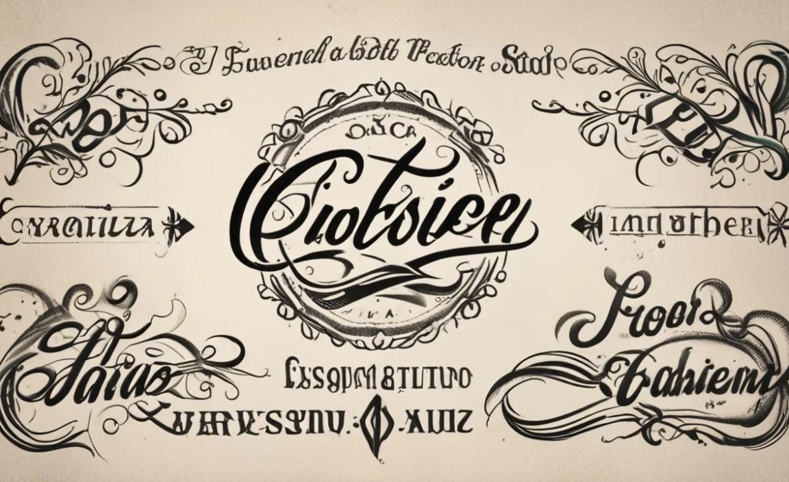
Popular Styles of Cursive Tattoo Fonts
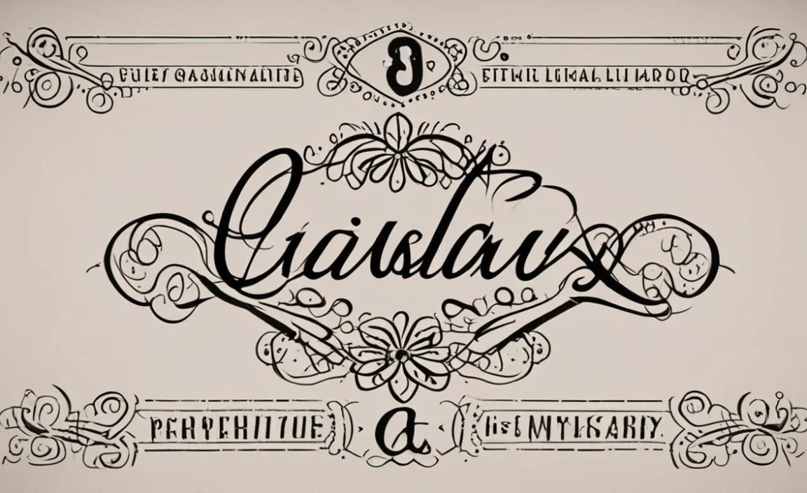
The world of cursive lettering is vast and beautiful. Here are some popular styles you’ll often see considered for tattoos, each with its own unique charm:
Classic Calligraphy Fonts
These fonts draw inspiration from historical scripts like Spencerian and Copperplate. They are characterized by:
- Elegant, sweeping strokes.
- Distinct thick and thin lines created by the pen’s angle.
- A formal and sophisticated appearance.
Best for: Longer quotes, names, or phrases where elegance is paramount. They work well in larger sizes and on areas with ample space.
Modern Script Fonts
These are often cleaner and simpler than traditional calligraphy, sometimes incorporating elements of sans-serif fonts. They might feature:
- Smoother, more consistent line weights.
- Less ornate flourishes.
- A contemporary, stylish feel.
Best for: Shorter words, names, or single impactful phrases. They are often more forgiving in smaller sizes and on areas like wrists or collarbones.
Brush Script Fonts
Inspired by the dynamic strokes of a paintbrush or brush pen, these fonts are often:
- Bold and expressive.
- Ranging from thick to thin with visible “brush” texture.
- Full of energy and movement.
Best for: Short, impactful words or symbols where a strong, artistic statement is desired. They can be very eye-catching but need careful attention to stroke thickness for longevity.
Handwritten Fonts
These fonts aim to mimic everyday handwriting. They can range from:
- Casual and slightly imperfect.
- Neat and legible, like a well-written note.
- Often less formal than calligraphy.
Best for: Personal messages, inside jokes, or names you want to feel truly “yours.” They can be a great choice for a very personal and intimate tattoo.
Custom Lettering
This isn’t a font style, but a process. It involves working directly with a tattoo artist or a lettering artist to create a unique script specifically for your tattoo. This ensures:
- Perfectly tailored to your message and desired style.
- Designed with tattoo longevity in mind.
- Completely original.
Best for: Anyone who wants a truly unique piece and is willing to invest in the design process. It’s arguably the best way to get a flawless script tattoo.
Finding and Selecting Your Font
Ready to find that perfect script? Here’s a practical approach:
Where to Look
- Font Websites: Sites like Google Fonts, Adobe Fonts, Font Squirrel, DaFont, and MyFonts offer thousands of fonts. Search for “script,” “cursive,” or “handwritten.”
- Pinterest & Instagram: Visual platforms are great for inspiration. Search for “cursive tattoo ideas,” “script tattoo fonts,” or specific words you’re considering. Save images you like.
- Tattoo Artist Portfolios: Many artists showcase their script work online. This is an excellent way to see fonts in tattoo form.
- Calligraphy Books & Resources: For inspiration on classic styles, explore books on calligraphy or historical scripts.
Testing Your Font Options
Once you have a few contenders, it’s time to test them:
- Print It Out: Print your chosen word(s) in the font at the size and placement you envision. Hold it against your skin. Does it look right?
- Get Feedback: Show your printed options to trusted friends or family. Do they find it readable?
- Consult Your Artist: This is crucial. Bring your printed options, inspiration images, and ideas to your tattoo artist review. They can tell you which fonts are tattoo-friendly and suggest modifications. A good artist will often redraw a font slightly to ensure it works perfectly as a tattoo.
What to Avoid
Steer clear of:
- Extremely Tiny Fonts: Especially for cursive.
- Overly Complex Flourishes: Elements that are too close or too thin.
- Fonts with Low Contrast: Where thick and thin lines are too similar.
- Fonts that Look Blurred Even at Larger Sizes.
Examples of Stunning Cursive Tattoo Designs
To spark your imagination, let’s look at some common and effective uses of cursive tattoo fonts:
| Tattoo Idea | Font Style Suggestion | Placement Examples | Why It Works |
|---|---|---|---|
| Single meaningful word (e.g., “Breathe,” “Hope,” “Love”) | Modern Script, Bold Brush Script | Wrist, collarbone, behind the ear, inner bicep | Short, impactful words are easy to read in bolder, cleaner scripts. Limited space benefits from simpler designs. |
| Names (self, child, partner, pet) | Classic Calligraphy, Elegant Modern Script | Forearm, ribcage, ankle, shoulder blade | A personal touch. Classic scripts add timeless elegance. Ensure enough space between letters. |
| Short quotes or affirmations (e.g., “Be Kind,” “Never Alone”) | Readable Modern Script, balanced Classic Calligraphy | Forearm, upper back, side of thigh | Needs to be legible when read. Avoid overly long quotes in tiny script. |
| Dates (birthdays, anniversaries) | Simple Handwritten, Clean Script | Inside wrist, finger, ankle, behind the ear | Often small, so clarity is paramount. A handwritten style can feel personal. |
| Song lyrics or poetry snippets | Custom designed script, flowing Classic Calligraphy | Ribcage, full back, thigh, forearm wrap | Requires more space for visual impact. Custom design ensures legibility and artistry. |
Trends in Cursive Tattoo Fonts
While classics remain popular, some current trends are worth noting:
- Minimalist Script: Extremely clean, often sans-serif inspired but still connected. Think thin lines, subtle elegance.
- Geometric Integration: Cursive words or initials incorporated into geometric shapes or patterns.
- Handwritten Signatures: Emulating actual signatures for a deeply personal touch.
- Delicate & Fine Line: Ultra-fine lines creating an airy, ethereal look. (Use with extreme caution and expert artistry for longevity).
Maximizing Legibility and Longevity
Getting a tattoo is an investment. Here’s how to ensure your cursive script looks great for years:
Consult Your Tattoo Artist Early
As mentioned, your artist is your best resource. Bring your ideas, but be open to their professional advice. They understand how ink heals and ages. For instance, an artist might suggest slightly thickening certain strokes of a font or adjusting the spacing to prevent future blurring. Many talented tattoo artists are also skilled illustrators and can hand-draw script custom for you, ensuring optimal tattoo performance. You can explore resources like TattooNow to find reputable artists in your area.
Size Appropriately for the Area
A good rule of thumb is that cursive script needs more space than bold block letters. Aim for a size where individual letters are clearly defined, and the connections between them are smooth, not cramped. On a fingertip, you might only manage a single, very simple initial. On your back, you have much more freedom.
Prioritize Clear Letter Forms
Some cursive fonts have very decorative loops or swirls that can easily merge into adjacent letters as the tattoo ages. Look for fonts where the basic shape of each letter is distinct and the connections are clean. Avoid fonts where ascenders (like in ‘h’ or ‘l’) go too close to the descenders (like in ‘p’ or ‘g’ of the next letter).
Understand Line Weight Implications
Extremely thin lines are the enemy of long-lasting script tattoos. While they might look delicate and beautiful initially, they are the first to fade and blur. Discuss with your artist the ideal line weight for your chosen font and placement. Sometimes, a slightly bolder version of a font is necessary.
Consider a Simple Outline or Shadow
For some very fine or complex scripts, a subtle, thin outline around the letters or a very light shadow effect can help maintain definition over time. This is a technique best discussed with a skilled artist who specializes in lettering.
Research Font Aging
Look at healed script tattoos online. How do certain fonts or styles look after a few years? This will give you a realistic preview of how your chosen design might age. Understanding the long-term implications is part of making a smart, lasting choice.


Leave a Comment