Pyplot font size options control the readability and visual hierarchy of your charts. This guide makes adjusting labels, titles, and tick marks simple and effective for clearer data visualization.
When you first dive into creating plots with Matplotlib’s Pyplot, you might find your text looks a bit too small or too large for your liking. It’s a common little hiccup that can make your excellent data look less professional than it should. Don’t worry, adjusting font sizes in Pyplot is straightforward once you know where to look! We’ll walk through the simple steps to make your titles, labels, and even those tiny tick marks perfectly prominent. Get ready to make your plots shine with readable, impactful text that guides your audience exactly where you want them to look.
Frequently Asked Questions
How do I change the font size of a plot title in Pyplot?
You can change the font size of a plot title using the `fontsize` parameter within the `plt.title()` function. For example, `plt.title(‘My Plot Title’, fontsize=16)` will set the title font size to 16.
What is the default font size in Pyplot?
The default font size in Pyplot can vary slightly depending on your Matplotlib configuration and backend. However, generally, it tends to be around 10 or 12 points for most text elements like labels and ticks. Titles are often slightly larger by default.
How can I set a global font size for all text in a Pyplot figure?
You can set global font sizes by modifying Matplotlib’s runtime configuration parameters (rcParams). For instance, `plt.rcParams.update({‘font.size’: 12})` will set the default font size for most text elements to 12 points. You can also target specific elements like `’axes.titlesize’`, `’axes.labelsize’`, and `’xtick.labelsize’`.
Is there a shortcut for setting font size in Pyplot?
Yes, for common elements like titles and labels, you can often pass a shorthand string like ‘small’, ‘medium’, ‘large’, ‘x-large’, or ‘xx-large’ to the `fontsize` parameter instead of a numerical value. For example, `plt.xlabel(‘X-Axis Label’, fontsize=’large’)`.
What are the common font size units used in Pyplot?
Font sizes in Pyplot are typically specified in “points” (pt). For example, `fontsize=14` refers to 14 points. You can also use relative sizes like ‘small’, ‘medium’, ‘large’, etc.
Can I change the font size of tick labels in Pyplot?
Absolutely. You can change the font size of x-axis tick labels using `plt.tick_params(axis=’x’, labelsize=10)` and for y-axis tick labels using `plt.tick_params(axis=’y’, labelsize=10)`. You can also set them individually for each axis object.
Understanding Pyplot Font Size Basics
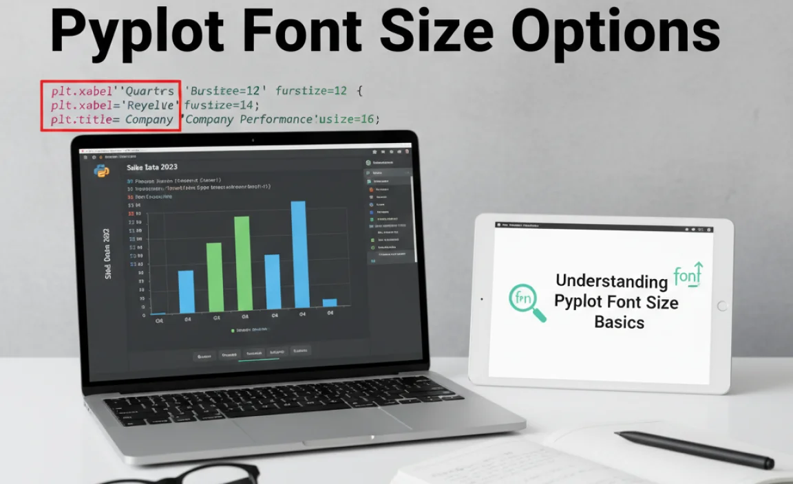
Matplotlib’s Pyplot module is your go-to tool for creating a vast array of plots and charts in Python. While its primary function is data visualization, the way text is presented significantly impacts how well your audience understands and engages with your graphs. Font size is a critical element of this presentation. If text is too small, important details can be missed. If it’s too large, it can overpower your actual data. Mastering Pyplot’s font size options ensures your visualizations are not only accurate but also clear, professional, and easy to read.
As a design enthusiast, I always stress that effective communication through visuals is key. Think of text in your plots like the captions on a photograph—they provide context and highlight important aspects. Getting the font sizes right helps tell your data’s story effectively. We’ll explore how to adjust sizes for titles, labels, ticks, and even text annotations, making your plots more impactful.
Why Font Size Matters in Data Visualization

In any visual medium, readability is paramount. For data visualizations created with Pyplot, this is especially true. Imagine a complex scientific chart or a dense financial report presented to stakeholders. If the font sizes are inconsistent or too small, key information like axis labels, data point labels, or the plot title might be illegible. This can lead to misinterpretations, frustration, and a general lack of confidence in the presented data. Conversely, excessively large fonts can crowd the plot area, obscuring the actual graphical elements and making the visualization appear messy or amateurish.
The strategic use of font sizes also helps establish a visual hierarchy. Larger fonts naturally draw the eye, making them ideal for titles and crucial labels. Smaller, but still readable, fonts can be used for less critical information, like tick labels or notes. This guide will equip you with the Pyplot tools to control these nuances, ensuring your visualizations are accessible and informative for everyone.
Controlling Font Size for Plot Elements

Pyplot offers granular control over the font size of various elements within your plots. These elements include the main title, axis labels (both x and y), and the tick labels that mark values along the axes.
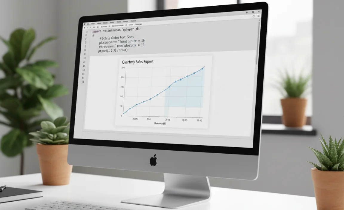
Plot Titles and Axis Labels
The main plot title and the labels for your x and y axes are prime candidates for font size adjustments. They often require slightly larger or more prominent text than other elements to clearly define what the plot represents and what the axes signify.
To adjust the font size of the plot title, you use the `fontsize` parameter within the `plt.title()` function. Similarly, for axis labels, you use the `fontsize` parameter within `plt.xlabel()` and `plt.ylabel()`.
Here’s a practical example:
import matplotlib.pyplot as plt
import numpy as np

Sample data
x = np.linspace(0, 10, 100)
y = np.sin(x)

plt.figure(figsize=(8, 5))
plt.plot(x, y)

Setting title and labels with specific font sizes
plt.title('Sine Wave Analysis', fontsize=16)
plt.xlabel('Time (seconds)', fontsize=12)
plt.ylabel('Amplitude', fontsize=12)

plt.grid(True)
plt.show()
In this code snippet, the title ‘Sine Wave Analysis’ is set to a larger font size of 16 points, while the x and y axis labels are set to a more standard 12 points. This creates a clear hierarchy, making the title stand out.
Tick Labels
The numerical or categorical labels along the x and y axes are called tick labels. They indicate the specific values or categories being plotted. Ensuring these are readable is crucial for interpreting the plot accurately.
You can adjust the font size of tick labels using the `tick_params()` method. This method is quite versatile and allows you to target specific axes and types of parameters.
For example, to change the font size of both x and y axis tick labels:
import matplotlib.pyplot as plt
import numpy as np

x = np.linspace(0, 10, 100)
y = np.cos(x)

plt.figure(figsize=(8, 5))
plt.plot(x, y)

plt.title('Cosine Wave Demonstration', fontsize=16)
plt.xlabel('Angle (radians)', fontsize=12)
plt.ylabel('Magnitude', fontsize=12)

Adjusting font size for tick labels
plt.tick_params(axis='both', which='major', labelsize=10) # 'both' applies to x and y, 'major' for main ticks

plt.grid(True)
plt.show()
Here, `axis=’both’` applies the change to both the x and y axes. `which=’major’` specifies that we are modifying the primary tick marks. The `labelsize=10` sets the font size for these tick labels to 10 points. You can also specify `’x’` or `’y’` for `axis` to adjust only one axis.
Text Annotations and Legends
Sometimes you need to add specific text directly onto the plot to highlight a particular point, explain a region, or provide additional context. This is done using `plt.text()` or `ax.annotate()`. Similarly, legends, which identify different plotted data series, also have associated font sizes.
When adding text annotations, the `fontsize` parameter is directly available.
import matplotlib.pyplot as plt
import numpy as np

x = np.linspace(0, 10, 100)
y = x**2

plt.figure(figsize=(8, 5))
plt.plot(x, y)

plt.title('Quadratic Growth', fontsize=16)
plt.xlabel('Input Value', fontsize=12)
plt.ylabel('Output Value', fontsize=12)

Adding an annotation with a specific font size
plt.annotate('Peak Value', xy=(10, 100), xytext=(7, 70),
             arrowprops=dict(facecolor='black', shrink=0.05),
             fontsize=9) # Font size for annotation text

plt.grid(True)
plt.show()
For legends, you adjust the font size using the `fontsize` parameter in the `plt.legend()` function. Common string shortcuts like ‘small’, ‘medium’, ‘large’ can be useful here.
import matplotlib.pyplot as plt
import numpy as np

x = np.linspace(0, 5, 50)
y1 = x
y2 = x * 2

plt.figure(figsize=(8, 5))
plt.plot(x, y1, label='Series A')
plt.plot(x, y2, label='Series B')

plt.title('Linear Series Comparison', fontsize=16)
plt.xlabel('X-axis', fontsize=12)
plt.ylabel('Y-axis', fontsize=12)

Setting legend font size
plt.legend(fontsize='medium') # Using a string shortcut for font size

plt.grid(True)
plt.show()
Using string shortcuts like ‘small’, ‘medium’, ‘large’, ‘x-large’, and ‘xx-large’ can be a quick way to set font sizes if you don’t need precise numerical control. These correspond to relative sizes within the Matplotlib theme.
Setting Global Font Sizes with rcParams
If you’re creating many plots within a single script, or if you want to maintain a consistent look across all your visualizations for a project, repeatedly setting `fontsize` for every element can become tedious. Matplotlib’s runtime configuration parameters, often referred to as `rcParams`, provide a powerful way to set default values for many plot properties, including font sizes.
You can update `rcParams` to define global font sizes for titles, labels, ticks, and more. This is especially useful in larger projects or when creating style sheets for your plots. The `plt.rcParams.update()` method is your primary tool here. You provide it with a dictionary where keys are the parameter names and values are the desired settings.
Here’s how you can set global font sizes:
import matplotlib.pyplot as plt
import numpy as np

--- Global Font Size Configuration ---
plt.rcParams.update({
    'font.size': 11,               # Default font size for most elements
    'axes.titlesize': 18,          # Font size for plot titles
    'axes.labelsize': 14,          # Font size for x and y axis labels
    'xtick.labelsize': 12,         # Font size for x-axis tick labels
    'ytick.labelsize': 12,         # Font size for y-axis tick labels
    'legend.fontsize': 11,         # Font size for the legend
    'figure.titlesize': 12         # Font size for figure titles (if using plt.suptitle)
})
------------------------------------

x = np.linspace(0, 10, 100)
y1 = np.sin(x)
y2 = np.cos(x)

fig, ax = plt.subplots(figsize=(10, 6)) # Create a figure and an axes.

ax.plot(x, y1, label='sin(x)')
ax.plot(x, y2, label='cos(x)')

Titles and labels will now use the global settings
ax.set_title('Global Font Size Example')
ax.set_xlabel('X-Value')
ax.set_ylabel('Y-Value')

ax.legend()
ax.grid(True)

plt.show()
In this example, by updating `rcParams` at the beginning, all subsequent plots will inherit these font sizes unless overridden by specific function calls (like `plt.title(‘Override Title’, fontsize=20)`). This is a powerful way to ensure consistency.
You can find a comprehensive list of `rcParams` available in Matplotlib’s documentation. For instance, exploring the Matplotlib Customization guide can offer deeper insights into controlling various aspects of your plots’ appearance.
Common Font Size Values and Their Use Cases
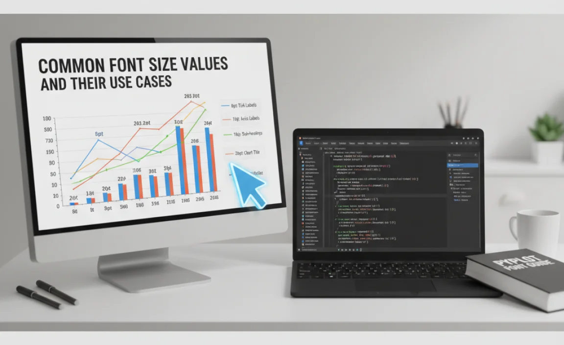
Choosing the right font size involves balancing readability with the available space in your plot. Here’s a table suggesting common font size values and scenarios where they’re typically effective:
| Font Size (Points) | Element Type | Typical Use Case | Readability Notes |
|---|---|---|---|
| 8-10 | Tick Labels, Small Annotations, Table Text | When space is very limited, or for secondary information that doesn’t need immediate focus. Useful in complex plots with many data points or axes. | Can be difficult to read in lower resolutions or for users with visual impairments. Best used sparingly. |
| 11-12 | Axis Labels, Legend Text, Primary Annotations | Standard, highly readable size for most plot elements. Works well for axis labels and legend entries, providing clear context without being overwhelming. | Generally considered the baseline for good readability on most screen sizes. |
| 14-16 | Axis Labels (emphasis), Section Titles | Used when you want axis labels to stand out more, or for sub-titles within a figure. Provides good prominence. | Offers a clear visual distinction from smaller text elements. |
| 18-24 | Plot Titles, Figure Titles (`suptitle`) | Ideal for the main title of the plot to immediately inform the viewer. Should be the most prominent text element. | Ensures the plot’s subject is immediately apparent. |
| 26+ | Very Large Titles, Display Purposes | Rarely used in standard plots. Might be employed in presentations or when a plot is displayed at very large resolutions, or for specific stylistic emphasis. | Can easily make a plot look cluttered if not used judiciously. |
When selecting font sizes, consider the context:
- The overall plot size: A font size that looks good on a large monitor might be too small on a small screen or printout.
- The complexity of the plot: Very busy plots with many lines, points, or labels might benefit from slightly smaller, yet readable, fonts to avoid clutter.
- Your audience: For broad audiences, prioritize readability with slightly larger fonts. For specialized, technical audiences, there might be more flexibility.
- The medium: Web display, printed reports, or presentations might require different font


Leave a Comment