Bolded Quick Summary
The Y2K font style, a blend of futuristic, nostalgic, and playful aesthetics, is perfect for adding a unique digital vibe to your designs. Think bubbly letters, metallic sheens, and vibrant colors. This guide will help you understand and use Y2K fonts effectively for branding, web design, and creative projects.
Remember the turn of the millennium? The Y2K era brought a distinct visual flair, and its typography was no exception. If you’re looking to inject a dose of digital nostalgia or a futuristic edge into your projects, understanding the Y2K font style is key. It’s a trend that combines playful, sometimes quirky, elements with a forward-thinking, tech-inspired feel. You might find it frustrating to nail this look, but don’t worry! We’re here to break down exactly what makes a font feel Y2K and how you can expertly incorporate it. Get ready to design with that iconic early 2000s sparkle.
What Exactly is “Y2K Font” Style?
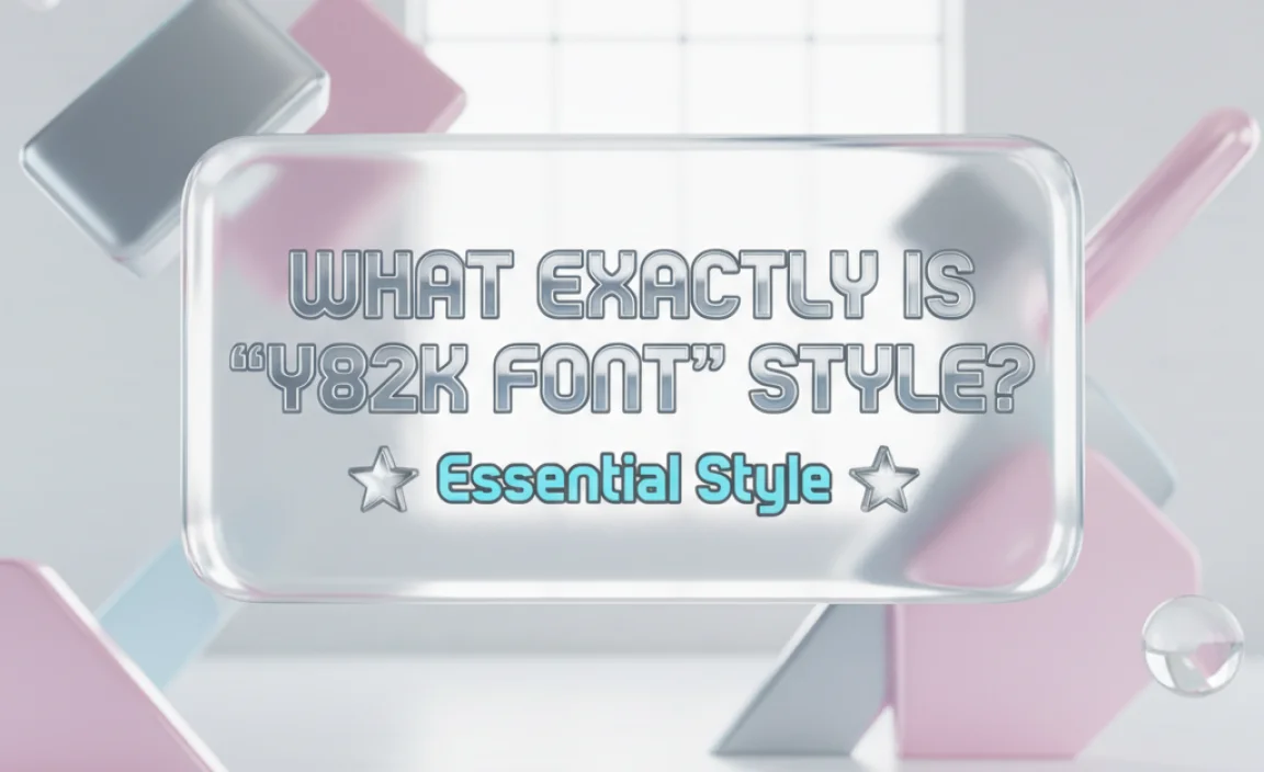
The term “Y2K font” doesn’t refer to a single, specific typeface. Instead, it describes a collection of typestyles and design elements that were popular around the year 2000. This period was characterized by a fascination with technology, the internet, and a bright, often optimistic, vision of the future. Designers were experimenting with digital aesthetics, leading to fonts that felt fresh, sometimes a bit unconventional, and undeniably early-internet.
Key characteristics of the Y2K font style include:
- Futuristic & Sci-Fi Influences: Think shiny metals, cybernetic designs, and sleek curves inspired by science fiction movies and early digital interfaces.
- Playful & Bubbly Shapes: Many Y2K fonts feature rounded edges, soft curves, and voluminous letterforms, giving them a friendly and approachable feel.
- Bold & Bright Colors: While not directly part of the font itself, Y2K design heavily relies on vivid, often fluorescent, color palettes that complement the typography.
- Metallic Gradients & Textures: Chrome effects, glitter, and glossy finishes were extremely common, making fonts appear three-dimensional and attention-grabbing.
- Glitch & Distorted Effects: Mirrors of early digital anxieties, some Y2K fonts incorporated subtle glitches, pixelation, or distortion to represent the burgeoning digital world.
- Retro-Digital Feel: It’s a blend of the old and the new – the excitement of the internet age meeting the lingering design sensibilities of the late 20th century.
Why is the Y2K Font Style Back and Growing in Popularity?
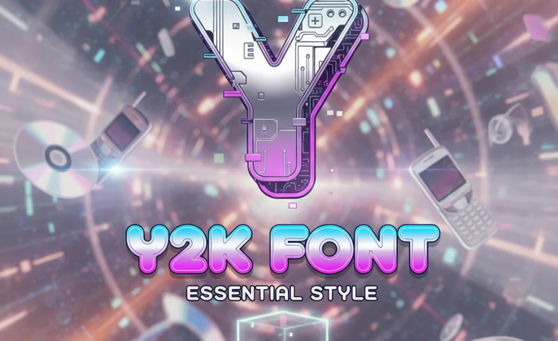
Nostalgia is a powerful force! As a new generation discovers or rediscovers the aesthetics of the early 2000s, the Y2K font style is making a significant comeback. This resurgence is fueled by several factors:
- Internet Culture & Social Media: Platforms like TikTok and Instagram have become breeding grounds for retro trends. Users are sharing and recreating Y2K aesthetics, making these fonts highly searchable and desirable.
- Graphic Design Eras: Trends in graphic design often cycle through different eras. Minimalism has had a long run, and designers are now looking for ways to inject more personality and vibrant expression, making Y2K a perfect antidote.
- Unique Branding Opportunities: For businesses and creators wanting to stand out, Y2K fonts offer a distinctive visual identity that can recall positive memories of optimism and technological excitement.
- DIY & Digital Art: The rise of accessible design tools and digital art platforms allows more people to experiment with and recreate these iconic looks, further spreading their appeal.
Key Characteristics and How to Identify Them
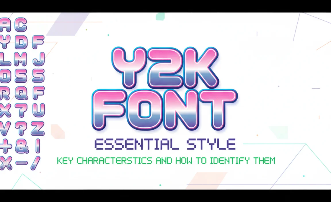
Spotting a Y2K font is easier when you know what to look for. It’s less about a single font family and more about a specific vibe. Here are the tell-tale signs:
Shape and Form
Y2K fonts often have soft, rounded shapes. Think of fonts that feel plump, bubbly, or even slightly squishy. They avoid sharp, rigid lines in favor of a more organic, friendly feel, reminiscent of early web graphics and cartoon styles.
Weight and Spacing
Many popular Y2K styles are bold and thick. This makes them stand out, especially on screen where they were often used as headlines or logos. Counter-intuitively, sometimes a slightly wider letter-spacing (kerning) can enhance the futuristic, airy feel, much like early digital displays.
Stylistic Elements
This is where the magic happens. Y2K fonts frequently incorporate:
- Rounded terminals: The ends of strokes on letters are often rounded, not cut straight.
- Exaggerated curves: Letters like ‘O’ or ‘S’ might be more circular or fluid than usual.
- Symmetry or geometric influence: A foundational geometric structure often underlies the playful shapes, giving them a digital precision.
- Open counters: The inner negative spaces within letters (like in ‘P’ or ‘A’) are often kept large and clear.
Color and Texture (Applied Styles)
While the font itself has characteristics, the Y2K aesthetic is heavily defined by how it’s rendered. Common treatments include:
- Metallic gradients: Chrome, silver, and gold effects are hallmarks.
- Iridescent or pearlescent finishes: Shimmering, color-shifting textures.
- Glossy or 3D effects: Making text look raised, beveled, or shiny like plastic.
- Bright, saturated colors: Often contrasting or neon hues.
These applied styles are crucial. A plain black Y2K-style font might look generic, but add a metallic gradient, and it screams early 2000s!
Where to Find Y2K Fonts
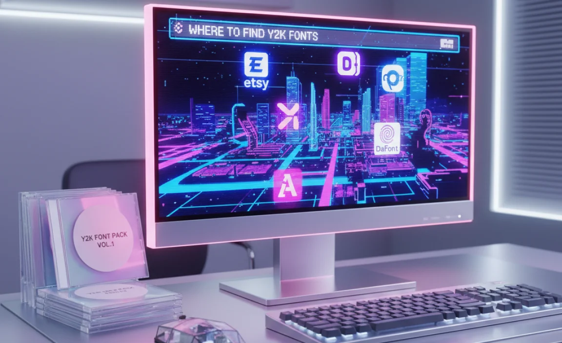
Thankfully, finding fonts that capture the Y2K spirit is easier than ever. Both free and premium marketplaces offer a treasure trove. Here are some reliable places to start your search:
Free Font Sites (Use with Caution for Commercial Projects)
For personal projects or inspiration, free fonts are fantastic. Always check the license agreement for commercial use. Reputable sites include:
- Google Fonts: While not specifically curated for Y2K, you can find many rounded, geometric, or playful sans-serifs that can be styled to fit the trend. Look for fonts like ‘Fredoka One’ or ‘Chewy’.
- DaFont: This is a massive archive. Search for terms like “script,” “bubble,” “futuristic,” or “rounded” and sift through the results. Be prepared for a wide range of quality.
- Font Squirrel: They offer a curated collection of free fonts, often with more commercial-friendly licenses. They have a great font identifier tool too.
Premium Font Marketplaces
For professional quality, unique designs, and solid licensing, premium sites are the way to go:
- MyFonts: A vast library with professional fonts. Search for “display,” “script,” or “decorative” and explore options that feature the Y2K characteristics.
- Adobe Fonts: If you have an Adobe Creative Cloud subscription, you get access to a huge library of high-quality fonts that can be used for Y2K-inspired designs.
- Creative Market: This marketplace is a goldmine for unique, often hand-drawn or stylized fonts that perfectly fit the Y2K aesthetic, often bundled with design assets.
Pro Tip: Sometimes, a classic font just needs the right styling! Look for well-designed sans-serifs or scripts, and then experiment with textures, gradients, and effects in your design software to achieve the Y2K look.
How to Use Y2K Fonts Effectively in Your Designs
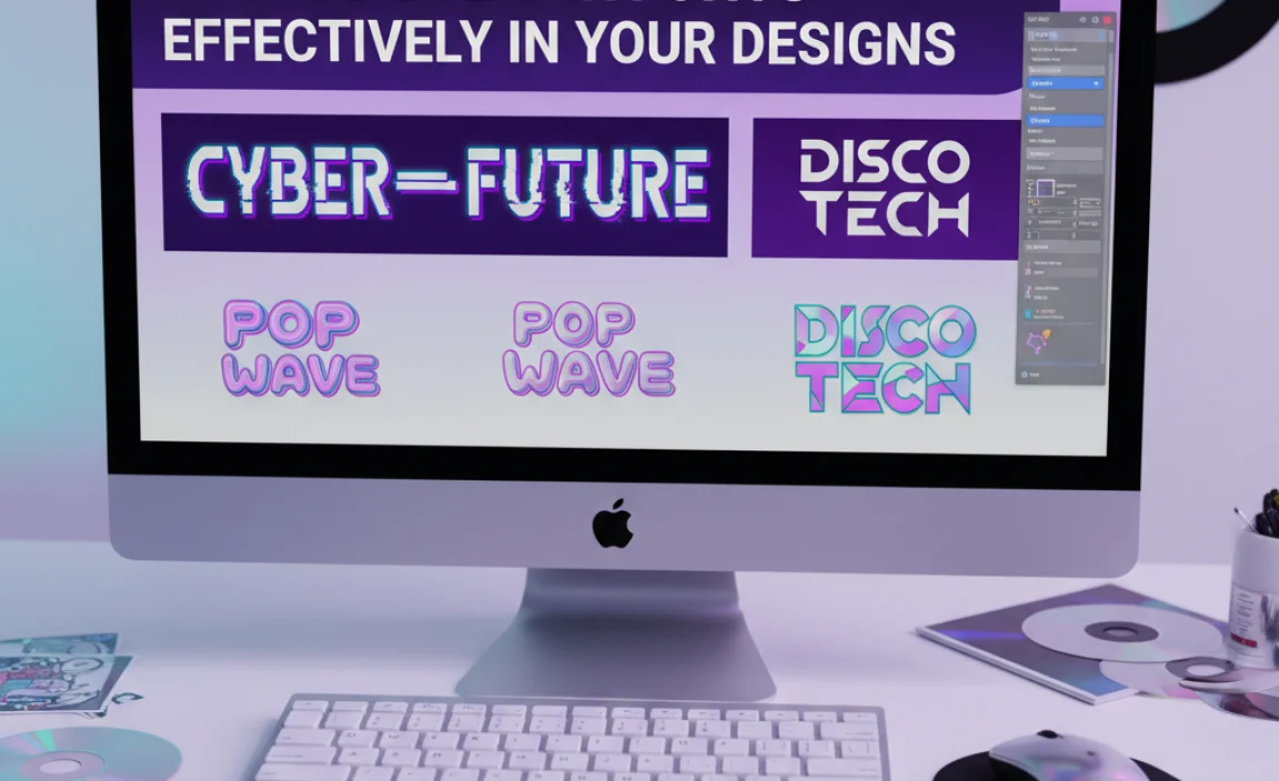
Incorporating Y2K fonts can elevate a project, but it requires a thoughtful approach. It’s easy to go overboard, so here’s how to use them strategically:
1. Define Your Purpose
Before you pick a font, ask yourself: What feeling am I trying to evoke? Is it pure nostalgia, futuristic excitement, or a playful brand identity? This will guide your font choice and styling.
2. Choose the Right Context
Y2K fonts often work best as display text—for headlines, logos, album art, social media graphics, or special promotions. For body text, they can be overwhelming and difficult to read. Stick to simpler, highly legible fonts for longer passages of text.
3. Master the Styling
As mentioned, the styling is key:
- Gradients: Use metallic, pearlescent, or bright, saturated color gradients. Tools like Adobe Photoshop or Illustrator make this easy.
- 3D Effects: Experiment with bevels, extrusions, and shadows to give your text depth.
- Outlines & Glows: A contrasting outline or a subtle glow can enhance the digital feel.
- Textures: Overlaying subtle noise, glitch effects, or even a digital grid can boost the Y2K vibe.
4. Balance with Modern Elements
Combine Y2K fonts with clean, modern design elements to prevent your work from looking dated rather than retro-inspired. A Y2K headline can look stunning paired with minimalist layouts and contemporary photography.
5. Color Palette Considerations
The Y2K era loved bright, energetic colors. Think hot pinks, electric blues, lime greens, and vibrant purples. Often, these were used in gradients or as contrasting accents. Referencing early 2000s fashion and tech palettes can be a great starting point. For instance, the color palette used in early digital cameras or music players.
6. Readability Check
Always ensure your chosen Y2K font, especially when styled, remains readable. Test it at different sizes and on various backgrounds. If it’s for a website, check its legibility across different devices.
Examples of Y2K Font Styles and Their Applications
Let’s look at some common Y2K font archetypes and where they shine:
The Bubbly Script
Description: Soft, rounded, often extended letterforms that resemble glossy bubblegum or shiny plastic. Think of handwriting that’s both playful and a little chunky.
Examples: Fonts like “Sweet Sensations” or “Bubblegum Sans” (conceptual names).
Applications: Perfect for branding for confectioneries, children’s products, or a retro-themed event. Also great for social media graphics and fun website headers.
The Futuristic Sans-Serif
Description: Clean, geometric, or slightly rounded sans-serifs with a strong “digital” feel. Often sleek, sometimes with extended widths or unique cuts in the letterforms.
Examples: Fonts that might evoke early tech logos or sci-fi movie titles. Think bold, often all-caps.
Applications: Ideal for tech startups, gaming brands, modern movie posters, or any project aiming for an optimistic, “future is now” vibe.
The Glitchy & Pixelated
Description: Fonts that intentionally mimic digital artifacts – a bit of blur, pixelation, or slightly offset characters. This taps into the era’s fascination with and slight apprehension towards digital glitches.
Examples: Custom-designed fonts that play with these effects.
Applications: Excellent for indie music promotion, avant-garde art projects, or brands that want to convey a cutting-edge, slightly rebellious digital identity.
The Metallic & 3D Extrusion
Description: Fonts that are designed to be rendered with heavy metallic gradients and 3D effects. They often have a strong base shape that accommodates these treatments well.
Examples: Think of those iconic early 2000s movie titles or CD cover art.
Applications: Highly effective for event promotion, album covers, promotional banners, or any visual that needs to immediately grab attention with a bold, shiny statement. These are often perfect for posters and banners where impact is key.
Key Design Principles for Y2K Typography
To truly master the Y2K font style, keep these design principles in mind:
Embrace Opulence (Where Appropriate)
The Y2K era wasn’t shy. Don’t be afraid of gradients, shadows, and bright colors. The key is to use these elements intentionally, not haphazardly. A well-executed chrome effect can transport your audience directly back to the era.
Contrast is Your Friend
Pairing a flashy Y2K display font with a clean, simple sans-serif for supporting text creates visual hierarchy and prevents the design from becoming too cluttered. This modern approach makes the Y2K elements pop more effectively.
Consider the Visual Language of Early Internet
Think about early web banners, animated GIFs, and pixelated graphics. Elements like rounded corners on buttons, bright contrasting color blocks, and a generally playful, energetic layout were common. Integrating these subtly can enhance the Y2K feel of your typography.
Typography Pairing
When pairing Y2K fonts, consider their weight and style. A bold, bubbly font might pair well with a thinner, more geometric sans-serif for contrast. Or, if you’re feeling brave, pair two complementary Y2K-style fonts, but ensure they have distinct uses (e.g., one for a logo, one for a tagline) and don’t compete for attention.
A successful Y2K design often feels like a vibrant, optimistic snapshot of a time when digital technology was exciting and new. It’s about capturing that particular brand of futurism.
Tools and Resources for Y2K Design
To bring your Y2K font designs to life, you’ll need the right tools. Fortunately, many are industry standards and accessible:
Graphic Design Software
- Adobe Photoshop: Indispensable for applying raster effects like gradients, textures, and glows. It’s the go-to for creating those signature metallic and glossy looks.
- Adobe Illustrator: Perfect for vector-based Y2K elements. You can create sharp, scalable logos and graphics. Its gradient mesh tool is excellent for creating smooth, complex color transitions.
- Affinity Designer/Photo: Powerful and more affordable alternatives to Adobe products, offering similar capabilities for creating Y2K-style typography.
Font Management
Keeping your font library organized is crucial, especially when exploring niche styles like Y2K. Tools like FontBase or RightFont can help you preview, organize, and activate fonts easily.
Online Font Identifier Tools
When you see a font you love but don’t know its name, resources like WhatTheFont! or Font Squirrel’s Matcherator can help you identify it, often pointing you to similar free or paid options.
Mock-up Generators
To see how your Y2K typography will look in real-world applications, use mock-up tools. Sites like Smartmockups or Placeit offer templates for everything from T-shirts to websites, allowing you to visualize your designs effectively.
Y2K Font Style: Pros and Cons
Like any design trend, the Y2K font style comes with its own set of advantages and disadvantages.
| Pros | Cons |
|---|---|
| Nostalgic Appeal: Evokes positive memories and a sense of playful optimism for many. | Can Become Dated: If not handled with modern design sensibilities, it can look too retro or cliché. |
| Unique & Eye-Catching: Stands out distinctly from minimalist or contemporary trends. | Legibility Issues: Heavy styling and bubbly shapes can sometimes hinder readability, especially at smaller sizes or for body text. |
| Versatile Styling: Can be adapted to various applications, from playful branding to futuristic tech. | Trend-Dependent: As a trend, its popularity can ebb and flow. Overuse can lead to designs feeling generic. |
| Creative Freedom: Encourages experimentation with color, texture, and 3D effects. | Requires Skillful Application: Achieving a polished, professional Y2K look demands design expertise, particularly in styling. |
Beyond the Fonts: Creating a Full Y2K Aesthetic
While the font is a crucial element, remember it’s part of a larger aesthetic. To complete the Y2K look:
- Color Palette: Embrace bright, often contrasting colors. Think about the default Windows XP colors or the vibrant interfaces of early web browsers.
- Imagery: Use early digital aesthetics, glitch art, holographic effects, or even distorted early internet imagery.
- Layouts: Sometimes, a slightly less rigid, more playful layout can complement distorted or bubbly typography.
- Motion Graphics: Early 2000s saw a surge in animated banners and website elements. Incorporating subtle, playful animations can enhance the Y2K

Leave a Comment