The “Eye Chart Font,” often seen in eye doctor’s offices, is a brilliant design showcasing legible, clear letterforms. Its genius lies in its simplicity, deliberate spacing, and universal recognition, making it a surprisingly inspiring study for anyone valuing clarity and readability in design. Learn how its principles can elevate your own font choices.
Ever gone for an eye exam and found yourself staring at a wall of letters? That familiar chart, with its progressively smaller lines of text, isn’t just a medical tool; it’s a masterclass in clear design. The letters themselves are chosen and arranged with incredible purpose. This “Eye Chart Font” might seem simple, but there’s a lot to admire about its effectiveness. If you’ve ever struggled to pick the perfect font for your website, logo, or any project where readability is key, you’re in the right place. We’re going to break down why this design works so well and how you can borrow from its genius to make your own text shine.
What is the “Eye Chart Font”? A Closer Look


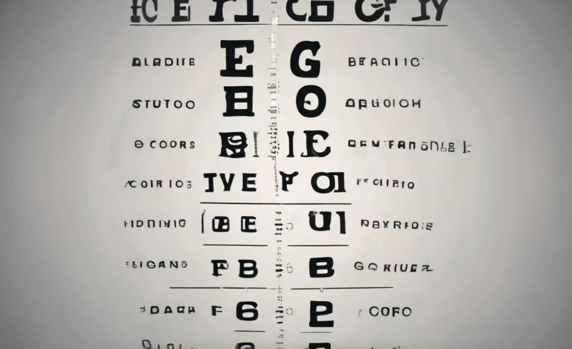
The term “Eye Chart Font” isn’t a specific typeface name you’d find in a design software menu. Instead, it refers to the general style and characteristics of the letters used on standard eye charts, like the Snellen chart. These charts were designed by Dutch ophthalmologist Hermann Snellen in the 1860s. Their primary purpose is to test visual acuity, measuring how well a person can see at a distance. To do this effectively, the letters must be instantly recognizable and easy to distinguish, even when very small.
The letters typically used on these charts are from the Latin alphabet, but not all letters are created equal for this purpose. Snellen selected letters that are symmetrical and have minimal complex curves or serifs. Think of letters like ‘E’, ‘F’, ‘P’, ‘T’, ‘L’, ‘Z’, ‘O’, and ‘A’. These have clear, straight lines and simple shapes, making them less prone to confusion, especially in low light or for someone with impaired vision. The design choice prioritizes clarity above all else.
The Genius Behind the Design Principles

The brilliance of the eye chart’s design lies in several key principles that we, as designers and creatives, can learn from:
- Simplicity and Legibility: The chosen letterforms are incredibly simple. They lack unnecessary flourishes, decorative elements, or intricate details that could obscure their identity. This focus on pure shape ensures maximum legibility at a glance.
- Monolinearity (Mostly): While not perfectly monolinear (meaning strokes are not all the same thickness), the contrast in stroke weight is generally kept to a minimum. This prevents thin strokes from disappearing at smaller sizes, a common issue with some more decorative fonts.
- Ample Spacing: Both the space between individual letters (kerning) and the space between words (tracking) are carefully controlled. This prevents letters from visually merging, especially at a distance or when viewed quickly.
- Universal Recognition: The letters selected are among the most easily differentiated. They minimize ambiguity. For example, a ‘P’ is clearly a ‘P’ and not easily mistaken for a ‘B’ or ‘R’.
- Progressive Difficulty: The chart’s layout itself is a design achievement. Letters are presented in rows that get progressively smaller, forcing the viewer to strain their eyes just enough to find their limit. This systematic approach ensures accurate measurement.
This attention to detail, even in a utilitarian context, highlights how font design directly impacts user experience and the effectiveness of communication. It’s a testament to how form follows function, but with an elegance that transcends mere utility.
Key Letterforms Used and Why They Work
Let’s take a closer look at some of the common letters and why they are preferred in eye charts:
| Letter | Design Rationale | Why it’s Good for Eye Charts |
|---|---|---|
| E | Simple, straight horizontal and vertical lines. High contrast in form. | Distinctive shape, easily recognized even when rotated 90 degrees (critical for testing confirmation). |
| F | Similar to ‘E’ but with one less horizontal bar. | Very clear form, minimal distinguishing features from ‘E’ that are still easily discernible. |
| P | A vertical line with a single curved bowl. | The combination of straight and curved elements is easily distinguishable from other letters. |
| T | A simple cross shape. | Highly symmetrical and simple, difficult to confuse with other letters. |
| L | Two perpendicular straight lines. | Extremely basic geometric form, very clear. |
| Z | Three straight lines forming a zig-zag. | Distinctive angled lines. |
| O | A perfect or near-perfect circle. | Simple, closed shape. |
| A | A triangle with a crossbar. | Forms are generally distinct, though the crossbar is crucial for distinguishing it from an ‘A’ without one. |
Notice the letters that are often excluded or used less frequently: ‘B’, ‘D’, ‘Q’, ‘G’, ‘R’, ‘S’, ‘V’, ‘W’, ‘X’, ‘Y’, ‘J’, ‘K’, ‘U’. These often have more complex curves, diagonal lines that can be confused, or combinations of elements that make them harder to read at a glance when small. For instance, ‘B’ and ‘R’ share similar curves, and ‘S’ can be tricky to differentiate from other shapes with its double curve.
Beyond the Eye Doctor: Applying Eye Chart Principles to Your Designs


So, how can the humble eye chart inspire your own typography and design choices? It boils down to understanding the core principles of legibility and clarity.
1. Prioritize Readability Above All Else
For many design projects – from website body text to product labels, from app interfaces to printed manuals – the primary goal is that people can read and understand the information easily. Just like the eye chart, your font choice should ensure clarity, especially for the content most vital to your audience.
When choosing body text fonts, opt for styles that have:
- Clear letterforms with distinct shapes.
- A moderate x-height (the height of lowercase letters like ‘x’ or ‘a’). A larger x-height generally improves readability.
- Sufficient contrast between thick and thin strokes, but avoid extremes for body text.
- Generous spacing between letters and words.
2. Consider Your Audience and Context
The eye chart serves a very specific audience (patients undergoing vision tests) in a specific context (a controlled examination room). Your design context will differ, but the principle remains. Who are you trying to reach, and where will they encounter your text?
For a marketing brochure, you might have more flexibility with slightly more decorative fonts. But for an app interface where users are quickly scanning for information, extreme readability like the eye chart is paramount. Think about the potential for visual distraction in the environment where your text will be viewed.
3. The Power of Simple, Familiar Shapes
The eye chart relies on letters that are deeply embedded in our visual vocabulary. They are instantly recognizable. When selecting fonts, especially for branding or logos, consider how familiar and easily digestible the letterforms are. While unique fonts can create personality, ensure they don’t sacrifice immediate comprehension.
Some fonts designed for high legibility, often referred to as “humanist sans-serifs,” incorporate these very principles. Examples include:
- Open Sans: Known for its excellent legibility across print and web, with friendly, open curves.
- Lato: A sans-serif font family that feels semi-bold, warm, and friendly, designed for clarity.
- Roboto: Google’s default system font, engineered for optimal readability on screens of all sizes.
These fonts, while modern, borrow from the fundamental clarity that makes the eye chart effective.
4. Spacing is Your Secret Weapon
Bad kerning and leading (the space between lines) can ruin even the most beautifully designed typeface. The eye chart implicitly uses good spacing. When setting type, pay attention to:
- Kerning: The adjustment of space between specific pairs of letters that might look unbalanced (e.g., ‘AV’, ‘WA’). Most design software has auto-kerning, but manual tweaks can improve it.
- Tracking: The overall adjustment of space between letters. Slightly increasing tracking can sometimes improve readability in long blocks of text.
- Leading: The space between lines of text. Too little leading makes text dense and hard to read; too much can make it feel disconnected.
Good spacing creates breathing room, making text feel less cramped and more accessible. This is crucial for maintaining reader engagement.
Common Eye Chart Fonts and Their Typeface Relatives


While there isn’t one single “Eye Chart Font,” the style is closely related to early sans-serif typefaces designed for clarity and legibility. The most influential early sans-serif was:
- Grotesque/Gothic Sans-Serifs: These emerged in the early 19th century. They characterized by simple, unadorned letterforms. Examples include Akzidenz-Grotesk. Many digital fonts are inspired by this genre.
The specific letterforms used on Snellen charts have been refined over time. You’ll often find that modern versions of standardized eye charts use custom-designed letters that distill the essence of these classic, legible forms. These custom fonts aim for:
- Geometric Simplicity: Based on basic geometric shapes (circles, squares, lines).
- High Contrast in Differentiation: Ensuring each letter is maximally distinct from others.
- Neutrality: Avoiding strong stylistic personalities that could distract from legibility.
Think of fonts like:
- Helvetica Neue (particularly its simpler weights): While more refined than early grotesques, its clean lines and open counters make it highly legible.
- Univers: Similar to Helvetica, known for its uniformity and excellent readability.
- Futura (in certain weights): A geometric sans-serif, which, despite its more constructed feel, offers clarity due to its simple forms.
However, it’s crucial to remember that these are relatives and not exact copies. The true power of the eye chart letters lies in their specific selection and arrangement for a single, critical purpose. For your own use, look for fonts that adopt these principles rather than just copying the look.
What You Can Learn from “Eye Chart Font” Design for Your Branding
Your brand’s visual identity is heavily influenced by the fonts you choose. The “Eye Chart Font” teaches us valuable lessons for branding:
| Branding Goal | Eye Chart Principle | How to Apply |
|---|---|---|
| Clear Brand Messaging | Maximal legibility | Use fonts for your tagline, website copy, and product descriptions that are easy to read. Avoid overly complex or decorative fonts for key messages. |
| Memorability | Simple, distinct letterforms | While logos need to be unique, consider logos that use clear, recognizable letter shapes. This helps recall. Think of iconic logos with straightforward typography. |
| Professionalism & Trust | Diligence in clarity | A font choice that prioritizes readability conveys professionalism and attention to detail. It shows you respect your audience’s time and effort. |
| Accessibility | Universal recognition | Choosing legible fonts makes your brand accessible to a wider audience, including those with visual impairments or reading difficulties. This aligns with best practices from organizations like the World Wide Web Consortium (W3C) on web accessibility. |
When crafting your brand’s visual language, think about the impact of your typography. Does it enhance or detract from your message? Does it feel professional and trustworthy? The eye chart, in its own way, achieves this through unwavering focus on its core function.
SEO Considerations for Typography
While the “Eye Chart Font” isn’t a typical keyword for SEO, the principles behind it directly impact user experience, which is a significant ranking factor for search engines like Google.
- Improved User Experience (UX): Websites with easily readable content keep visitors engaged longer. This reduced bounce rate and increased time on page signal to search engines that users find value on your site.
- Accessibility: Accessible websites are favored. Using legible fonts makes your content accessible to more people, which aligns with Google’s broader goals for the web.
- Readability for Snippets: When your content is clear and well-formatted, it increases the chance of being featured in Google’s rich snippets or answer boxes. The direct, clear nature of eye chart letters is a model for text that is easily digestible by algorithms and humans alike.
Therefore, optimizing your website’s typography for readability is an indirect but powerful SEO strategy. Choosing fonts that embody the clarity of an eye chart can significantly benefit your site’s search performance.
Case Studies: Where Clarity Reigns Supreme
We see the spirit of the eye chart font principles applied in many successful digital and print environments:
- For Medical Information: Websites and publications dealing with health information (like the NHS website) prioritize extreme clarity. They use fonts with high legibility and ample spacing to ensure complex medical terms are understood by a broad audience.
- User Interface (UI) Design: Operating systems (like Windows or macOS) and popular apps (like Slack or Mailchimp) rely on clean, highly legible fonts for their interfaces. This allows users to quickly scan menus, buttons, and notifications without confusion.
- Educational Materials: Textbooks, learning platforms, and children’s educational content often use fonts that are exceptionally clear and simple, drawing directly from the principles of legibility seen in vision tests.
In each of these cases, the goal is to convey information effectively and efficiently. The “Eye Chart Font” style is the benchmark for achieving this.
FAQs about Eye Chart Font and Typography
Q1: What are the most common letters on an eye chart?
The most common letters are those with simple, distinct shapes like E, F, P, T, L, Z, O, and A. These are chosen for their clarity and ease of differentiation, even at small sizes.
Q2: Is there a specific font called “Eye Chart Font”?
No, “Eye Chart Font” is not a specific typeface. It’s a general term referring to the style and characteristics of the letters used on standard vision charts, emphasizing extreme legibility and simplicity.
Q3: What makes the eye chart design so effective?
Its effectiveness comes from prioritizing clarity and legibility above all else. This is achieved through simple letterforms, minimal embellishments, good spacing, and the selection of universally recognizable shapes.
Q4: Can I use fonts that look like eye chart letters for my website?
Yes, you can use fonts that embody the principles of eye chart letters – simplicity, clarity, and good spacing. Look for highly legible sans-serif fonts like Open Sans, Lato, or Roboto. Avoid exact replicas if they lack modern web-friendly features.
Q5: Why do eye charts avoid letters like ‘B’, ‘D’, ‘G’, or ‘S’?
These letters can be visually similar to others (e.g., ‘B’ and ‘R’), or have more complex curves that are harder to discern when small or for someone with reduced vision. The goal is to minimize any ambiguity.
Q6: How does font choice impact UX and SEO?
Choosing legible fonts improves user experience by making content easy to read, increasing engagement and reducing bounce rates. This positive UX is a signal to search engines that your site is valuable, indirectly boosting SEO. Accessibility is also key; clear fonts make your content reachable by more users.
Q7: What is a good x-height for readability?
A good x-height is typically moderate to large. This means the lowercase letters are relatively tall compared to the uppercase letters. Fonts with larger x-heights tend to be more readable, especially at smaller sizes, as the letterforms have more substance.
Conclusion
The “Eye Chart Font” might seem like a simple tool for a medical procedure, but its design principles are profound. By stripping away complexity and focusing on absolute clarity, it offers a powerful lesson for anyone involved in visual communication. Whether you’re designing a logo, crafting website copy, or choosing a typeface for a critical document, remember the genius of simplicity.


Leave a Comment